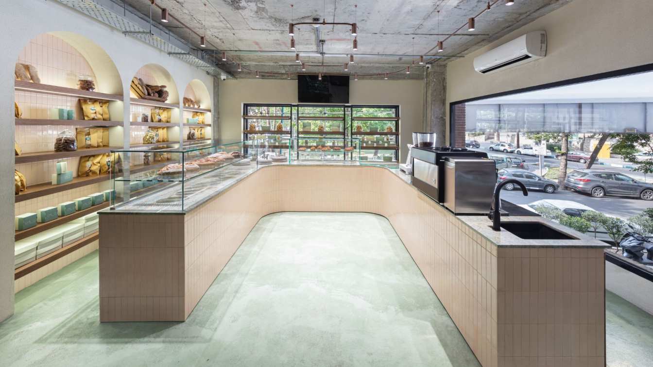
Biophilic Architecture & Interior inspired RETAIL Store. The semi - public space is designed to reduce carbon footprints and to design an energy-efficient Barrier Free building.
The project
This assignment, a space retailing exotic wood and wood elements such as beautiful veneers, stands at the crossroads of retail design and the desire to rekindle and strengthen the bond with nature in its various forms. By constant experiment and reinvention — a fundamental credo at tHE gRID Architects — the design emerges from acknowledging the basic human urge to be in tune and touch with nature, and the fact that nature has formed an enduring design inspiration through the ages.
The intent
Every era finds its way to respond and adapt to nature while maintaining the humanistic identity and efficiency of built-forms. This building, too, demonstrates striking biophilic design by integrating nature into the city and the architecture. By being energy-efficient, the built-space contributes to sustainability as well as awakens an understanding of the vulnerability of the local ecology. However, in doing so, it does not veer away from its raison d’être — that of a retail center. Thus, the design also seeks to reinvigorate the customers relationship with the material by transforming their approach to it through an experiential environment. "Thus, this centre becomes a place of origin, a part of a story that is still unfolding because we are constantly experimenting with our developing culture and its symbiosis with the natural legacy,” state the architects.
The design was to be visually expressed as a clean, sinuous entity offering a customized and curated to-order service for a selected range of products of wood and carefully designed carpets. The aim was to reduce wastage by producing items only upon request, establishing relationships that connect people and nature through design.

The architectural envelope
The elevation uses organic materials that indicate the sense of rootedness and proximity to Mother Earth that is so integral to the narrative. Local sandstone plays the leading role in a line-up featuring wood and sand-faced plaster, orchestrated in a pleasing graphical manner. A monolithic material application of sand plaster bearing a debossed pattern of circles underscores the clean linearity of the structure. The architectural skin features large openings that blur the boundary between the interior and exterior, while also facilitating natural ventilation and sunlight. The southwest façade features a series of sandstone columns that help alleviate the heat of the region as well as filter the harsh sunlight in that direction. On the first floor, the long, metal-mesh shades of the porthole-like windows cast long shadows, creating an intriguing sciagraphy.
The programme
The architectural planning is starkly simple and influenced by natural forms. The internal linear volume is parcelled into a series of sequentially strung display halls, identified with the kind of retailing that would be done at different points. The aesthetically pleasing and functional environment is shaped by the flow and the circulation the customers would take and is orchestrated such that the end user finds his way easily and experiences every part of the design.
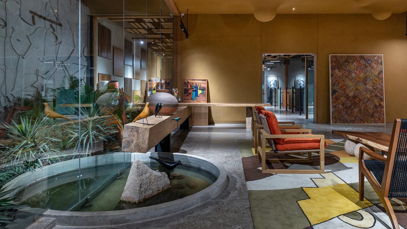
Pockets of greenery and water are deftly woven into the built-fabric, uniting the exterior and the interior so that they merge and coalesce visually, physically and spiritually. These light- and greenery-filled volumes create spatial pauses add a visual break for the customer. Sit-outs created throughout the retail space encourage social interactions and provide the visitor with a multiple experiences and views.
The material palette
The exterior and interior experience is articulated using simple and restrained materiality: wood, sandstone, mild steel and water. These are energised by the presence of life: the beautiful koi and lush plants. Together, the animate and the inanimate create an atmosphere of incredible serenity.

A walkthrough
The entrance of the building is highlighted by a serene waterbody with a sit-out, animated by golden-hued koi and lush water lilies. A striking elephant sculpture adds an interesting dimension to this outdoor courtyard of sorts. The west facade of the building is rendered in glass, with a 13-foot-tall entrance door with a scooped-out pattern on its wooden surface.
Step inside, and you are immediately cocooned in warmth and the sensorial atmosphere triggered by characteristic textures of the materials. An inviting “outdoor” courtyard merges inside with lush greenery and a waterbody infused with koi fish and plants. This forms the focal point of the store, drawing the eye of the visitor inwards as they enter. Overhead, a striking ceiling design attracts the eye as well. With the colour and texture mimicking sand dunes, the surface is sculpted into a series of softly-rounded drop-shaped forms, intensifying the reference to an undulating landscape. The welcome table is a huge wooden live log which is part of the courtyard and the interior space, thus merging the connections.
As we move further into the retail space, details of the wooden logs and curated carpets come into view. The ceiling here is designed using reclaimed wooden panels from the company’s workshop and factory, skilfully woven with built-in lighting. Casual places to sit and small meeting tables to contemplate purchase decisions engender a chic, comfortable atmosphere.
Proceeding deeper, the third hall is defined by custom-made hanging fixtures installed on the ceiling to establish a feeling of lightness while indirect lighting emphasises the sinuous lines of the building. A large staircase located in the central courtyard is made into a thing of beauty by carefully designed lighting. It takes us to the upper floor, reserved for longer deliberations involving bespoke wooden products, be it lighting or furniture.

The display
The aesthetic value and inherent beauty of wood as a natural material is projected effectively through products as well as interior elements. Live-edge tables, consoles made of dressed logs and ceiling design concocted out of wood waste as well as wood panels speak of the material that occupies the central position in the narrative. In addition to this aesthetic functionality, the product themselves are treated as objects to be admired and cherished. In some places, they are treated as wall-mounted art, in others as wooden expanses emerging from a sea of large pebbles. Elsewhere, their warmth gets intensified under the positive munificence of the sun. All these strategies are geared towards providing personalized advice and services to the customer, bolstered by digital-free, tactile product experience riding on a wave of a renewed post-pandemic interest in meeting and greeting people.
The conclusion
The design is a collaboration between the latest interior and architectural wood products in an urban lifestyle. It focuses on the latest technological efficiency and endeavours towards a minimal environmental impact. The narrative draws attention to the importance in striking a balance between urban needs and those of nature, while also taking into account the importance of preserving local art and craft.
Simply put, this retail space is a building of the new era, where the man is in tune with nature. It is an honest and warm place surrounded by greenery, water and welcoming natural materials —whether being retailed or a part of design.


