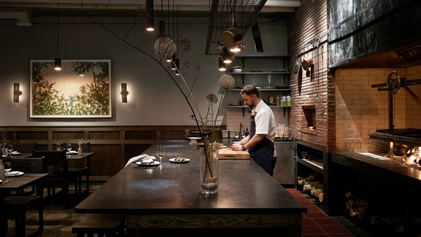
Mutuus Studio: The restaurant takes its name, Samara, from the winged fruit of maple trees that twirls like a helicopter. That attention to nature find its counterpart in the design of the restaurant. Inside, rich earth tones dominate, bringing to mind a tranquil wooded understory. “The design brief,” notes Saul Becker, a Principal with Mutuus Studio, “was to create a small, sophisticated, and intimate neighborhood corner bistro. The menu is focused on locally-sourced and environmentally-friendly heritage breed animals and produce. Central to the restaurant is the multi-level, wood-fueled grill and oven.”
The dining area opens directly to the wood-fired grill, ensuring that guests have a front-and-center seat to the preparation of their food and serving as a not-so-subtle reminder of the comfort we feel in gathering together around a fire. “The design team sought to integrate the restaurant into the fabric of the neighborhood by creating a place that evokes a rich sense of timelessness and comfort,” notes Kristen Becker, a Principal with Mutuus Studio. “We wanted it to feel comfortable to go to in all seasons, a fire in the winter and a fire in the summer. We also wanted to welcome the neighborhood including families.”

Dark-stained oak paneling and wainscoting wrap a portion of the space and the bar front, while the balance of the space features a section of the building’s original firewall that was revealed during construction. Fellow Principal Jim Friesz adds, “The darker tones of the restaurant enhance the experience of the firelight from the hearth and the custom lighting made by Mutuus. Keeping the light low also helps create the sense of intimacy with the space and the food.” The firewall is composed of framing timber turned on its side, and now provides a subtle homage to the cooking method of choice.
Seating for 38 is handled through a mix of seating groups featuring anti-tip tables topped with wood recycled from old piers, and a leather banquette. A chef’s counter, finished in soapstone, seats an additional six guests. Copper cladding wraps the area above the grill features a rich patina, and hand-made Danish brick, embedded with fused glass, surrounds the grill to create a delicate dance of firelight. “I liken the atmosphere to a Dutch still life painting. It’s rich and moody with an elemental simplicity, notes Saul Becker. “The simple, ubiquitous copper pot was an inspiration to us. It’s something utilitarian that only gets better with age. We carried this theme throughout the restaurant with custom patinaed copper panels and pendants, handmade Danish bricks, a soapstone chef’s counter and bar, and richly stained wood…simple materials that will get better over time and through use.”

Throughout the interior, custom-designed-and-fabricated lighting fixtures serve as important touchpoint, bringing the spirit of fire into the lighting scheme. The chef’s counter and food prep areas feature a combination of 4-inch diameter Cinder lights and 2-inch diameter Ember lights, both made from knurled copper pipe and a custom patina. Banquette lighting is provided by a custom-designed rotating arm fixture dubbed Mallet (also featuring a knurled and patinated finish), that enables lighting to swing and adapt to table groupings. Translucent micarta sconces, made of linen and resin, line the wall. The washroom features a light fixture made from a spent artillery shell, the body perforated and coated with reflective glass beads to create a subtle, twinkling light effect. Existing concrete floors were given a subtle stain and then sealed. New windows, and an exterior awning round out the improvements.

Quotes from the design team
“The design brief was to create a small, sophisticated, and intimate neighborhood corner bistro with seating for 38. The menu is focused on locally-sourced and environmentally-friendly heritage breed animals and produce. Central to the restaurant is the multi-level, wood-fueled grill and oven.” (Saul Becker)
“The design team sought to integrate the restaurant into the fabric of the neighborhood by creating a place that evokes a rich sense of timelessness and comfort. We wanted it to feel comfortable to go to in all seasons, a fire in the winter and a fire in the summer. We also wanted to welcome the neighborhood including families.” (Kristen Becker)
“The client, who was raised in Chicago, wanted to bring a little of the craftsman style that he loved to the design of the restaurant. As a result, the design feels reassuringly familiar and timeless.” (Saul Becker)

“I liken the atmosphere to a Dutch still life painting. It’s rich and moody with an elemental simplicity. The simple copper pot was an inspiration to us. It’s something utilitarian that only gets better with age and patina. We carried this theme throughout the restaurant with custom patinaed copper panels, custom patinaed copper pendants, handmade Danish bricks, a soapstone chef’s counter and bar, and richly stained wood…simple materials that will get better with age and use.” (Saul Becker)
“The design and the menu are inextricably linked. Each ingredient and each element of the restaurants design are given full weight. It was paramount that the mission of Samara was to give the restaurant patrons a heightened sense of the ritual of enjoying a meal and their presence in the space. Keeping the elements, ingredients, and materials clear allows the patrons to be present and focused on their experience. The smoky char of the sunchokes is reflected in the dark patina of the copper pendants. The warm copper glow of the wall mounted “Mallet” lights echoes the glow of the fire.” (Saul Becker)

“The chef’s counter was critical to get right. It needed to be intimate and connected to the hearth but not feel like it put the chef on stage. More like being hosted at someone’s home than Eric (the chef) on display. Even with Seattle’s reputation for rainy weather, people still like to be connected to the outdoor neighborhood streetscape when dining. So we organized the table layout next to new, large operable windows at the front, cozy corner of the restaurant.” (Jim Friesz)
“The darker tones of the restaurant enhance the experience of the firelight from the hearth and the custom lighting made by Mutuus. Keeping the light low also helps create the sense of intimacy with the space and the food.” (Jim Friesz)

“The material palette takes cues from charred wood and copper cookware. We chose copper as our metal over blackened steel or other more conventional metals because of its connection to cooking. The ember glow of the fire inspired the design of the lighting that uses a torched copper exterior patina with the polished copper interior. Inside, rich earth tones dominate, bringing to mind a tranquil wooded understory. The dining area opens directly to the wood-fired grill, ensuring that guests have a front-and-center seat to the preparation of their food. Dark-stained oak paneling and wainscoting wrap a portion of the space and the bar front, while the balance of the space features a section of the building’s original firewall that was revealed during construction. The firewall is composed of framing timber turned on its side and now provides a subtle homage to the cooking method of choice.” (Saul Becker)


