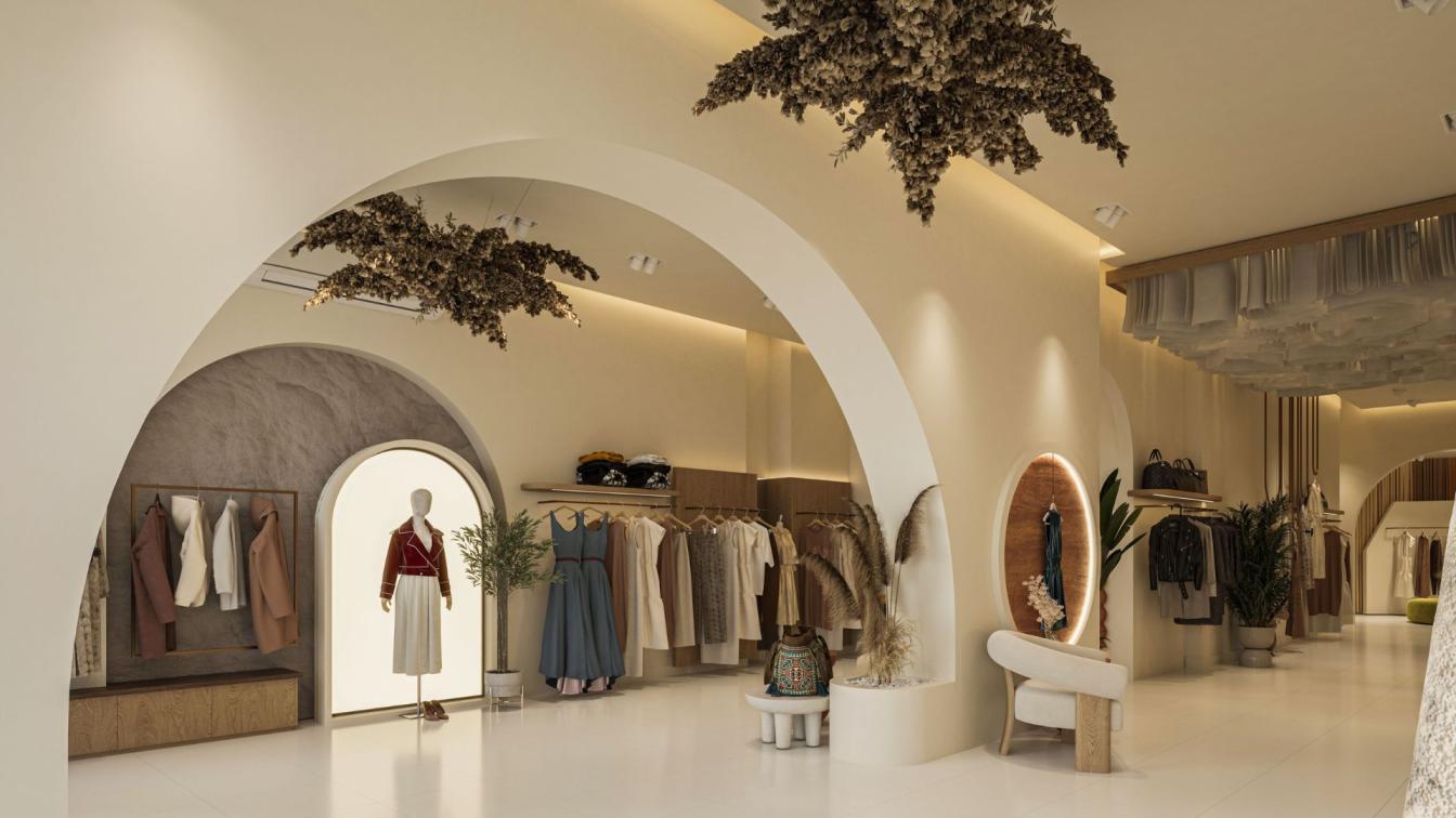
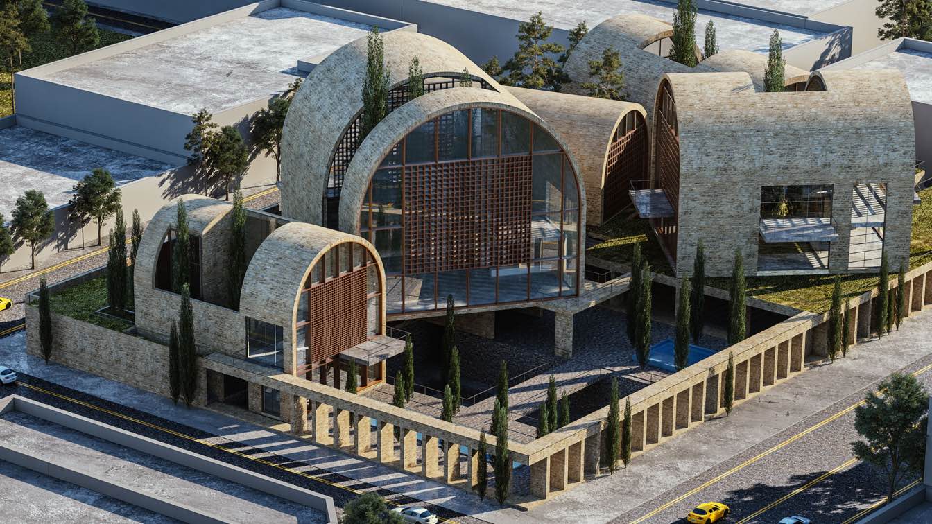
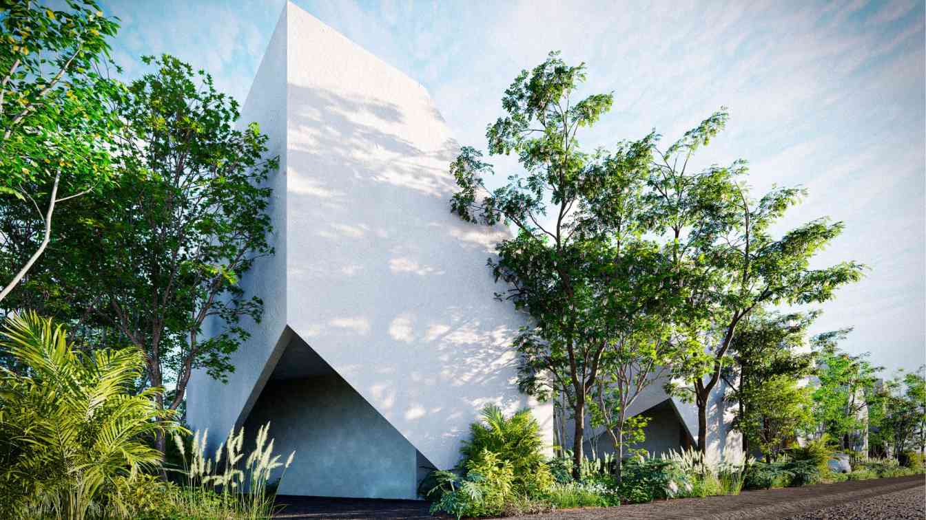
Fish I Visuals / Moamen Mahmoud: a harmonious blend of practical usability, captivating aesthetics, and strategic circulation. It evokes a sense of seamless movement throughout the store, where storage zones are cleverly integrated and display areas become captivating destinations.
1. Core: it's where the display delights, we made it an inviting captivating zone to explore and attract customers. it act as the final treat station for the customer tour!
2. Counter: Centrally positioned yet strategically distanced from the entrance, the reception area acts as a welcoming hub, offering panoramic oversight of the entire store. This deliberate placement provides several benefits: it facilitates smooth customer flow by directing them towards the heart of the store, enhances security by ensuring valuables are not readily visible from outside.
3. Fitting room: Strategically positioning the fitting rooms at the end of the store allows customers to complete their shopping journey before encountering them. This discreet placement respects customer privacy and avoids disruptions to their browsing experience. Additionally, a semi-private "haram" area further enhances privacy and provides a dedicated space for customers to try on garments.
4. Storage room: Tucked away in a discreet yet strategically chosen space, the staff area blends essential functionality with hidden convenience. It offers a well-equipped haven for employees, complete with a sleek counter, organized storage, Staff bathroom, and access to cleaning tools, Storage shelves, and Racks for ironed dresses – all seamlessly hidden from the customer experience, while fostering a sense of privacy for the store's team.


About
Fish i is a Design Studio Based in Egypt, Our Motive is to craft spaces that truely resonate with users by understanding how people will live, work, and connect within the space. Moreover, making a difference for Architects by creating images that are noticed and tell a story.

