Pioneer Harmonism
With a passionate edge,
Engaging the world in harmony.
——AVVENN
Within the grand narrative framework of the city, the individual expression often conceals delicate emotions. Shanghai, beyond its famous buildings and bustling districts, possesses an ever-evolving trendiness and vitality, continuously enriching the city's cultural depth and internal texture.
AVVENN, a diverse designer brand, was established in Shanghai in 2021. Skilled in merging artistic aesthetics with avant-garde consciousness in clothing design, it conveys a self-consistent and comfortable state through a simplification approach. The brand's new physical store returns to Shanghai, where the space serves as a medium for brand narration. Time To Gather, conceptualized around the prototype of clothing — the pattern paper, interprets the brand spirit of "Pioneer Harmonism" from multiple dimensions, including appearance, interior, and details.

1. Form
Pioneer Harmonism
From the perspective of appearance, the architecture breaks away from conventional forms, redefining itself with an L-shape. The visually symmetrical entrances on either side boldly proclaim the brand's stance on the contradictions and coexistence, as well as the sharpness and relaxation, inherent in "Pioneer Harmonism".
"Pioneer" signifies difference and uniqueness. Natural stone, serving as the primary material for the embedded structure, establishes the uniqueness of the spatial facade. Metal blocks interweave from the exterior to the interior, visually enhancing the volume of the passageway, directing foot traffic, and simultaneously creating a sense of ceremony upon entering the space. The stone and metal plates, aged by hand, soften the surface's rigidity, awakening the space's natural warmth and sense of story, allowing the "harmony" expressed by the brand to be traceable.
Conventional commercial design thinking is to occupy every inch of space. However, what makes a pioneer "pioneering" is the courage to lead and go against the norm. By conceding a certain physical space at the entrance, it allows for an emotional buffer and transition. The light grey terrazzo, continuing from the outside to the inside, guides visitors into different settings.
As one moves, the inward folding edges of the metal stools on the stairs translate the lightweight texture of "pattern paper"; the curved stone doorframe at the entrance extracts the movement trajectory of "cutting"; the intricately interwoven structure of the door handle expresses the action of "threading" through a sewing machine. In these subtle details, a concrete exploration of the brand spirit unfolds.

2. Concept
The Scale of Creativity
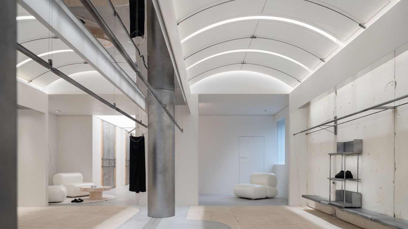
The concept of "pattern paper" originates from the prototype of clothing design, symbolizing unlimited creativity and precise measurement. Stepping inside is like being in an unfinished clothing design drawing. Lines, forms, textures, and colors all express the creative ideas of the design.
Continuing the structural design of the facade, the interior is symmetrically arranged. The arch-shaped ceiling, with its orderly arrangement of slab structures, evokes the freedom of cutting and the lightness of pattern paper. The 10mm wide grooves surrounding the metal structure simulate the fixed pin connections and clasps found in garment-making, with smooth lines reminiscent of a craftsman's precise control during drawing. Light seeping through the gaps emphasizes the form, highlighting the concept of "pattern paper."
Texture is the emotion of a space. A vast expanse of white liberates from regular constraints, offering more freedom for imagination. Hand-carved wormhole stone walls, like strokes of nature, seem random but effortlessly evoke subtle emotions upon closer inspection. Each piece of clothing, like an independent artwork, provides visitors ample space for appreciation.
Aged stainless steel, naturally mottled artistic paint, and sections of beige stone introduce a poetry of details through the contrast of different materials; ruggedness and delicacy coexist, bringing a nuanced perception. The metal text and lines embedded in the floor once again respond to the brand's textural attributes.

3. Interpretation
Freedom of Expression
From "pattern paper" to clothing display, the design narrative also metaphorically represents the diversity and potential of the space. The central area, inspired by the intertwining of sewing machines, introduces a hanging system arranged in pairs, accommodating adjustments within a height range of 1200mm to 2400mm, to suit the display needs of the brand's seasonal collections.
From its inception, AVVENN aimed to build an ageless, borderless community that blends diverse cultures into a lifestyle. When the hanging system is adjusted to its highest point, it can be completely concealed, transforming the space into a multifunctional social arena. Here, the brand's creative ideas are unleashed, facilitating encounters with like-minded, interesting souls.
The design's interpretation of the brand extends beyond its outward display to lie within all the small, beautiful details. The wall-mounted clothing system, with its interweaving, connecting, and overlapping, artistically reenacts the moment of threading a needle in the garment-making process, as if witnessing the transformation from a piece of fabric to a piece of clothing.
The fitting mirrors, cleverly connected to the clothes rod via hooks, can be easily moved to different positions and adjusted at various angles around the hanging point, offering a comprehensive display of the clothing's beauty from different perspectives. The 350mm high curved display stand perfectly reserves a display area for the brand's shoes, hats, and other accessories. Individual display racks are flexibly placed according to the brand's daily needs, enriching the display requirements in different scenarios.
AVVENN is a female-led brand. The original square pillars are wrapped in metal sheets to form cylinders, softening the space. The beauty of femininity lies not only in softness but also in the inner strength beneath the surface. The interlocking fixation in a triangular form, with clean and sharp lines, symbolizes the strong core of modern pioneering women, presenting a balance of strength and softness throughout.

4. Relaxation
A State of Ease
As one advances along the path, whether exploring or reaping— the back area sheds its armor, embracing a relaxed and comfortable present. The irregular canvases on the wall echo the concept of "pattern paper" once more, adorned with lively metal lines, akin to the brand's unique and interesting take on clothing combinations. The original design sofas and side tables, with their soft and rounded combinations, bring a more comfortable and relaxed atmosphere to the lounge area.
The cash desk, continuing the color scheme of the facade's frame and enclosed by natural stone, faces the front display area for easy identification and sales guidance for visitors. The side carves out a space for hanging clothes, making fuller use of the space.
The fitting room, as the most private area of the store, is where detail-oriented design shines brightest. The clothing hooks are evolved from the "fixing pins" used in garment making; the stone, serving as the space's surface, displays natural textures and warm colors, creating a more relaxed atmosphere. Considering the potential for the stone's rough texture to scratch visitors or clothing, its surface has been carefully polished. This not only retains the natural beauty of the material but also highlights the brand's ultimate pursuit of an exceptional consumer experience.
As the door to the fitting room closes, it assumes a flattened appearance, reminiscent of an uncut piece of pattern paper. Defined by a central axis, the door appears as if it has been ingeniously split along this median, shifting from a two-dimensional facade to a tangible, three-dimensional form. This interplay of opening and closing not only physically transforms the space but also metaphorically represents the evolution of the consumer experience.
END
The "Pioneer Harmonism" upheld by AVVENN is rooted in the core of the brand. Just as clothing serves the individual—not only as a means to keep warm but also as a direct expression of inner emotions and pursuits—the tangible presentation of the brand space, while achieving modern aesthetics, must transcend the boundaries of a singular space. It should construct a spiritual world filled with creativity and imagination, offering consumers a greater opportunity to connect with the warmth and essence of the brand.
The colorful lighting modes provide diverse atmospheric settings for brand operations, fully satisfying the needs of various activities such as irregular exhibitions, art salons, exchanges, and live streaming. The meticulous expression, diverse culture, and concise presentation all embody the sense of ceremony in design and life, further demonstrating the profound heritage of the brand and the exquisite craftsmanship of its craftsmen.