Intent: The architecture and interior design of “The Concrete Shop” have been carefully crafted to create a dynamic and engaging Design Studio, retail space and experience center. An environment that showcases the beauty, potential and versatility of concrete in various forms, textures, and finishes. The HERO material is FRC (Fibre reinforced concrete).
FRC can help reduce carbon footprints in construction when produced with lower CO2 emissions, incorporating recycled materials, and incorporating technologies like carbon capture and utilization. It is also durable, long-lasting, and energy-efficient, which can reduce the environmental impact over its lifespan.
The project
To create an experience cum design studio centred on concrete as a material. The compact space, spread over two levels of 872 sq ft (ground floor) and 925 sq ft (first floor), would also serve as a retail outlet for product/applications crafted from concrete.
The design response
The fiscal and spatial limitations of The Concrete Shop made tailoring the design response an interesting and challenging exercise. The protagonist of the narrative itself showed the way to creating an experience that would be both visually striking and cost-effective. The cogent design solution the team presented was a hybrid one, born out of the objective of a creating a retail space and a desire for product exploration, depicting, in the process, the strength, the durability and the versatility of concrete. At a more functional level, in order to extract every possible inch out of the compact footprint, the space was designed to be flexible, with movable displays and workstations that could be easily reconfigured to suit different uses and events, as well as with storage and display elements into the walls and other architectural features.

The elevation
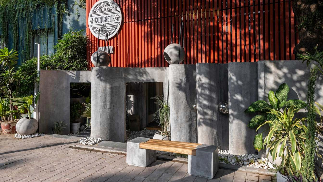
Being the first impression of the retail cum design studio, the facade was bestowed with considerable design attention. The approach was to script a visually striking elevation by juxtaposing different textures and finishes of concrete. Thus, it uses the hero material in two different renditions, signaling two internal functions: the retail space on the ground floor and the experience Centre cum design studio on the first level. This shift in material formalisation is dramatic and eye-catching. The Architectural Façade at the lower level sees concrete being interpreted as a delicately meandering, folded enclosure, emerging from a gravelled bed of natural stone. This affords privacy to the enclosed space. The entry to the retail section and the pathway that leads upstairs to the experience Centre punctuate the pleats. More drama is created by the presence of concrete orbs—light fixtures—perched on long metal legs, and metallic spheres secreted within the pleats of the concrete compound wall. The delicate grey ruffles on the lower-level contrast beautifully with a more rigid interpretation of the material—this time as a slatted sheath of concrete louvres, coloured a burnt sienna, over the second level. On this rhythmic, ribbed skin, the cast-concrete signage, intricately detailed and wonderfully delicate, declares the name of the store.
While the facade is high in stylistic and aesthetic treatment, it is also driven by earth-sensitive technical expertise and precision. The slats have been designed and positioned after an in-depth study of the sun path to engender a comfortable internal environment that minimises the need for active cooling.
Together, both concrete elements illustrate the versatility and the varied applications of the material, reinforcing its visual potential, functional strengths and efficiency.

The interiors
The immersive environment is built upon an orchestration of four materials: concrete (in various forms, including terrazzo), wood, mild steel and natural stone. This contemporary and stylish materiality births a warm ambience that tempers the industrial aesthetic projected by concrete. The main material itself is interpreted and envisioned as a series of visually striking surfaces, sculptural panels, patterns and objects, both functional and decorative.
The cast in situ terrazzo floor, for instance, unfurls as an eye-catching ochre and emerald, setting the stage for concrete shelves, held aloft by wooden blocks and displaying an mélange of vases and coasters; an upright concrete block with geometric cutouts; a stunning model of Tower of Pisa (designed by the architects’ team and implemented by the client); a timepiece featuring smooth concrete lozenges supported on a dainty metal frame, concrete partitioning bearing gentle obround indents as well as cut-outs… Walls, too, display the material’s design strengths: panels with wavy lines, rigid textures, voids and projections, accordion-like pleats, 3D tessellations; with embossing and bas-relief, surfaces with stucco-like appearance and a smooth, silky finish, create a visual montage that is at once striking and informative.
Along one wall, four rounded forms—ranging from a sphere to an ellipsoid—supported on metal pipes and showcasing finishing techniques such as exposed, etched and coloured finishing, add a playful touch. At the window, a series of pivoted concrete louvers act as a sun-breaker, while overhead, a matrix of circular concrete lights, like a battalion of mini flying saucers, bathes the interiors in an even glow.

This display of design ingenuity and craftsmanship continues on the first level, where the material is transformed into a series of furniture pieces: ottomans, benches, consoles and mirror-frames. Particularly eye-catching among this fascinating display is a console, grey and sombre, with an unexpected treated of metal foiling, and a wood-and-concrete desk, slim and graceful as a boomerang, held aloft by two structural pillars.
Collectively, all these objects and applications displayed on both levels demonstrate the adaptability of concrete to various uses, ranging from solid functional furniture to a design pattern as delicate as lace.
The conclusion
The design of “The Concrete Shop” prioritises both form and function, laying emphasis on sustainability and biophilia, to create a dynamic and engaging environment that visitors will remember long after they leave. The visually stunning and technically advanced space showcases the beauty and versatility of FRC through the use of different textures, finishes and as 3D objects, ensuring that customers will return time and time again to experience the space and learn more about the material. Equally important, the final design of the concrete experience cum design studio is a testament to the creativity, resourcefulness and ingenuity of the designers.


