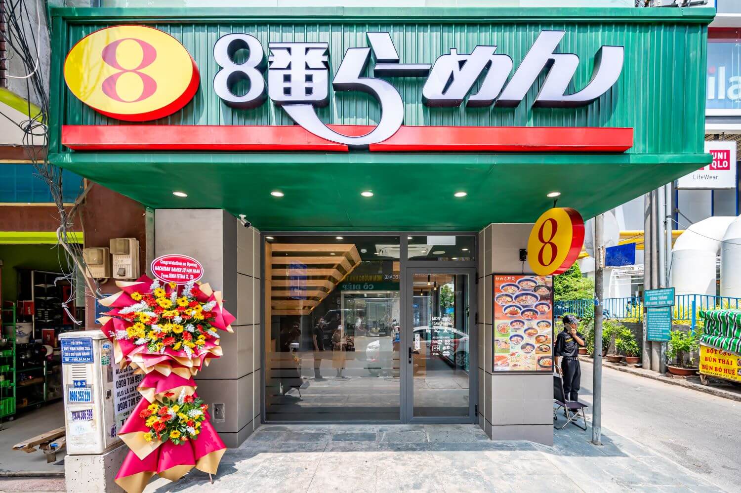
1. [HACHIBAN RAMEN] is a strategy that targets Vietnamese families and young people. That's why they don't put Japanese or Westerners as our target customers. They have that strategy, but since they have only two stores, Vietnamese people are not aware of it yet. That's why I completely ignored "Japanese HACHIBAN RAMEN" and designed it. Especially regarding the FACADE, the target was completely Vietnamese. I only thought about "What do Vietnamese people think?" The corporate color of HACHIBAN RAMEN is green. I wanted to express the color [green] not as a building material, but as a plant. I thought that the design that integrates architecture and planting is perfect for Vietnamese people. This is because the percentage of Vietnamese who prefer plants (green) is very high.
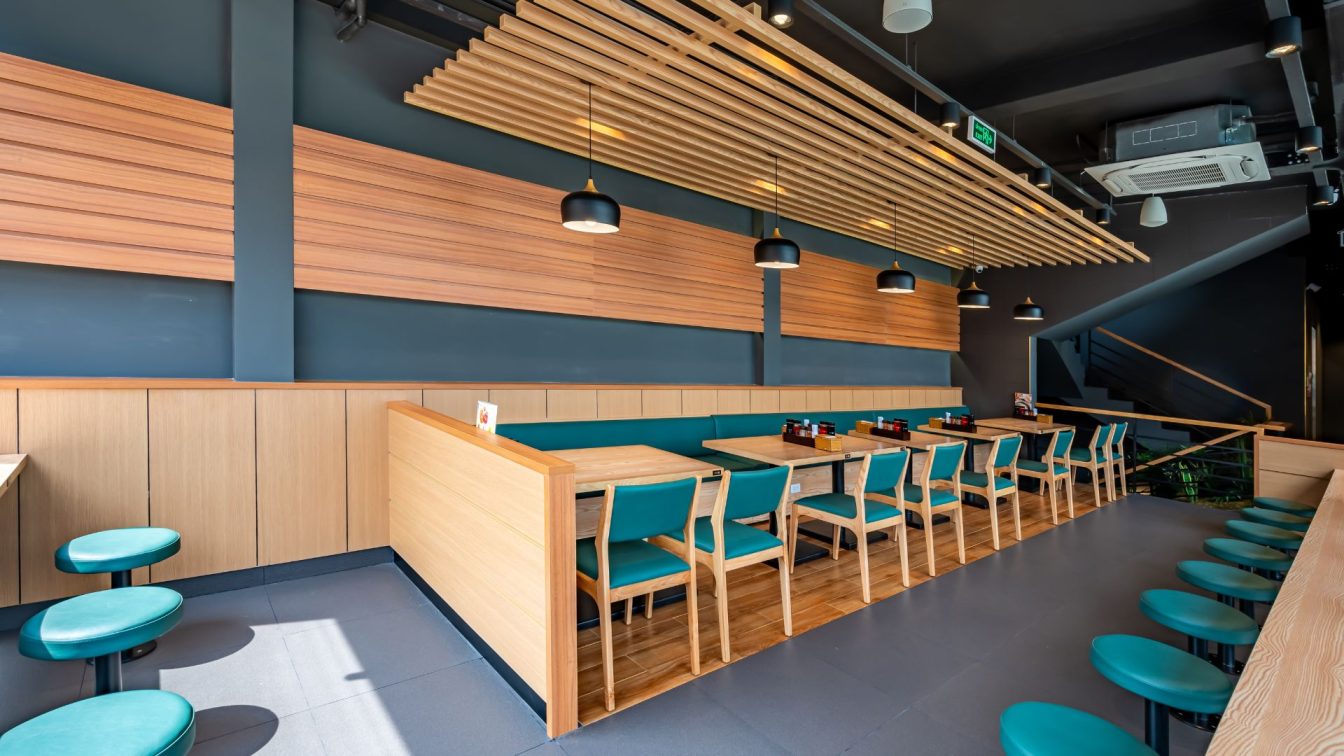
2. The [HACHIBAN RAMEN] brand has a low unit price per customer, so the construction cost is very low. So, I wanted to make it more rough. But [HACHIBAN RAMEN] is a Japanese company. So, they wanted to keep the atmosphere of a Japanese restaurant in the restaurant, so I had no choice but to give up. However, the Vietnamese who saw my Interior3D design were very interested. So I told [HACHIBAN RAMEN] that I wanted to pursue the coolness of Vietnam for the third store. Of course, they saw the reaction of the Vietnamese people and agreed with me.
3. Exterior; mortar paint, planting, steel mesh Interior; mortar paint, tile, laminate.
4. I design using as much as possible the architectural methods that the area is good at. I want to make the material and construction method as cool as possible with a low budget. Even if you spend time and money with methods that you are not good at, the cost-effectiveness is low. Also, if the strategy is to target locals, I think it is even more so.


