Shaili Banker Architects - Arkytos: The Liquescent house, located on the outskirts of Ahmedabad, embodies an architectural language inspired by organic forms, a dialogue between the built and unbuilt, and the careful integration of natural elements. The architect’s inclination towards the design language is imbued with a natural fluidity, shaped by a childhood immersed in clay. This formative experience—working with a material that responds so intuitively to the hand—has deeply influenced an approach to architecture that favors organic, flowing forms over rigid lines and angles. This house, sculpted like clay, reflects a philosophy that architecture should mirror the harmonious interrelations observed in nature, where elements are not distinct but exist in unity and continuity.
Concept and Form
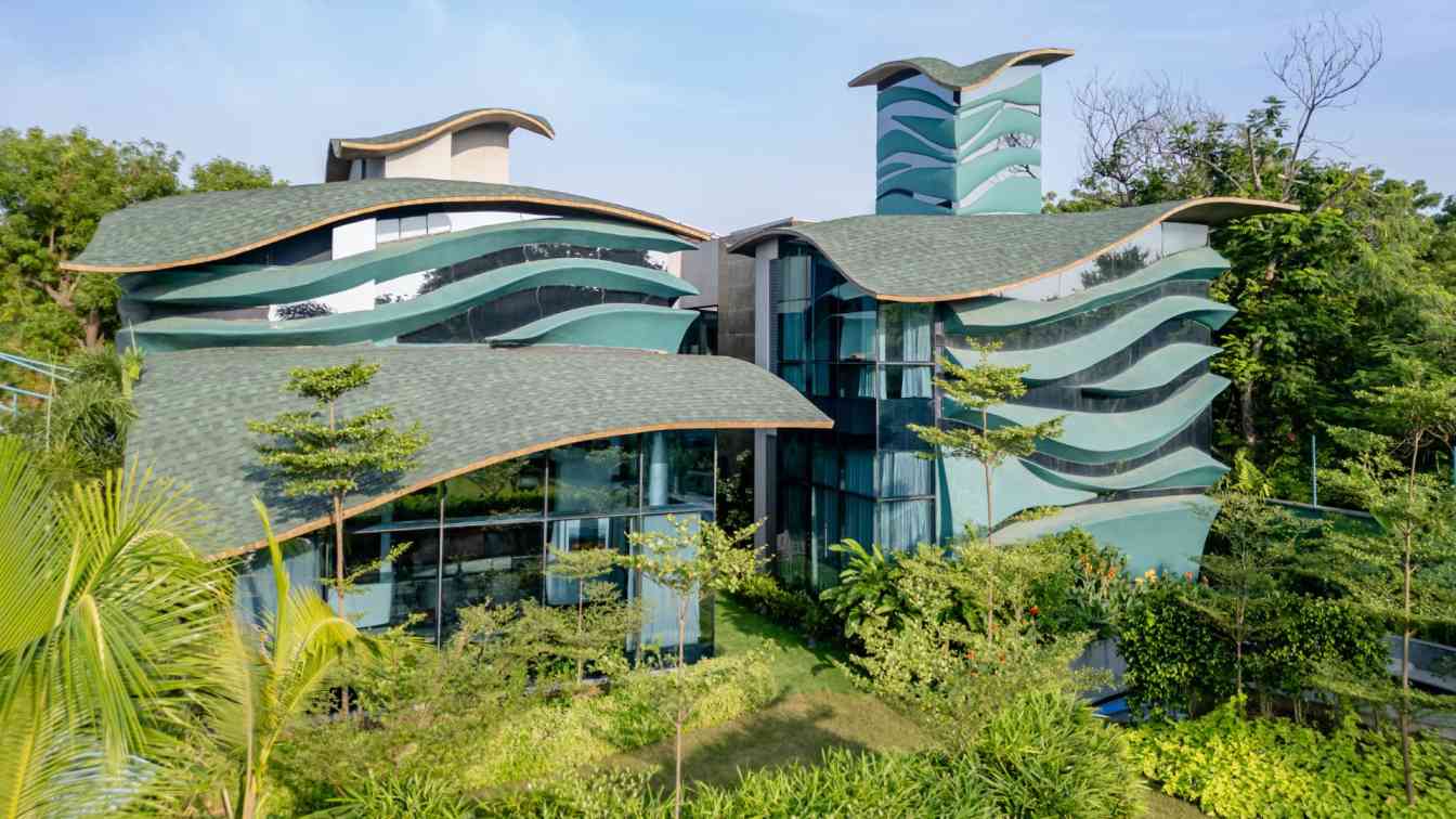
The house form, a curvaceous and geometrically intricate structure, draws from the idea of a language of fluidity—a response to the influence of organic forms—manifests in the building’s roof, walls, and spatial articulation. The architectural plan is C-shaped, with a courtyard at its heart, seamlessly integrating indoor and outdoor spaces. This layout brings light, air, and greenery into the home, creating an experience of movement and harmony. The courtyard serves as a connective tissue, offering visual relief, natural ventilation, and vibrant light across the residence. The roof is a highlight, a form that is realized in ferrocement to achieve paper-thin edges that give the form a sense of weightlessness and elegance. These edges frame the building, contrasting the robust structure with an almost transparent lightness. By curving and manipulating each segment, the roof emulates the continuous flow of natural forms, a fluid geometry that allows the house to blend into its surrounding context while providing volumetric character to the spaces beneath.
Materiality and Structural Innovation
Ferrocement, a material selected for its pliability and ability to form complex curvatures, defines the residence’s roofing structure. This material helps achieve the architectural vision of thin, flowing surfaces. The choice of ferrocement also allowed for a super-slim edge profile, enhancing the visual effect of floating, lightweight forms. Structural elements such as beams and supports were meticulously planned through wireframe models, which helped translate the hand-sculpted curves into a feasible framework. The walls complement the roof’s curvatures, with each surface molded to follow the organic flow of the roofline. These walls, painted a deep turquoise, create a striking contrast against the reflective glazing that mirrors the lush green landscape. The seamless curvilinear connection between the roof and walls blurs the boundary between the structural components, echoing the cohesion found in natural systems where elements are part of a unified whole. The interior architecture reflects the continuity of the exterior form.

Interior Design: A Continuation of Form
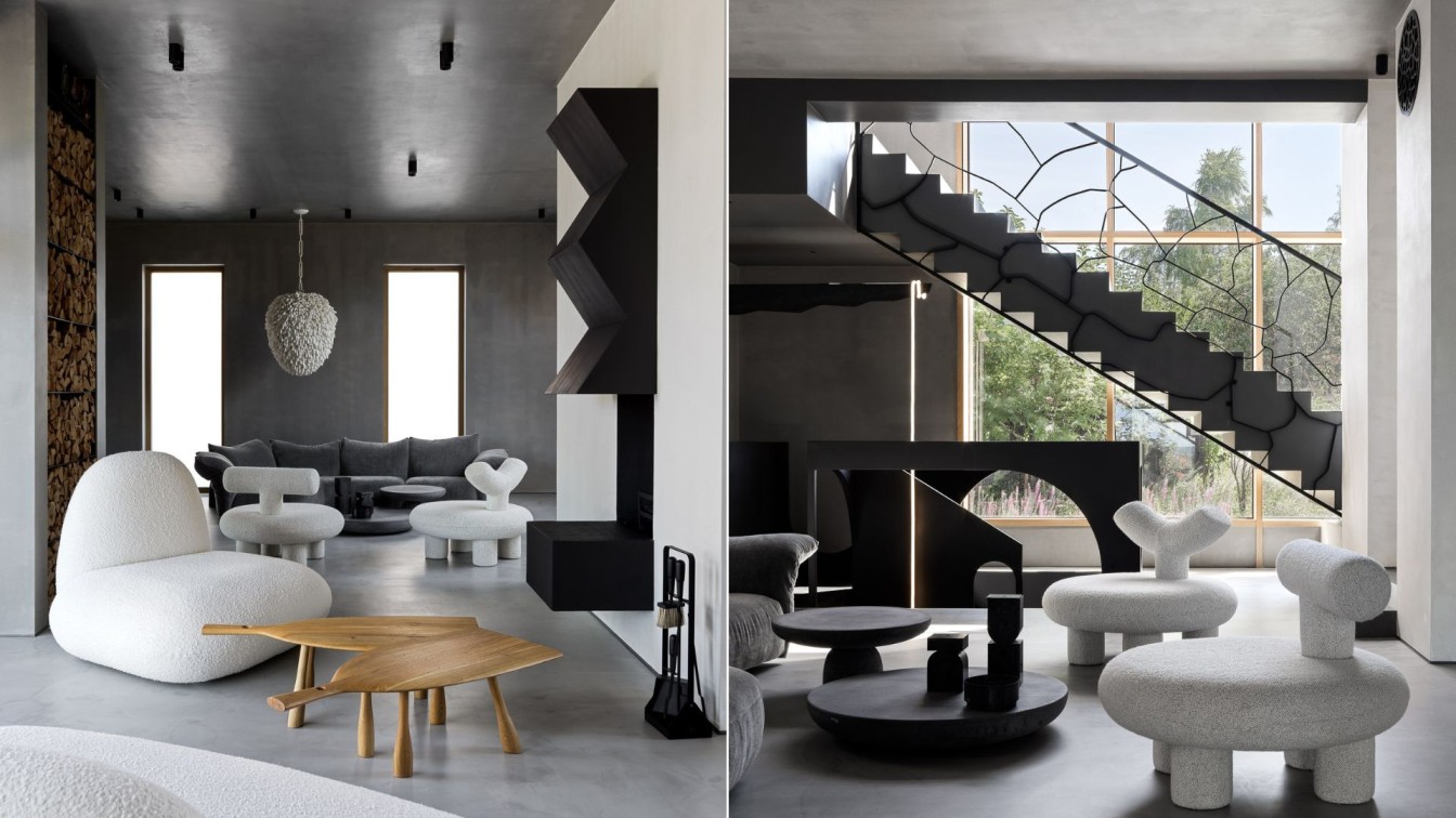
Dominated by white, the interior spaces emphasize purity and simplicity, allowing the fluid geometry to stand out. The choice of white is intentional: it creates a neutral background that highlights the architectural forms and accentuates the organic shapes that define the space. The lack of vivid interior colors directs attention toward the building’s curves, edges, and volumes, while selective use of bold colors adds depth and focus to specific elements. Spatially, the layout respects the needs of a joint family, with master bedrooms for each generation, guest rooms, and a shared study area overlooking the pooja space. The roof modulations are carefully achieved to maintain harmony. Functional elements such as a waterbody adjacent to the pooja area ensure that cultural values are integrated seamlessly with the design. Additionally, the natural light filtering through the strategically placed skylight above casting a serene glow on the idol and enhancing the spiritual atmosphere that bathes the space in a serene ambiance, aligning with Vastu principles.
Integration of Nature and Space
The architecture’s relationship with nature is intrinsic to its design. The use of glass and transparency enhances the interaction between interior and exterior spaces, creating an inviting, semi-open environment where natural light floods the interiors throughout the day. The landscaped pathways, courtyard, and water bodies create a progression through spaces that are both reflective and refreshing. The layout of the house integrates the garden seamlessly within the built form, allowing greenery to flow between structures.
A water body extends into the interior, positioned between the staircase and dining room, creating an organic division between these spaces. This thoughtful insertion of the garden and water feature allows natural light to flood the central areas throughout the day, fostering an indoor-outdoor connection thereby extending the experience of the natural landscape into the heart of the home.
Conclusion: Fluidity as Form and Function
The Liquescent House is a testament to the transformative power of fluid geometry in architecture. Inspired by natural morphology and the sculptural nature of clay, the house exemplifies how built forms can emulate organic processes to create harmonious, cohesive spaces. The residence does not impose strict boundaries but flows with its surroundings, using transparency, materiality, and structural innovation to achieve a seamless unity of form and function. This project redefines residential architecture by challenging rigid conventions, instead offering a spatial experience that feels both grounding and uplifting. By integrating natural light, open spaces, and curvilinear forms, the residence honors its context while remaining functional and aesthetically compelling. The Liquescent House is an architectural exploration of continuity, where every curve, surface, and element merges into a singular, fluid narrative.


About the firm
After graduating from the School of Architecture, CEPT, Ahmedabad in 2004, Shaili Shah Banker had a brief period of practicing architecture. Later she did her masters in urban management and architectural design from Domus Academy, Milan, Italy in 2006. She also worked at Boeri Studio, Milan, under Stefano Boeri and Gianandrea Barreca.
In 2007 she started the firm Arkytos based out of Ahmedabad, India. It handles architectural, interior design and landscape projects.
Brought up by a ceramic designer mother, Shaili’s childhood was immersed in clay. This had an immense influence on her approach to design and an inclination to create fluid like forms. Her approach to design is strictly unconventional and engages in experiments with physical models as well as virtual models to achieve the required design output. Each project is treated as a creative experiment, design solutions are sought using an unorthodox and highly logical way of thinking, to achieve a stunning architecture.

