Forum Advaita: STORY BOARD
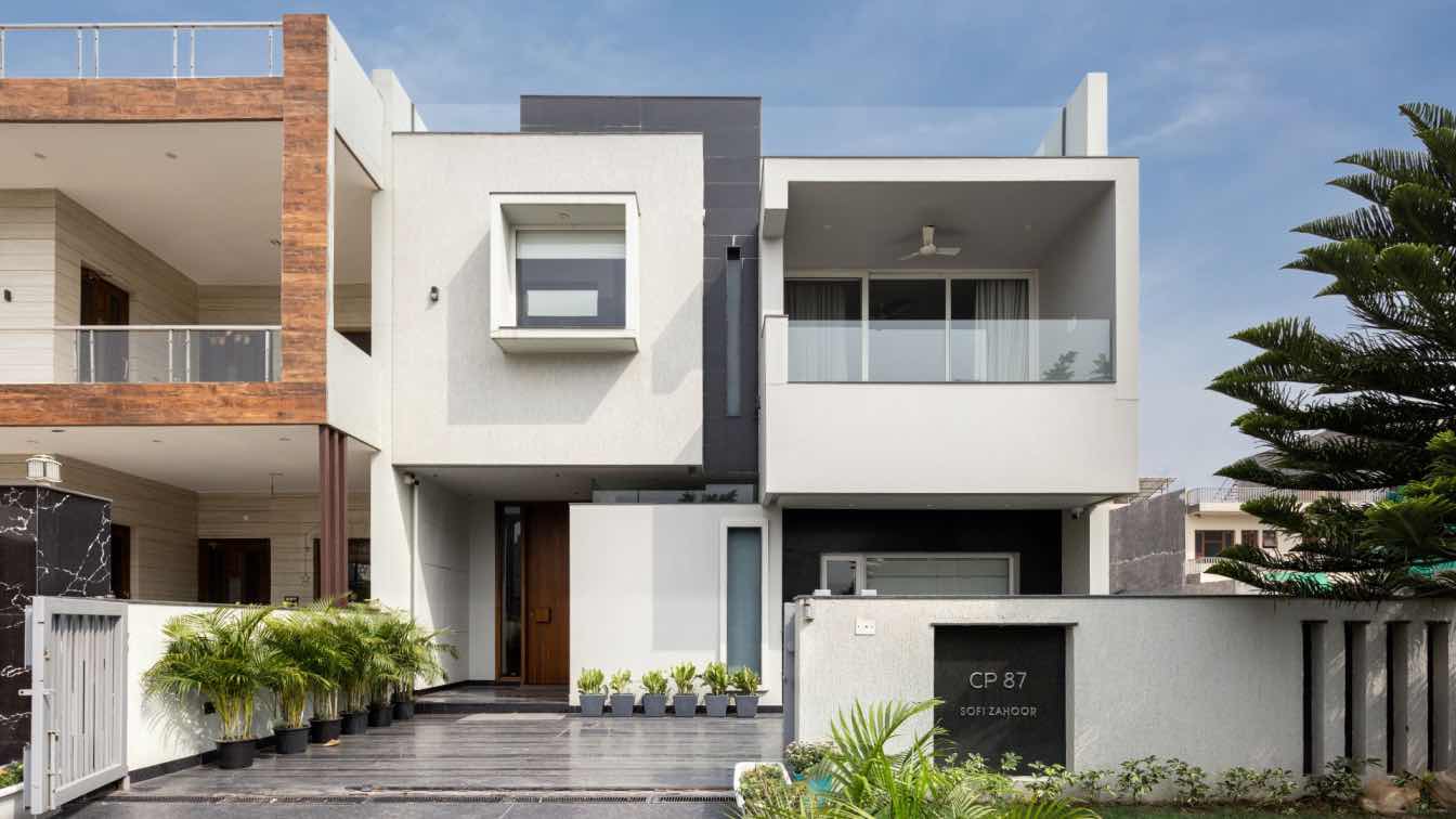
Our clients Mr Sofi Zahoor and Mrs Ritu Tondon aspired to have a naturally lit house which celebrates nothingness thus bringing in a meditativeness in the house. This house was largely about the resistance to throw any form or color into the space.
THE FOYER
The arrival into the house is a sunlit space that makes your eye move around within a small linear space of 7'x9'. A 10 ft high wooden door opens up the space flooded with natural light from the skylight above. The light defamiliarises you with the actual dimensions of the space. One slowly transcends from the vertex of the plot into the formal living seemlessly directed by a curved wall. The arrival leaves you with a choice of either pick a straight flght towards the first floor or else follow the curved wall arrive into the formal living room that becomes part of the circulation offering a different dimension of space.
THE STAIRCASE
The staircase flight from first floor to second floor has a glass skylight which gives a filtered light untill the ground floor staircase flight . . The flight from the first floor to the second floor is a metal staircase with teak wood steps, again lit by a skylight above that creates a filtered pattern of light along the wall through the steps.
THE DRY COURT
The 300 square yard house was envisioned in such a way that habitable spaces were pushed to the periphery and to bring openness in the centre. A dry court with glass skylight was positioned towards the sun movement thus bringing in indirect light which is glare free and transforms the space into a silver light from within. This court has all the habitable spaces like the dining, bedroom, formal living abutting around it. The formal living is part of the circulation space rather than being a locked space tucked away on one side. A framed opening between the living and small family sustains the transparency in the house. The dry court covered with glass skylight is an extention to the formal living area in order to create an informality in the space that can be enjoyed from neighbouring spaces like the dining and bedroom area. The window shutters were crafted from Kashmir to bring reminisces of the roots of the owners.

SKYLIGHTS
The 3 skylights inside the house create a composition of light and shadows throughout the day offering changing moods through out the day. THE BAY WINDOW on first floor is tapered into the dry court to make one feel suspended into the court area. It also adds a new dimension into the space.
THE FRAMES
The entire spatial arrangement is such that one doscoveres multiple frames within spaces, thus the name “The Framed House“. These frames separate staircase from the family area on the first floor, formal living and lounge on the ground floor.These frames allow a notional enclosure and distant viewing at the same time.
THE LIBRARY
The library on the first floor overlooks into the dry court while one sits to read. It allows cross dialogue like traditional Indian settings.
THE FACADE
The house was composed as a composition of cubes creating a choreography of 3 elements. To ensure the individual identity of all the 3 cubes, we ensured that they are all disconnected from each other, eventually thus allowed us to create window openings to bring natural light inside. The black leather stone cladding onto the recessed planes helped enhance the identity of the cubes thus amplifying the dialogue amongst them.


