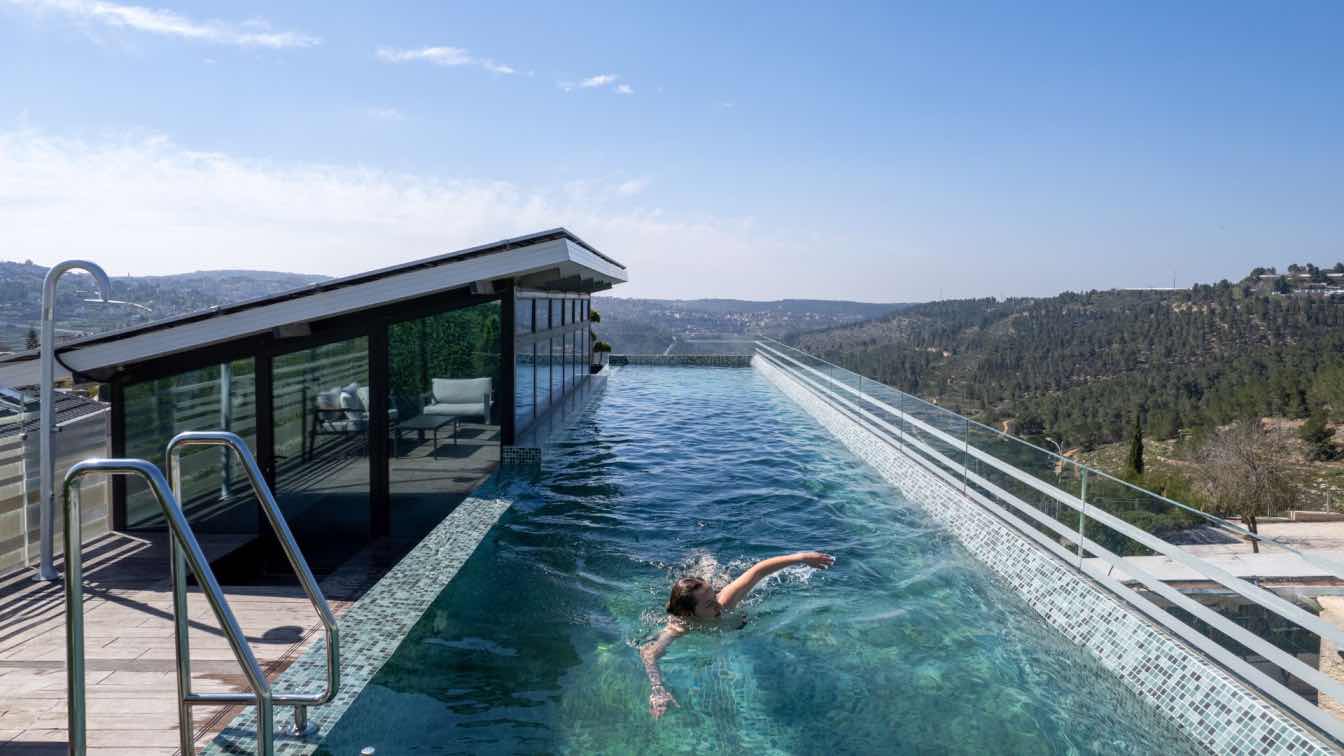
Ollech Tol Architects: A villa built on three levels, combining floating stone above a glass box and a rooftop pool, overlooking the unique landscape of the Jerusalem hills. This house features several unique elements, including a seven-and-a-half-meter staircase that was dropped as a single unit from the roof directly to the center of the space. In this villa, the rules for using Jerusalem stone on the facade were redefined, while the planners also tackled challenging topography and even fulfilled a small dream for the homeowner at the entrance.
In n old, quiet Jerusalem neighborhood, the family purchased the land as part of a plot intended for a 260 square meter shared house. We set new boundaries for the plot and created a narrow, elongated structure rich in details. In addition to the desire to create a modernist structure for the couple, we also had to consider the regulations for cladding buildings in Jerusalem stone throughout the city. This created an interesting meeting between Jerusalem classicism and subtle modernism, mainly expressed in the details.
The starting point was the specific topography, which created a significant difference between the eastern and western facades and helped generate two unique views of the same structure. The rear facade presents a single-story, narrow, and modest stone structure sitting on the ground next to a private yard. The front (western) facade reveals a villa that, at first glance, challenges gravity laws with a whole stone prism and a rooftop pool, all floating above a glass floor.
The villa is planned on three levels - the ground floor is the shared, open floor, the first floor is private and houses the family bedrooms, and the roof floor is dedicated to accessing the pool and, apart from the central glass pavilion, does not include additional construction. The plot on which the villa was planned is semi-detached, and the previous house was adjacent to the neighbor's. The first step in planning was to separate from the neighbor and create a house that stands independently and does not share a wall with the neighbor. This affected the house's form, making the plot narrow and long, and the house took on these proportions.

The separation created the first boundary, which became the reference point for the villa's planning. Thus, an additional facade was gained for the house and design independence that allows for high control over details and the possibility to create elongated proportions and completeness of the house. Indeed, elongation is a recurring motif in the design – from the choice of flooring on the ground floor or the way the parquet is laid, to the placement of ribbon windows on the sides of the stone prism and the separation strips accompanying the openings along their entire length.
The main entrance to the house is through the ground floor, which must be reached from the street level at the bottom of the slope, where the parking is also located. To reach the entrance, one must climb in two separate sections. Once the ground floor is visible, it is discovered to be exposed behind transparent screen walls, carrying the stone prism above it. Externally, the villa does not stand out in the landscape and blends into the street facade, which is also the last line for construction, beyond which lies the unique landscape of the Jerusalem hills. "Another entrance to the house is through the middle floor clad in Jerusalem stone, which is the private floor of the villa. To reach the ground floor (the public space in the villa), you go down stairs that accompany the neighbor's stone wall, alongside a concrete slide that was a small dream come true for the homeowner.
The extensive use of glass on the ground floor naturally raises the issue of privacy and how to bridge the choice of material with its functional requirements around the clock. Reflective and masking glass during the day becomes entirely transparent in the evening and night, and dealing with sunlight entering through the wide openings is also significant. There's a breakdown of concepts like boundary, interior, and exterior here, We wanted to create softer boundaries and move from a single-value boundary of a wall to a range that includes decisions and elements that make it a soft boundary instead of an opaque wall. The entire ground floor is transparent, and the stone is essentially a mirror image.
The floor feels completely open, and the question is where does it end? There's no doubt that in a private home, you want privacy and a certain degree of enclosure, and that was indeed a challenge to address. Therefore, the vegetation was planned accordingly, accompanying the floor with a degree of masking. The glass is also not entirely transparent; it is thermal and filters radiation. Textiles like curtains were an integral part of this as well. The items for the home's furnishings from Zara Home.

The area between the external stone wall enclosing the villa and the glass walls on the ground floor is filled with details that also accompany the choices made in the kitchen, dining area, and living room surrounded by transparent glass. The homeowners love traveling and are connected to nature, so we wanted to bring that into the house and define each function with both interior and exterior. An ancient olive tree stands in the dining area, the living room is adjacent to the large deck and garden, and the herb garden is dedicated to the kitchen. The living room leads to the adjoining yard, with matching flooring marking a broader boundary that serves as an extension of the living space itself. Beyond that, a wooden deck accompanies the view.
As a direct continuation of the independence from external walls and the use of glass as a soft boundary marker, each function in the public space stands on its own. The library and television wall is adjacent to the glass, and the neighbor's external stone wall is reflected, creating a sense of depth extending beyond its boundaries. The white kitchen is located in the inner part of the ground floor, providing 360-degree access with natural light and direct access to the outside. To maintain the principle of continuity, additional storage in the kitchen is suspended from the ceiling, not attached as a standard upper cabinet to the wall. Seating around the island is possible. On the other side is the solid wood dining area, with a wooden bench and woven jute chairs. The light carpentry wall that accompanies both the kitchen and the dining area is a storage unit that allows the entire space to remain free of appliances and noisy details.
A natural palette of materials and colors was chosen for the house, blending with the local materiality. Traditional Jerusalem stone contrasts with the modernity of glass and iron – which in some ways complements the light and clean glass – blending with warm, homey wood. At this stage in their lives, when the couple hosts their grown children and grandchildren, the interior design that emerged is modern, clean, and mature. The stone reflected from the outside is an integral part of the same scheme, joined by iron, glass, and wood to create a warm and homely foundation that remains modern and decoration-free.
The original concrete ceiling is the one in the stone plane, and the internal ceiling is a lowered plaster ceiling. At the edges of the lowered ceiling, we left a range where the curtains were placed, making the plaster a detail that conceals the connectors. The lighting fixtures throughout the house are recessed in the plaster and do not protrude below the ceiling line. The recessed lighting fixtures and the cladding for the curtain connectors created a completely smooth foundation that contributes to the proportions and framing of the external environment of the house.

The only element interrupting the space is the monolithic steel staircase, designed as a single unit and rising in a double-height space of about seven meters. The staircase "sews" the three levels of the villa together and ends with an exit to the pool floor. Only towards the end of construction was the staircase brought in and dropped from the roof. The steps are clad in wood matching the carpentry units, providing an acoustic need as well. The stairs are located in a double-height, open space, and when transitioning to the first floor, there is a bridge between the master bedroom and the other rooms. You can see two white masses on its sides, and the front part is open and reflects the neighbor's stone façade.
The boundaries of the private floor made of stone extend beyond the glass floor below it, creating a cantilever that shades the yard. The stone cladding on the lower part gives the prism a complete appearance floating above the glass floor. The floor is divided into two wings with a corridor between them, with the bedrooms on one side and the bathrooms and services on the other. At the end of the corridor, you reach the couple's bedroom. Through a walk-in closet with access to the spacious bathroom, you move to a space that also serves as an office. The facade facing the view is completely open. The bedroom, like the other spaces in the house, is bright and clad in parquet laid along the room. There are also flush-mounted storage units and soft textiles. Here, too, the separation of the lowered plaster ceiling from the concrete ceiling at the room's edges conceals the curtain connectors and frames the impressive view.
The use of Jerusalem stone for cladding buildings throughout Jerusalem has been enforced since the 1960s, but the roots of the regulation go back to the Mandate period. The desire (and necessity) to combine the classic Jerusalem stone with the aspiration to give the villa a more modernist, light, and airy look created the appearance of a Jerusalem villa that is modern in its subtext. From the street view, it does not stand out in the landscape – neither in its dimensions nor in its materiality.
To counter the heavy presence of stone, we chose not to use grout (cement for filling gaps between stones in walls or flooring) in the facade. The grout helps bridge natural deviations in stone placement, and its absence required precise work on-site. climbing plants soften the stone facades and walls. External lighting recessed in the stone illuminates the villa softly in the evening.

One of the first tasks was to place the pool on the roof. This involved technical details and challenges like weight bearing and sealing. The pool is an infinity pool, with water flowing from the deck into a basin below. The rooftop, with the pool, was designed as two narrow rectangles: one for the deck and glass pavilion with a solar roof, and one for the mosaic pool. The pool's outline extends beyond the stone prism’s boundary to the east (the rear facade), shading the private yard of the living floor, which includes the bedrooms. The glass railing on the roof allows for a unique swimming experience overlooking the open view.
The pool's construction challenges, combined with the narrow plot, also had to address the need for a modernist residential structure with Jerusalem stone, which should still appear lighter. To tackle the design challenge, we thickened the ceilings and placed the supporting columns on the ground floor slightly back from the transparent curtain walls. The columns were painted white, blending almost entirely into the space.
The building's narrow and symmetrical proportions allow for their placement at equal intervals on the sides of the space, without disrupting the interior's open flow.This house is composed of details. It was challenging to achieve the desired proportions, creating a composition of clean systems and infrastructure. The interior is modern, but the work with the plot’s boundaries, namely the stone walls enclosing it, created a balanced situation where the stone resonates inward through the glass.


