Rauch Architecture: Located on a historic block in one of the NYC’s earliest planned landmarked neighborhoods, Chelsea, this renovation involved the combination of two units into a duplex apartment inside an 1830s Greek Revival brownstone. The goal was to create a cohesive, modern living space while preserving the architectural essence of the property.
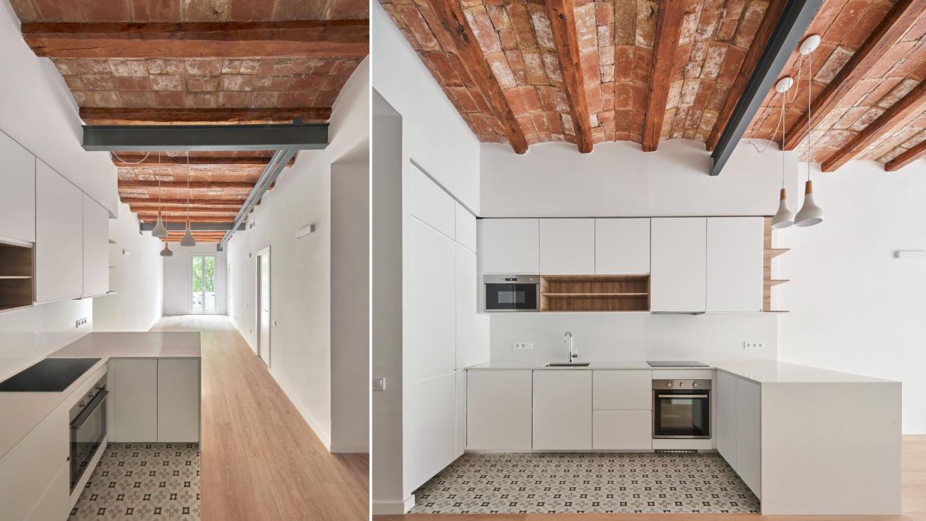
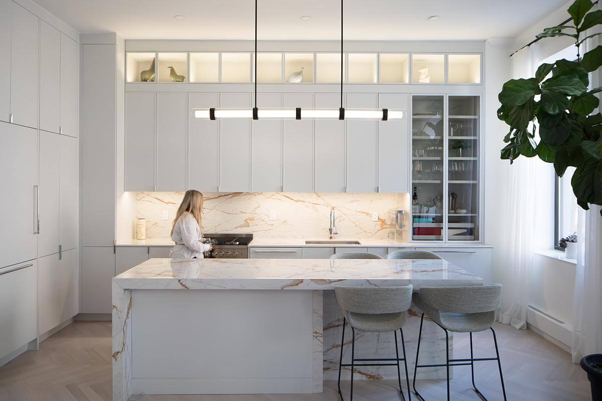
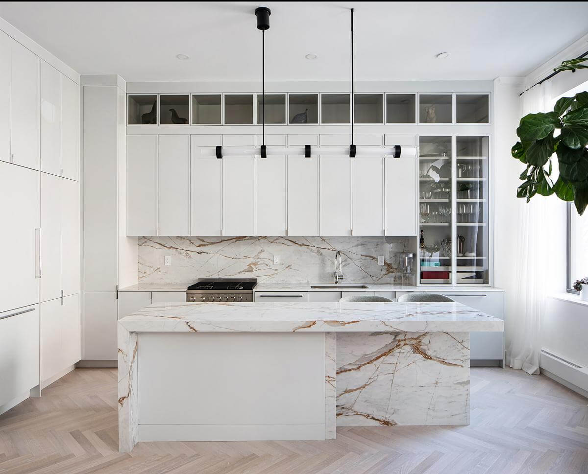
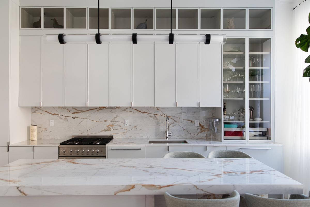
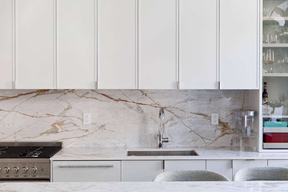
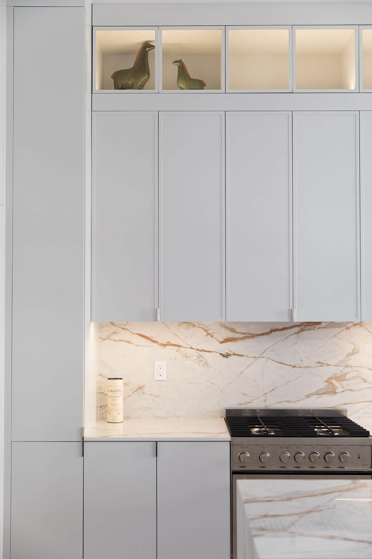
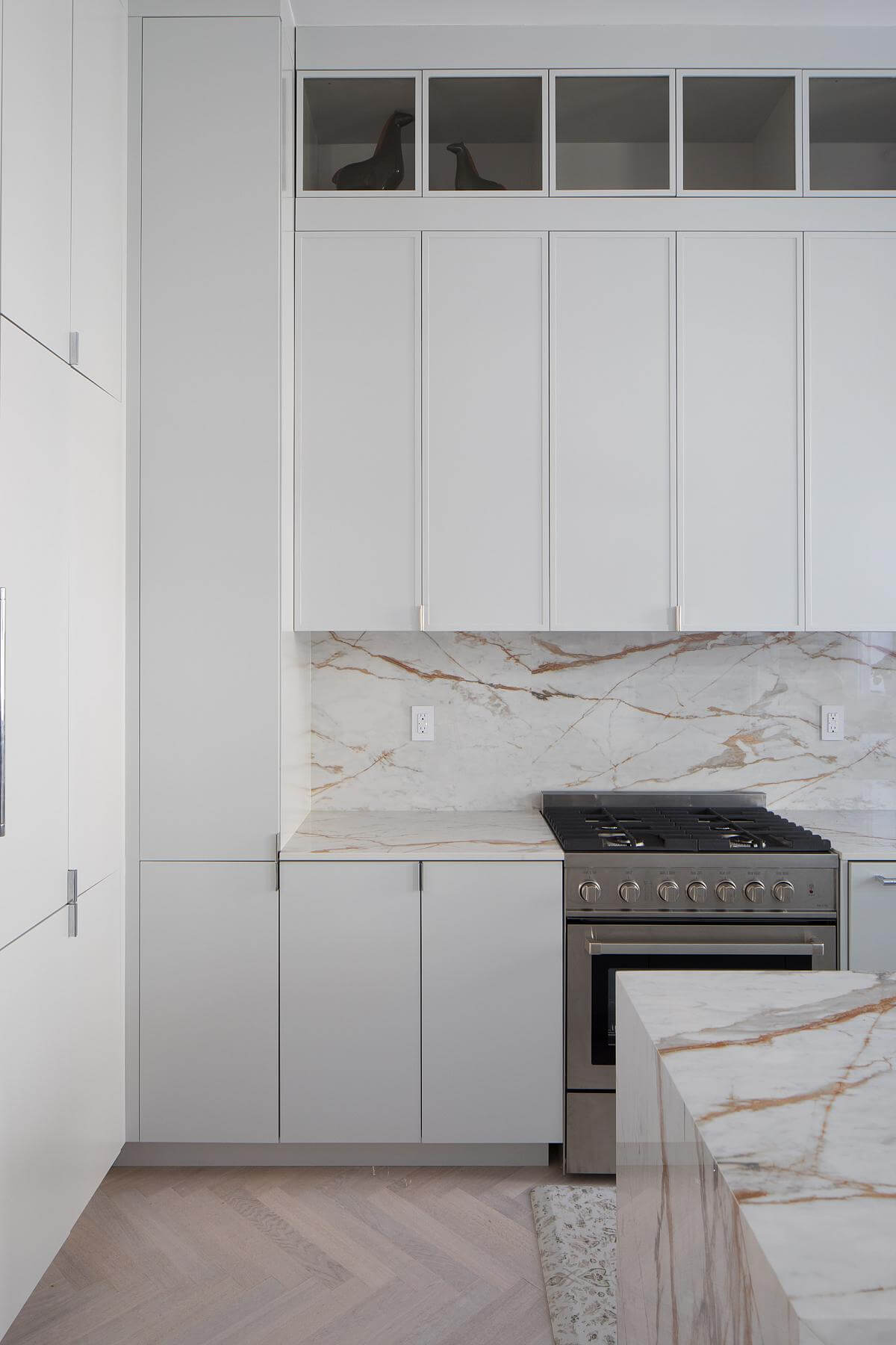
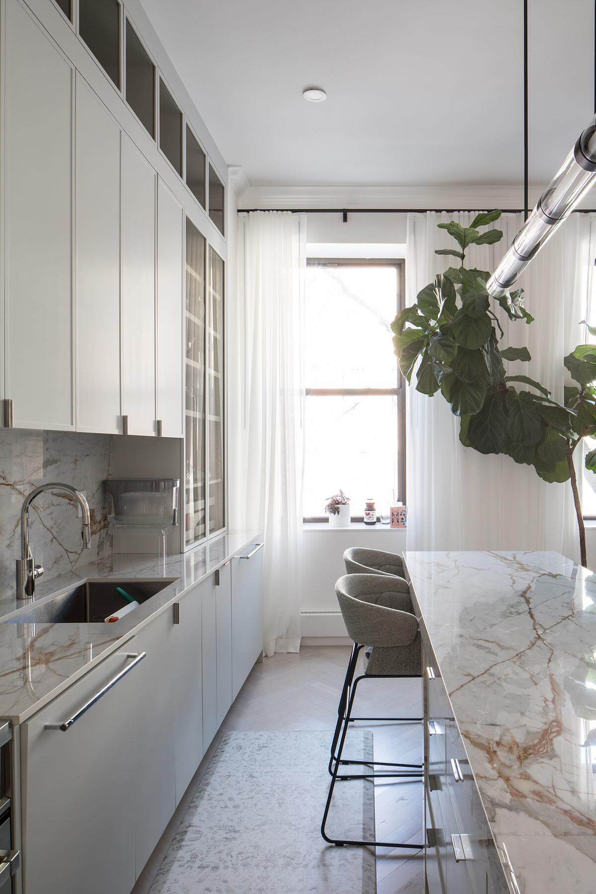
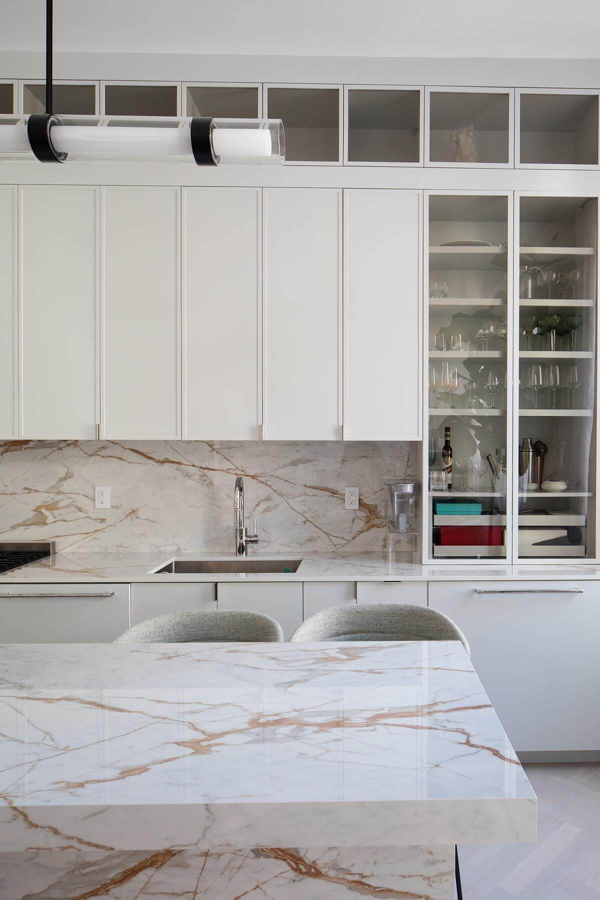
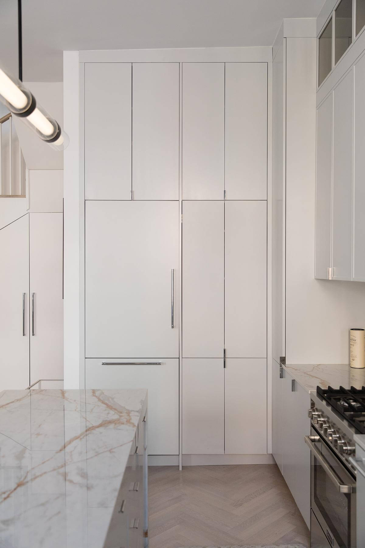
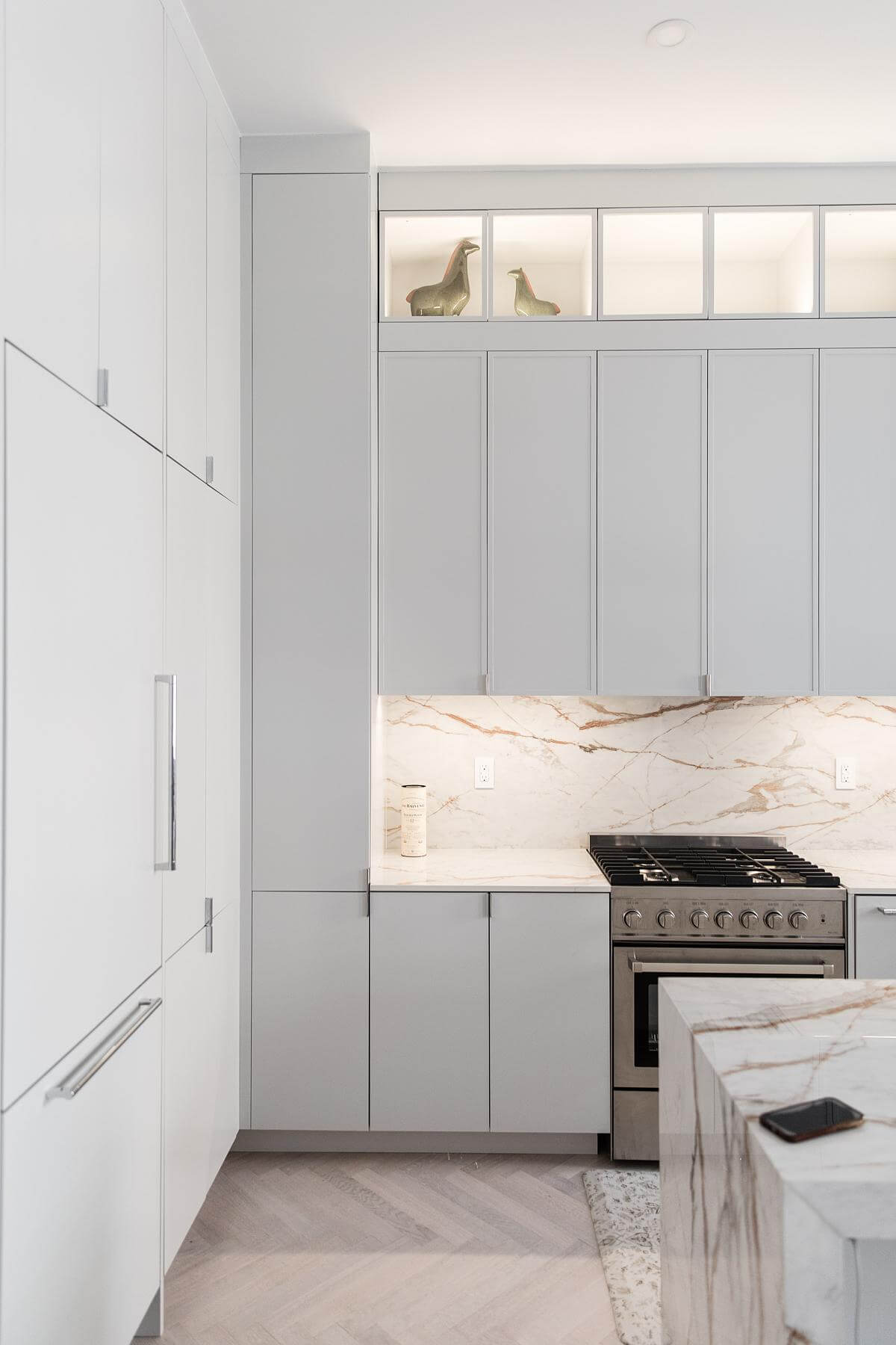
The main level of the home houses the kitchen, living room and guest bathroom. The kitchen was designed to not only serve as a culinary hub but also as a central gathering space. It features custom grey slim shaker cabinets and a seamless Dekton engineered porcelain backsplash.
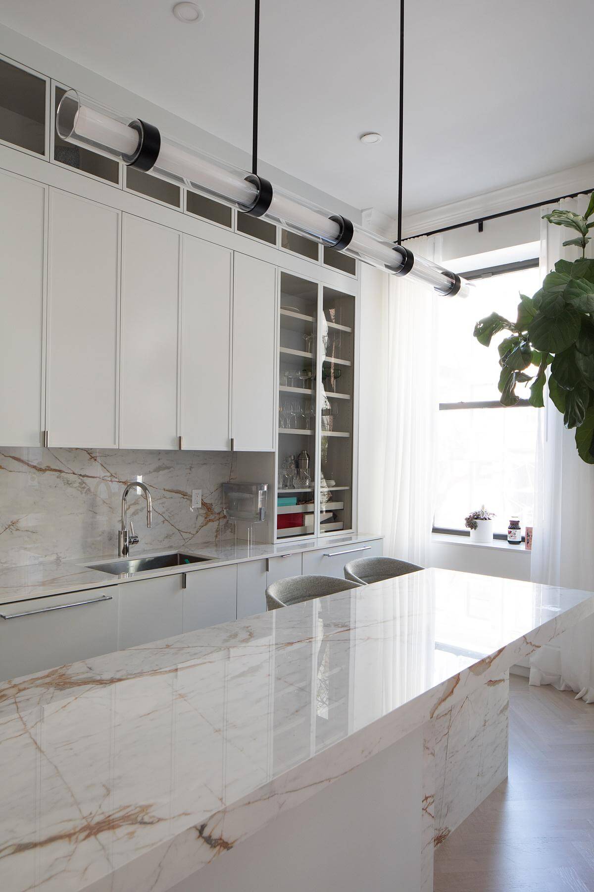
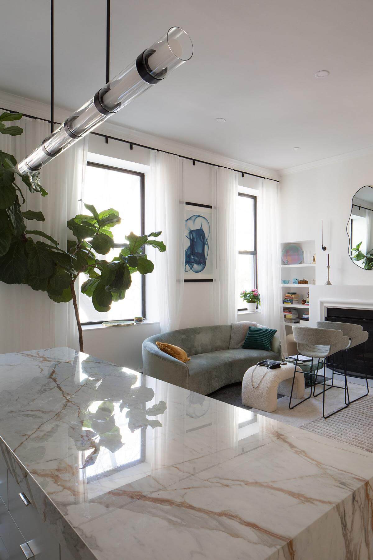
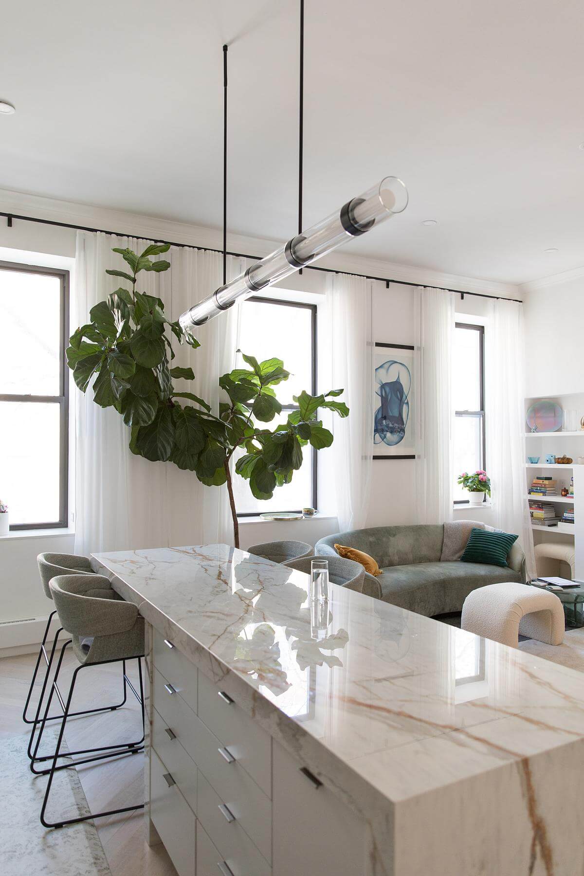
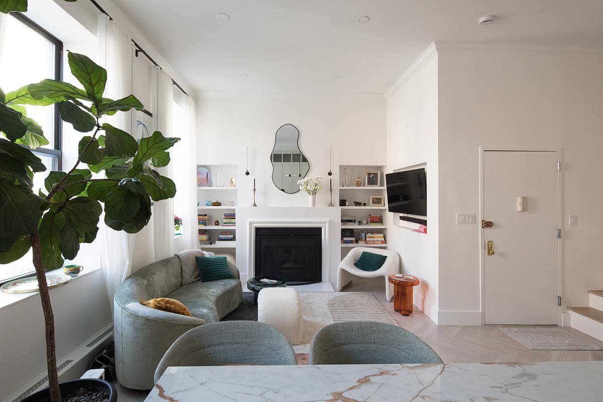
Due to the limited space in the combined living, dining, and kitchen area, we developed a design for an island that doubles as both a “dining table” and an extension of the cooking space. The entire surface of the island is placed at “bar height”, with a custom overhang allowing bar chairs on both the kitchen and living room side of the island. The island is wrapped with the same custom engineered stone to create a durable and long-lasting surface.
In the living areas, we enhanced the sense of openness by integrating the living, dining, and cooking spaces. Large, energy-efficient windows were installed to draw in natural light and offer views of the historic Chelsea streets, thus brightening the space and creating a connection with the exterior urban landscape.
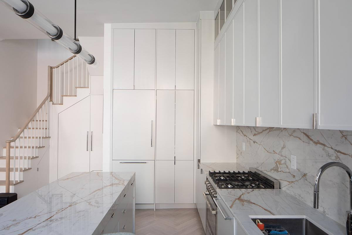
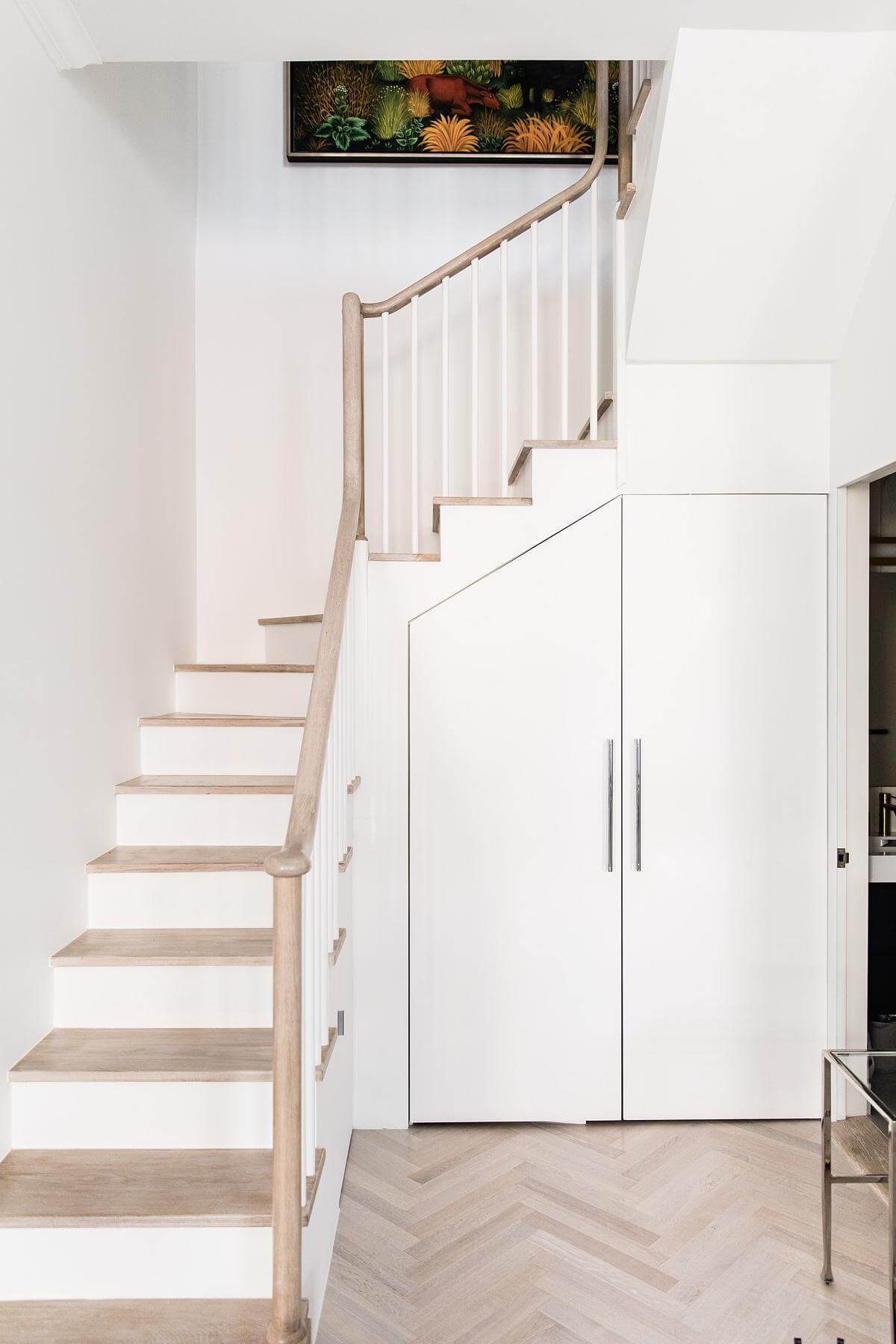
Throughout the apartment, we maximized the available space and looked for every opportunity for additional storage and custom millwork details. For example, the space under the stairs became an integrated coat closet, with a shoe storage pullout under the smallest area. All of the cabinetry and appliances were integrated to take advantage of every square inch of available space.
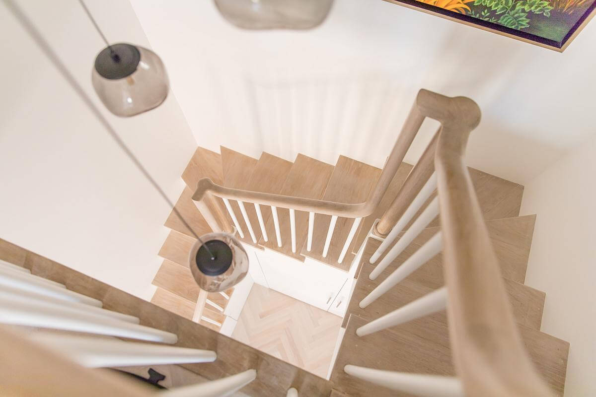
The stairs were redesigned to fit in with both the minimal aesthetics of the space and the historical detailing of the exterior. We used a simple round oval profile for the handrail and tapered “candlestick” balustrade, but ensured that the geometry of the stair featured a continuous elegant “sweep” to carry the historical language from the main floor to the upper level.
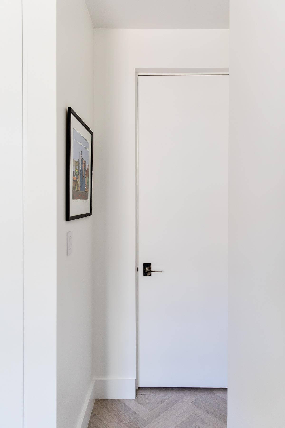
A key feature of our design strategy was the use of “trimless” doors and minimal detailing throughout the apartment. This approach not only complements the modern aesthetic but also enhances the visual flow of the space. Rather than trying to replicate the original moldings and trim, we wanted to introduce a more streamlined, contemporary aesthetic that would not resonate with the historical exterior, and not fight with it.
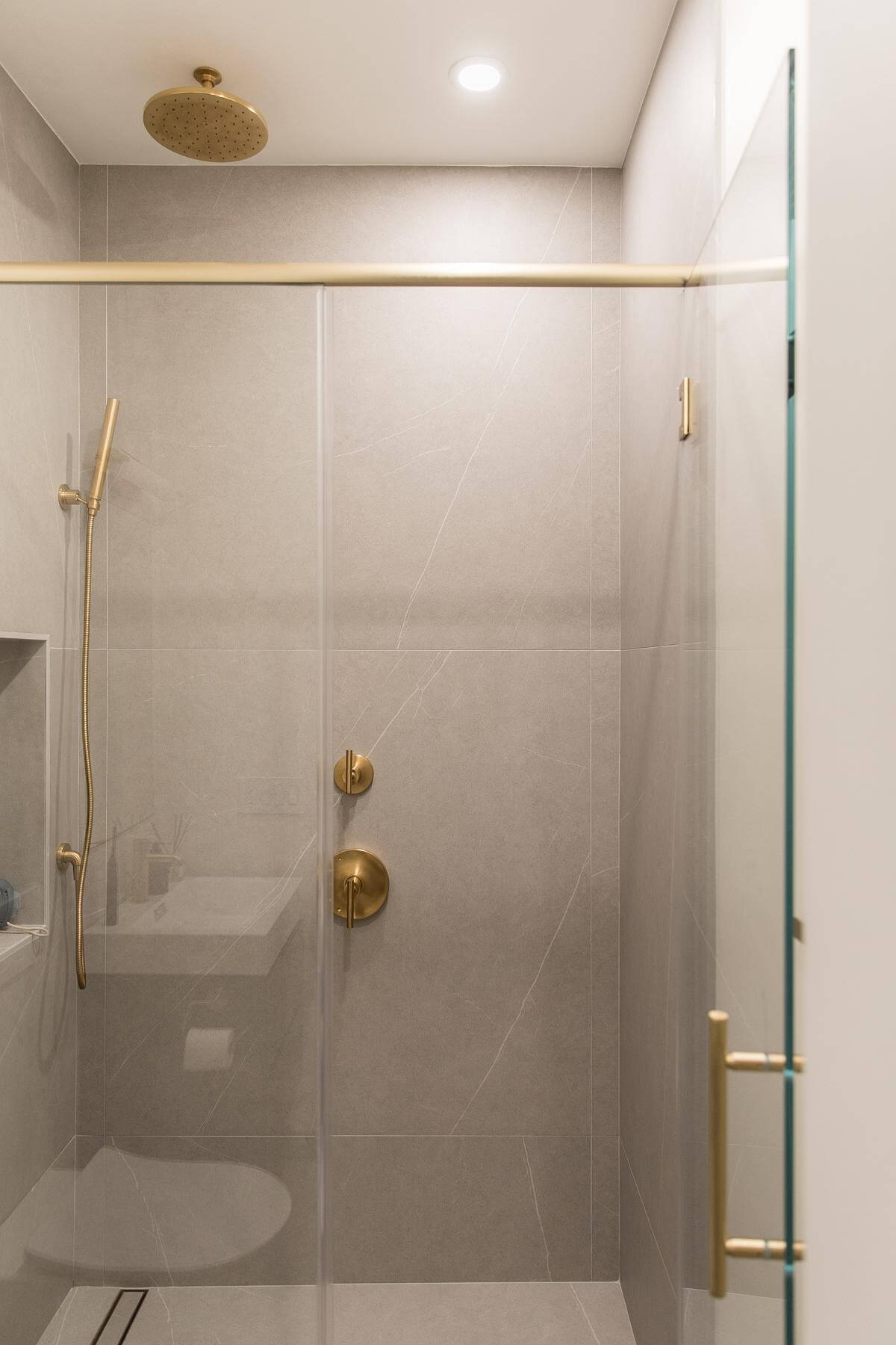
The bathrooms mirror the design aesthetics from the rest of the space, with monumental large format engineered stone tiles, minimal fixtures, and glass shower enclosures with rainfall shower heads that provide a spa-like experience. A linear drain and minimal detailing further enhance the simple, clean, aesthetics of the space.
What was the brief?
The goal was to create a cohesive, modern living space while preserving the architectural essence of the historic property
Key products used:
Dekton Engineered Stone / Porcelain Slabs, Smoked Glass cabinet doors, Ezyjamb trimless doors
What were the solutions?
Due to the limited space in the combined living, dining, and kitchen area, we developed a design for an island that doubles as both a “dining table” and an extension of the cooking space. The entire surface of the island is placed at “bar height”, with a custom overhang allowing bar chairs on both the kitchen and living room side of the island. The island is wrapped with the same custom engineered stone to create a durable and long-lasting surface.

.jpg)
