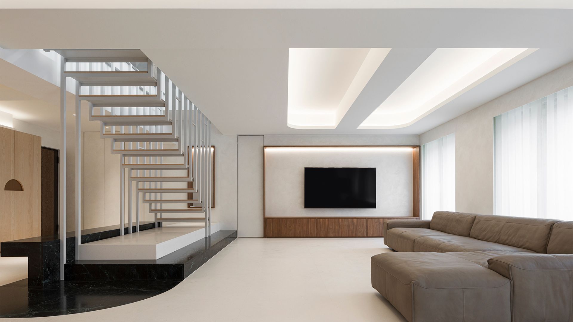
DIG Architects: The articulation of Fillet Haus lies at the intersection of an endeavour for an immersive environment, a reimagining of contemporary interior architecture in the Indian apartment genre, and a habitat tailored perfectly to a certain lifestyle. Given that the site was a nondescript, 4BHK apartment in equally nondescript surroundings, the home was retailored to be an inward-looking one. The clients, a young, well-travelled family of three, were clear about their requirements: a contemporary living space that would do away with the extraneous.
Consequently, of the four bedrooms, only two were retained. Of the remaining two, one was used to create a larger master bedroom, while the other was repurposed into a lounge cum guest room. Creating a meaningful orchestration of spaces around an existing structural framework that could not be violated, represented the challenge in this assignment. The team also had to ensure that the framework was ‘absorbed’ in the new scheme to prevent unsightly intrusions in a clean-lined, smoothly articulated expression.
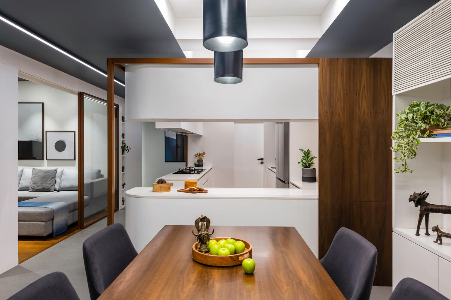
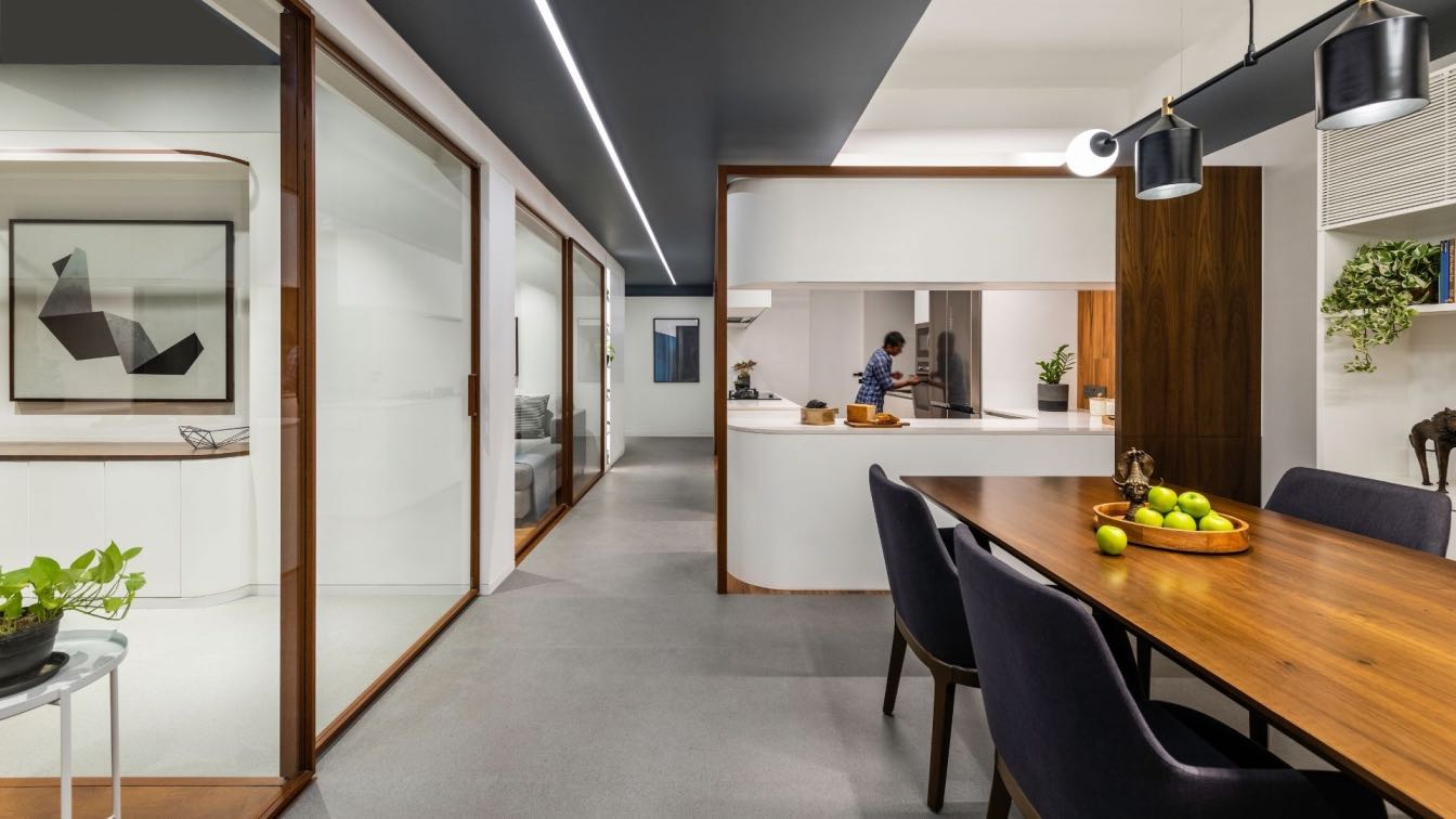
Overall, the outcome of the re-caliberation exercise is a free-flowing, interactive semi-private zone and a private zone tucked away towards the rear of the apartment. The former comprises the lounge and the living room on the left, the dining area and the kitchen on the right, with the spinal circulation passage separating the two clusters that freely converse with each other. Thus, the plan was articulated in a way to address the privacy of the hosts as well as the guests where the lounge area can be transformed into a guest room with an attached washroom with the help of sliding partitions.
The visual expression of Fillet Haus stems from three important design moves that are almost architectural in nature: liberating the spaces by taking down obstructive walls and replacing them with glass, taking a volumetric approach to space modulation and curving the junction of expanses — or filleting, in design terminology. The last strategy also helps alleviate the feeling of brutalist rigidity, leading to a more gentle, spacious feel.

The central idea of filleting is manifested in both macro and micro elements. The kitchen counter, for instance, and a passage wall that camouflages storage are the most emphatic moves. On the other hand, in the lounge, a metal rod that forms a rounded hanger, exemplifies the strategy percolating to smaller details. Objectifying functionalities also bolsters the uniqueness of the spatial experience. In the kitchen, a wooden wireframe was introduced to bind the gently rounded counters together in order to read them as one object. However, excluding the shift between flooring materials (cementitious tiles of the rest of the public zone vis a vis hardwood of the kitchen) from filleting intensifies the very ‘act’ of filleting, allowing it to be read more clearly. Similarly, in the passage and the master bedroom, a small offset created between the grey ceiling and the curved white walls, forms a visual separation, enhancing the fillets. This white skin is stretched across the apartment, smoothing the transition from one space to another. Ancillary spaces such as a storage room were placed right in the middle of the layout, but are hidden from view by being concealed within the same white skin. This placement also bestows a certain flow on the passage that now gently nudges the user towards the two bedrooms.
The material and chromatic palettes are minimal, yet emphatic: pristine white, cementitious grey and hints of warm wood make the apartment cosy and homely. Subtle interventions of Bastar Art of India were integrated into the décor which also helped promote local handicrafts. The artwork is judicious, it is eye-catching yet doesn’t take away the focus from the shell. Ultimately the apartment is a thought of as a sculptural entity that reveals persistent fillets from different perspectives. The project thus attempts to redefine the idea of the modern contemporary apartment in the Indian context.


