Main Concept
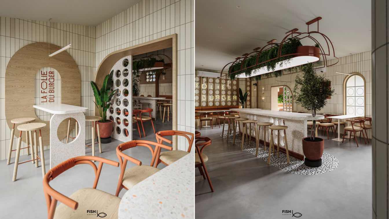
Fish I Visuals: Space with a clear and specific identity that establishes the mental image among custome. Prioritizes efficient use of space, maximizing guest comfort. A varied seating layout featuring booths, communal tables, and individual chairs caters to different group sizes. Architectural solutions have been developed to be modified on site in order to facilitate the movement of guests. We wanted the place to be quiet, warm, cozy, and welcoming to all guests, and suitable for all ages at different times, and we wanted the first impression to be distinctive.
The restaurant had a minimal design approach that was consistent with the general idea of the restaurant owners and aligned with the way we thought in the studio, so we worked on that carefully and not to exaggerate anything
Materials
The finishing materials were chosen with great care to clearly reflect the identity of the restaurant in terms of colors, and to suit the operation and maintenance process. Materials with high durability and easy cleaning and maintenance were selected. Whether wall materials, furniture and flooring. Architectural solutions have been developed to be modified on site in order to facilitate the movement of guests.
We wanted the place to be quiet, warm, and welcoming to all guests, and suitable for all ages at different times, and we wanted the first impression to be distinctive.


