Surrounded by 500 bottles of wine - Red Tongue Pangyo - by 134. Red Tongue’s sixth wine boutique condenses function and information into a minimal space, to help streamline the customer’s wine selection process.
When first commissioned the design of the 6th Red Tongue Wine Boutique, I immediately recalled the view of the vast vineyards and shimmering lake of a Swiss winery.
Amidst the systematic rows of grapevines lay hidden a singular wine cellar. Countless bottles of endless shades of wine are brought to our shelves after crossing various elements, from the land and climate of where a grapevine is raised, to the vintner and producers who help elevate the qualities of each and every grape through their own techniques for cultivation, production, and storage.
While I enjoy a glass or two every so often, I’m no connoisseur. Whenever I visited a wine shop, the endless rows of bottles simply appeared as shelves to my inexperienced eyes. Instead of registering the detailed information listed on the various labels, the bottles became no more than silhouettes and colors, the text no more than minuscule pixels to my eyes. Thus, it was crucial that all of the focus was on the customer and the wine- there could be no leeway for unnecessary information that took attention away from the product. I wanted the boutique to rouse curiosity, but not conceal. By offering only a glimpse of the wine bottles, I wanted to intrigue the common passerby. The approach to materials was simple- everything we needed was in the wine bottle itself.
The burgundy hue of wine, cork from the stopper, glass from the bottle, and paper from the label. The entire space was cast in tones of beige and wine, and set apart from the exterior surroundings by a clean glass wall.
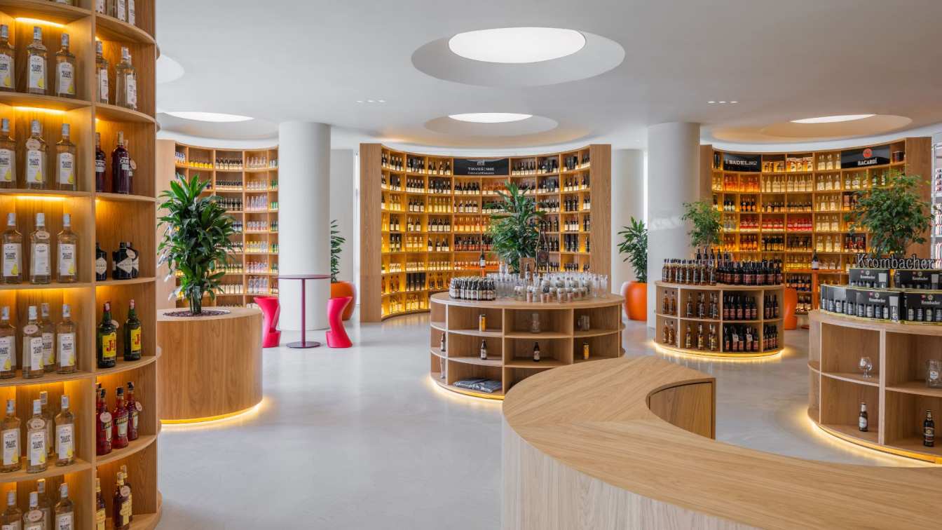
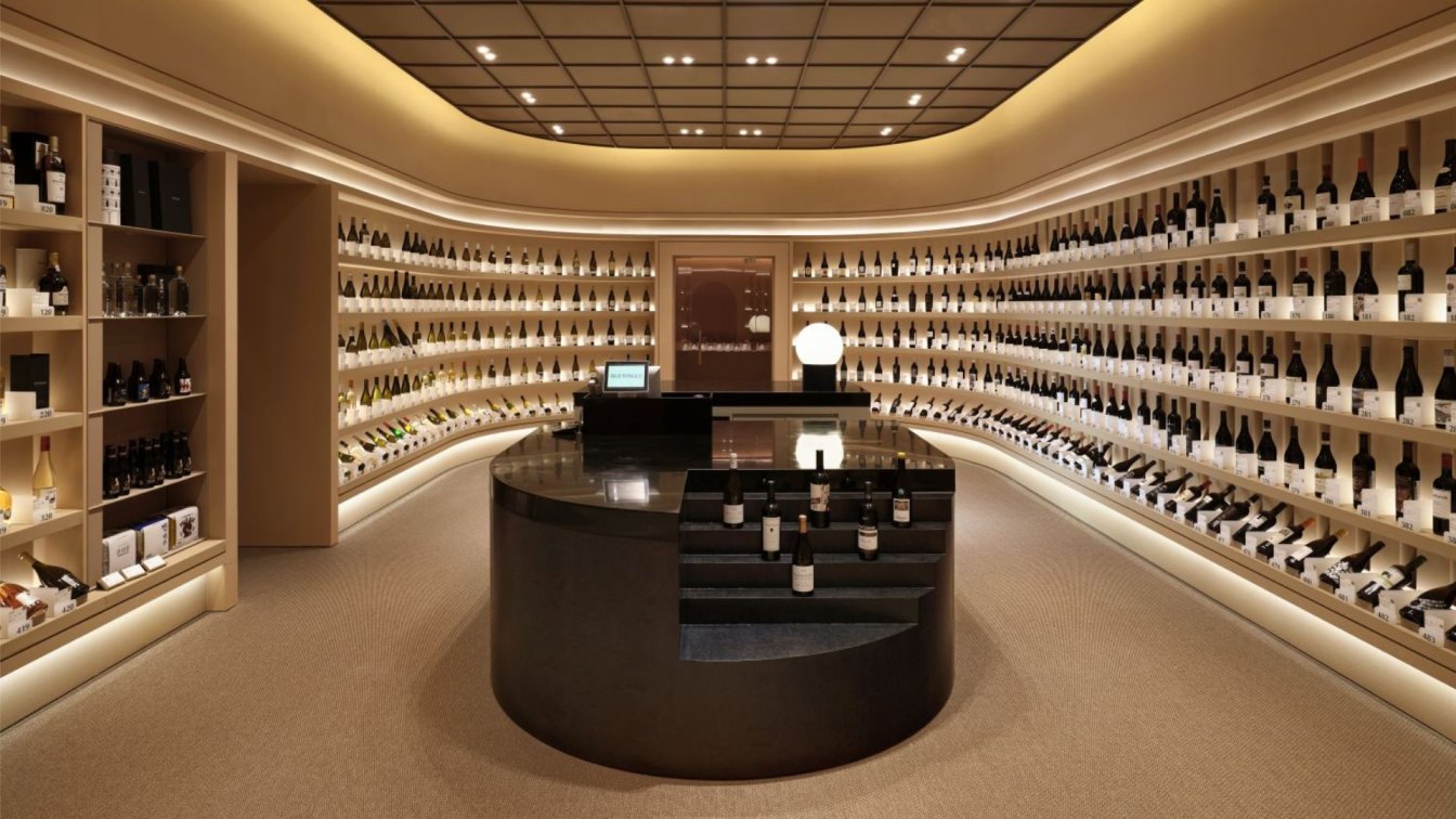
The space is split between a store and an employee space. Five hundred wines are displayed in the main boutique, and in the center lies a table where promotions, check out, and tastings all take place. The employee space consists of inventory storage, shelves to store 2500 bottles, a space for packing orders, a space to wash the tasting glasses, and a locker room.
The rounded shelves upon which bottles of wine are displayed create the framework of the exterior while also hosting 500 curated bottles. Each wine has its own compartment on the shelf, which it has “rented”, complete with a product tag and number for easy identification. Between each bottle of wine is an acrylic block, serving as both an ornament and an indicator of special discounts. Every compartment has a width and depth of 200 millimeters, compared to most wine boutiques which display bottles in spaces of 100 by 100 millimeters. At Red Tongue, there are five rows of 100 bottles, and every season a new selection of 100 different wines are featured at a special price for members. Due to the nature of the Pangyo Kakao location, it was expected that there will be more regular customers than new ones, thus the wines are numbered to allow for easy identification and re-ordering. In the store, the customers can browse the racks with ease, simply scanning the QR codes for additional information, and can order at the center table by writing down the desired wines’ number and quantity, without having to lug around heavy bottles throughout their visit.
By coordinating the shelves, ceiling, and floor with similar beige tones, the wine bottles and their labels are brought to the center of attention in the store. All that matters is the customer and the wine.