A new lifestyle destination for urban residents and pets
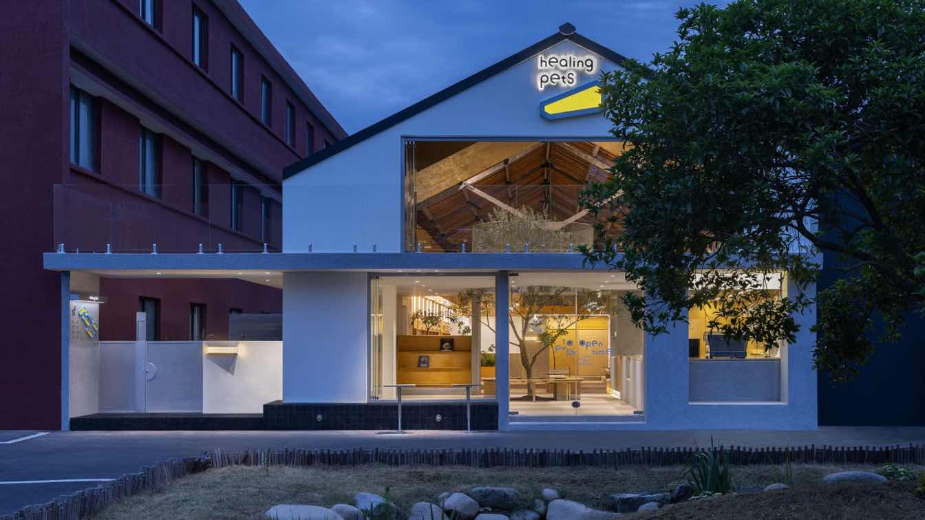
The project is situated within West Lane Cultural and Creative Park—formerly a toy factory nestled in an old industrial neighborhood in Xiaoshan District, Hangzhou. Through conceiving a comprehensive brand design solution for the client healing pets, Informal Design aims to create a destination for pet lovers, fostering a warm human-pet community that counteracts the alienation often felt in urban life. The goal is to cultivate a new lifestyle for urban residents and their pets, promoting mutual growth among individuals, dogs, and the bond between humans and their pets.
Part 01. The new and the old interweave for a fluid, open space
The overall space design aligns with the building's existing conditions. Adhering to sustainable design principles, the architectural transformation centers around the relationship between the new and the old. Valuable elements of the original construction are preserved, with the main roof structure exposed and integrated with new additions, creating a interplay between the old and new. This blend of old and new volumes fosters a fluid, open spatial relationship.
Part 02. Natural texture, natural approach
To create a natural texture in the building, materials such as washed stone, gravel concrete, granite cubes, textured paint and marine plywood are juxtaposed to infuse the building with life and a natural vibe.
Rough washed stone is used for the indoor bar counter, seating, and flooring, creating a simple, natural aesthetic. The gravel concrete flooring and gray washed walls complement each other, enhancing the outdoor feel of the space. The rough textures provide a non-slip surface for pets, while also offering the durability and stain resistance akin to outdoor natural materials. The retail display walls and movable furniture system are constructed using a collage of marine plywood panels, creating a warm and inviting atmosphere that complements the wooden ceiling. The clever selection of these materials, along with their natural weathering over time, will further enhance the building's texture.

Part 03. A complete brand VI system
The design team incorporated a pet-friendly ramp as a visual symbol, integrating it with the architectural space's functionality to create a memorable brand identity. The graphic elements, designed with a three-dimension feel and a sense of volume, further articulate the space's iconic and fun identity. Various super visual symbols, crafted by the graphic design, seamlessly echo the concept of a shared space between people and pets. The three-dimensional visual design enriches the formal language in this community space. Blending functionality and symbolism, these symbols contribute to a more diverse and multi-dimensional brand image. The brand's visual identity is further strengthened by using pet-sensitive colors, such as blue and yellow, which convey a lighthearted and fashionable vibe through the interplay of lines and planes.
Combining brand symbols with space functionality, the design team crafted a series of branding materials, signage, graphics, and installations. A pet map at the entrance helps visitors better understand the spatial functions, while the door handle and business hours information are cleverly arranged to create an engaging three-dimensional graphic. This comprehensive brand design enhances the space with a stronger and more cohesive brand identity.
Part 04. Orderly and well-organized layout
By cleverly utilizing the building's height, the design team creates a two-story space that ensures brightness and transparency while diversifying the spatial functions. The overall layout is composed of three sections: the cafe at the entrance, the activity area in the middle, and the functional area at the back. This maintains the relative independence of each functional space, and also ensures an orderly circulation.
The cafe at the entrance is conceived as a landscaped courtyard, creating a continuous corridor that breaks the boundary between interior and exterior. A semi-enclosed landscape entrance is formed around a big tree, with the entire area wrapped in washed stones. These natural textures continually awaken the vitality in pets, bringing fresh energy into the space. The middle activity area retains the original spatial structure, with a ramp connecting the pet activity areas on the first and second floors, forming a natural hillside that seamlessly integrates with the entrance corridor. The park-style bench seating arrangement maximizes space for pet activities. Natural light filters through the building interior from morning to dusk, creating a dynamic play of light and shadow throughout the day.
The functional area at the back consists of several stacked boxes. The first level accommodates the pet hotel and grooming rooms, with capacitive glass partitions that can be flexibly adjusted to display the grooming room's work status as needed. The second level features office spaces and a pet photography studio, with the offices offering a panoramic view of the entire space for improved communication and management.
Part 05. Pet-friendly, flexible design
The furniture details within the space are thoughtfully crafted to provide a sense of security for pets visiting for the first time. Space is intentionally left under the seating areas to give small animals a safe spot to settle in and ease their anxiety in an unfamiliar environment. The suspended design beneath the movable central bench minimizes obstacles during play, allowing pets the freedom to run or rest.
Fixed small round tables, designed with the function of anchoring dog leashes, free pet owners' hands, enabling them to chat and enjoy food at ease. The wall features pegboards, which serve both as retail displays and decorative elements. The space's flexibility is further enhanced by fully movable furniture, allowing for easy reconfiguration to suit different pet-themed needs.


