Daniel Canda: Carrying out a commission for a Social Institution reconsiders the role of the architect. The client represents a group of people who grant him a power to ensure services for the community. There is no profit, there is no profitability. Service only. There is an omnipresent figure occupying a place in every talk, in every exchange of ideas. Architect and client work interpreting that imaginary projection of the common good and a vocation for solution flows that overcomes individual desires.
Flexibility, flexibility, flexibility
When the project began, there was only one certainty: that when the building was finished, the program would already have changed. The institution was in the process of growing, and that was a fact.
During development, the Meeting Room mutated into a Multipurpose Room and then into an Auditorium, the Mutual changed places three times; and about to finish the building, it was decided to incorporate the offices that functioned in an annex building.
The Structural Spatial Strategy
But there was another determining factor: not only should the plant admit the interchangeability of functions, but these functions were of very dissimilar dimensions. In other words, the open plan was not enough, it had to be an open plan without columns. On a plot of land between party walls and... 12 meters. Wide. It sounded almost impossible.
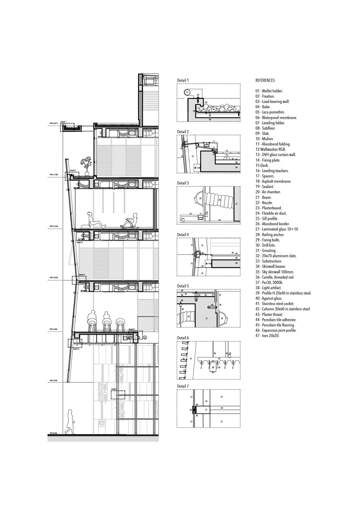
Intensive work was done with the structural scheme until reaching a system of dividing partitions in H40 that absorbed the loads. On these, large beams of 75 cms. high, drilled for the passage of the facilities. The scheme worked in a stable way and only needed a central nucleus in the front building to make the whole rigid. Both blocks were joined by "bridges" that absorbed differential deformations and allowed to organize a constructive stageability due to the dimensions of the lot. The submural septum is continuously driven by traction and works at almost 100% of the load.

Deep (but Narrow) Plan
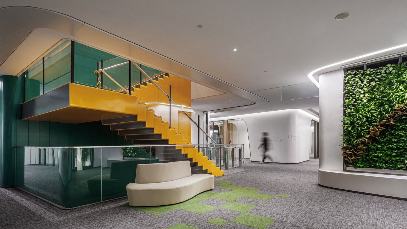
The 50 meters deep in the lot made it difficult to provide hierarchical spaces down to the last meter of the floor. The idea was to deconstruct the limit of the municipal line and make the narrow streets of the historic center flow towards the interior of the building. We reread Community and Privacy1 and developed a strategy for sequencing spaces from the public to the private. The street. First the retreat with double height. A covered path. Then the triple interior height, inside but outside. The hall, the vestibule, the service area, the patios and so on until culminating in the administrative work area. And there, in the darkest part of the floor... the glazed staircase that reconnects the three levels and allows you to start over. Like a fluid circuit that runs through the building.
The Horizontal Tower
This circulatory spine was something we called the horizontal tower, that is, a circulation axis traversed by a succession of vertical spaces whose sole purpose is to provide light. As if we had knocked down the classical tower by reversing the axes. As an alternative to high-rise building.
Once the façade has been removed, the sequence continues with a triple-height space that takes the rebound of light from the street and disperses it over the first three levels. Then the inclined patios alternate to achieve the greatest solar incidence and finally the lantern cube that spills light through the three subsequent levels. The incorporation of natural light in such deep sectors allowed the incorporation of vertical gardens in almost all the spaces of the building.

And then came the Pandemic...
Three months before the inauguration the world stopped for six months. And when it started again, nothing was the same anymore. Paradoxically, the building was prepared. The Clinics quickly became Vaccinatories. The Convention sector in a Laboratory and the Auditorium in a Gymnasium. The vertical plenums were filled with ventilation ducts and the ceilings were filled with data cables.
The project strategy of the building had been put to the test with an unexpected situation. And he had responded efficiently. That is what makes it truly sustainable.
The Facade Device
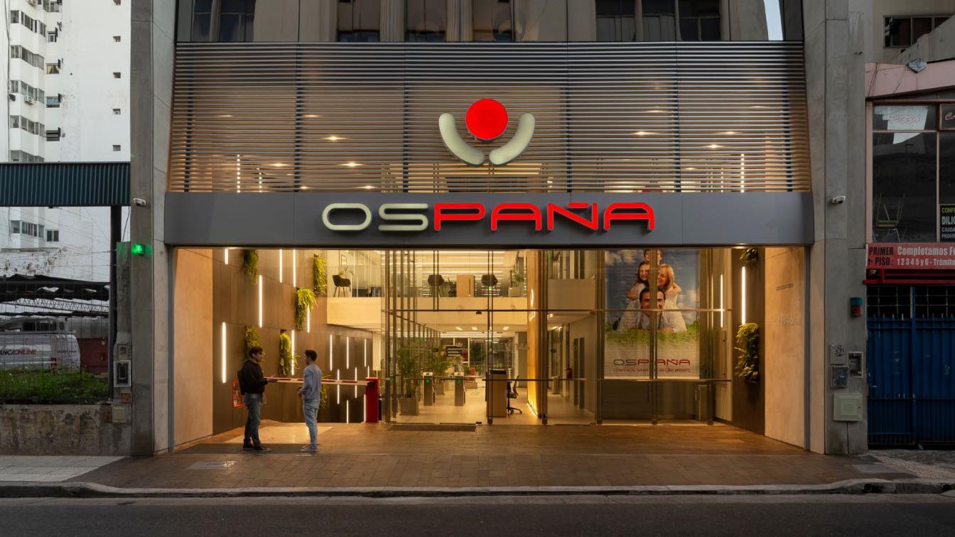
The front of the building synthesized all the concerns of the project. On the one hand, it had to solve the image of the Institution in a friendly way with the environment, characterized by mixed uses. Secondly, it had to respond to sunlight, since although most of the work spaces were oriented to the South, the North façade needed protection. And finally, it had to be integrated with a historic building such as the Registry of Property located just opposite.
After many alternatives, it was then decided to work with a "broken" façade plane. In this way, the impact of the glazed front on the scale of the street was attenuated, and at the same time a subdivision was shown that was a reflection of the program: the first three levels for the Obra Social (Health Insurance) and the last three for other activities.
With the same geometry, the inclination of the façade acted as an eave for each floor immediately below, thus protecting an important strip of the floor at the most unfavorable hour. The lower level was transformed into a sunshade permeable to the light rays that contained the front retreat.
Finally, this tilting operation also allowed the reflection of the historic building to be returned to the pedestrian level, acting almost as a gesture of reverence, which is also reinforced by the tripartite partitioning of the façade and the location of the opening panels.

Low Profile and Profile Low
We believe that today the building works as a discreet intervention within the Montserrat neighborhood, seeking to articulate the streets of the historic center with the proximity of a deep scar such as 9 de Julio avenue. Even so, the impact of incorporating more than 3,000 m2 of uses is relatively low. And the inclusion of nearby activities attenuates it even more. Apart from the Obra Social (Health Insurance) there is a Mutual Association, a Rehabilitation Center for the Disabled, a Laboratory and a Vaccination Center in the building. In addition, the second level has an Auditorium where exhibitions, concerts and free artistic events open to the Community are held.
A separate effort represented the creation of the 500 m2 dividing wall, which plays with the colors and shapes of the building; and gives the city a pause against the vertigo of the “widest avenue in the world”.
We call it Scar Tissue.
1 Community And Privacy. Towards a New Humanist Architecture. Serge Chermayeff, Christopher Alexander. Ed. New Vision, 1963.




Daniel Canda, architect Graduated in Architecture (1994) and in Graphic Design (1995) from the Faculty of Architecture, Design and Urbanism of the University of Buenos Aires.He has worked in the field of university teaching since 1990.He is currently Adjunct Professor by Competitionat Architecture Area at FADU (University of Buenos Aires)He is also a Researcher at the Center for Studies for the Conservation of Urban and Rural Heritage at FADU (UBA) since 1998.Member of the International Committee for Documentation and Conservation of Buildings, Sites and Neighborhoods of the Modern Movement (DOCOMOMO) since 2006.Since 1996 partner of Canda & Asociados, specialized in the subject of urban collective housing, building to date several buildings in the metropolitan area of the City of Buenos Aires.In the field of preservation, those referring to works for the restoration and enhancement of the Basilica Nuestra Señora de Luján, among others, stand out as project team work.He has received various awards during his professional career and his works have been published by different local and foreign media.He has also participated in numerous national and international Congresses and Exhibitions, and has been a Jury in different Architecture competitions.

