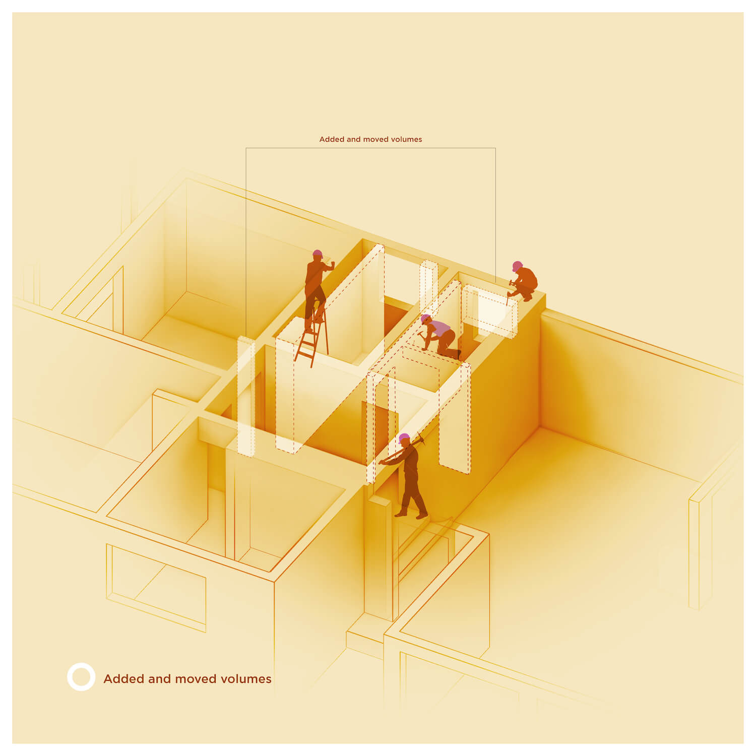
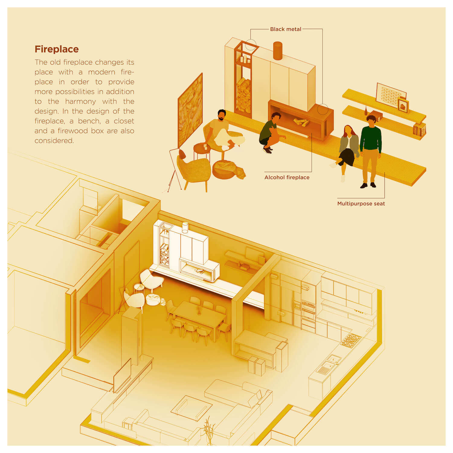
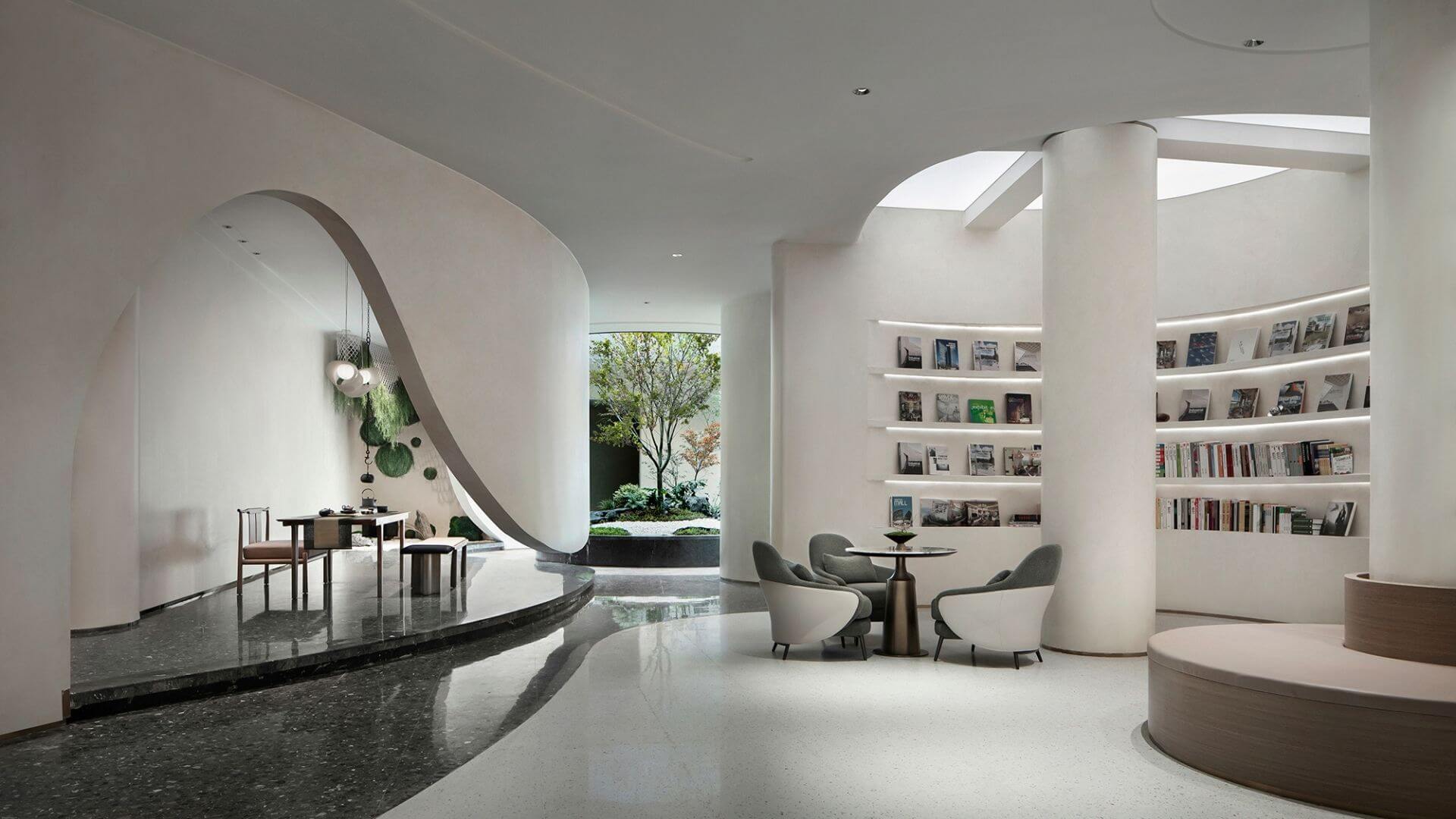
Neda Mirani: The renovation of this project was based on factors such as enlarging the space through visual continuity between related zones, creating functional filters, legibility and coordination of the project components together, more light in the public zone, and injecting a new spirit into the house. In order to achieve these demands, the plan underwent changes in the location, dimensions, and also type of access to the spaces, in addition to the limitations that existed due to the oldness of the property.
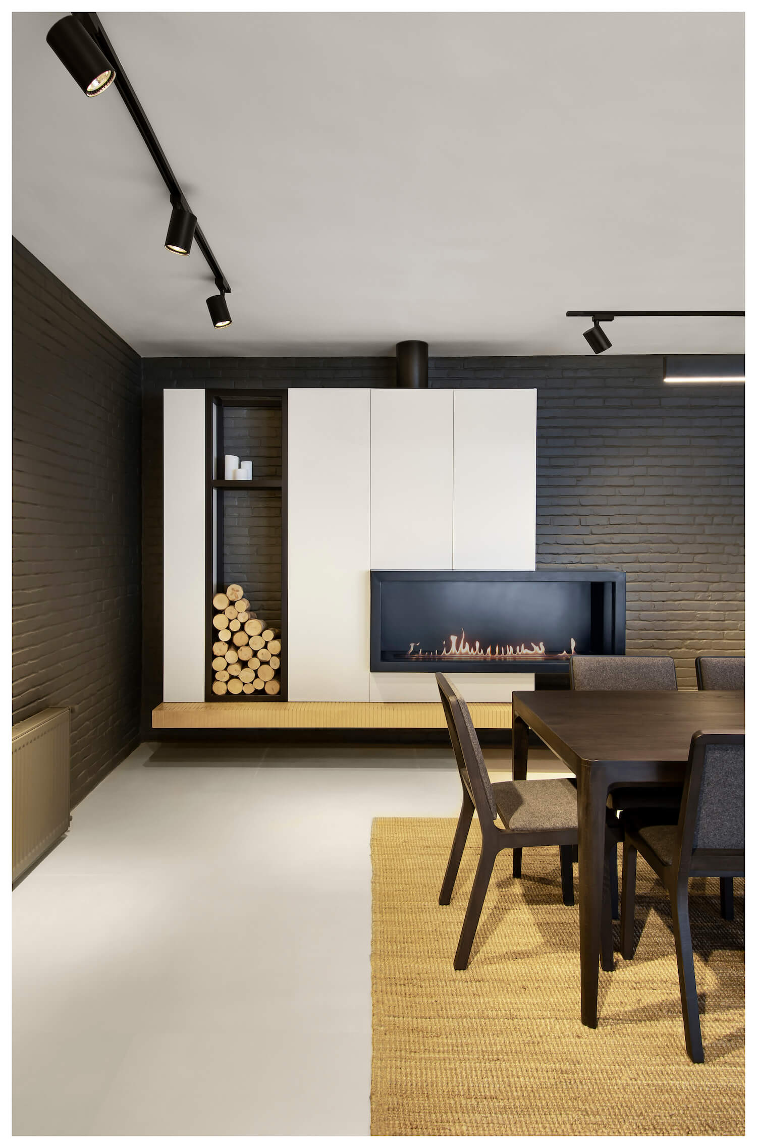
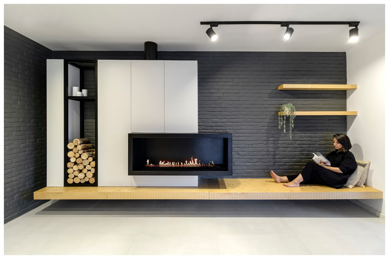
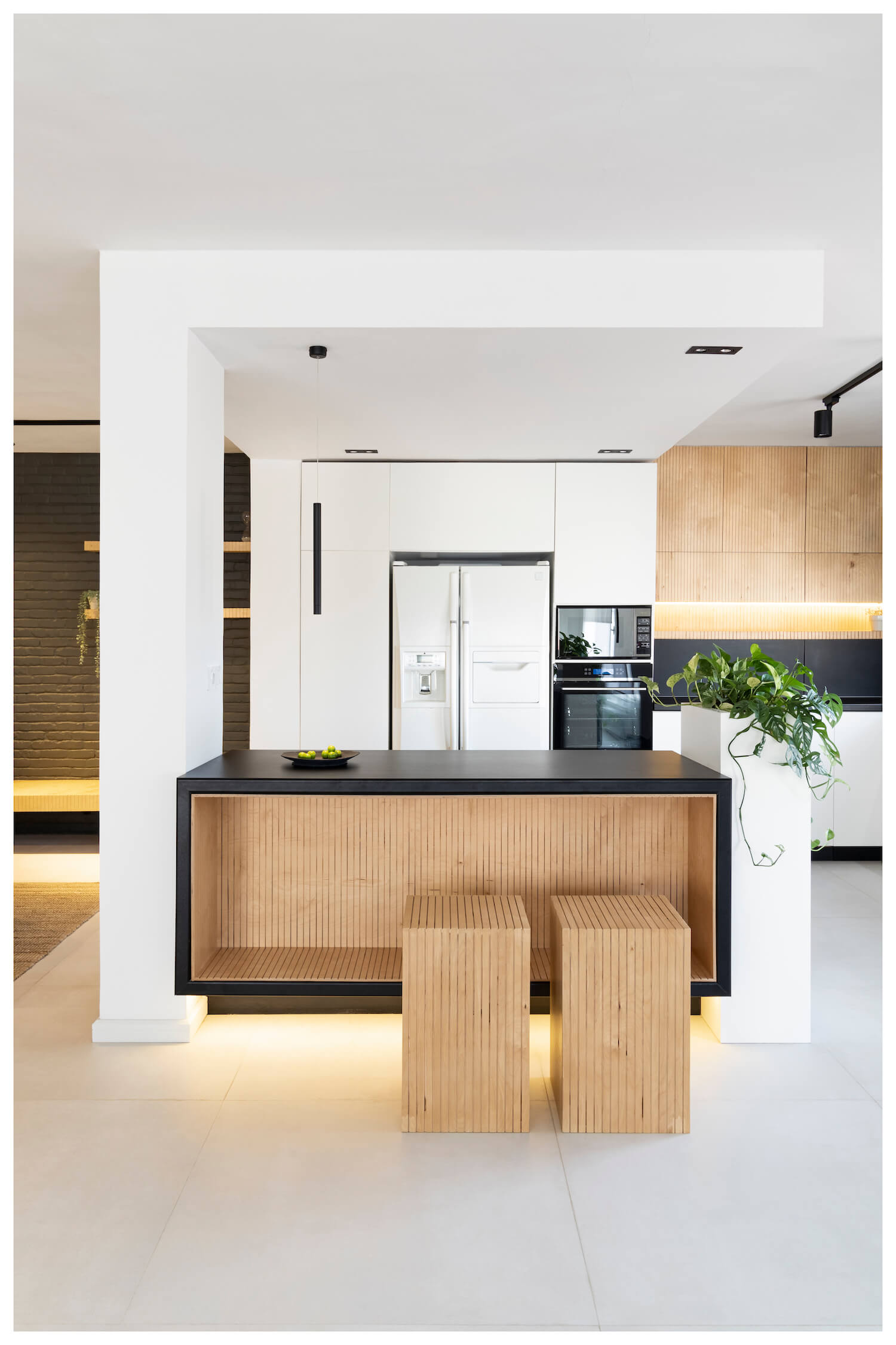
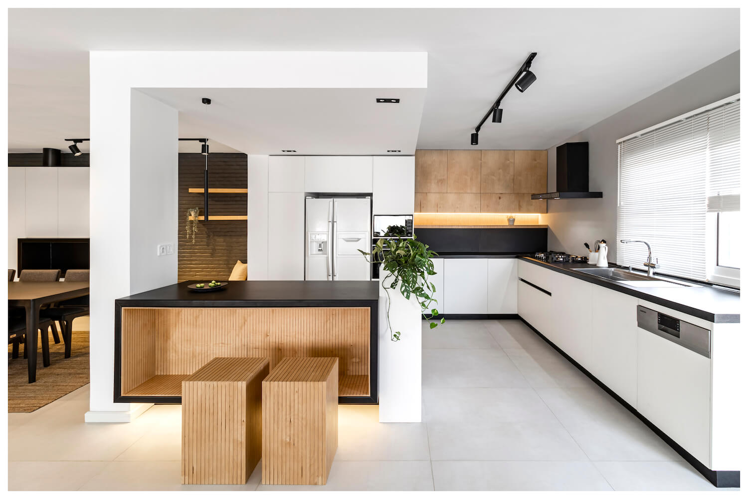
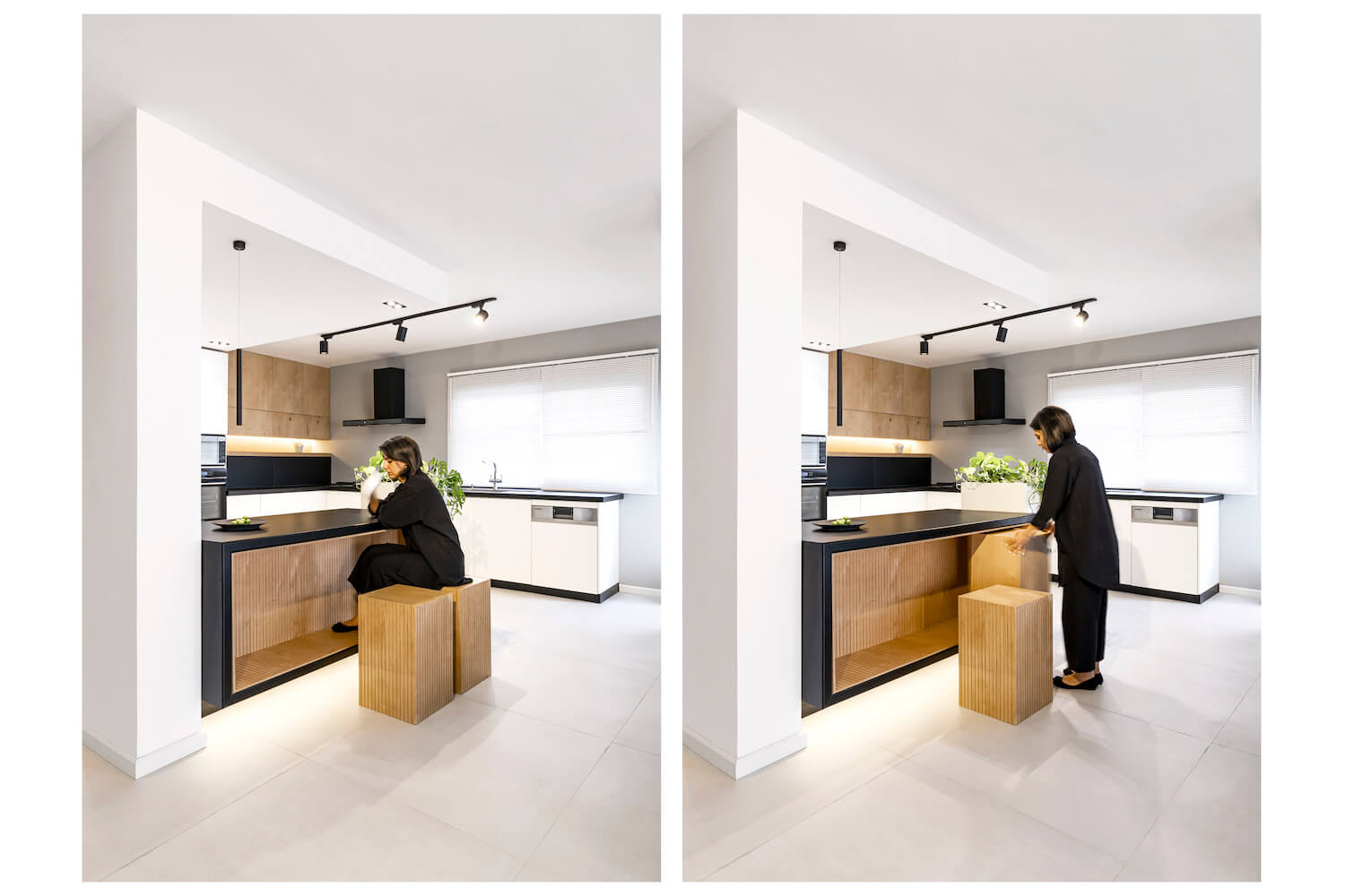
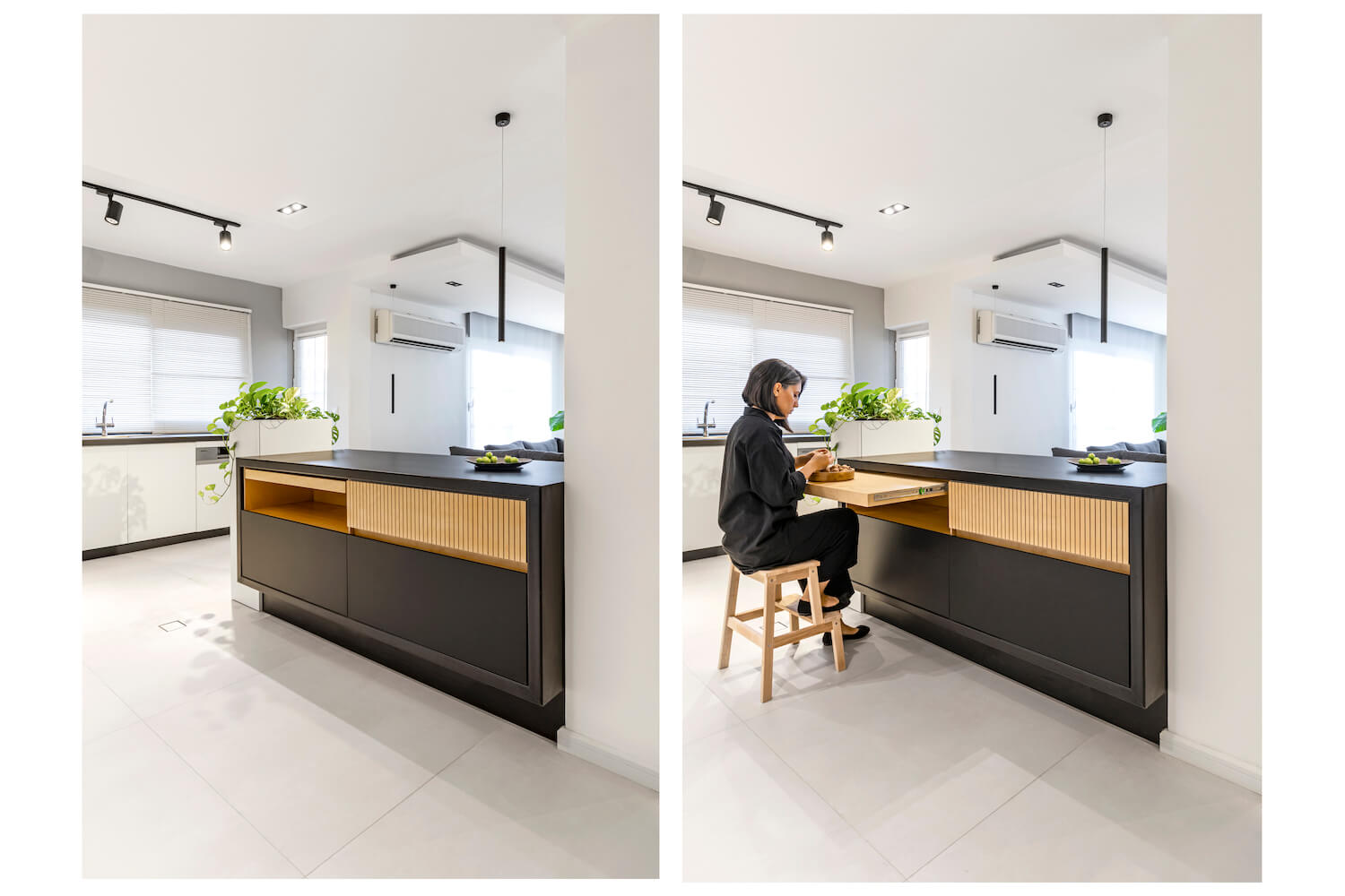
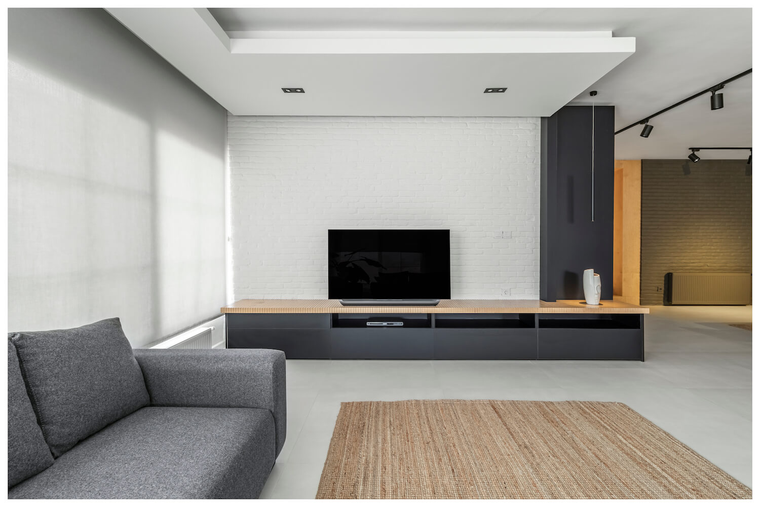
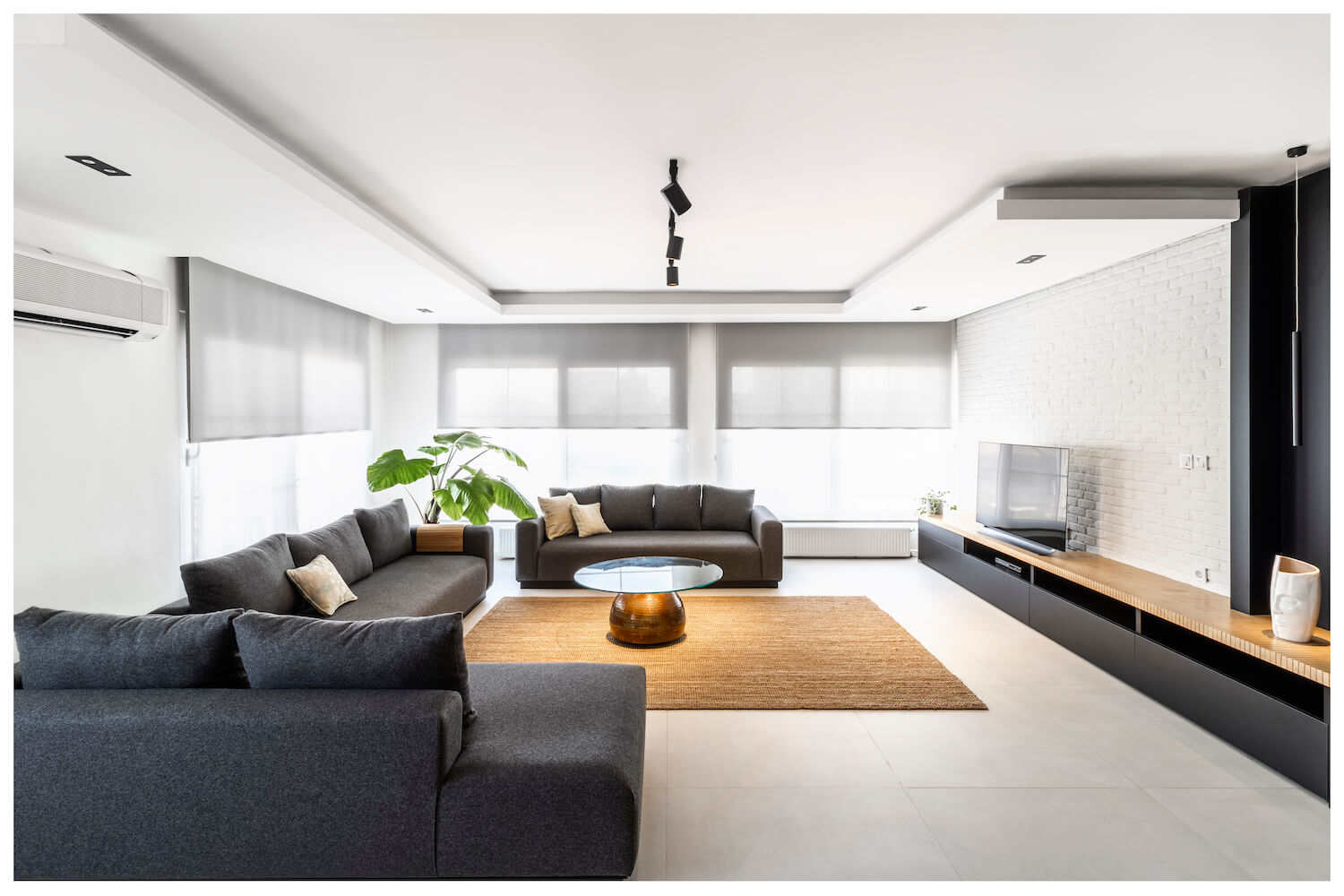
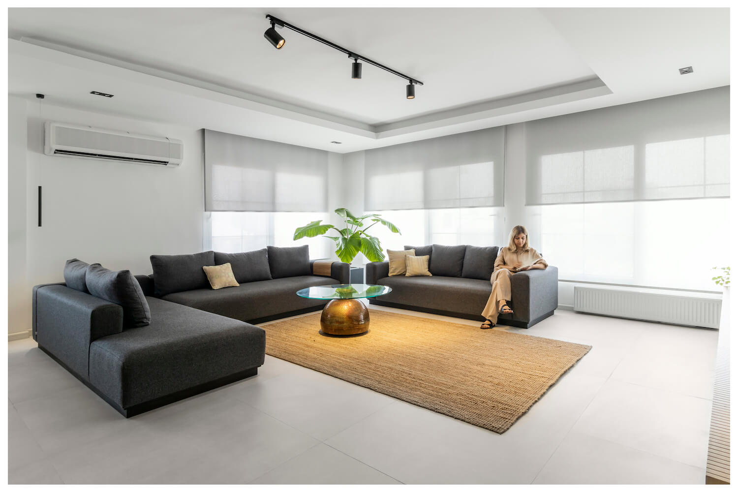
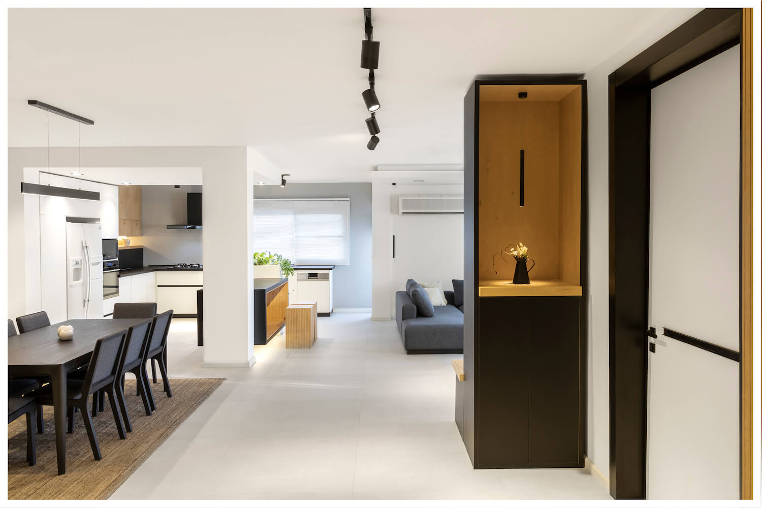
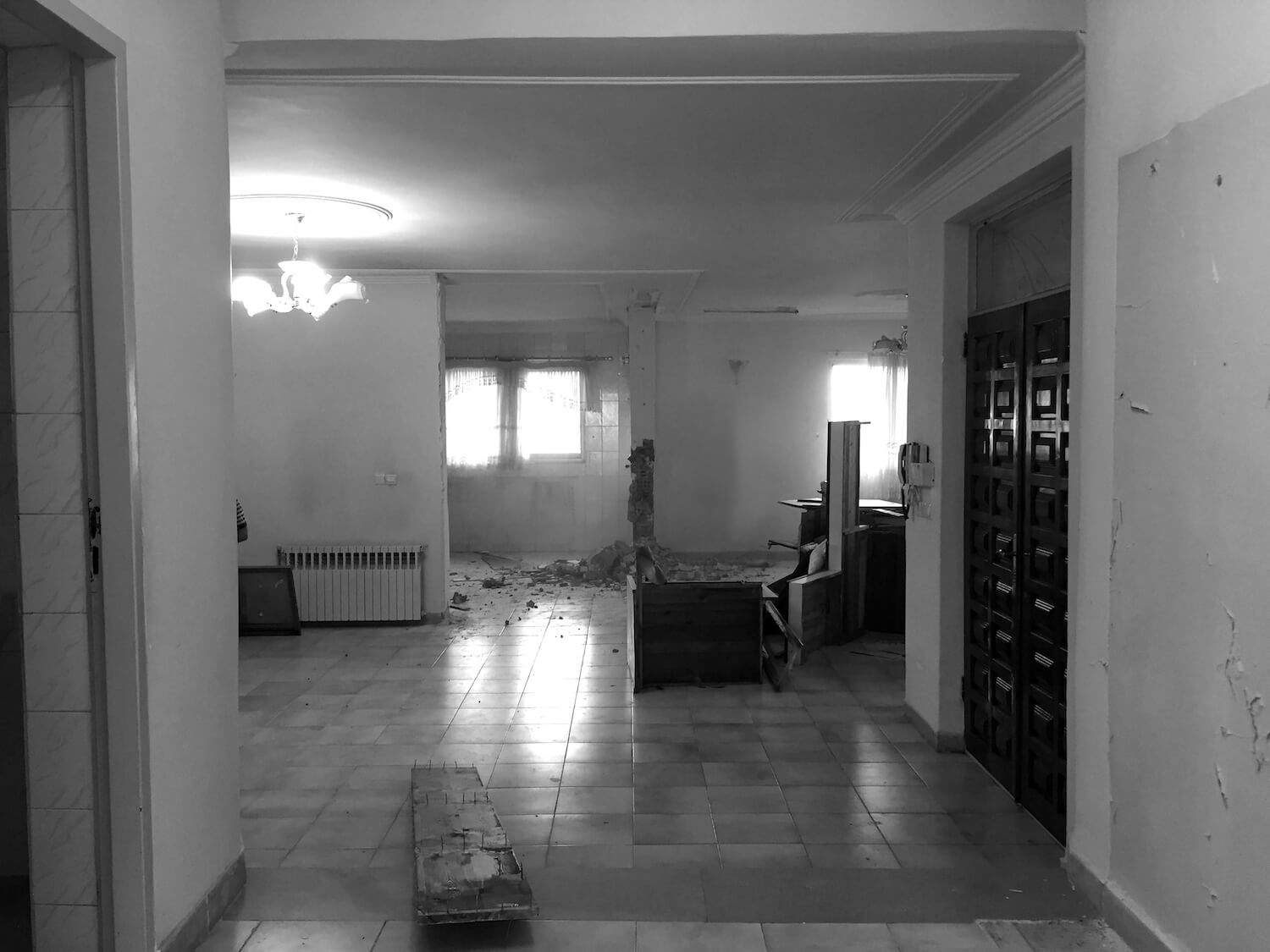
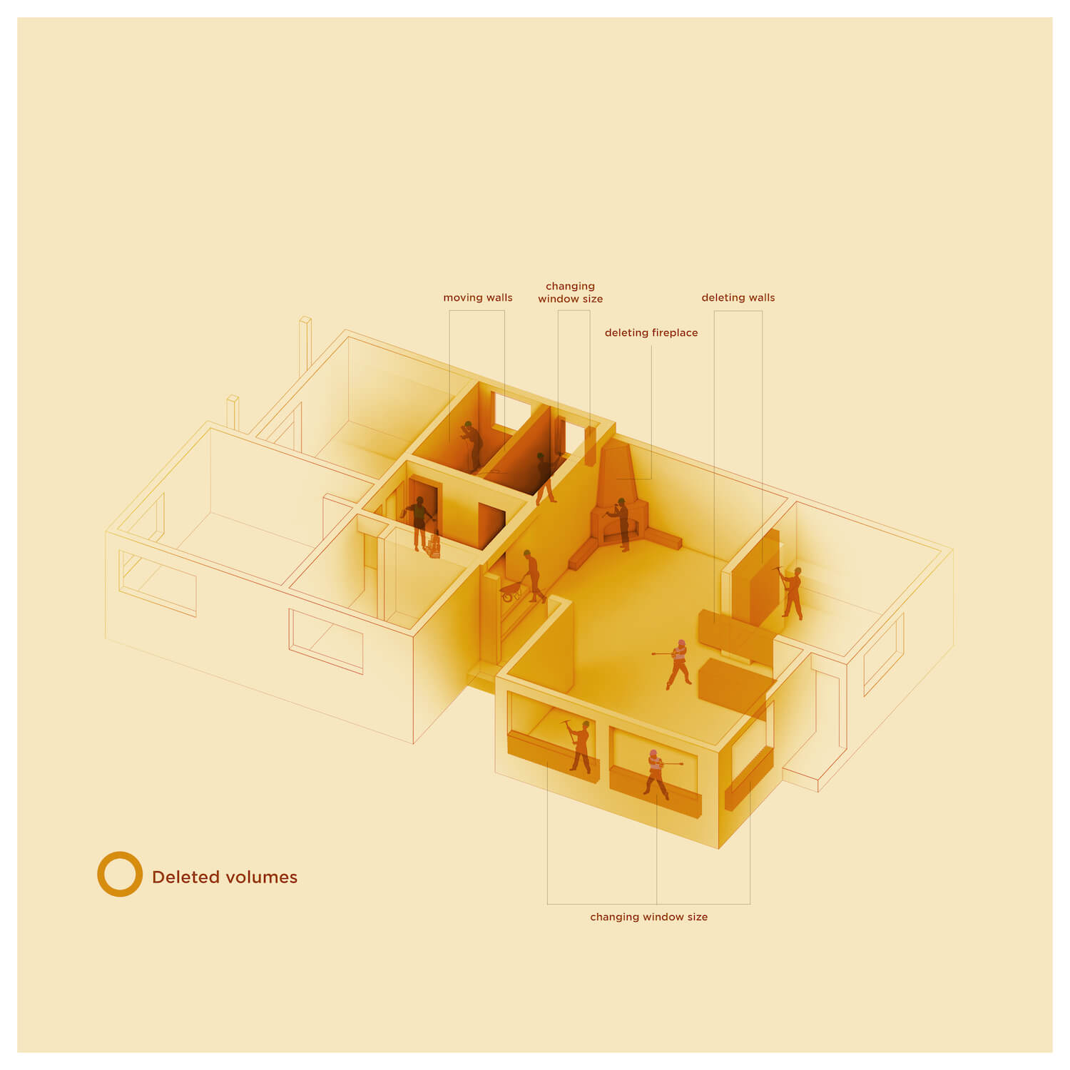
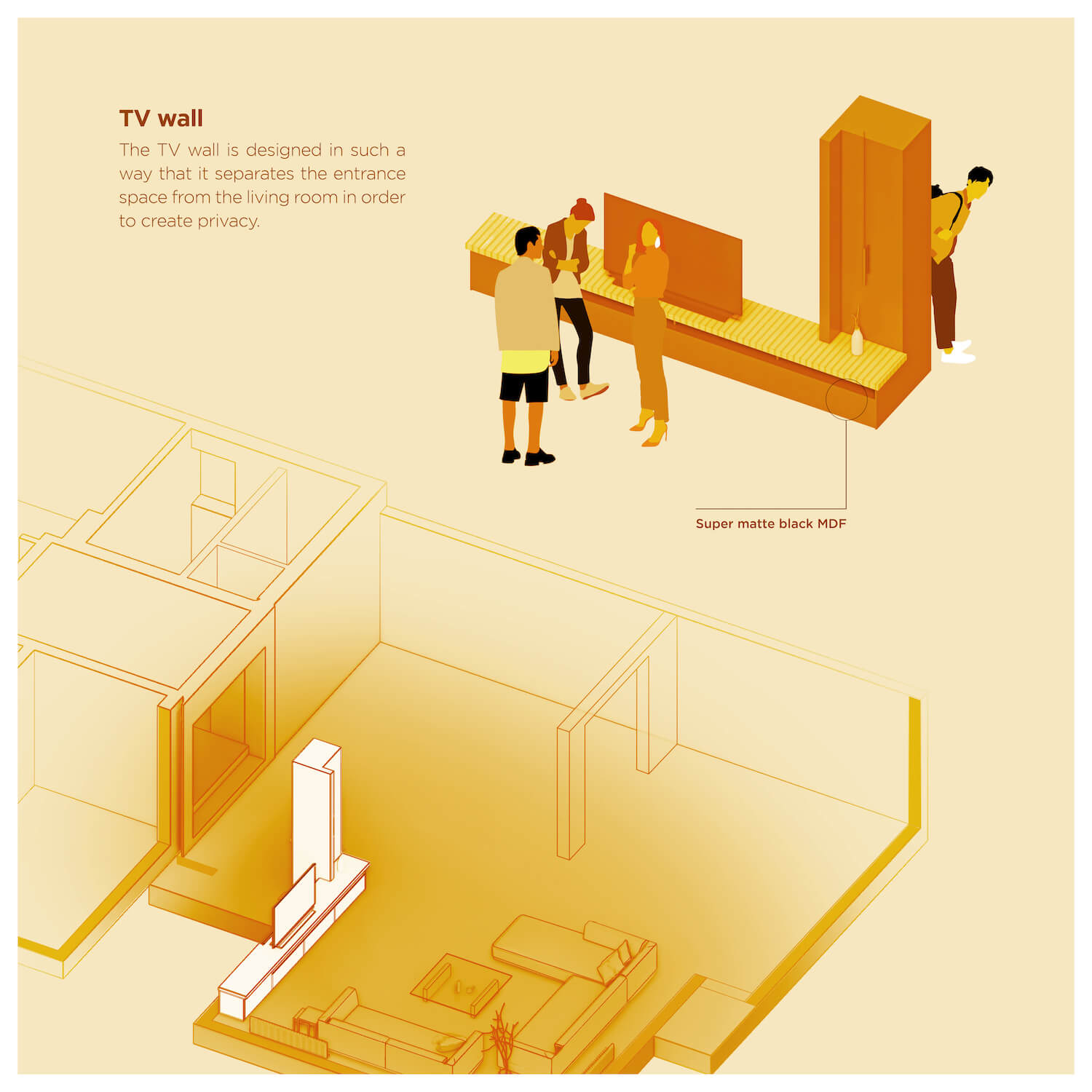
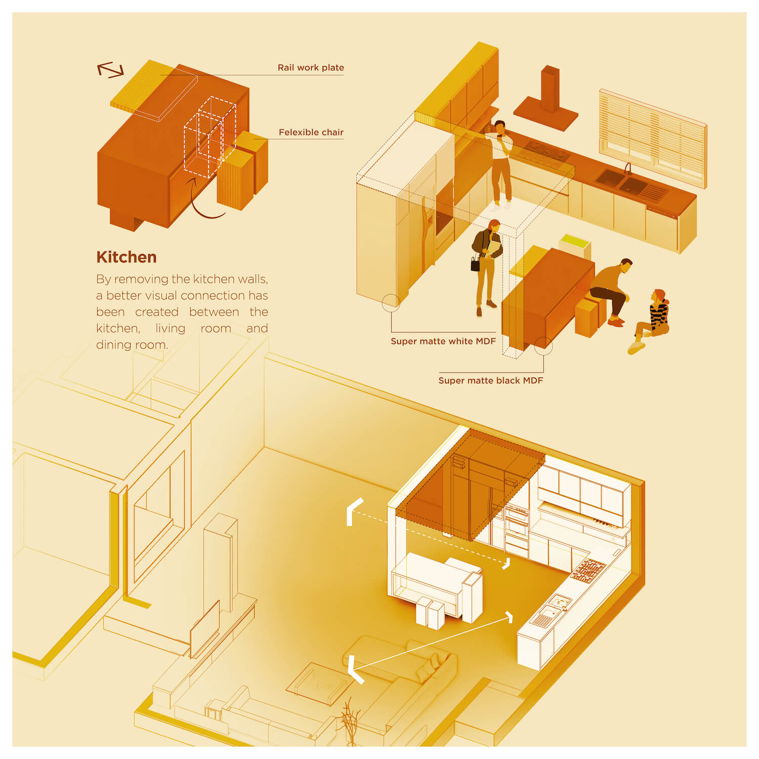
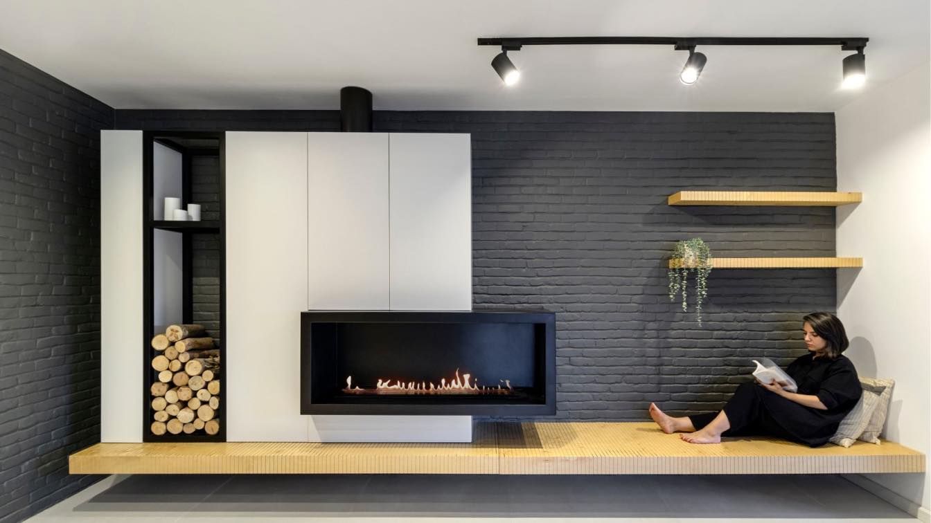
In this unit, the blades between the kitchen and the dining and sitting areas were removed and more visual communication was formed between these areas. Also, by placing the main counter in a space further back than before, more space was added to the reception and sitting areas. The area of the windows in the reception area was increased and the lighting of the space was also increased. To control the view from the entrance part of the unit, a connected German reception space was added in the role of a shoe rack, and a TV table was added along it to define a front entrance at the same time.
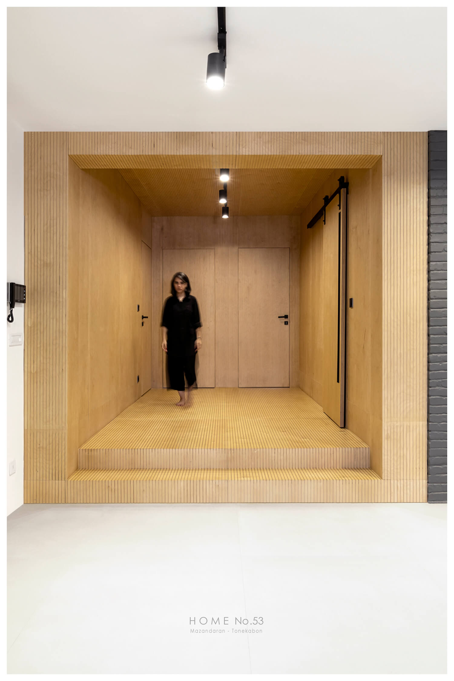
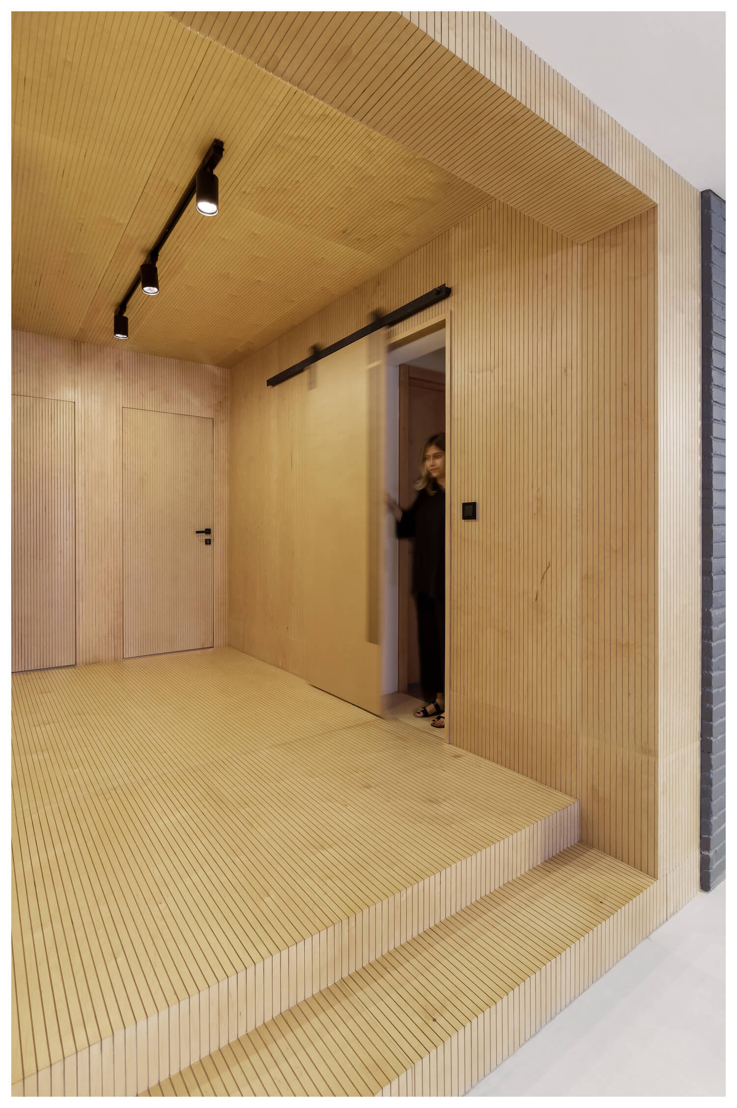
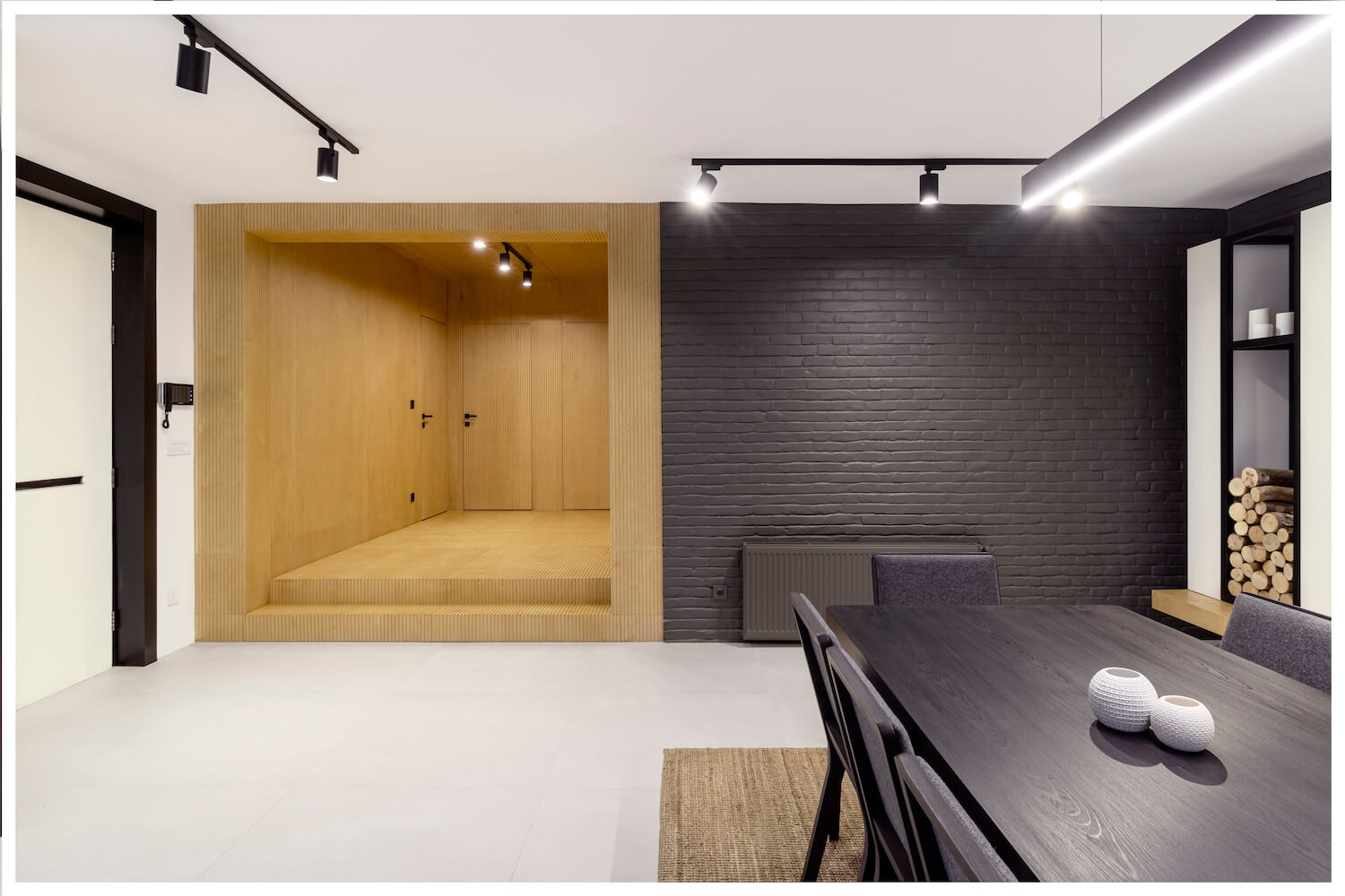
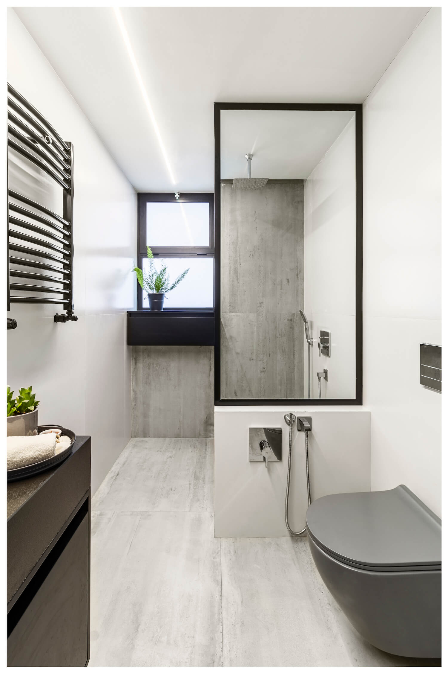
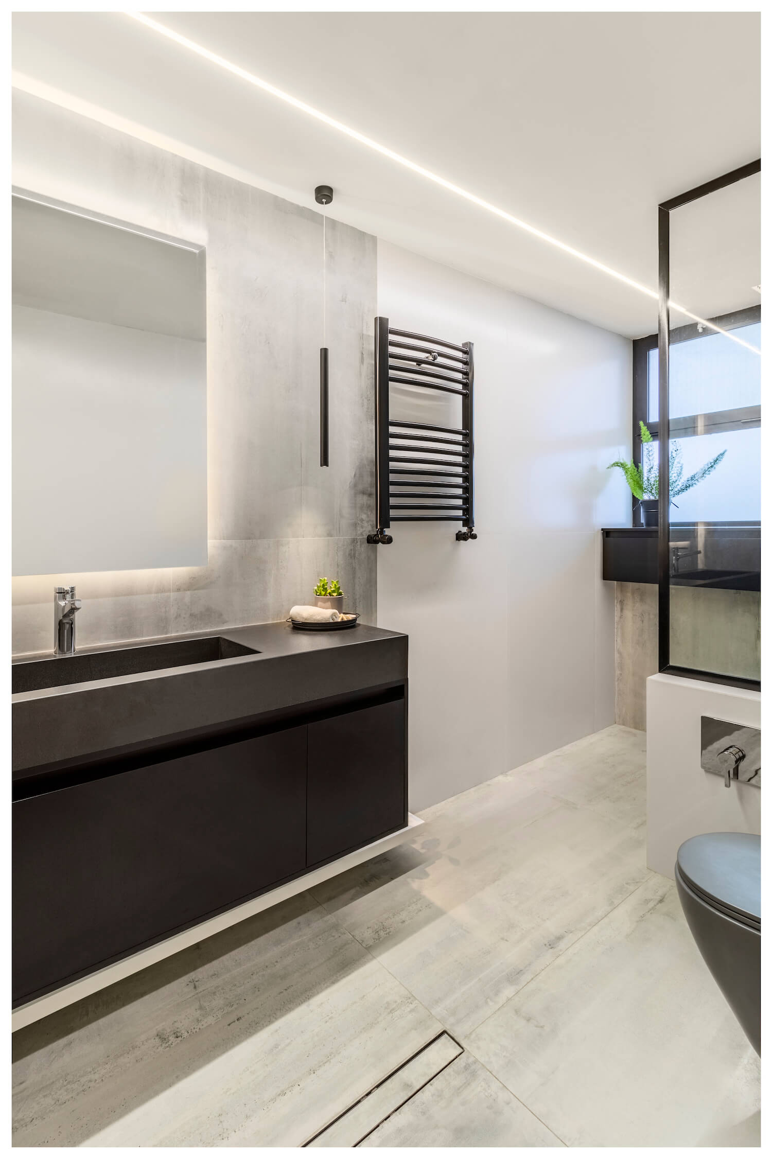
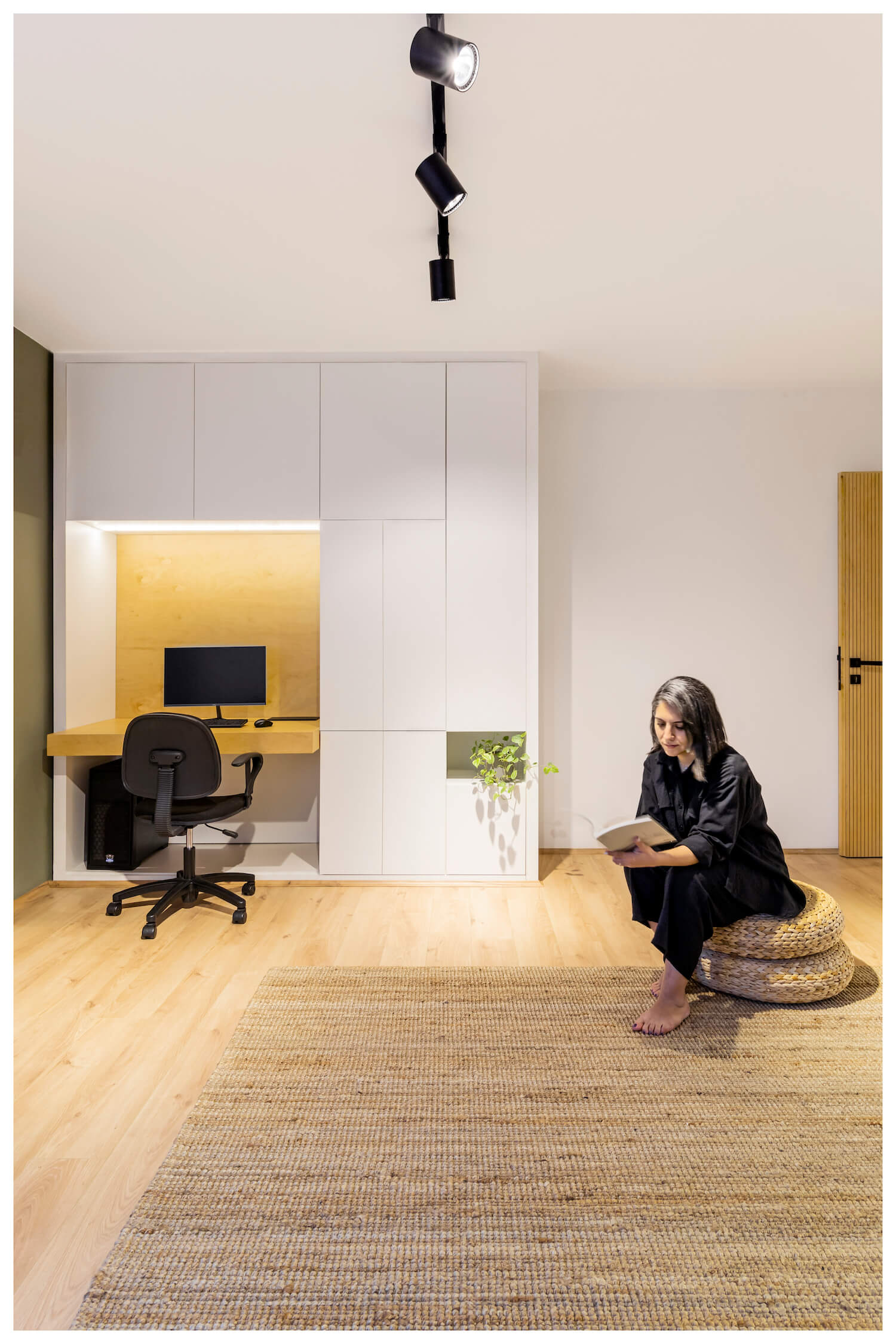
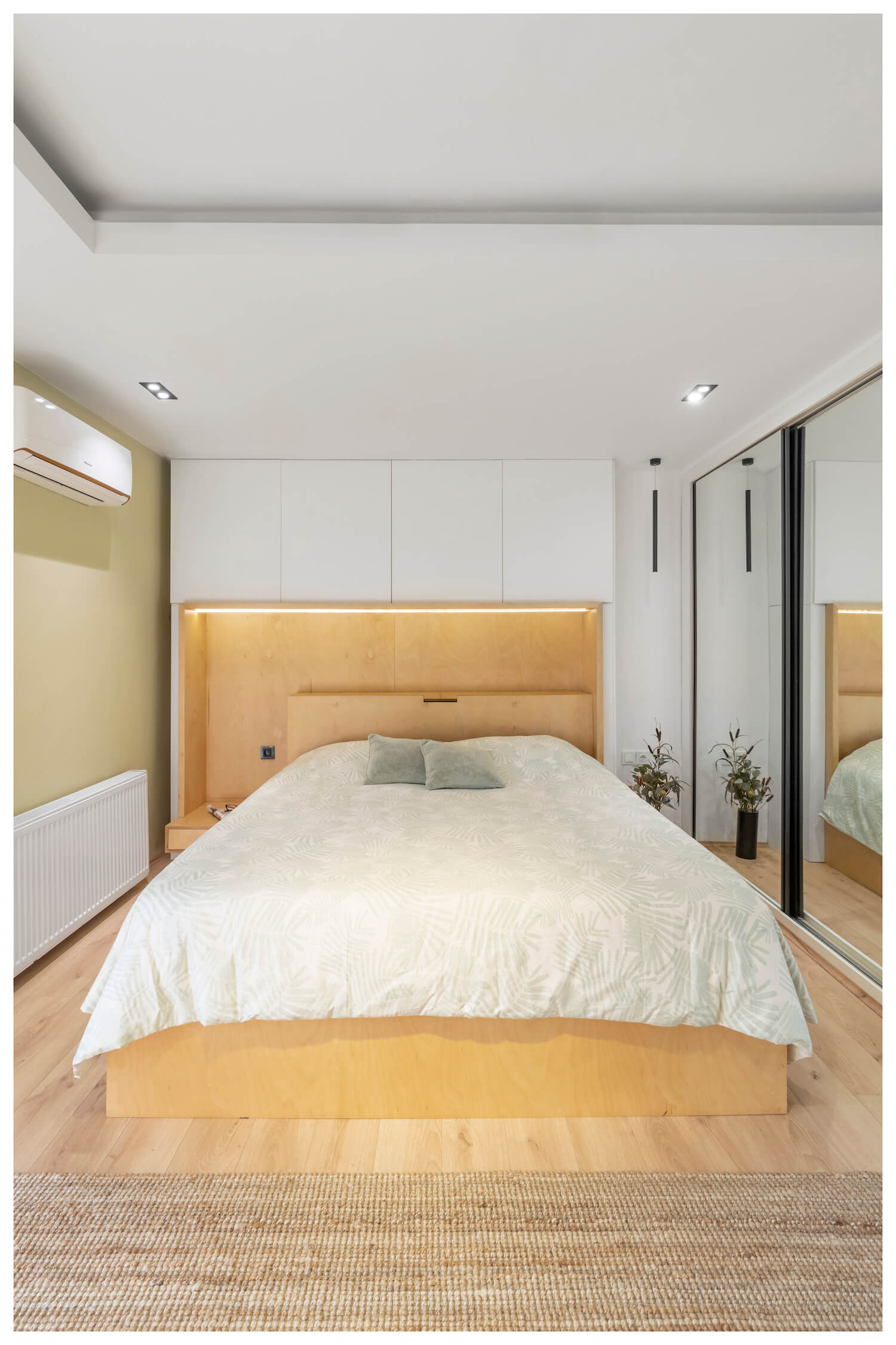
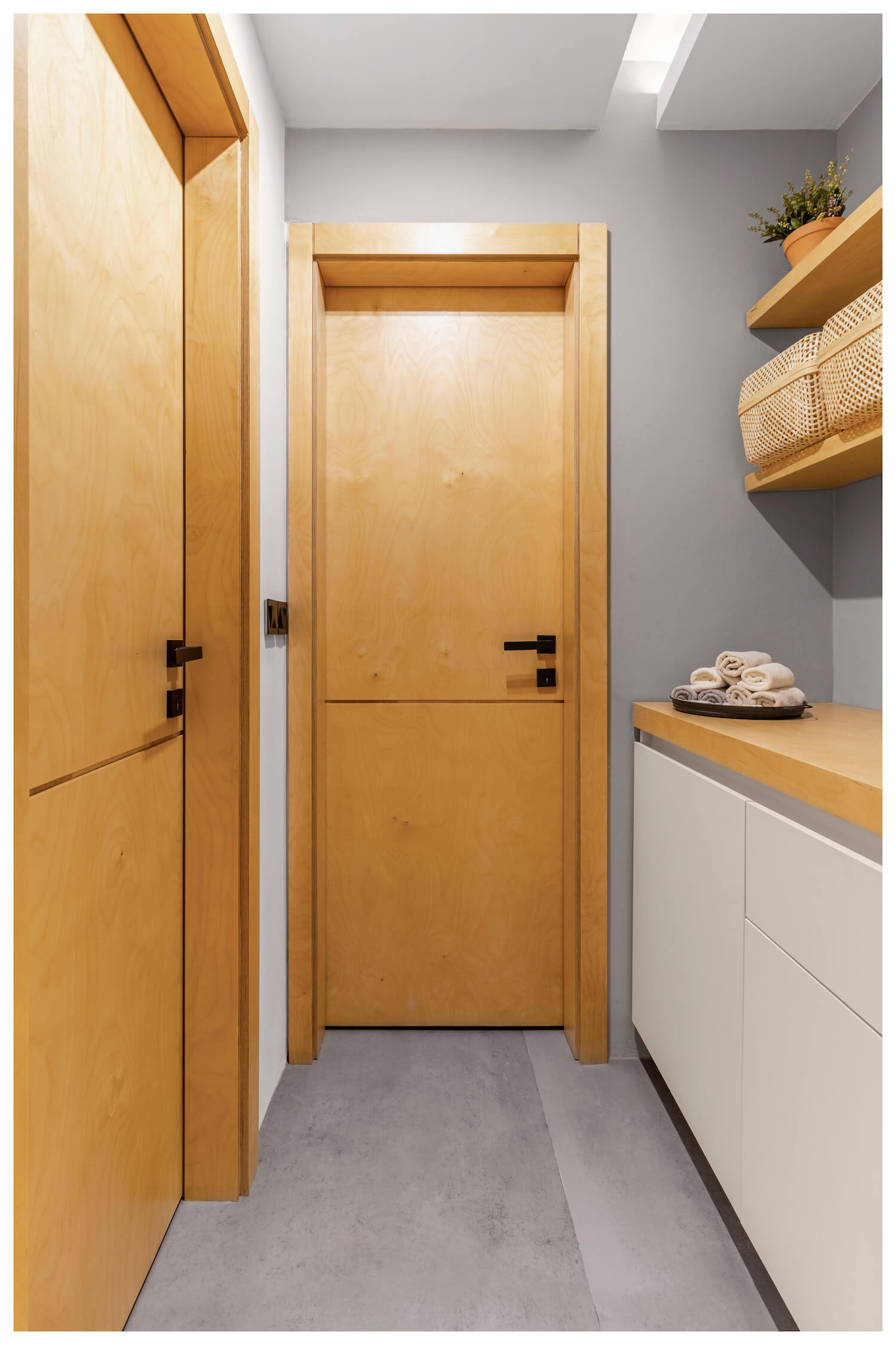
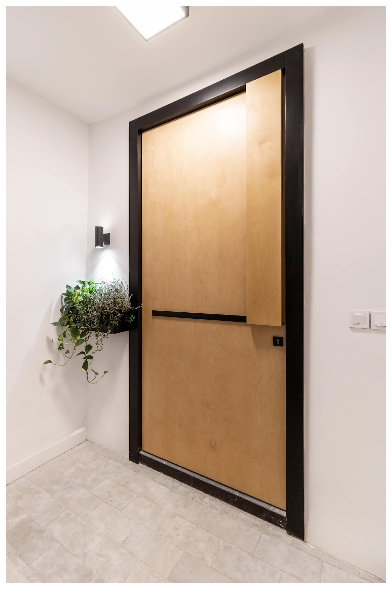
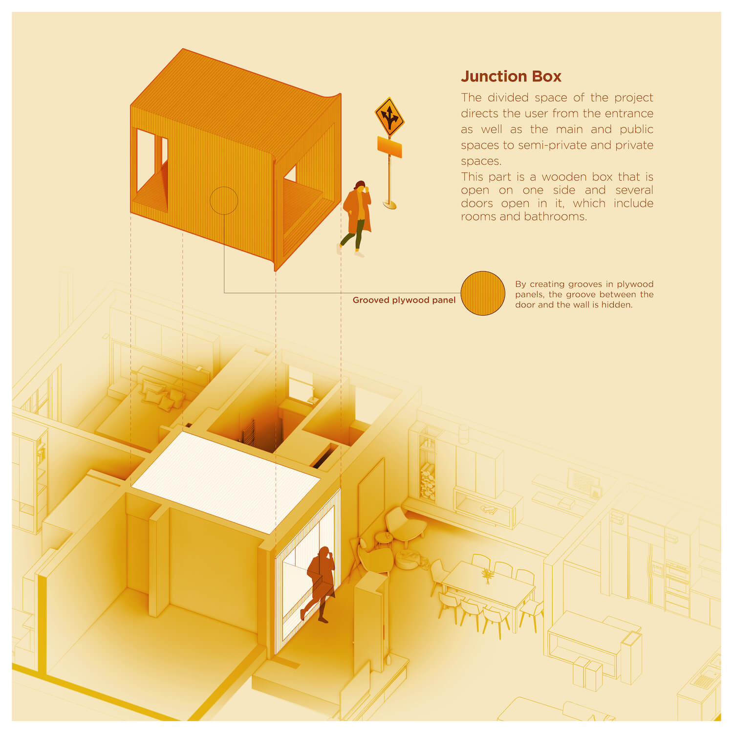
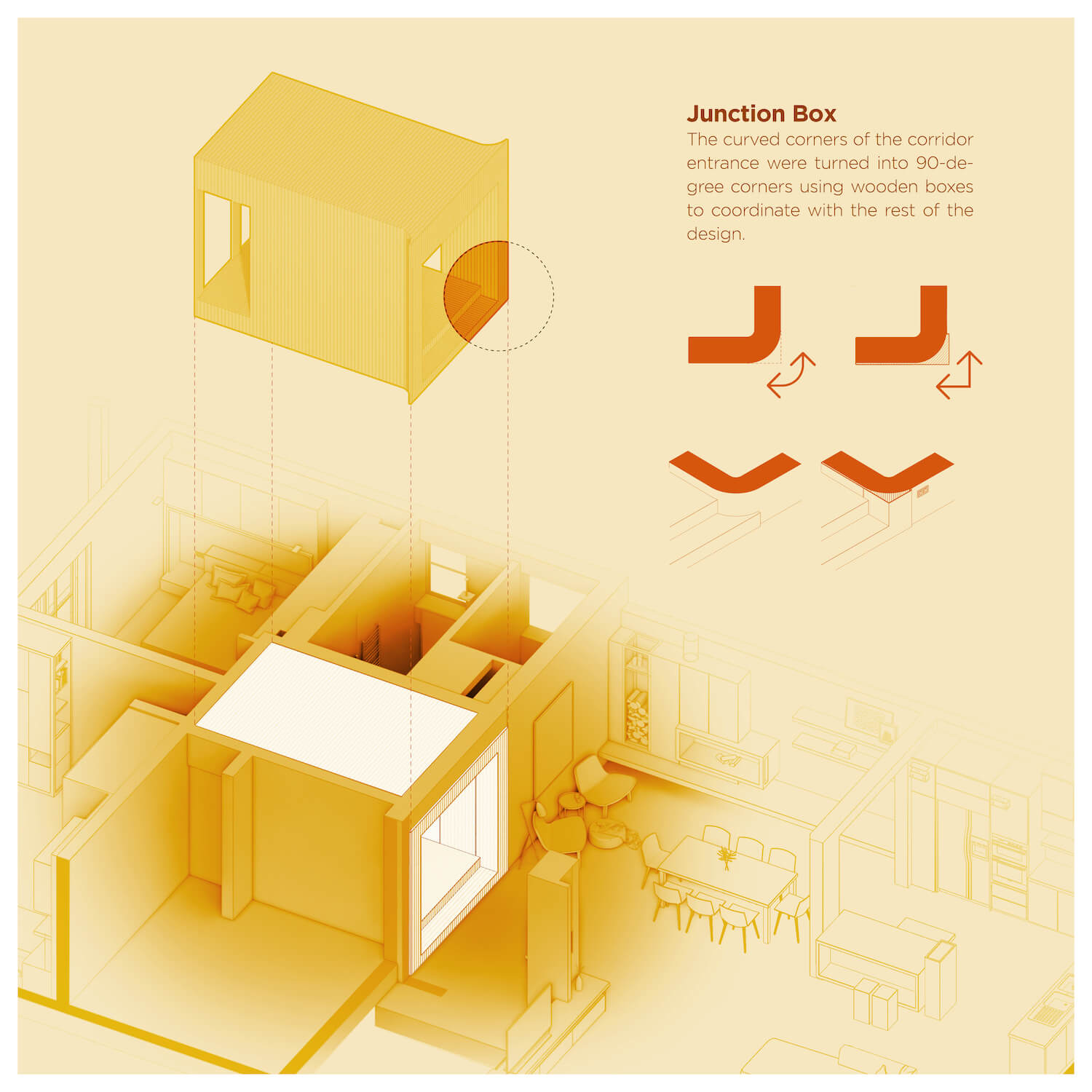
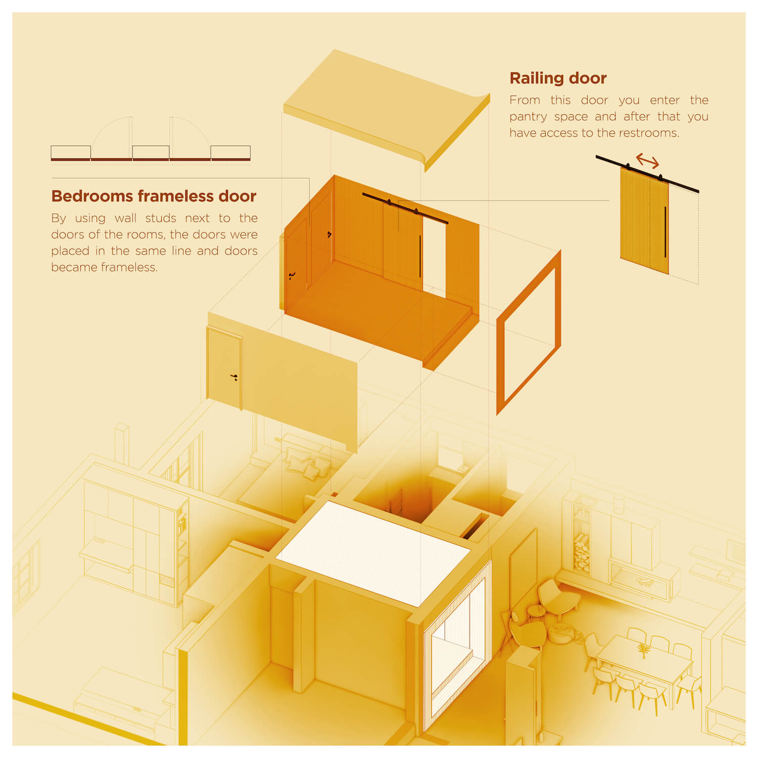
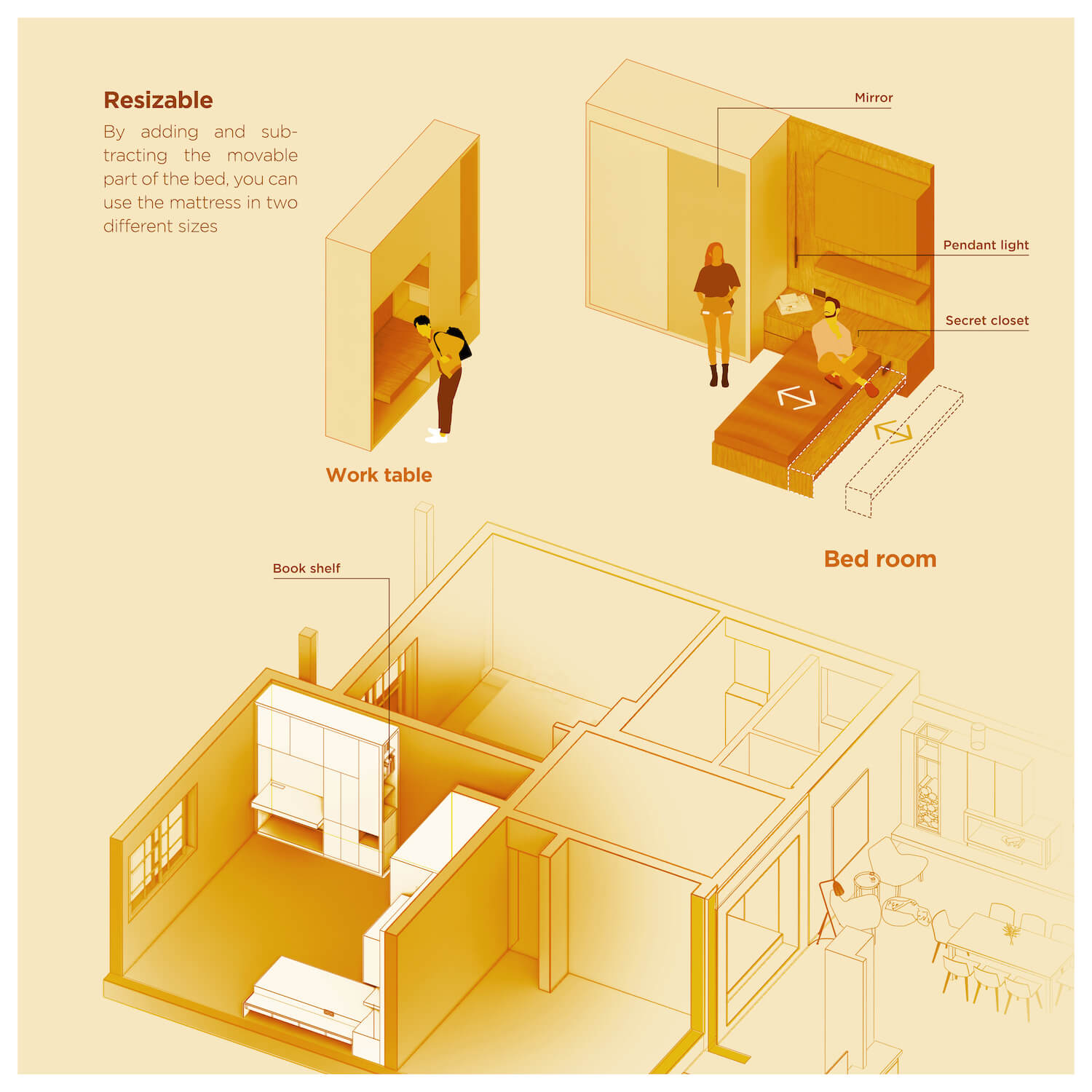
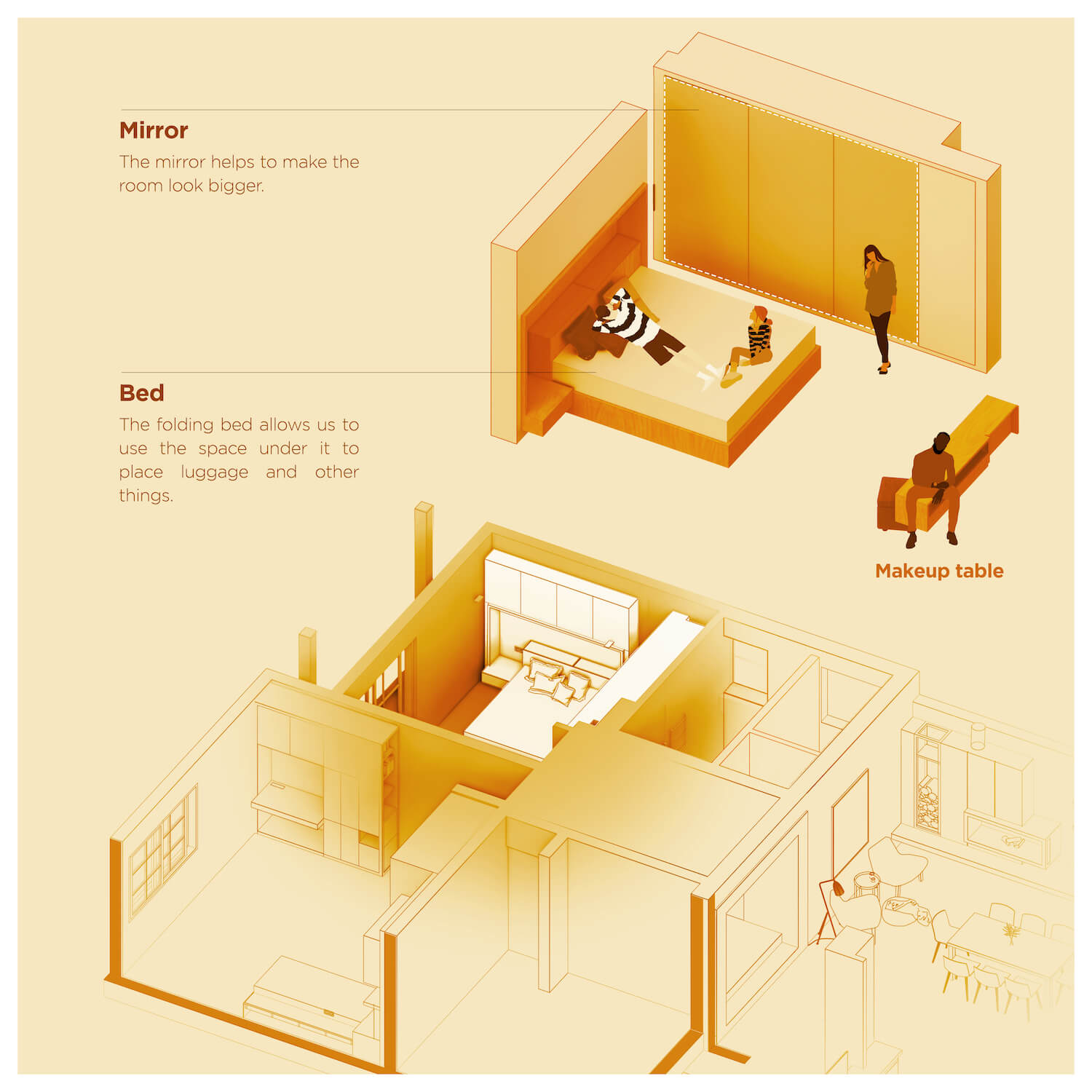
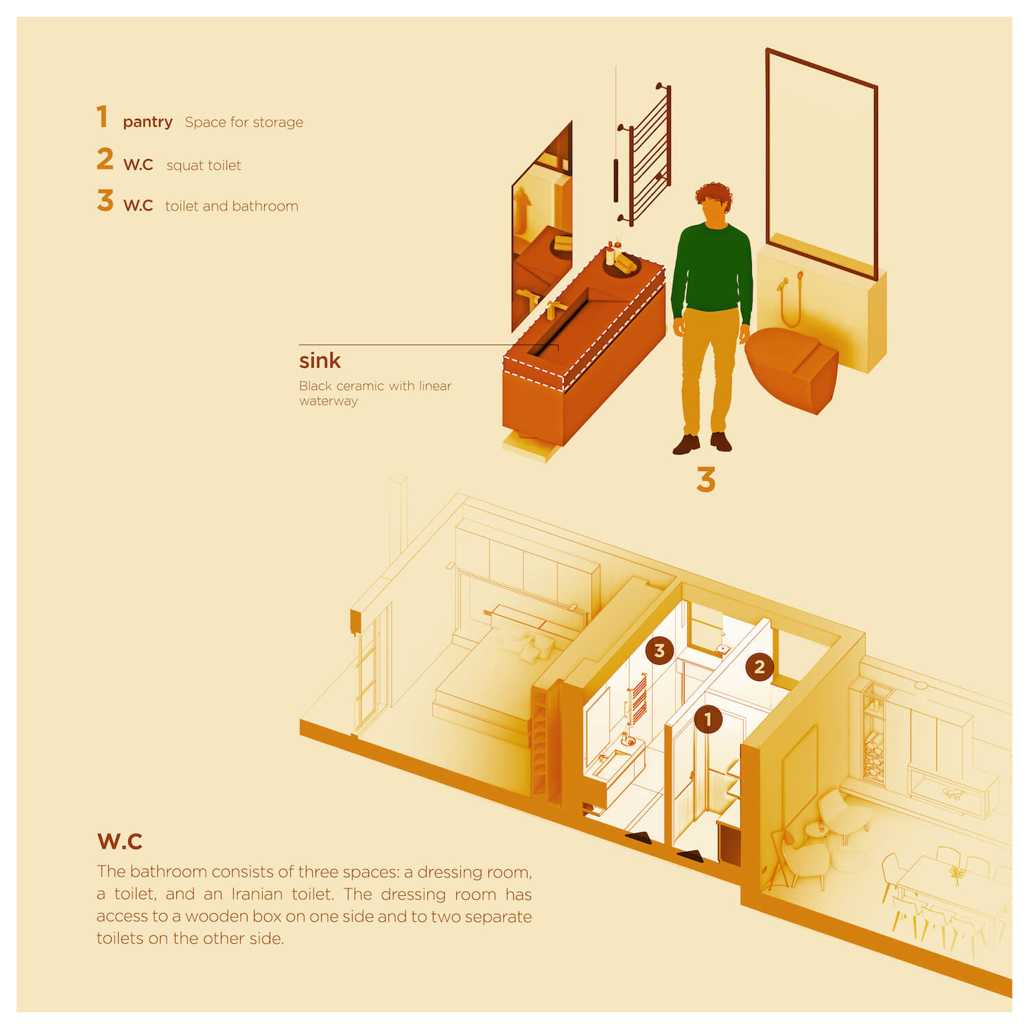
In the middle space of the entrance of the bedrooms and services, the goal was to eliminate direct and unmediated access to the service and bathroom to minimize the view of the reception area. For this purpose, one of the openings of the service and bathroom to the middle hall space was removed and by defining a filter space in that part, access to the bathroom and toilet was provided through this filter space. In order to separate and differentiate, a wooden box was added to this section through a continuous shell with a single plywood material. To maintain purity, with the help of this wooden shell, all the bedroom doors have hidden frames, which gave the appearance of frameless doors to that space. In the bedroom area, also an effort was made to create a more optimal space for rest and workspace with different placement of closets and changes in its dimensions.
