1. About the inspiration of the project and the key concept
MIRAI IDCD: Recently, the number of Japanese ramen shops in Vietnam has increased. The biggest design point is that the main target is young Vietnamese people. Since Vietnam has a cafe culture, I wanted to design a stylish and cute atmosphere. The corporate colors are white, black, and red, so I used this color composition for the interior to unify the design and give it a POP feel. I wanted to create a design that was like an icon.
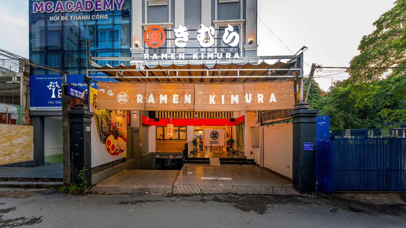
For the facade, we used wood and blinds to express the easy-to-understand word "Japan" in a POP way. I also used logos and bold fonts for the noren and lanterns. Since motorcycles are a daily lifestyle in Vietnam, it is necessary to make the facade recognizable. That's why we were conscious of the word "Japan" being easily understandable. Also, if you can't see inside the store, it will give the impression of being high-class, and it will be difficult for Vietnamese people to enter the store.
So I used glass as much as possible on the front to make the interior completely visible. How can we ingenuity and create an interesting space on a low budget? I believe that the atrium entrance and the glass front design are major factors in making young Vietnamese customers feel comfortable entering the store.

2. About the difficulties we faced and some initial setbacks
As the area is surrounded by residential areas, issues with noise and odor from the exhaust duct and the need to make improvements in the kitchen due to a malfunction of the existing drainage pipes had some impact on the cost.
3. Regarding the construction techniques and main materials used in the project
Walls: paint, laminate, tiles; Floor: tiles; Ceiling; Spray painting, bamboo
4. Space composition and main reasons
I hope that this spatial design, which is loved by Vietnamese people, will help them feel closer to [ramen] and become more widely accepted.


