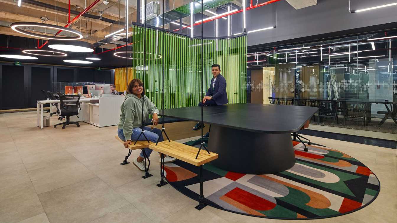
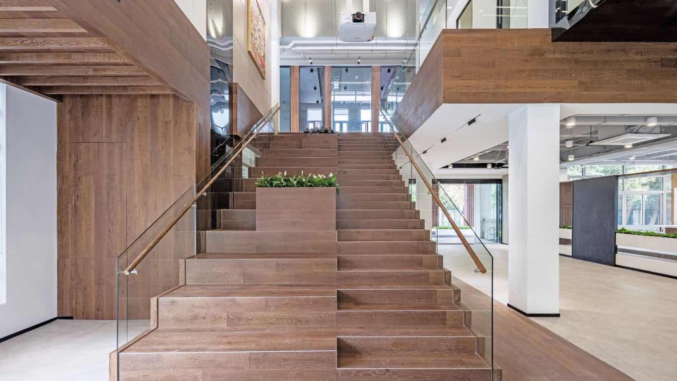
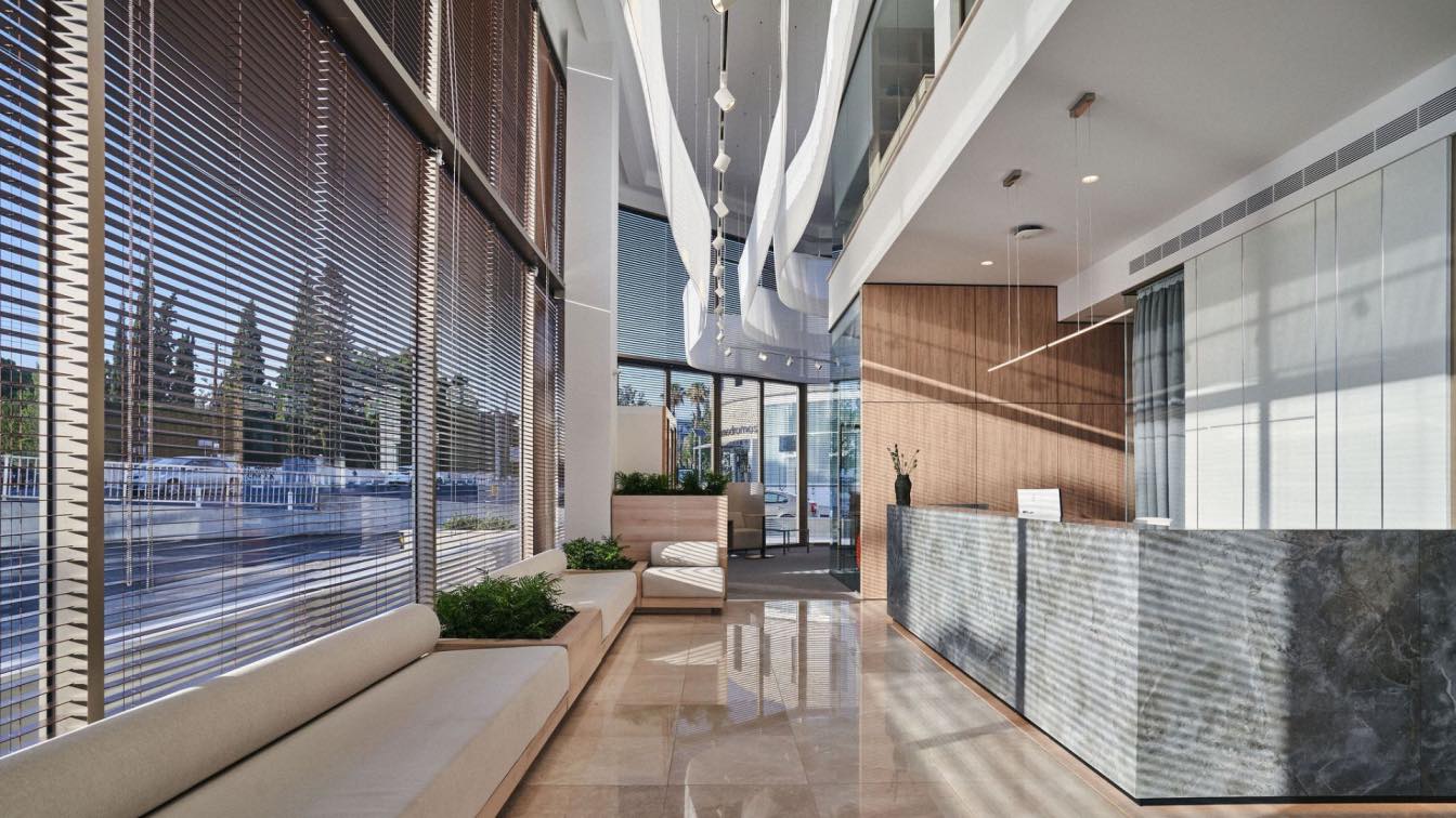
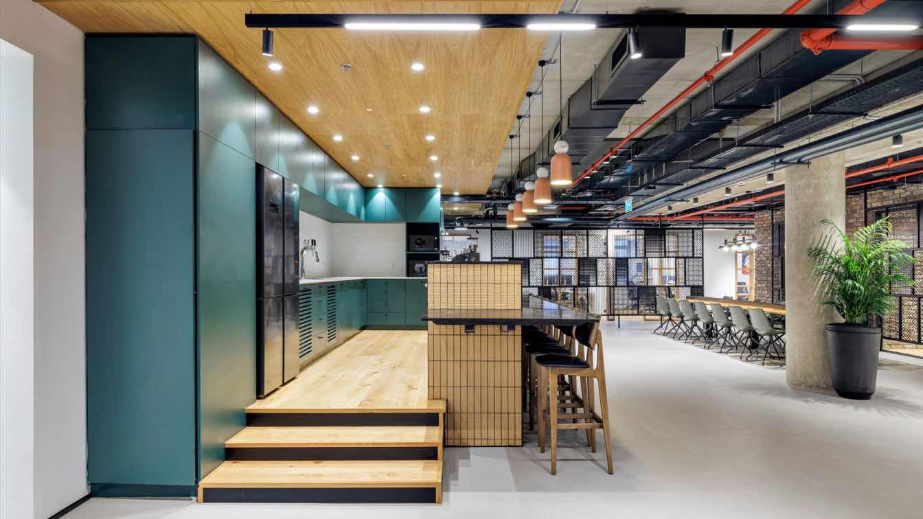
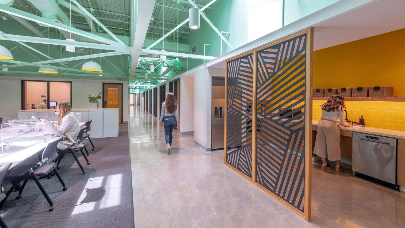
In an area of 432 m². The idea was to create movement and visual complement from shapes and finishes, taking advantage of the space, making the areas that require collaboration be in a nucleus. The palette of finishes includes: epoxy floor of different colors, Mangata ash porcelain and Creta gray cement, gray scale vinyl paints and plastic laminates following the same line as the paint. The hall is a plasterboard wall, at its base there is an organic bench designed by WTF Arquitectos, and in the body of the wall a lamb is planted that expands towards the ceiling, on the right side of the hall, we find the meeting area. On the left side of the hall is the main hallway that, along its route, gives us access to the meeting room, showroom, printing area and kitchenette/dining room.
The first space you enter is WTF's custom-designed boardroom. In which a rug was installed to provide visual impact, the showroom adjacent to the meeting room is a versatile space, it does not have fixed furniture since it has adaptations to assemble and dismantle the product on floors or walls. The kitchenette/dining room is located at the end of the main hallway and is, along with the private ones, one of the areas located on the façade. Below are all the private ones, with a custom WTF design.The open space is intended for Workstation trains and collaborative areas, the idea of this meeting point was to provide users with a creative space to work on ideas.
This project allowed us to use different design tools to create a unique space, each element plays a role in the final conjunction, because although they are understood individually, it is better when they are interpreted collectively since their contrast is very noticeable and In this way they complement each other organically, allowing the user to enjoy each space.


