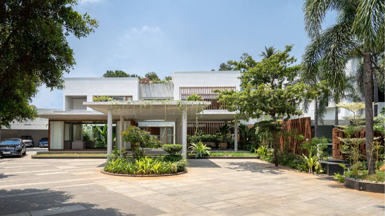
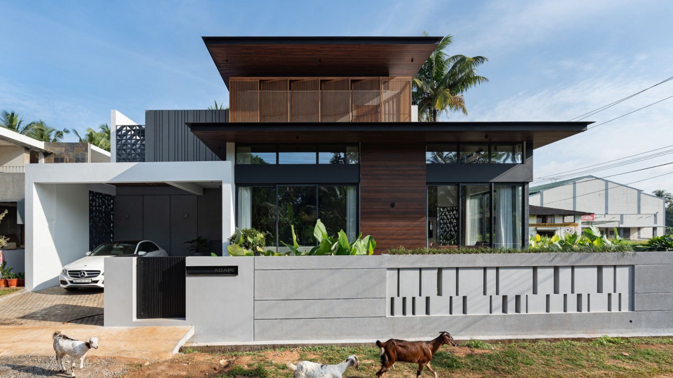
Mawi Design: In the lush labyrinths of T. Nagar, Chennai, this residence sits on the far end of a triangular plot that naturally allows for a paced first look. The brief was to give new meaning to an existing shell of a building while achieving all requirements posed by the client - a house connected with nature, exalting pleasant vibes and one that is simple to perceive.
Keeping only the structural grid of the existing block, all other space making elements were stripped; the entire form reimagined and redefined to suit a new vision, guided by the principles of spatial layering. The concept of spatial layering is used to articulate depth through the juxtaposition of space, void, light, material, creating a spatial continuity that stimulates different responses in people who experience them. The interstitial fabric of the structure is imagined as compositions of opacity and transparency, open or closed, solid or porous. This is achieved by superimposing spaces, openings, material of various natures, landscape and other architectural elements to create domains that are spatially and visually connected.The existing structure, being a huge mass, was first lightened by breaking it into three wings through the introduction of open/ semi-open courts and gardens.
While the rear part was modified to become more porous, new programmes like an office, an entry porch and a kid’s pool were introduced in the foreground. Apart from fulfilling client requirements, these spaces act as pause points that provide a gradual entry into the main house. The concept was chosen to give depth to the simple act of arranging spaces – to evoke a sense of curiosity through the layering of courts and gardens amongst regular rooms. This gives rise to a refreshing environment both figuratively and literally – the microclimate of the house being moderated by the various garden pockets. The idea is cleverly applied in two ways to make the imposing structure emote better - conceptual and perceptual layering.

Conceptual layering applies to the massing of an edifice – how the geometry, heights, volumes are composed to create the basic form of the structure and how it is perceived from different distances, angles and viewpoints. Puncturing the building with courts and cascades, introducing isolated and light volumes in the foreground as a build up to the main house, taking the green inside and around the house which allowed the blurring between exterior and interior lines, using light and plants themselves as space making elements – such design decisions made, help people experience the house intimately. Thus, the large volume gets scaled down to perceiving a single composition of different spaces at a time. This helps evoke different emotions at different points in the house.
Perceptual layering is that which is perceived in the vertical planes, i.e in the sections. The courts were introduced to lighten the building; where they were going to be placed depended on how one would perceive them. Layering a semi open sit-out, an open garden with an enclosed space allows people to feel a sense of curiosity and drama as they pass through, finally arriving at the closed room where they fill with a familiarity and a sense of peace.
Such permutations and combinations of differently natured spaces were framed carefully to give pleasant views from various points of the house. The simple act of arranging spaces transcends to the next level through the concept of spatial layering, thus giving an experiential and a visual feast. The external palette has a distinct tropical theme to it – basic alabaster tones of the house is well complimented by the earthy, warm laterite highlights, cold-cut cement finishes of the courts and the refreshing aqua hue of the pools. Material hasn’t been applied as a superficial film but they are the consequence of different programmes coming together to form the larger picture.

The interiors are minimal, neat and fuss-free. The main aim was to create simple, pleasing spaces which were usable, inviting and reflects the effortless brilliance of the entire structure. Landscape plays a very important role in the project – a space making element that provides depth to the design. Different spaces demanded a different look – the front gardens were planted with tall, thick shrubs that allow only glimpses of the house creating an escalation as one approaches. They also frame the large driveway leading up to the porch and counter its hardscape.
The courts inside come in varied spirits – dry, minimal branches offset by rocks and pebbles for a zen garden, brightly-hued flowers frame the cascading terraces which step down to merge with the garden around the teal -hued pool. A porous laterite wall fringed by small shrubs serves as a screen to offer privacy to the pools from the entrance of the house.
The rear garden of the house is a complete mood by itself. Housing a curvaceous koi pond that compliments the rigid lines of the house, fringed by quaint smooth boulders, encompassed by forest- like landscape; it is the perfect climax to a dramatic home – where one can sink in peace post the dynamic experience of the house. The residence is a coveted example that portrays simple architectural brilliance. It is a candid consequence to a design theory that is devoid of any active exhibition; there are no parts without purpose, no layers without reason. Every element of the edifice has a place because it has a purpose in stitching together a larger context – Through the Layers.


