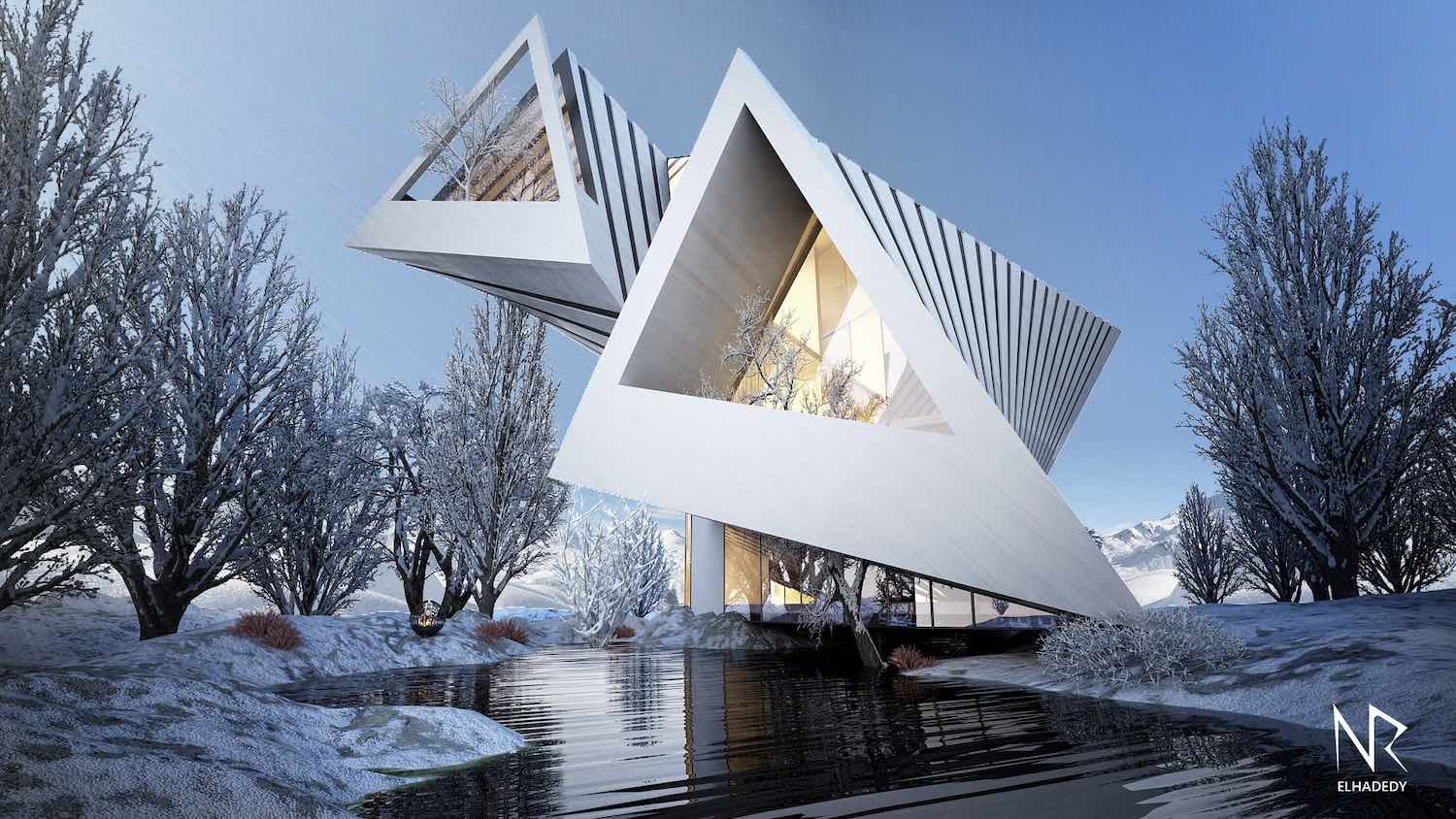
To freeze emotion into architecture
To practice restraint of opening
To gain the strength of enclosure
To satiate spirit in the space
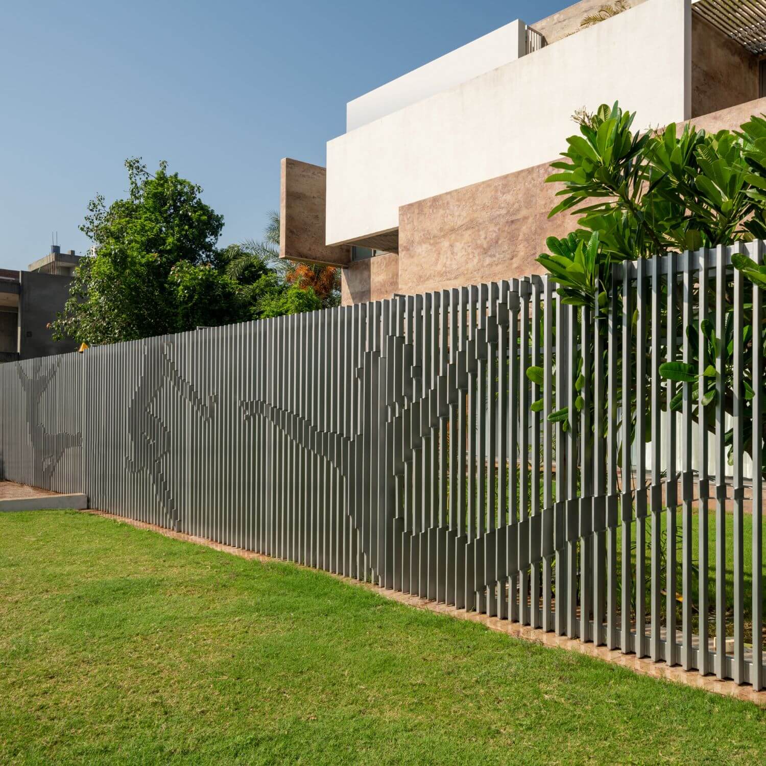
To celebrate life in dance
BRIEF: To design a house that ensures security for a single old lady & her tenants.
SITE: The site is located in Panchkula (Haryana), a satellite town adjoining the border of Chandigarh. Chandigarh city was designed by Le Corbusier and is a symbol of modernism in India. The site is in a newly developed plotted sector, adjacent to the Information & Technology Park of Chandigarh.
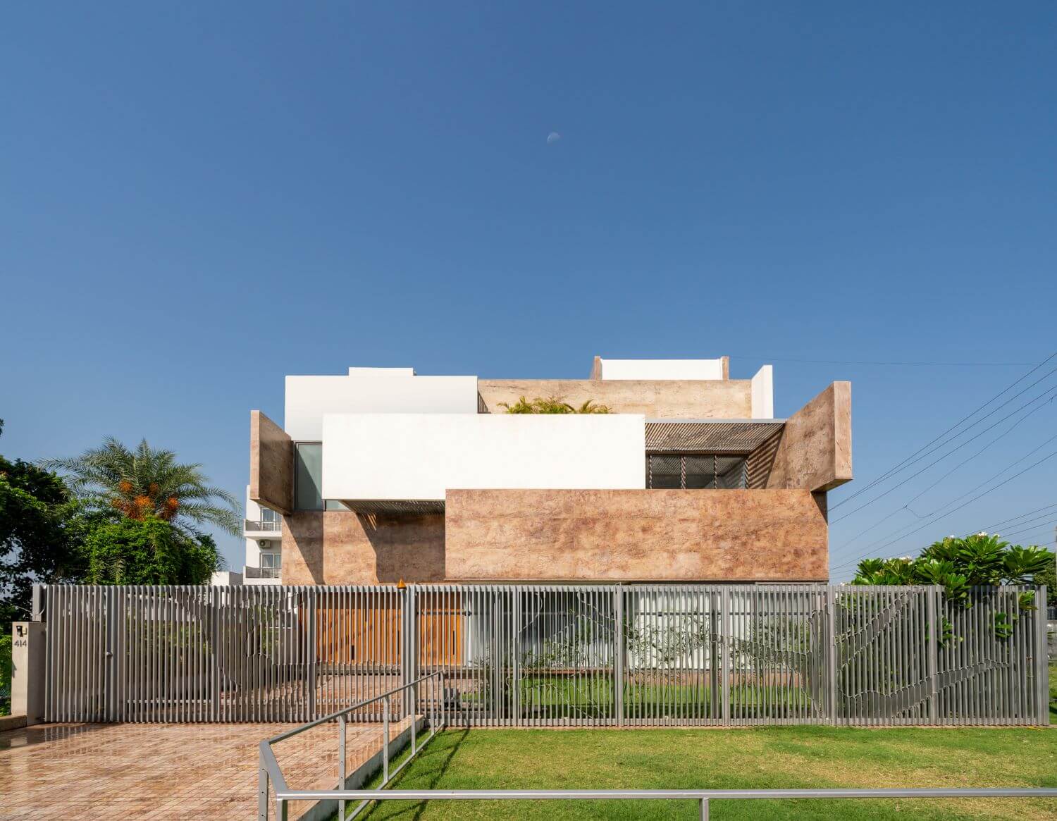
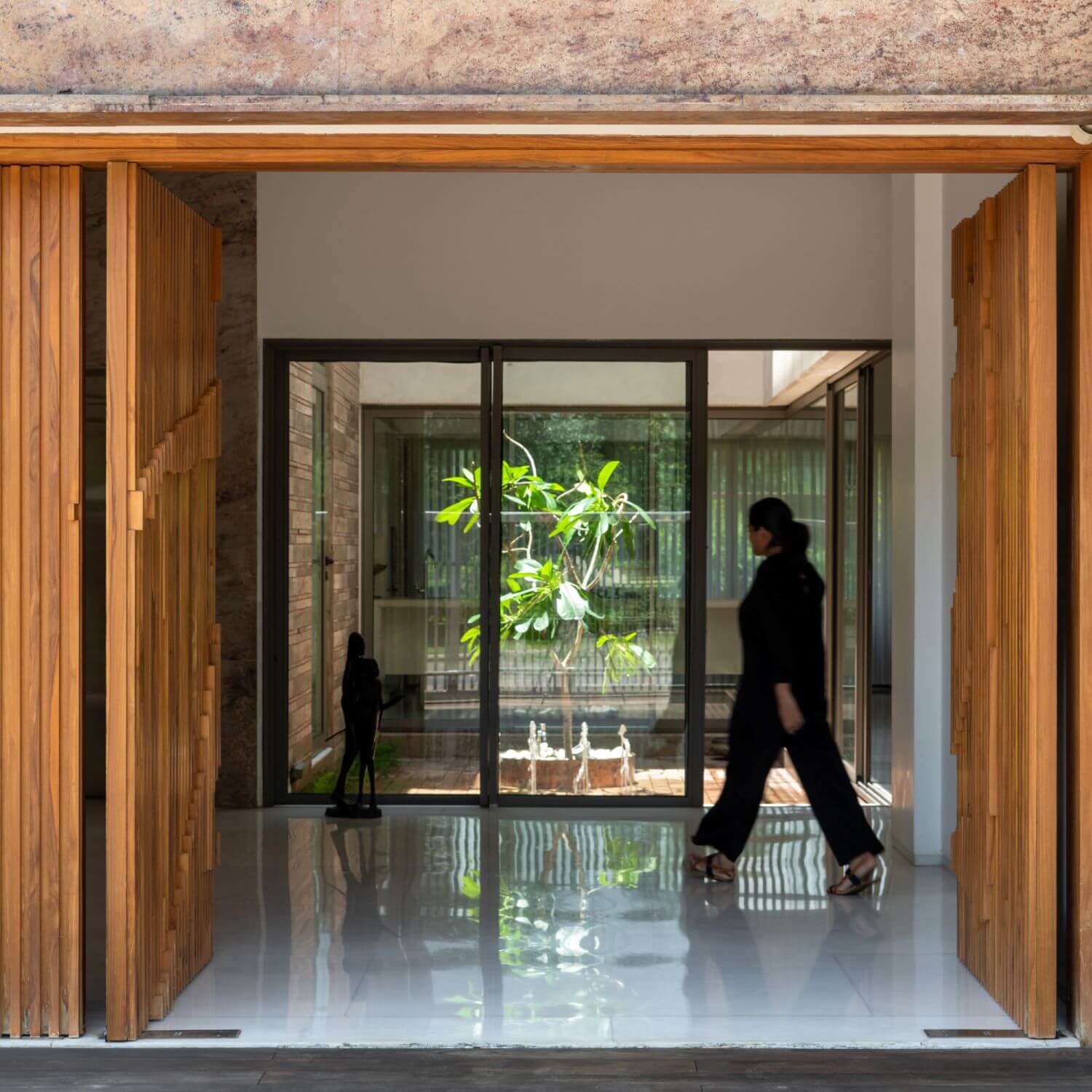
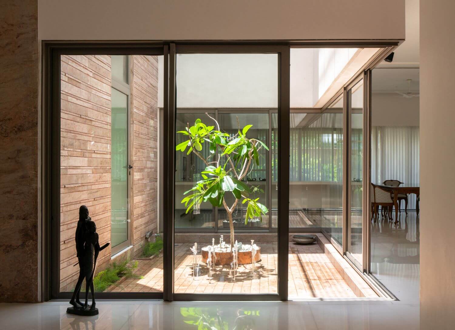
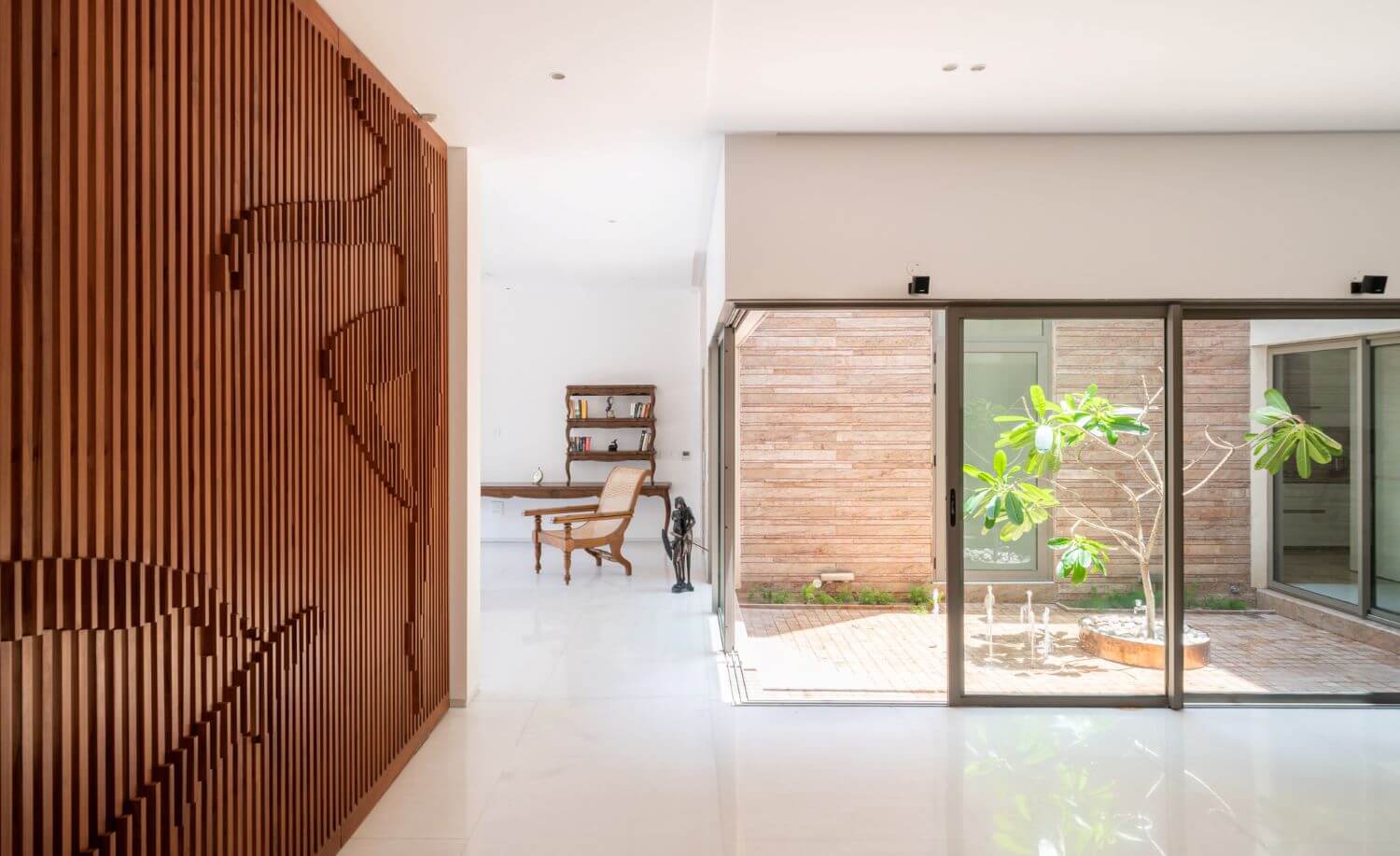
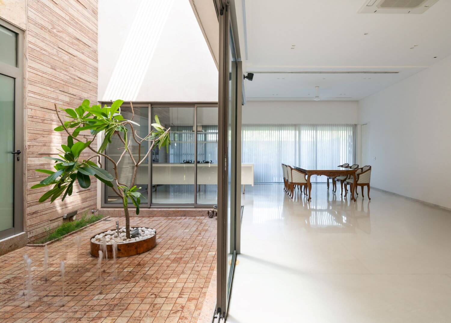
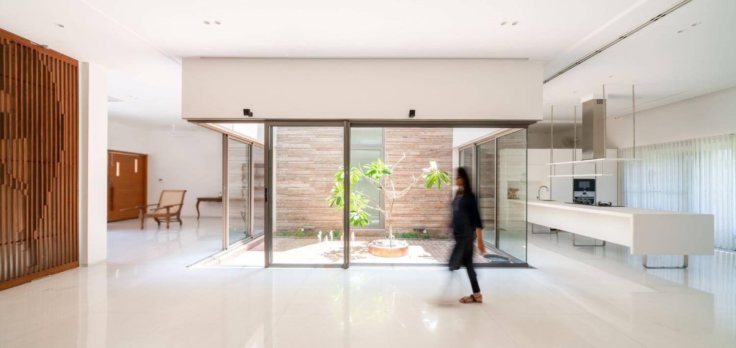
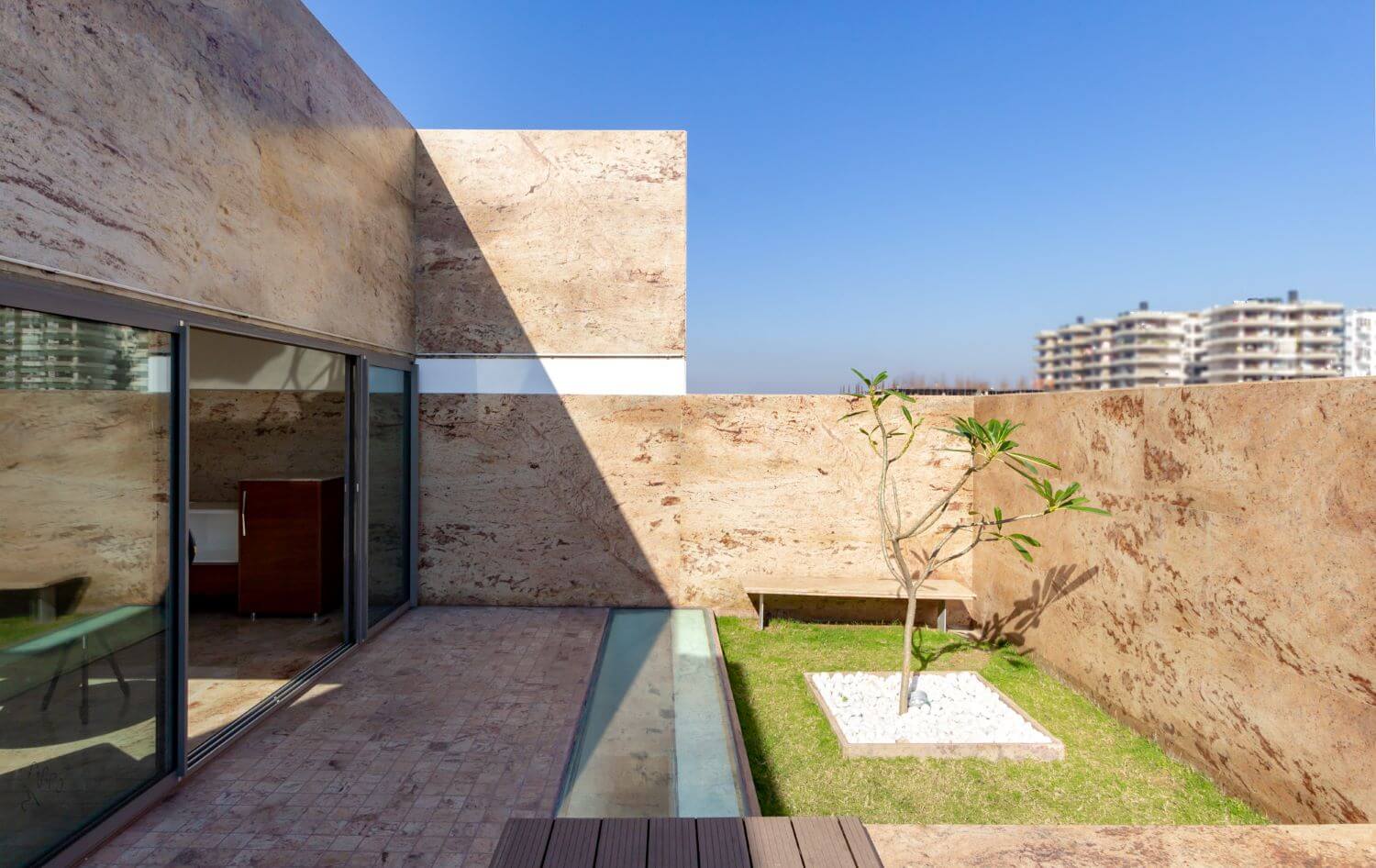
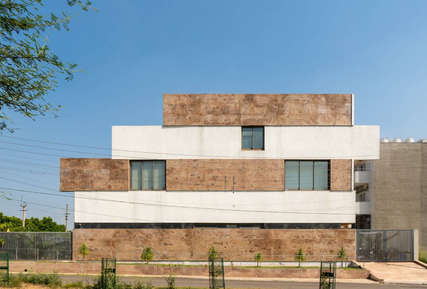
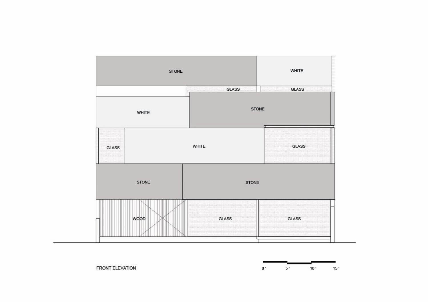
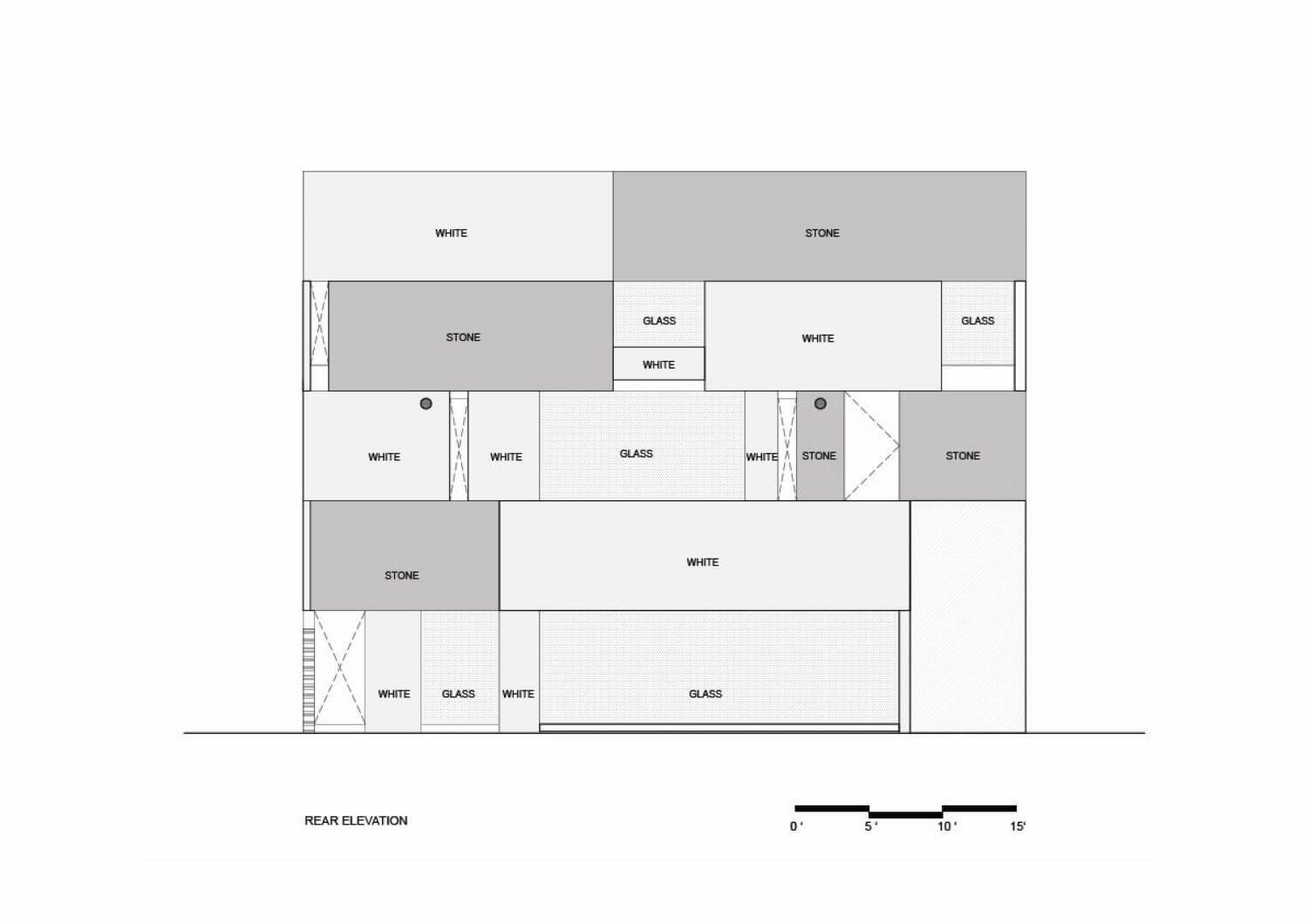
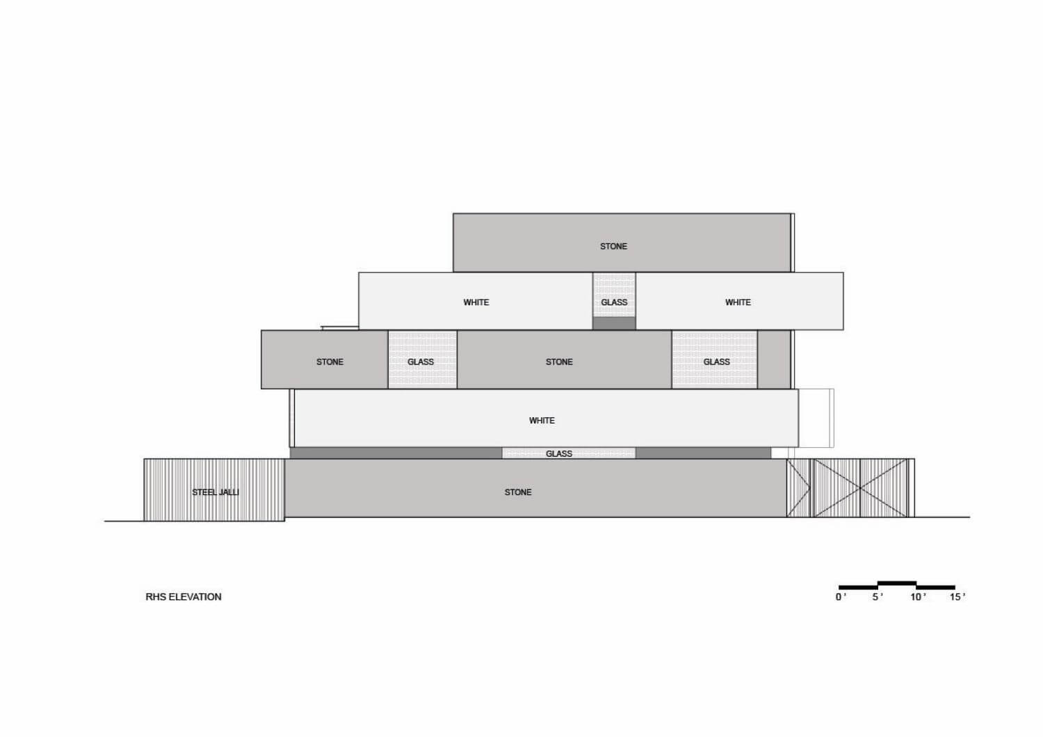
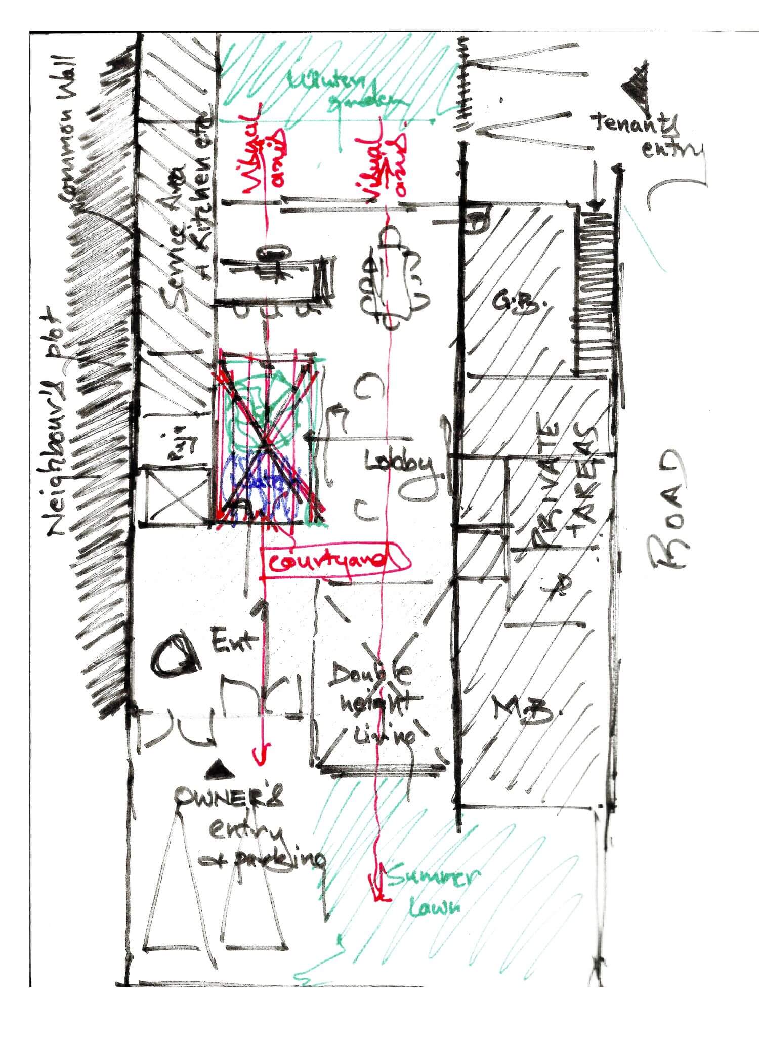
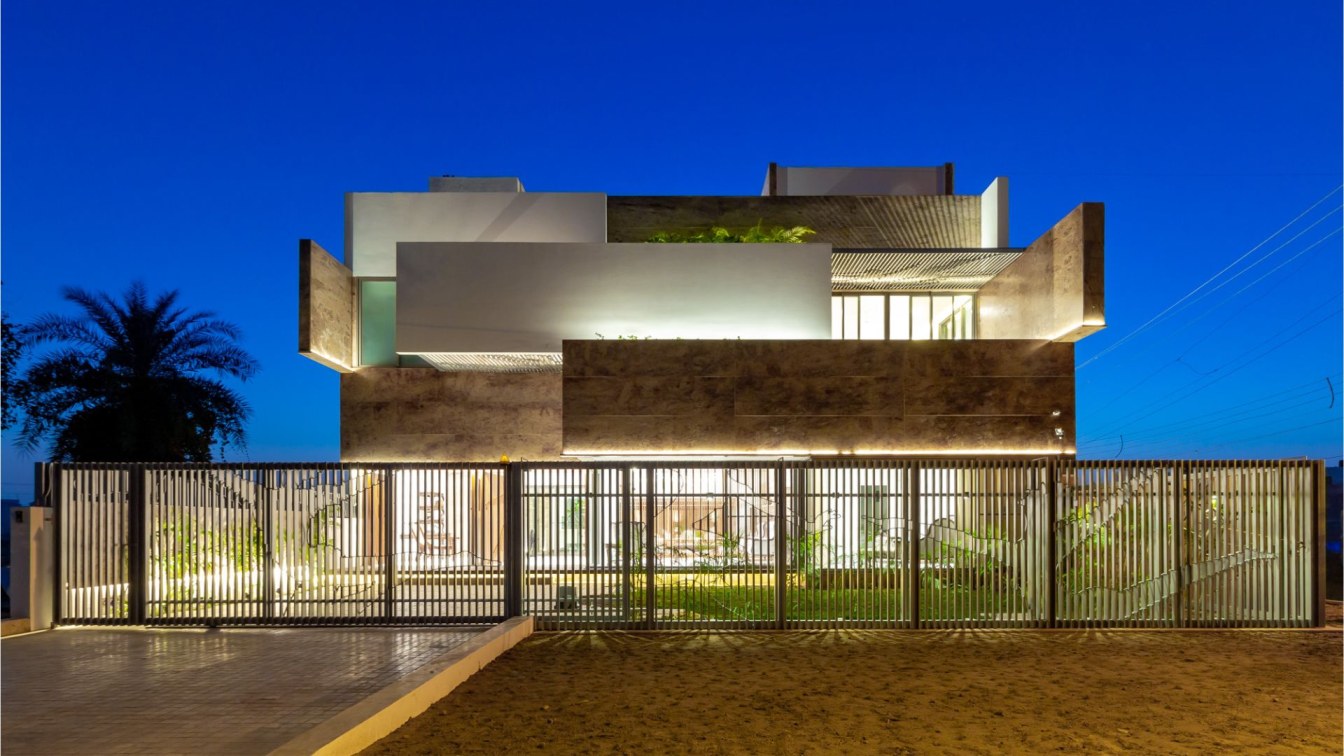
CONCEPT: The layout was conceptualized as a free plan around a central courtyard. The levels & accesses were carefully divided between the lady and the tenants to provide comfort & privacy to all. The architectural vocabulary is derived as a response to all the development happening in close proximity to the site and its neighborhood. The stark contrast of glass facades of the IT park on one hand and the old existing clusters and slums on the other hand were responded to by developing a blank facade, consisting of the most basic architectural element, the 'plane'. The stacked planes convey the need to go back to the essentials of architecture in the midst of the insensitive development happening all around.
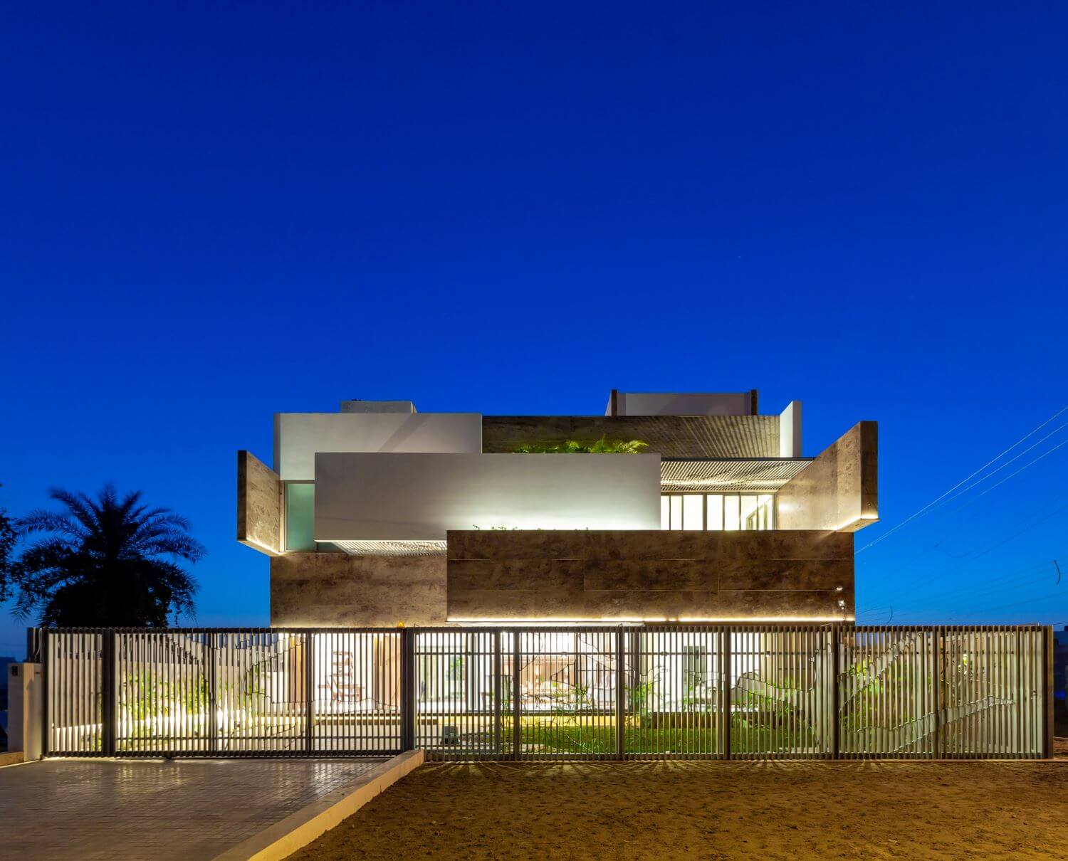
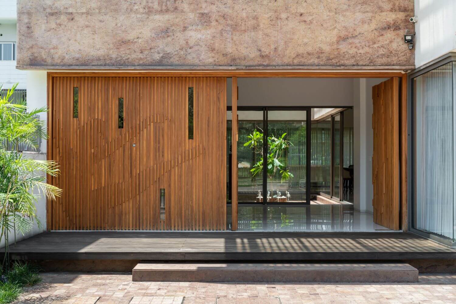
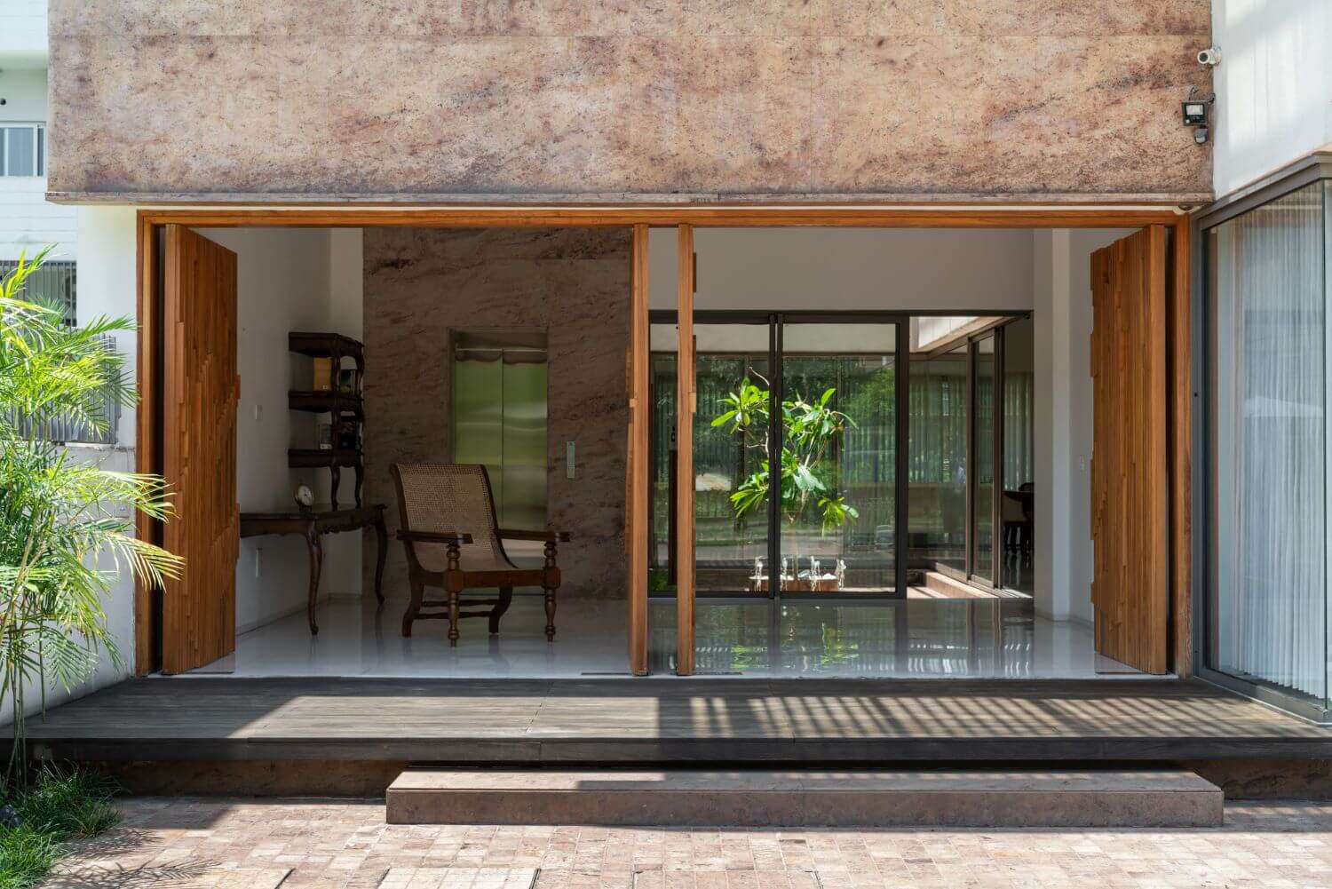
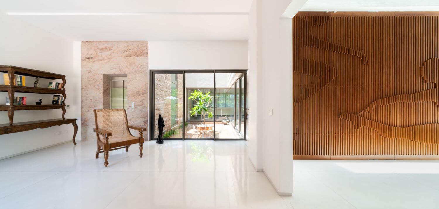
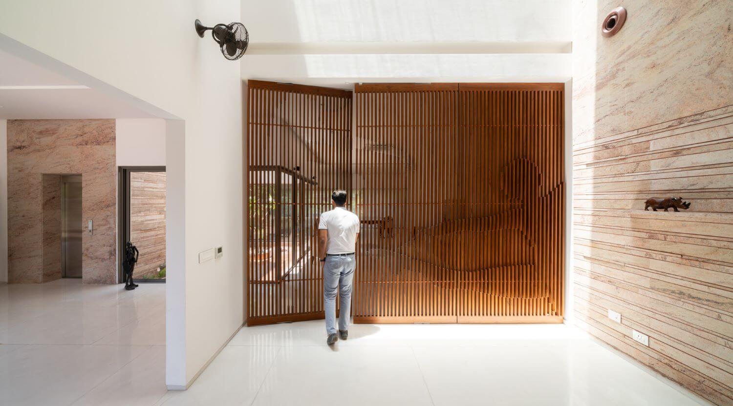
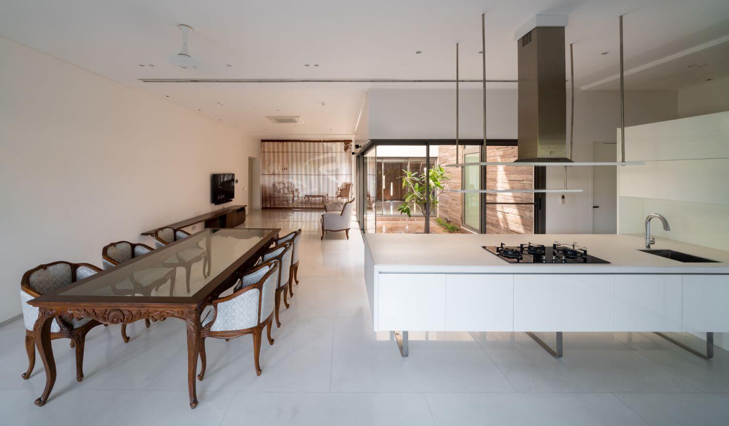
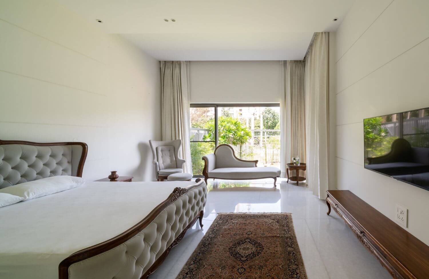
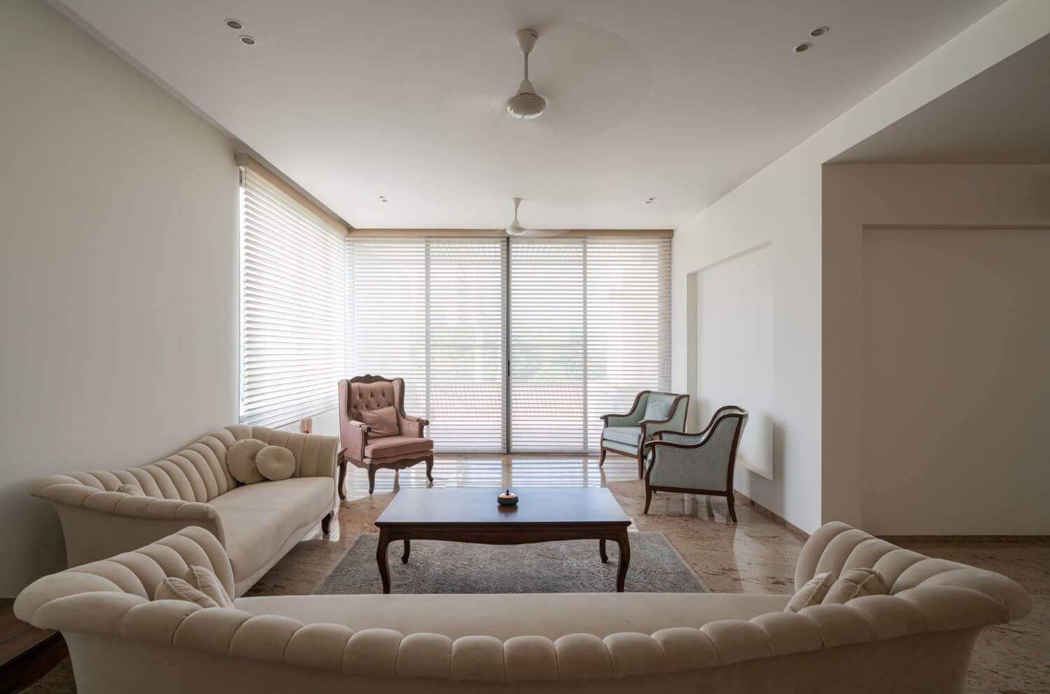
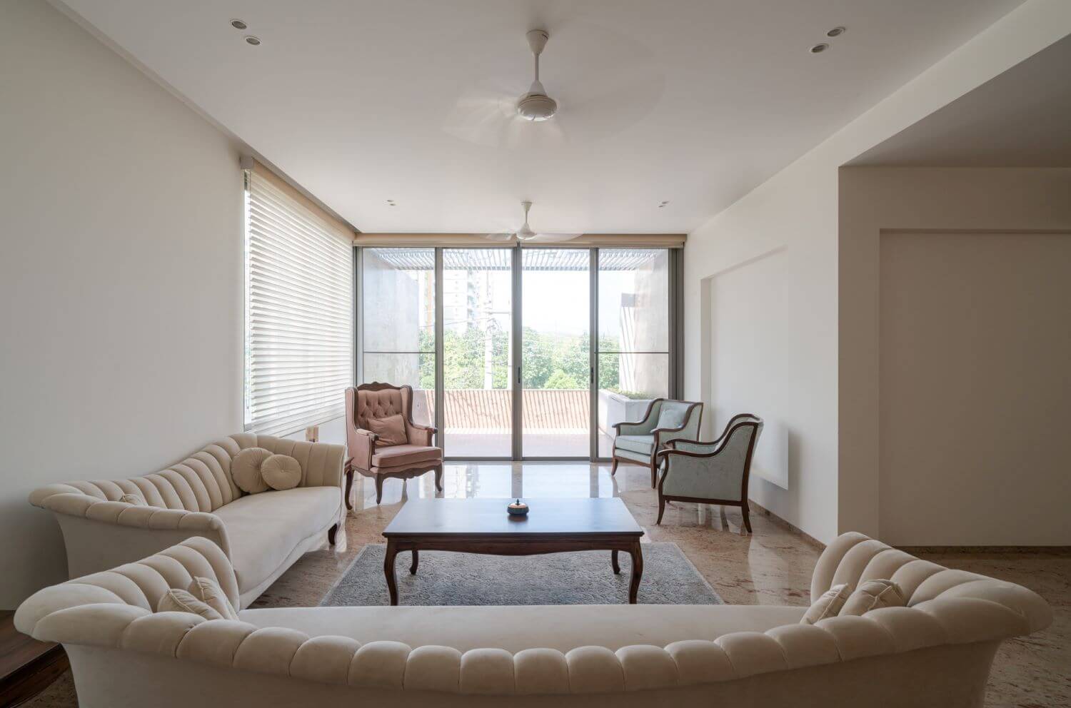
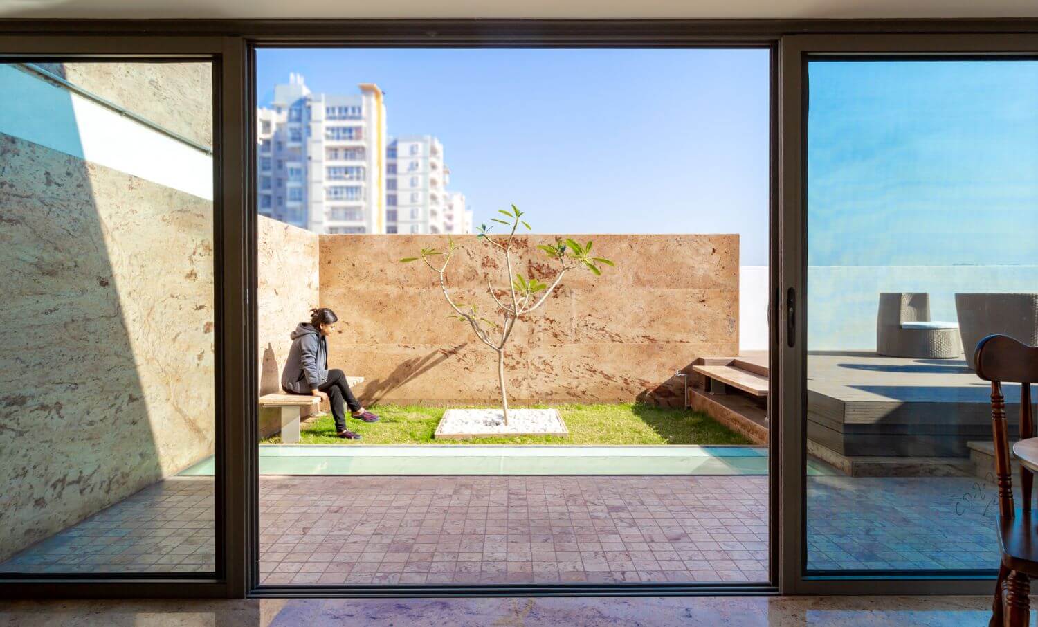
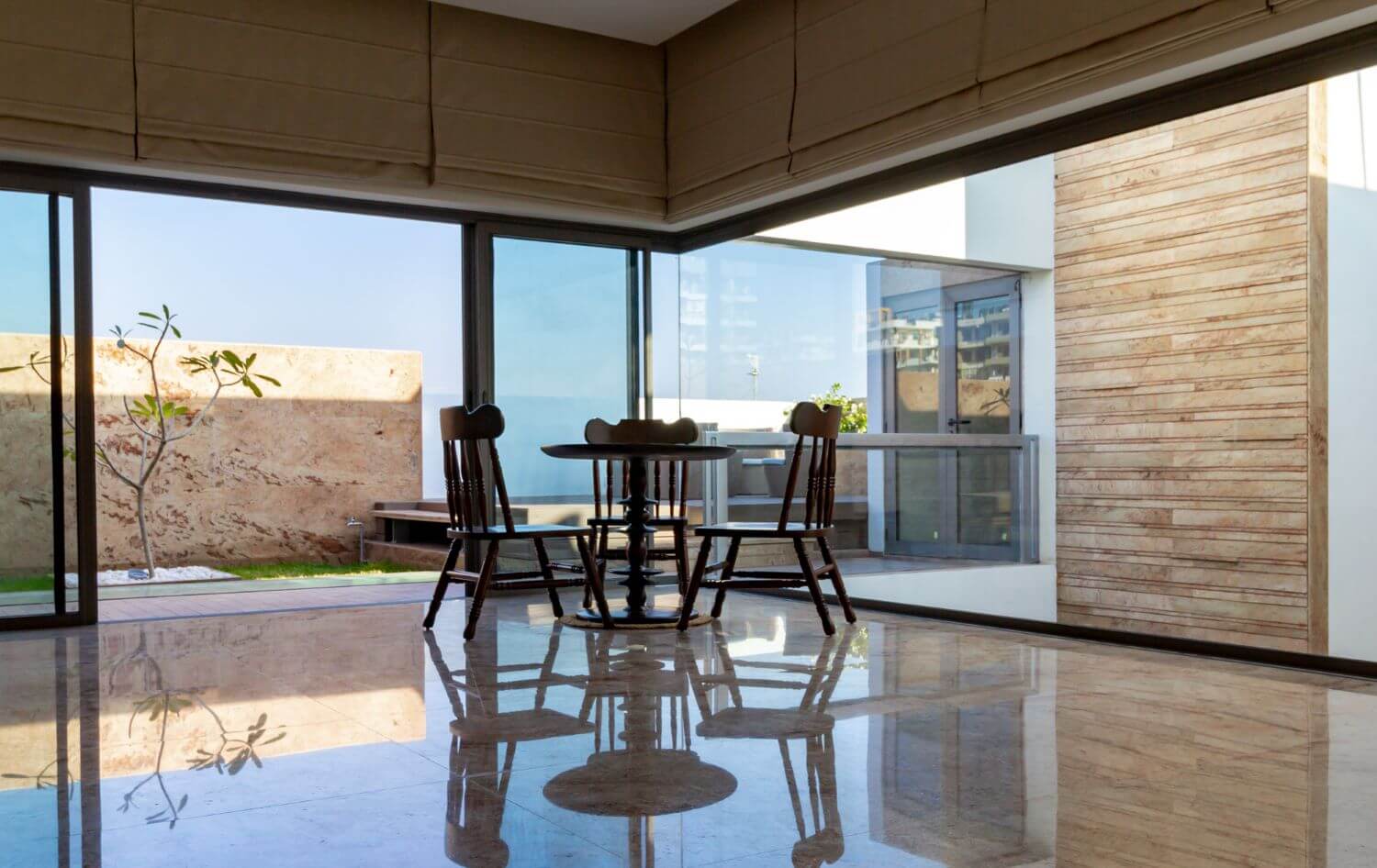
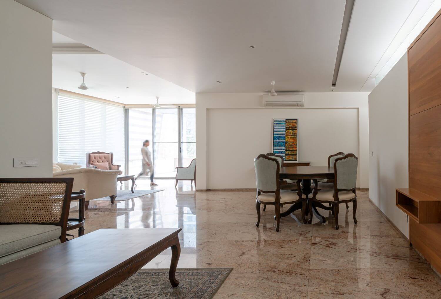
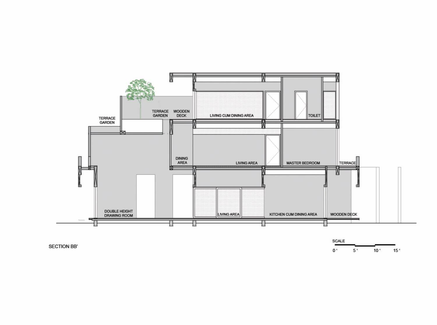
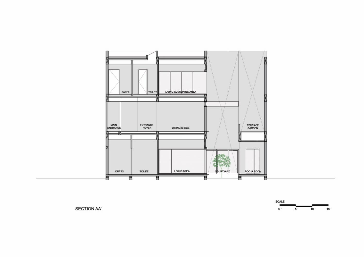
PLANNING: The overall plan is organized around a central courtyard that interacts differently with the interior spaces on different levels. It is open & accessible on the ground floor while the first floor has a ribbon ventilator to ensure privacy for the ground floor. The lower level houses a bedroom for the old lady in the front and a guest room at the back. The open plan allows the public spaces like the living room, lobby and dining to flow into one another along with an open kitchen. A separate spice kitchen along with the other amenities has also been provided.
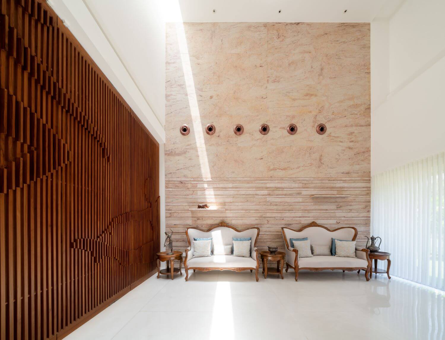
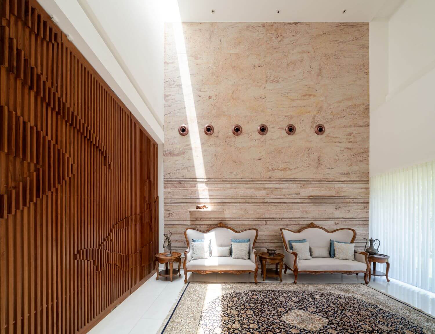
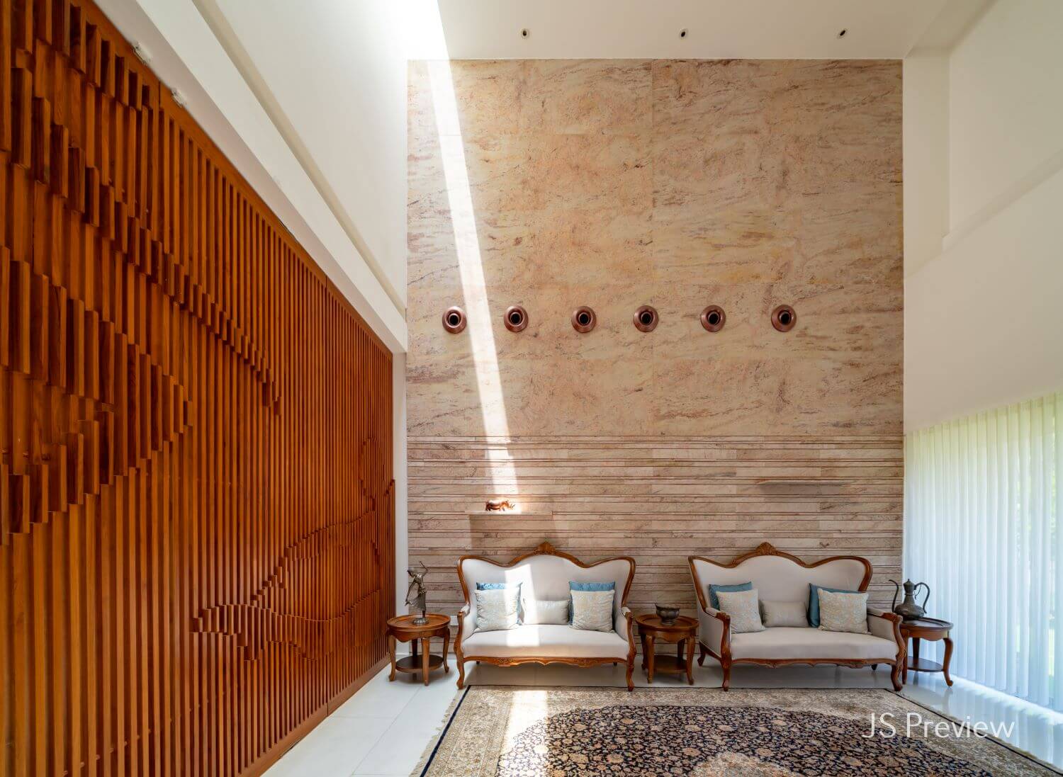
Since the ground level houses the primary occupant, the volumetric expansion was achieved by having a double height living area. Although the lady wanted to rent the upper floors, she was very keen to have the terrace to herself. This is made possible through access to a separate elevator that opens directly onto the terrace from her entrance foyer. The first floor has a 3 bedroom unit and public areas that flow on to private terraces. The second floor houses a one-bedroom unit with an open pantry. It also has 2 separate units for the domestic help of the lower floors. They too have been given separate private terraces that are not visible in the façade to ensure the maintenance of privacy. The parking and access for the lower floor is from the north-eastern side of the site while a separate parking and access to the upper levels is towards the south.
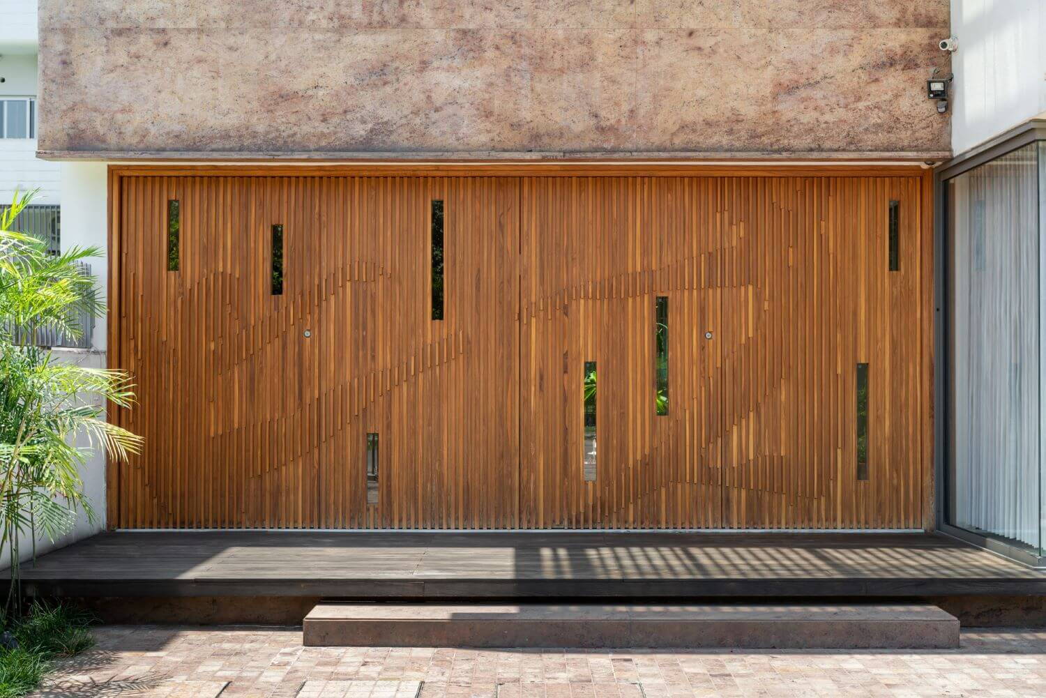
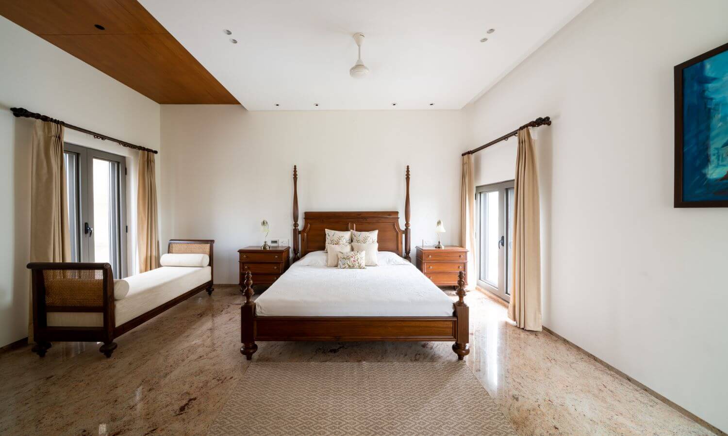
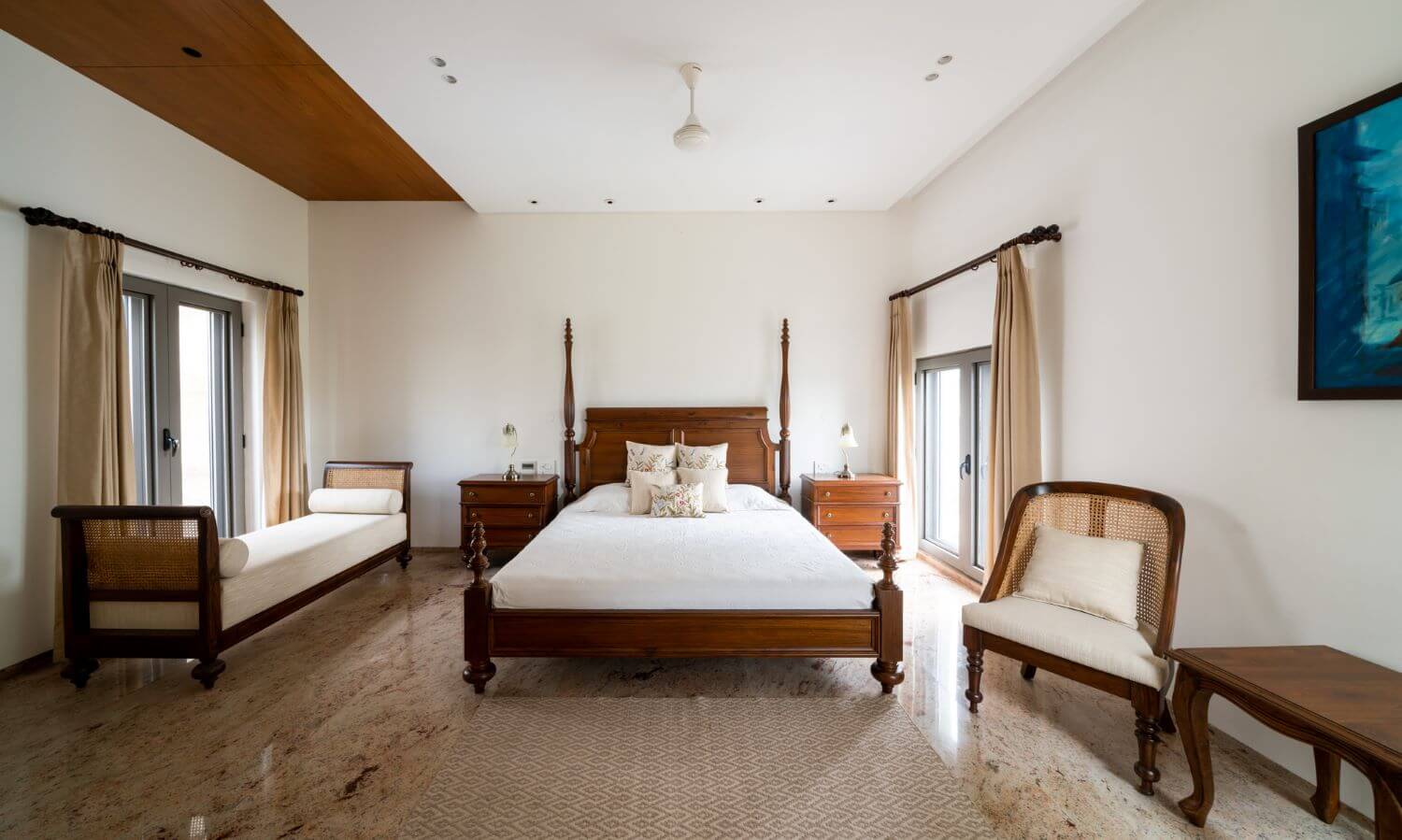
MATERIAL PALETTE: The overall material palette is limited to only white marble & Sivakasi gold granite along with simple white plastered surfaces. The flooring on the ground floor is white marble to ensure a luxurious feel while on the upper floors it is the same granite. The textures & finishes on the granite have been explored using a number of traditional techniques & craftsmanship.
