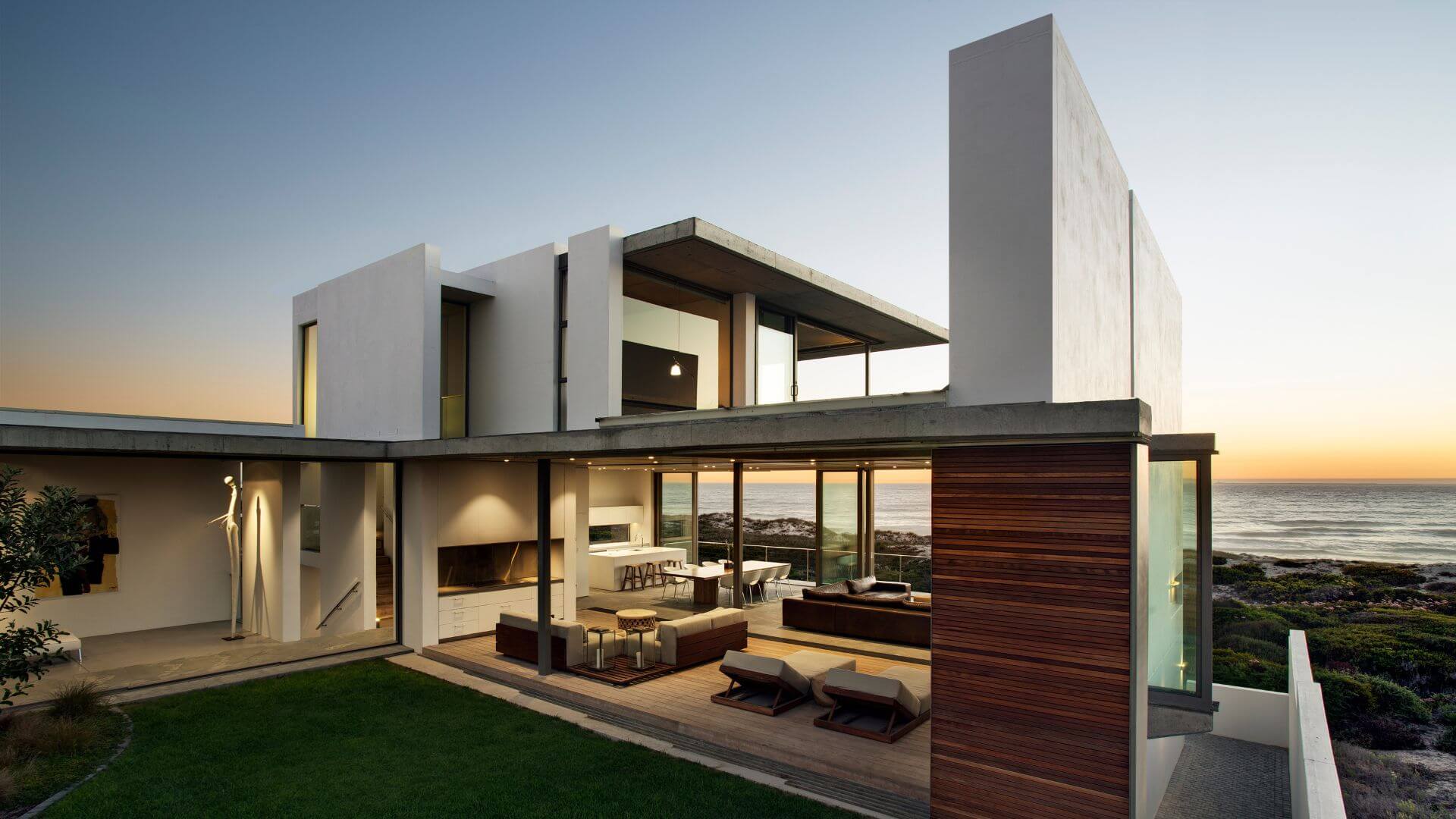
This pristine contemporary home is located on the west coast 90kms north of Cape Town – bordered by a nature reserve adjoining the ocean. Sites like this don’t come much more spectacular. Taking full advantage of the ocean views and responding to the coastal dune context, Gavin Maddock describes it as ‘a glorious site’.
The client wanted a holiday house she would eventually retire to. The brief called for a ‘modern’ house with ocean views and an observance of a limited budget, which was to include the standard accommodation requirements.
With the front dune sitting up a little higher than the rest of the site, the challenge was to reconcile house, dune and views. The result is a rectangular double storey structure of 600 square metres with imaginatively conceived outdoor living spaces. It comprises: three bedrooms, four bathrooms, generous living and dining areas both inside and out, a gallery, casual living room, a study, decks, terraces and balconies: Ocean views exist from virtually every room.
Given a limited brief the focus was on two main issues: a modern signature within the budget. The architecture and interiors enjoy various aesthetic interests and were inspired by the west coast landscape which is quite textural and typified by simple white houses and cottages, reminiscent of the Mediterranean.

Cavity brick construction was used throughout with all walls plastered and painted white. The building had to be grounded – it could not float – therefore it needed to be vertical, not horizontal. ‘Both the front and rear pavilions are two storeys and the windows are sliced through to the parapet to emphasise the verticality. The two pavilions are joined by the gallery, which is a single storey element where the horizontal lateral wall again emphasises the verticality of the main building. There is a seamless flow between these spaces and a sense of uninterrupted connection between inside and outside. The floor slabs are off-form concrete, contrasting with the painted plaster of the walls, yet further expressing the vertical line.
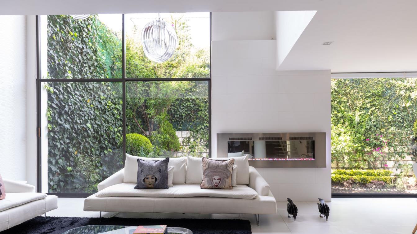
The scale of furniture, its colour and texture, were important to satisfy comfort levels. The unit seating and the dining table were custom designed to complement the space. The external furniture pieces were chosen for their scale and simplicity; bold pieces that hold the spaces together. The TV and all audio equipment were concealed in the living room wall cabinet, behind the large steel framed sliding panel that accommodates a substantial artwork. A custom designed fireplace was recessed into a stainless steel ledge.

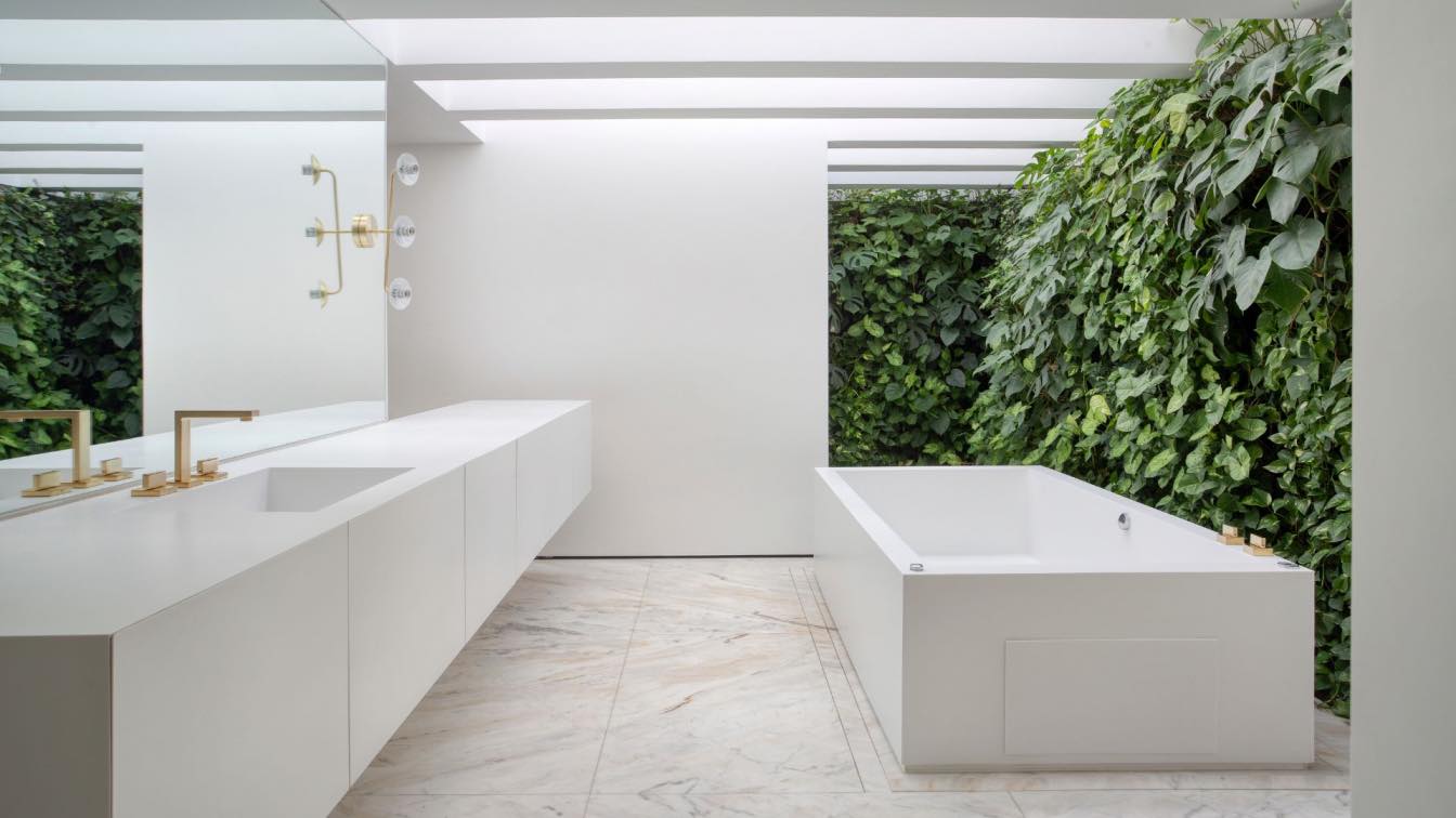
To maximise the size of the main en-suite, a custom-shower was created and glass for the internal walls was used. All bedroom floors are finished in wide-board oak flooring; the view from the master suite is ever-changing.
The granite tiles were selected for their texture and grain, which resonates with rocks in the distance, providing that external feel – of being on the terrace. Their size is proportionate to the space and contrasts with certain soft textures within the interior. Here, the selection of furniture includes various modern classics. Striving to reduce the structure to its minimum so as to maximise views, there are no ‘framed views’. The canvas had to be as large as possible on a site such as this, yet provide privacy to / from future neighbours and shelter from the elements. Using strategically placed columns, the opening was stretched to the maximum of 14 metres addressing the ocean. To achieve the lightness of the space, proportion and height was essential. Ceiling heights of 3,3 metres ensured this result, with full height sliding doors. The living areas needed to flow seamlessly, creating a feel of the outside deck to be inside and the living / dining space to include the covered terrace for flexibility. The full height sliding doors retract into the structure to form a singular space here.
The result is an individual statement of appealing symmetry, a modern home with large entertainment areas and all the mod cons.


