Robeson Architects : Situated on a busy street, the Hyde Park House seeks to maximise views to both the leafy Hyde Park across the road and the city skyline beyond, whilst maintaining the privacy of the family. Whilst not strictly a ‘heritage control zone’, both neighbouring properties had character homes on them, and the local council was very prescriptive and unyielding when it came to permitted external materials, street setbacks and building forms. The challenge was to design a home that was not ‘faux heritage’, but was rather a contemporary interpretation that fit in the streetscape, and suited the unique needs of the family.
What was the brief?
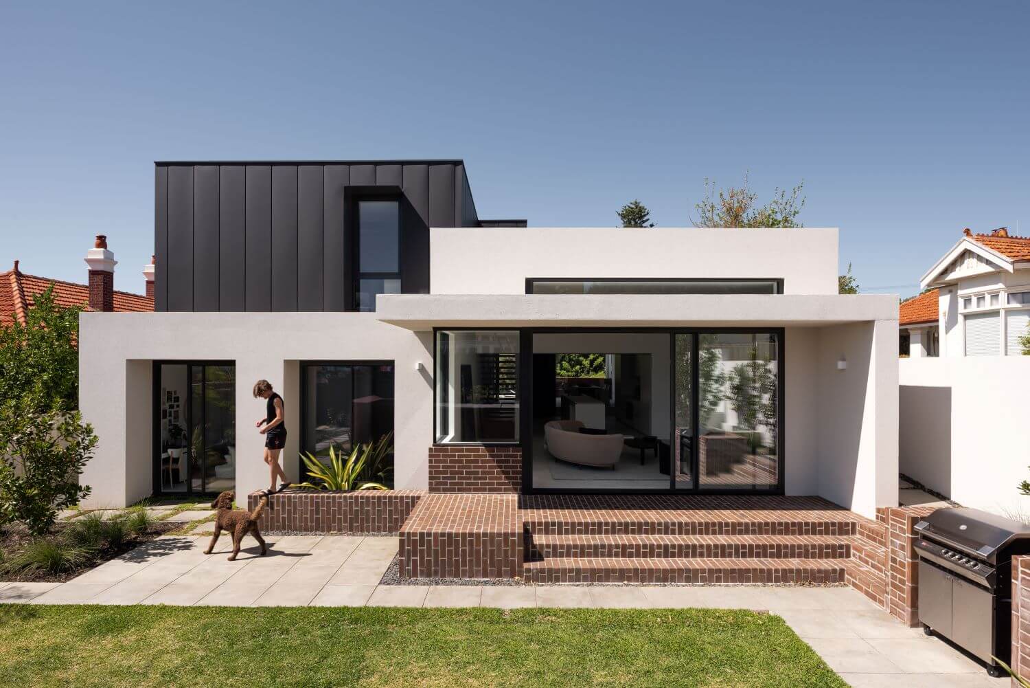
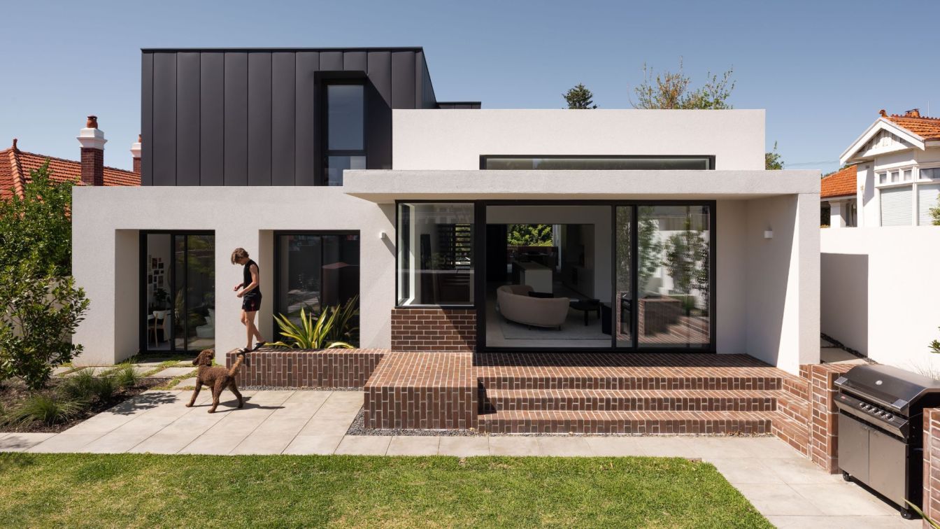
The brief called for a long-term home for the couple and their four children and pup, together with a music room for the owner to teach from. Modesty was key, it was not to look like a mansion. Our response was to design the home to look essentially single storey from the street, through significantly increased second storey setbacks and by manipulating the floor levels. She’s bigger than she looks!
We split the home lengthways down the middle, with the eastern side (housing the bedroom’s) sitting on natural ground level with a first floor over and basement for cars underneath. We decided to keep the western half of the home, the ‘living wing’, single storey. We lifted this ‘wing’ 0.5m above natural ground level which meant we could create very high, undulating ceiling heights and volumes whilst still complying with height limits. This raised living wing also allowed for great views of the park’s trees whilst providing privacy from the traffic and passersby’s below. Lines-of-sight were drawn at planning stage from eye levels of both pedestrians on the street and occupants sitting at their dining room table, to ensure this was possible. The full-height ‘Vitrosca’ glazing to the dining room slides back into a pocket wall enabling this room to stretch out onto the terrace, forming one large indoor/outdoor room that feels external, yet protected. Whilst the dining room faces south to the views, the lounge was located at the opposite end of the living wing facing north. This enabled us to design glazing and eaves for maximum winter sun penetration and no sun penetration during summer.

How is the project unique?
The lounge room opens onto a large back yard with a raised pool and deck. The pool was raised at a height so that when luxuriating in it, you can see straight through the living wing to those leafy views. The high ceilings, and tall glazing allowed for this opportunity to grab those views from even the back corner of the block. Raising the pool also removed the need for traditional pool balustrading, as the height of the pool effectively formed this barrier protection. The pool wall is clad in a burgundy Japanese ceramic tile, with recessed garden up-lighting to highlight it at night. CAPA Landscape Architects provided concept design for all garden areas, including the shape of the pool which is curved, contrasting nicely with the rectilinear building forms.
What are the sustainability features?
A decent chunk of the budget was allocated to those items that can’t be seen, but greatly improve the comfort of the family. Good move. Thermally-broken double-glazed windows along with high-spec insulation and air-tight ‘Passivhaus’ construction principles created a very comfortable home to suit Perth’s climate. Not that the home looks typically ‘sustainable’, it has a 7.4 star rating which we were quite chuffed about. Minimal windows were placed on the eastern and western façade, with the majority facing north to maximise the homes energy efficiency. The upper floor construction was reverse-brick veneer which is much better suited to Perth’s temperate climate than the preferred double brick construction that is so prevalent. Behind the charcoal metal cladding was a 30mm layer of ‘Foilboard’ and additional insulation batts.
Solar panels on the roof power the homes electrical needs, including powering the underfloor hydronic heating which is piped through the tile screed on the ground floor and under the timber flooring on the first floor. In summer ceiling fans in all rooms are utilised to assist in air flow. Operable windows are located strategically to encourage Perth’s ‘freo doctor’ to cool the home in summer afternoons and push out hot air.

Key products used:
We wanted the design to be ‘of its place’ and sympathetic to the streetscape and adjacent heritage properties. Bone-coloured stuccoed walls are used on the western portion of the home’s facade, being a richer-coloured version of the neighbour’s art deco home the west. The eastern portion of the home was clad in a reddish-brown handmade face brick, echoing the red brick used prolifically in the neighbourhood. The brown and blue tones in the brick complimented the charcoal accents elsewhere in the building. The face brick wall has a slight curve to it which subtly references the art deco homes which are predominant on this street, and softens the edges of the façade of the building. Deep, raked joins were requested for the facebrick to form deep shadows adding texture to these walls. Many samples of mortar colour were trialed on site to ensure a muted charcoal, further highlighting the brick itself.
Internally the materials are pared back and minimal, allowing the owner’s life and possessions to be the star. The walnut timber cladding featured on the external front door wraps internally around the dining room and entry to conceal a hidden powder room and coat cupboard. This timber cladding is also featured in the master suite, wrapping around the walk-in-robe and forming a cabinetry unit in the ensuite. The bathrooms and kitchen were intentionally pared-back and minimal in appearance to create calm vibes, and keep the focus on mother nature outside.