STILL YOUNG: In recent years, the women’s sportswear industry has emerged as a burgeoning niche market, ushering in explosive growth and witnessing the rising of leading brands. In 2018, NEIWAI launched its independent sports brand NEIWAI ACTIVE, which integrates textile fabrics, design aesthetics and technology to provide females with sportswear solutions tailored to various sports scenarios, including dance, body shaping, functional training, and outdoor activities.
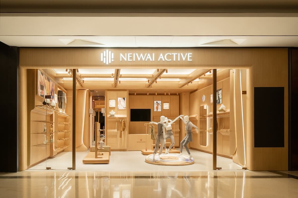
Taking a bold step towards global expansion in 2020, NEIWAI ACTIVE has successfully evolved into a global brand that blends Oriental aesthetics and international vision. In response to its aspiration for an enhanced brand image, Still Young conceptualized new stores for NEIWAI ACTIVE. Within the context of the globalized chain retail landscape, the design team anchored the concept in the brand’s product textures and styles, to infuse a distinctive sporty rhythm into the spatial experience of the store.
Dance is the poetry of footsteps; the body awakens in these moments. A liberated soul moves in harmony with the play of light and shadow through time. The interplay of light and dark produces the most exquisite colors. The quivering heart, nestled beneath the skin, attains a tranquil experience through physical pleasure and self-release.
#01. { Physical theater }
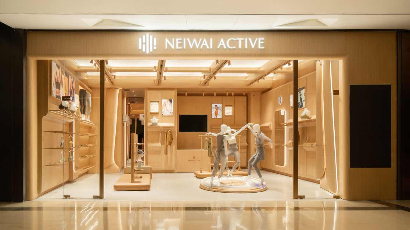
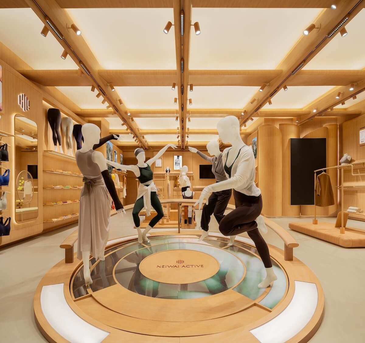
The circular island installation, inspired by Henry Matisse’s painting “The Dance,” presents a dramatic and dynamic display. Its design skillfully captures the strength and elegance of females during exercise, and harmoniously blends with the products to convey the rhythmic essence of dance. It effectively communicates the brand’s spirit of “infinite love and extreme self-discipline,” derived from the world of ballet.
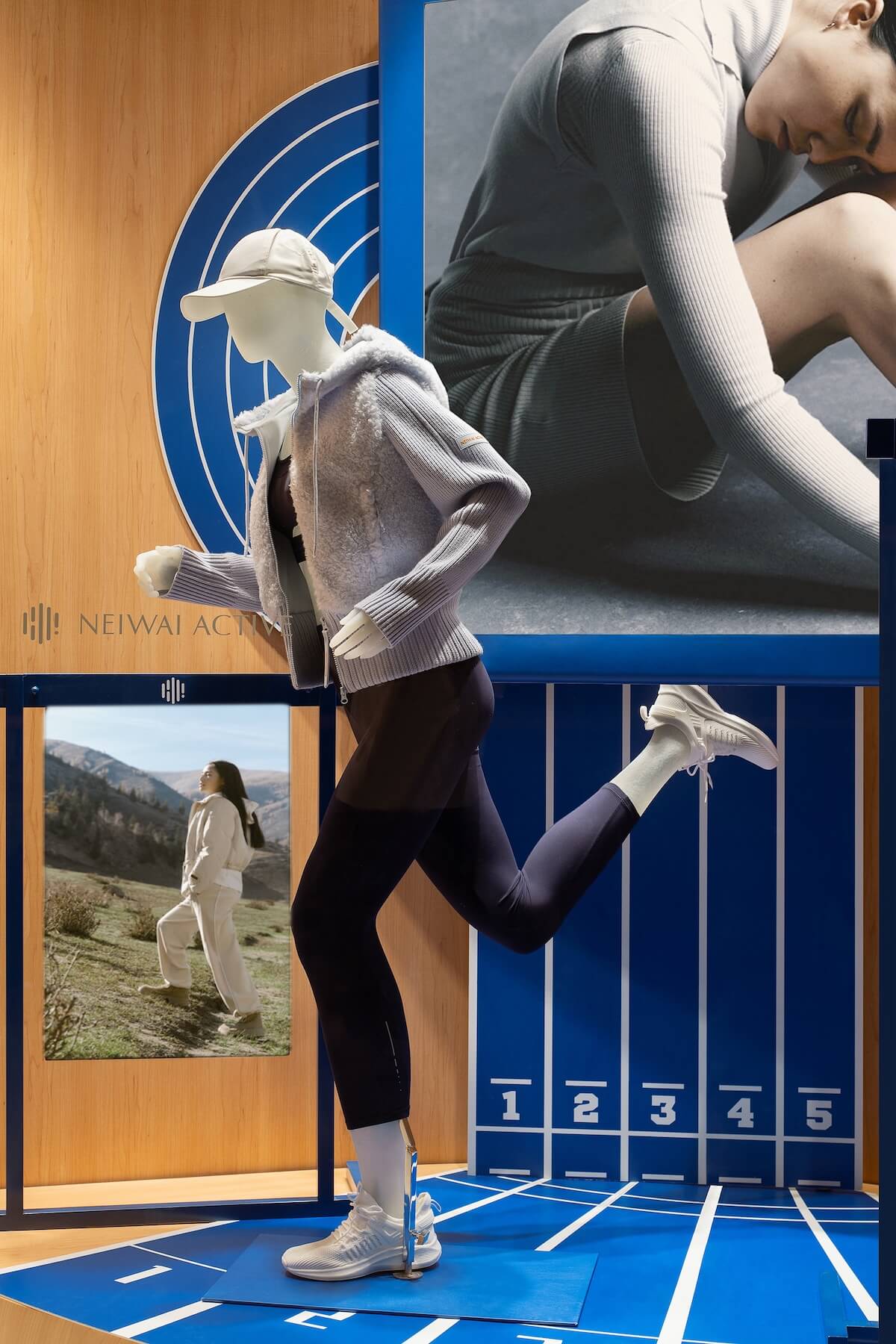
The formal design of model props emphasizes strength and dynamism over the traditional, rigid arrangement of mannequins. The goal is to move away from conventional displays that lack narrative and an immersive feel, to establish a visual identity that differentiates NEIWAI ACTIVE from other women’s wear brands.
Throughout the process from modeling to sample creation in the factory, the design team systematically considered the details of these customized mannequins. The goal was to explore authentic body language and showcase the graceful beauty of physical movement. The natural and lightweight resin used for mannequins is well-suited to the unique fabrics of products and is consistent with the brand’s identity and product attributes.
#02. { Light and atmosphere }
A gentle atmosphere permeates the “interior” space, to differentiate it from the “external” environment of the property. Every inch of space is designed with purity, offering a pleasing, expansive and free visual experience. The 3-meter-long island becomes the visual focal point, contributing to a smooth loop circulation. The open circulation allows customers to freely explore the displayed products, providing a broad view and a playful spatial experience.
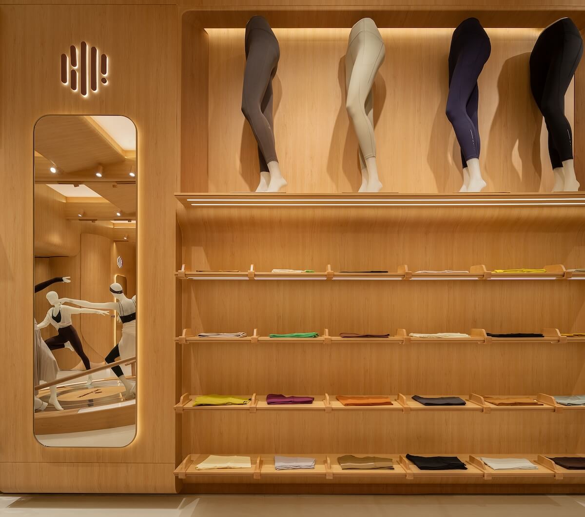
Wood color, curved lines and modular elements are employed as key components to construct the space. Through appropriate proportions, scales and the play of light and shadows, the design creates a space reminiscent of a pilates studio, characterized by rich layering and a serene vibe.
In lighting design, the design team utilized soft floodlighting to establish a welcoming atmosphere while ensuring essential illumination. Beams, air outlets and spotlight tracks are embedded into the overall structure. Spotlight tracks are strategically positioned on the side panels for supplementary lighting, to create diverse atmospheres and scenes through point light sources and natural light.
The regularly criss-crossing wooden ceiling facilitates a gentle transition between light and architecture. It is intended to simulate a komorebi-like effect, evoking a scene that sunlight filters through trees in a forest.
The interior walls emanate a sense of softness and order. Designed in the likeness of curved petals, these walls utilize sheet-like prefabricated decorative modules to emulate the appearance of cloth while retaining the pure and simple expressive texture of the material itself.
The light brings subtle variations to the wood-grain surface, adding a sense of movement to the minimalist space. Meanwhile, the random fabric details enrich the overall spatial experience.
#03. { Balance of rigidity and flexibility }
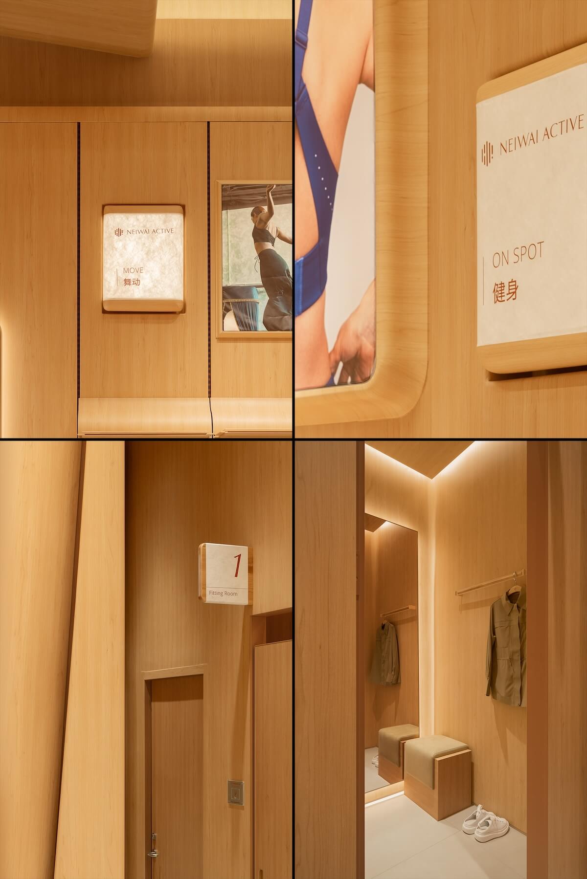
Through the investigation of brick and mortar stores, the design team identified challenges that required resolution, such as conflicts between functional areas arising from a weakened signage system. The primary challenges for this project involved how to systematically organize display and functional areas, and how to establish a more systematic signage system and display design to guide the circulation in the space.
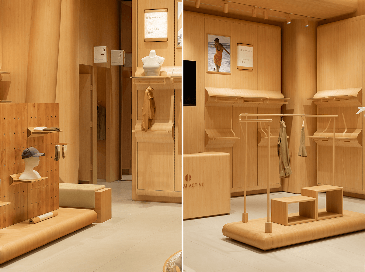
In crafting display props, the designers used curved surfaces to balance with the right angles in the space. The overall rational tone is complemented by wooden and textile textures, achieving a subtle balance between square and roundness, rigidity and softness, and creating a flexible scale in the space.
The interior skin of the space is defined by soft-tone walls, while the displayed products and props are extensions of the “exterior.” The interior facades feature concealed structures, which are embedded into the framework to simulate sewing threads, making the interior facades like an envelope for the skeleton.
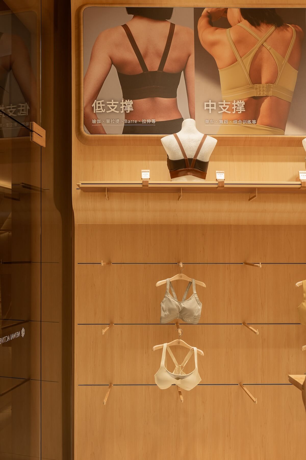
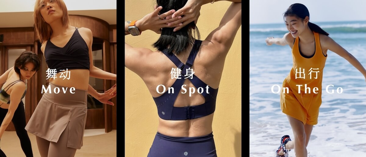
The design team tailored modular props for NEIWAI ACTIVE’s different products series such as “MOVE”, “On Spot” and “On the Go”. Additionally, custom-sized panel walls were also created for accessories within these garment series.
The assemblable prefabricated modules provide convenience for maintenance and replacement, and also offer abundant space options for garment storage and organization. In addition, these modular components provide flexibility to cater to the operational needs of the store, such as incorporating new arrivals and adapting to the changing lengths of clothing in different seasons.
The display design doesn’t intend to separate different product series, but rather to guide customer behaviors in the store and to capture their attention with the visual elements. After analyzing the product series, the design team developed a display solution accommodating different scales and multiple scenes. The display scheme prioritizes the compatibility of display props and garments while integrating design aesthetics with technological functions.
Moreover, the brand’s signature fabrics are integrated into the design of display shelves. Soft textiles adorn the clothes racks and rails within customers’ reach, encouraging them to feel the fabric textures more closely and bringing a warm sensory experience.
Still Young employed efficient modular design and delicate lighting displays to fulfill the functional requirements of the NEIWAI ACTIVE stores. The design team leveraged the soft texture of fabric and the dynamic tension of movement to craft a distinctive space to engaging with the brand. This design approach conveys the brand's ethos of "capture beautiful moments, maintain inner harmony, and embrace external challenges."
In narrating the brand’s story, the space unfolds a delightful shopping journey for consumers. It conveys an expectation that females discover more possibilities while embracing themselves.
