Building Refurbishment – třiarchitekti
We have been working with the investor for a long time. From the generous intention of extending the apartment building, he finally decided to start with the implementation of extending the commercial space to the basement and the structural preparation for the future extension.
The main part of our work therefore remains invisible, hidden under neutral high-quality finishing materials. And that's the way it should be. We are all the more pleased that the commercial space was leased by an enlightened client who had the store designed by ORA.
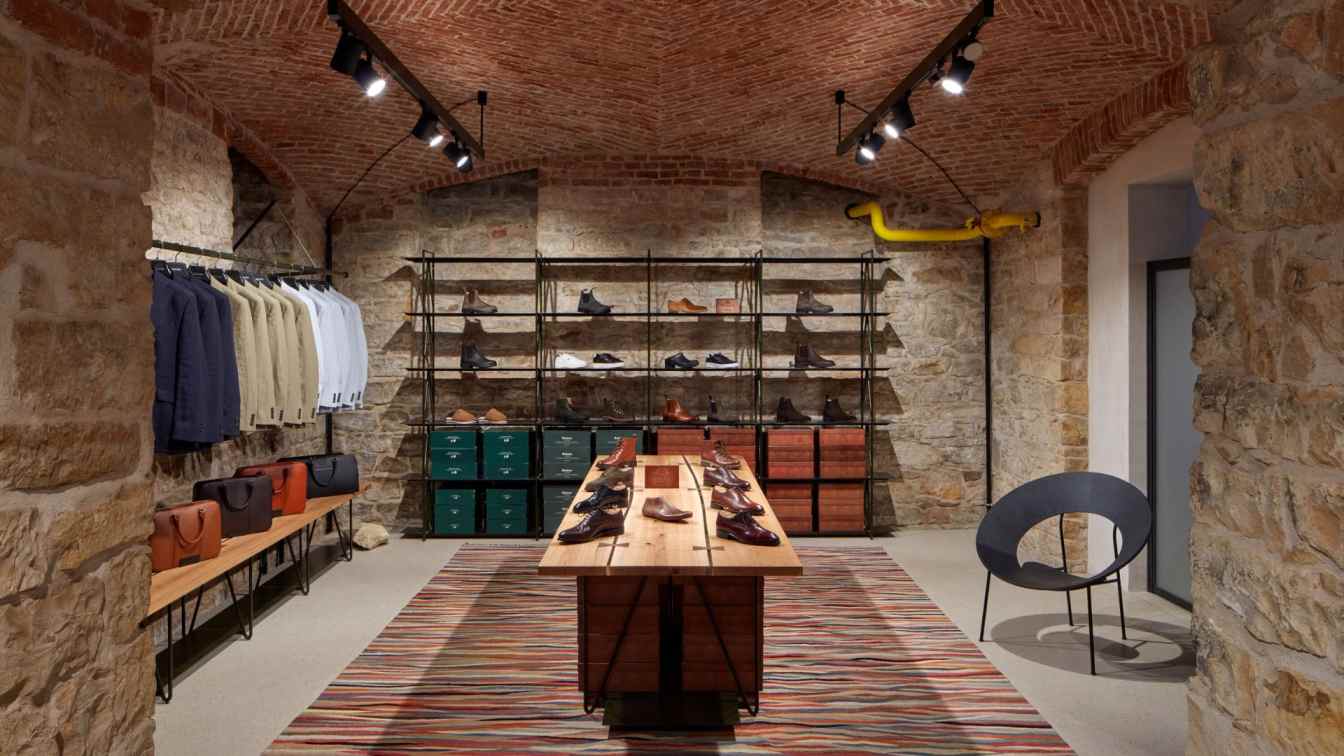
Our proposal consists primarily of transforming the original basement space into a commercial space. We are leaving the grand vaulted rooms unplastered. The darker surfaces of the brick vaults and stone walls are complemented by a new light-coloured floor made of polished concrete, separated from the old walls by a distinctive joint. The ground floor undergoes only a facelift, with the most significant intervention being the new terrazzo staircase that connects the basement to the ground floor. We carefully searched for the location of the staircase and managed to choose a place that naturally connects to the entrance. We found a balance between an economical and comfortable solution and the least possible structural intervention.
The material palette of the spaces is moderated to be as versatile and timeless as possible.

Gentleman Store Interior Design – ORA
We were approached to design the interior of a boutique in a space that had just been very well refurbished. Therefore, there was no need to create an elaborate backdrop or to mask anything. We are not turning away from the existing architecture, on the contrary, we are stepping towards it. We are not overshadowing the space, but complementing it naturally. At the same time, the design deals with the issue of selling quality goods. It is not so empty that it resembles a gallery and over-fetishizes individual pieces, nor is it so crowded that the products merge into one mass. We are looking for a balance between these two positions.
Craftsmanship
The store focuses on quality predominantly British men's fashion. The interior therefore avoids ostentation, instead aiming for asceticism. The designed furnishings are simple and transparent, but are perfectly crafted in detail and use only a few high-quality materials. All substitutes are avoided. We want the interior to be inviting to touch, to feel solid.
Playfulness
We want customers to enjoy exploring the interior as much as we enjoyed designing it. We let the geek in us show through. We're more interested in how a thing is constructed than how it looks at first glance. We want the interior to encourage exploration at a second glance.
Furniture
Stable craftsman tables made from solid oak planks with defects. The tables reflect the craftsmanship. They are distinctive solitaires perched on the floor. Lightweight hangers represent lightness of construction. Although they are subtle, they can carry a large amount of clothes. However, they are here not for decoration, but for utility. They are balanced by coarse stones that were removed from the house during the renovation. We discovered them in the backyard where the landlord kept them. Folded pieces of sheet metal serve as shelves. Simple raw material, simple repetitive motif. We leave most of the shelves open, there's no need to hide the products.


About studio / author
ORA stands for Original Regional Architecture. Most of the studio's work consists of modifications to existing structures. The authors like to work with structures and fragments that have been condemned to extinction in order to revive them in a new context. In addition to creating houses and spaces, the studio also deals with the design of individual objects.

