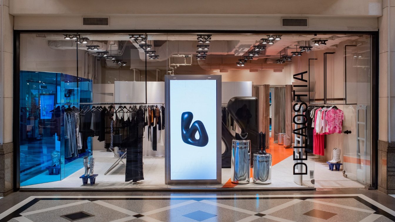
Vang Studios: The project emerges as the new image for DELAOSTIA stores, a prestigious Argentine brand with a strong history in women's clothing. It caters to a youthful audience through its daring designs that stand out for their contemporary style. The project's premise was to create a powerful visual impact, inviting its audience to immerse themselves in a sensory and futuristic fantasy, and breaking away from the traditional notion of retail stores.
From the exterior, the boundaries already appear blurred with a spacious and uninterrupted shop window. The envelope presents itself as neutral to allow for material experimentation: saturated colors, colored mirrors, curved surfaces, rough and glossy textures all coexist in the store to present this new avant-garde image that consistently conveys quality and sophistication in its proposition.
The icon, the brand's new symbol, stands as the focal point of this landscape. It is a solid structure with an inflatable appearance that functions as an articulation of the store and its circulation. The clothing racks are made of stainless steel, the garments become figures against mirrored backgrounds, and the reflections transform into textures that evolve with the movement of people throughout the space. An orange path invites exploration and indicates the transition towards the fitting rooms, where surfaces take on three-dimensional volume. The lack of orthogonality, both in the furniture and in the layout and supports, creates a dynamic visual movement in the perception of the space.

Some objects intentionally border on the absurd. Cones are also used as a device to display footwear; mannequins have been replaced by screens showing life-sized human figures, highlighting the transition towards the digital realm; the counter as a prominent object no longer exists as such, and now it is a hidden niche behind a window. The store ceases to be a mere container for garments and transforms into a meta-urban set, capable of transforming our ephemeral relationship with commercial spaces into an experience that turns us into active spectators in a new shopping fantasy.
What was the brief?
This commercial store project aimed to create a new image for the brand's flagship store. The objective was to establish an aspirational model that represents the brand's desired positioning. The design aesthetic needed to be distinctive from competitors in the market, avant-garde, and impactful.
What were the key challenges?
The store has limited square footage, and due to the inclusion of several specific and intricate pieces, it was essential for them to harmonize seamlessly with each other without overwhelming the overall result.
What were the solutions?
In the initial stages of the project, decisions were made regarding the key elements that would be the main focus. These elements, considered in terms of their volume, include the inflated isologo positioned in the middle of the store and the cone cladding in the fitting rooms, initially hidden from view. Secondary elements such as the stainless steel table and the blue-colored mirror are then introduced. Additionally, the ceiling disappears to expose the visible installations, which are unified with the walls in a light color, creating spatial continuity. Finally, the cash register is concealed as an extension of the storage area, allowing the limited space to be solely dedicated to the compositional elements of the project.

Who are the clients and what's interesting about them?
The brand attracts a young audience that actively participates in the nightlife scene. In this context, the goal is to make the in-store shopping experience enjoyable and to create an innovative proposition, a setting that invites people to take photographs.
How is the project unique?
The aforementioned elements are custom-made based on the brand's image, aiming to build customer loyalty. Each element is carefully designed and crafted to align with the brand's vision and appeal to its target audience.
Key products used:
Elements such as the fiberglass sculpture, the cladding of orange cones, the blue-colored mirror, and stainless steel were incorporated into the design.
What building methods were used?
The entire construction is carried out using dry construction methods.


