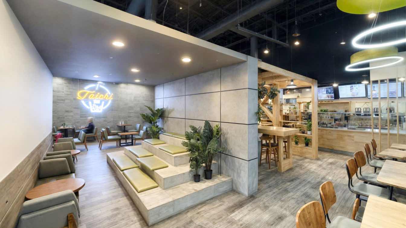
TCT Design: The design of Taichi Bubble Tea in Ithaca, NY, near Cornell University, was driven by the diverse needs of the surrounding academic community. The goal was to create a multifunctional space that went beyond a typical self-service restaurant, offering a flexible environment where students, locals, and visitors could study, collaborate, and socialize while enjoying meals and drinks. Central to the concept was the creation of an indoor garden, featuring versatile seating arrangements and a welcoming atmosphere, all anchored by a strong commitment to sustainability through the use of natural materials like wood and indoor greenery.
One of the main design challenges was dividing the large dining area in a way that made the space both functional and visually engaging. The task was not just to ensure a comfortable dining experience but to prevent monotony. Early difficulties included balancing the need for a variety of seating options while maintaining a cohesive design that could accommodate both work and leisure. The space also needed to feel warm and inviting, despite the modern aesthetic, which required careful selection of materials and lighting to create the desired ambiance.
Consistency, a core principle of franchise design, was another key focus. The team retained the organic diagonal pattern, a signature design element inherited from the first Taichi Bubble Tea location. This, along with the brand’s characteristic use of natural wood finishes and indoor landscaping, helped reinforce Taichi's identity. To modernize the look and give it a more industrial feel, concrete elements were introduced, which complemented the exposed ceiling and ductwork, adding an edgy vibe without sacrificing the brand’s essential warmth.
The spatial layout of the restaurant was thoughtfully designed to encourage different forms of interaction, with distinct zones created for individual study, group collaboration, and casual lounging. These areas were organized to support both studying and dining.

Guided by the existing structural columns, the space was divided into seven sections. The most creative and multifunctional area is positioned at the center of the restaurant, featuring a welcoming entrance lounge enriched by indoor landscaping and the Taichi branding logo, which fosters an inviting and warm atmosphere. Behind the branding wall is an amphitheater, partially enclosed with lightweight concrete panels. Equipped with a projector, this space allows customers to project content from their phones, enhancing versatility while promoting both privacy and interaction. Adjacent to this area is a collaborative space defined by a wooden ceiling and dividers that incorporate Taichi’s signature organic diagonal pattern. The existing columns are concealed by these wood dividers, creating a semi-private area with high tables and a whiteboard, ideal for studying or collaborating after meals. On either side of two circulation aisles, one features flexible seating benches while the other offers lounge seating. A one-way circulation path against the wall directs the order line, effectively organizing traffic flow and dividing the space into distinct sections.
To balance the square and linear design elements, a series of suspended circular features were added, creating a playful contrast. Circular ring LED lights, combined with floating round ceiling clouds, soften the industrial aesthetic, adding a sense of lightness and whimsy. Round tables further enhance the curved visual language, offering variety within the dining areas. The lighting design amplifies this balance, with organic-patterned wooden ceiling clouds serving as a backdrop for industrial-style pendant lamps. These lamps were strategically suspended to emphasize the interplay between linear and curved forms, creating a visually dynamic space.
The project employed a combination of sustainable and modern construction techniques, focusing on eco-friendly materials and energy efficiency. Warm wood finishes, certified by the Forest Stewardship Council where possible, were paired with sleek concrete elements to achieve a balance between natural warmth and contemporary design. Cabinetry made from 90% post-industrial materials with no added formaldehyde, and lightweight concrete panels with zero VOCs, were chosen for their sustainability and durability. The lighting system was retrofitted with energy-efficient LED lights, and appliances such as Advansys dishwashers and ENERGY STAR-certified ice makers were installed to reduce energy consumption. Additionally, energy-use schedules and temperature settings were optimized to further enhance the sustainability of the space.
The combination of thoughtful spatial planning, varied seating arrangements, and a bold yet welcoming aesthetic has made this Taichi location a standout in the community. The design has been highly praised by the landlord for increasing foot traffic and revitalizing the surrounding area. This project demonstrates how good design can not only enhance a space but also drive positive economic impact.


