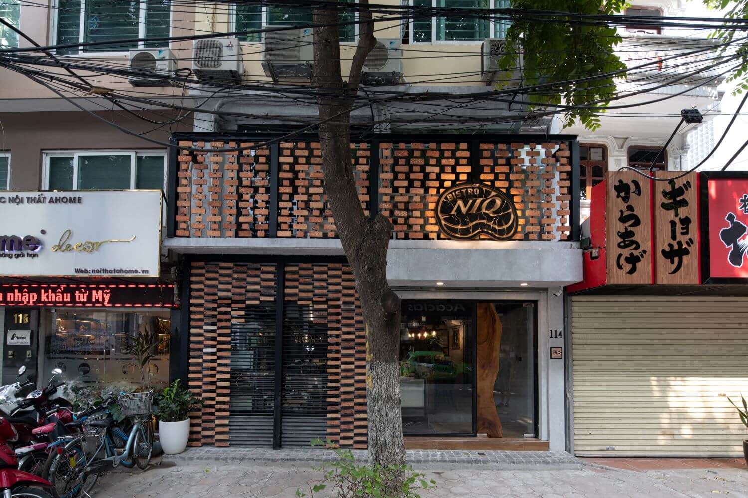
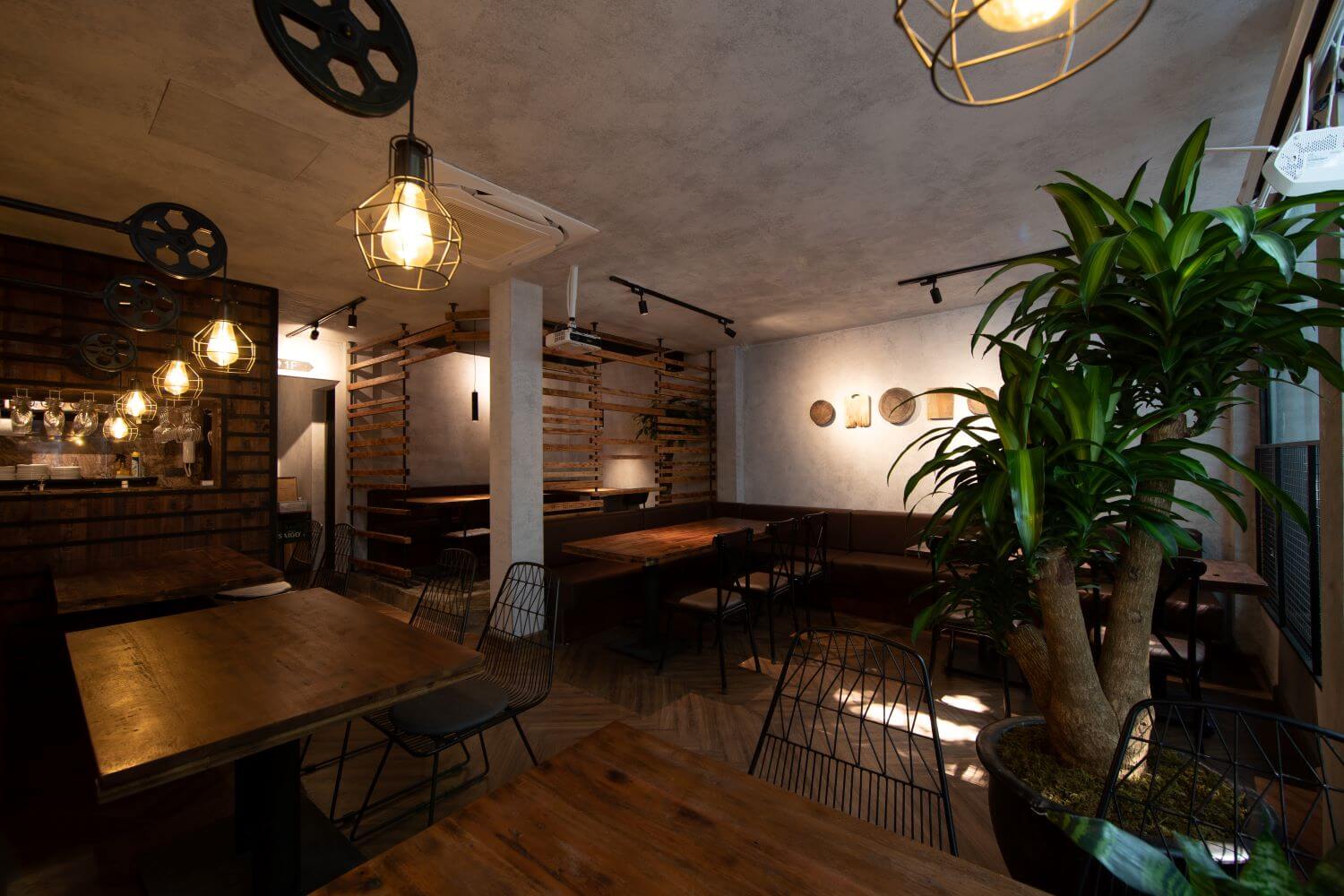
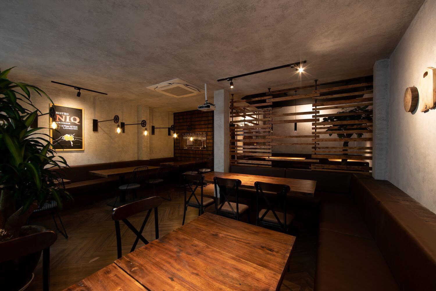
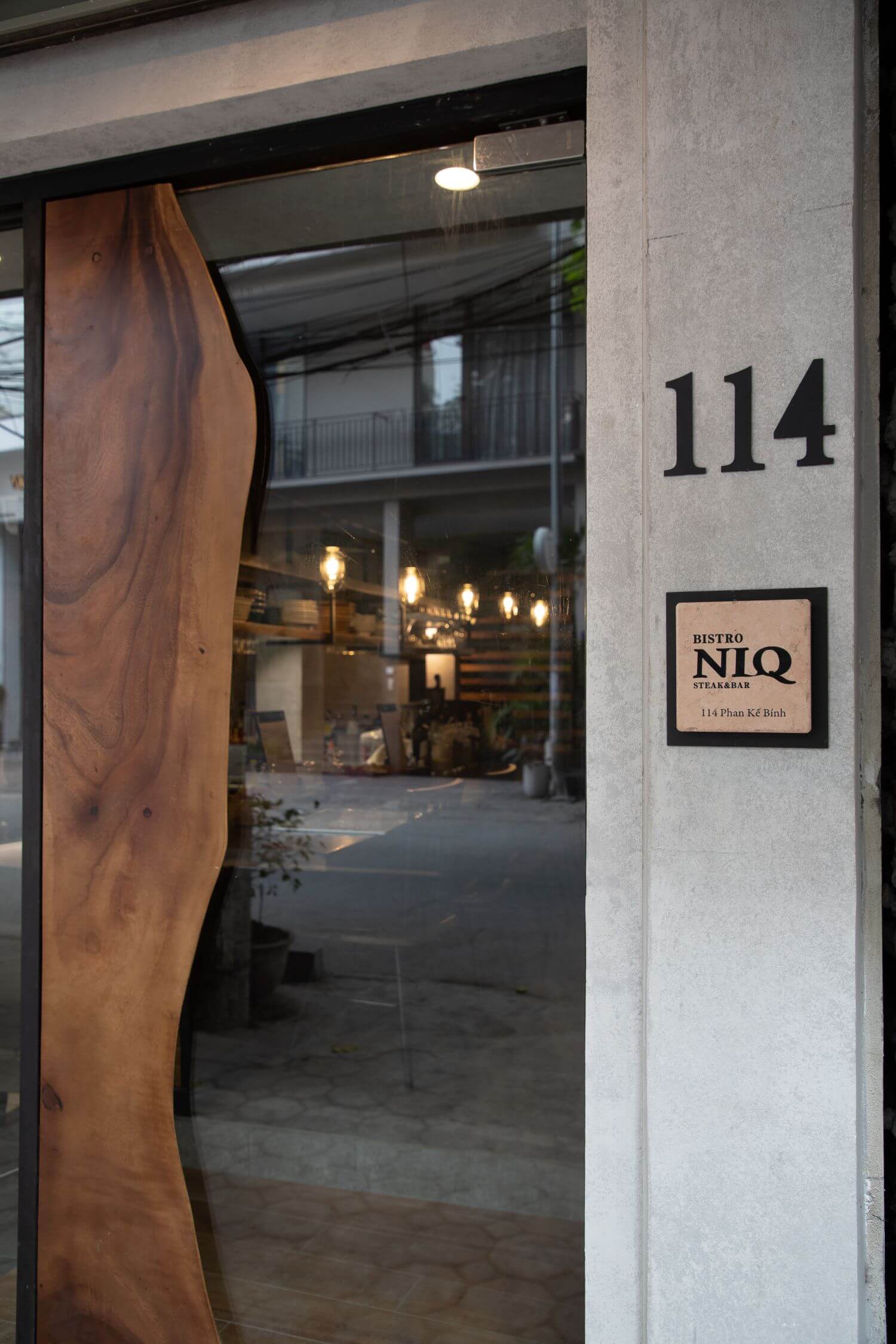
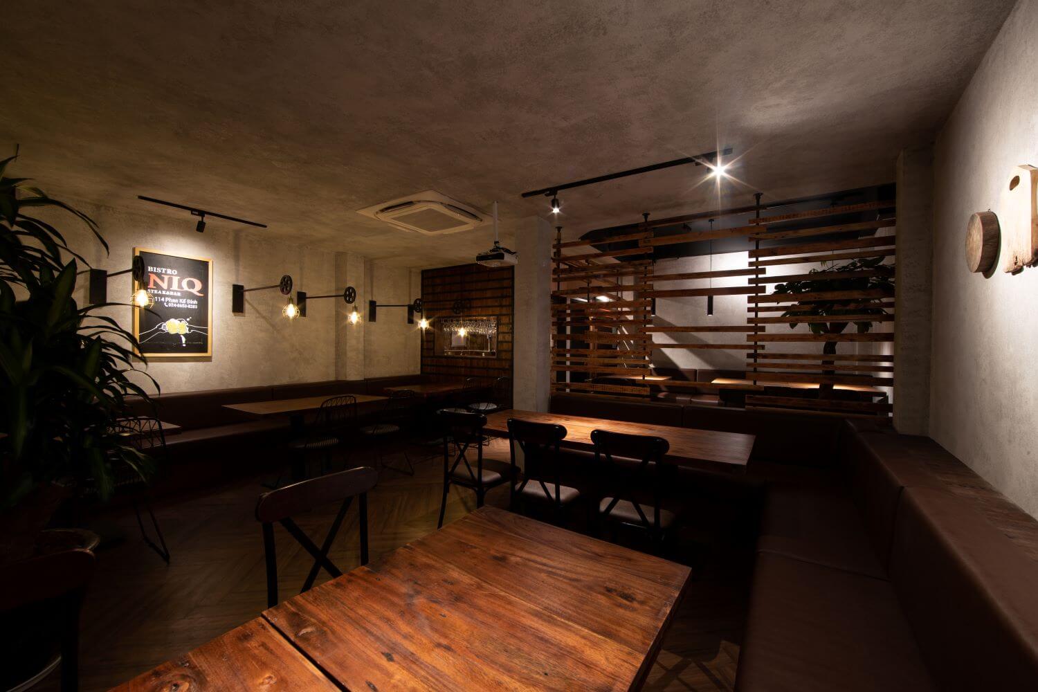
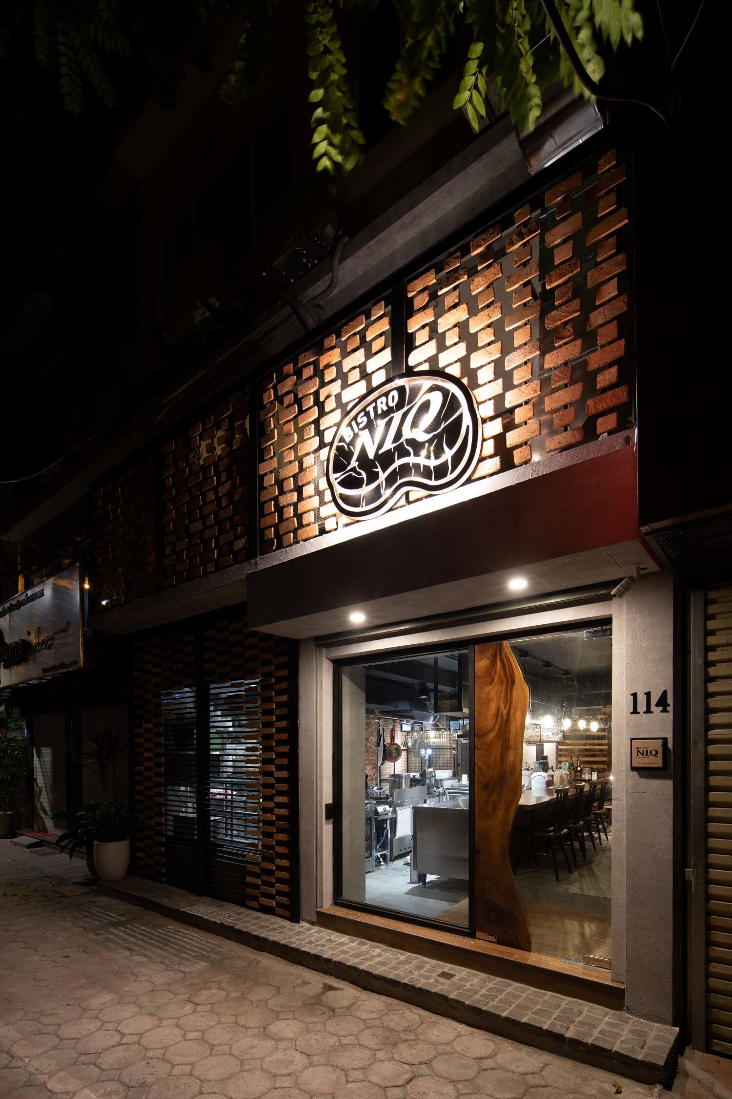
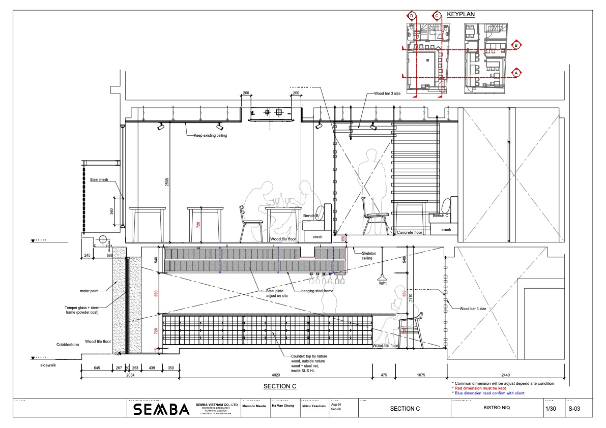
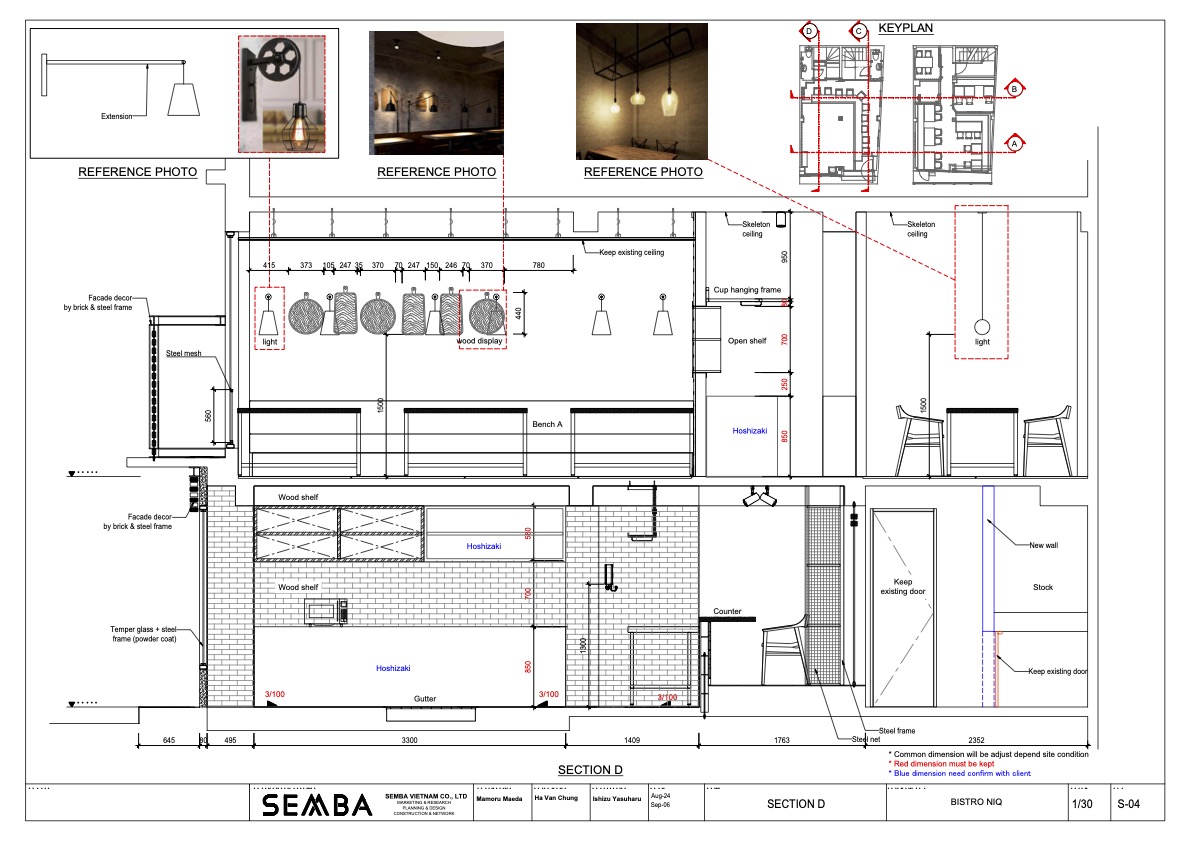
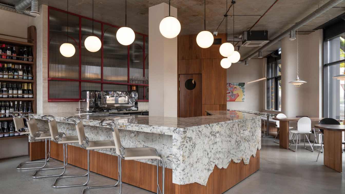
SEMBA VIETNAM: The location faces "Phan Kế Bính Street". This street is a popular Japanese street in Hanoi city these days. It is also popular with Europeans and Americans and is a lively place.
"BISTRO NIQ" is based on the concept of [dining that not only satisfies your stomach, but also satisfies your mind and heart] with a focus on ingredients. I thought about the design with the theme of ~ a healthy dining where you can meet the real thing ~.
The owner himself was full of expectations and hopes as it was his first overseas store. However, since this was my first overseas business, I also wanted to keep the investment as low as possible.
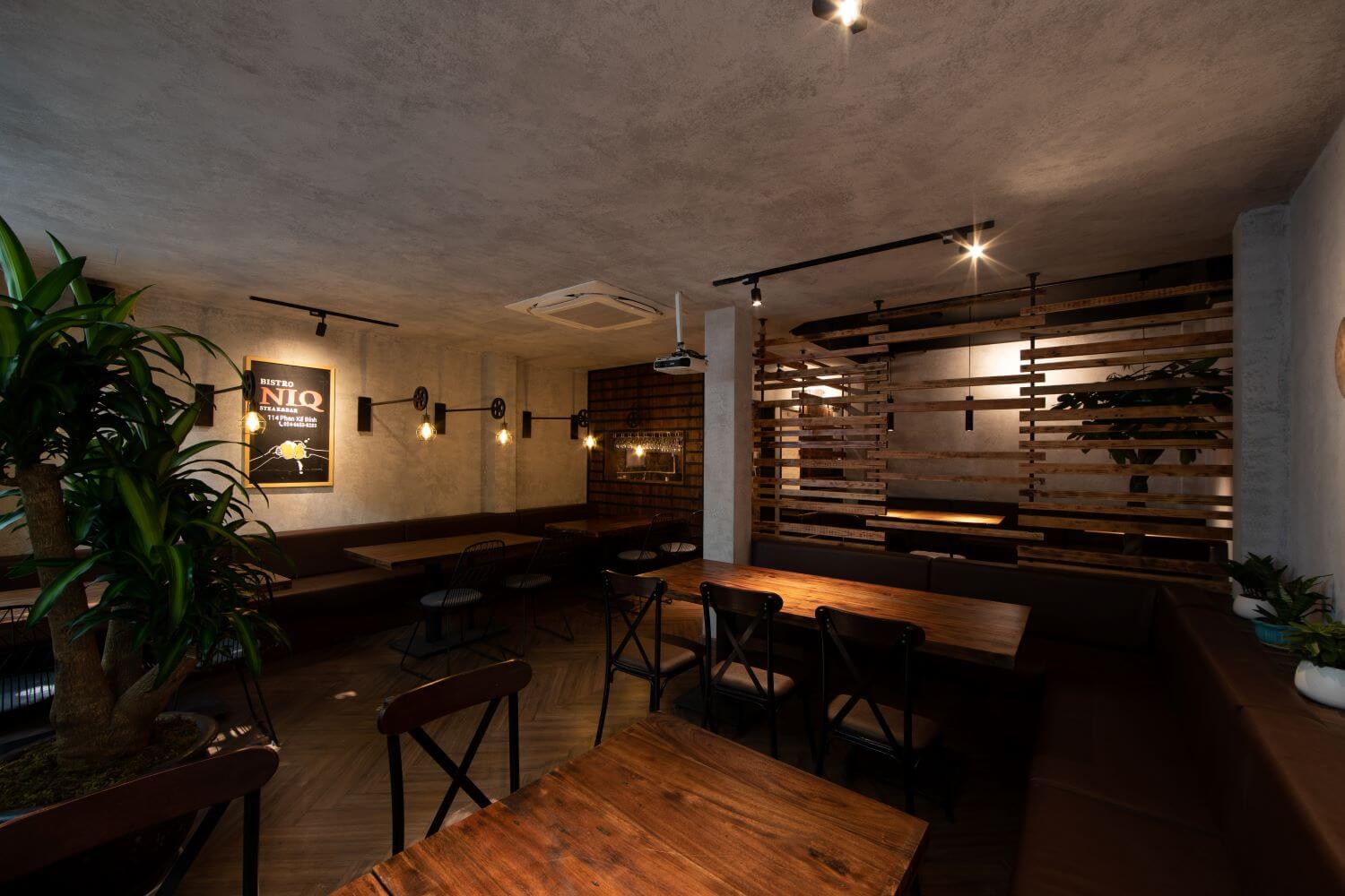
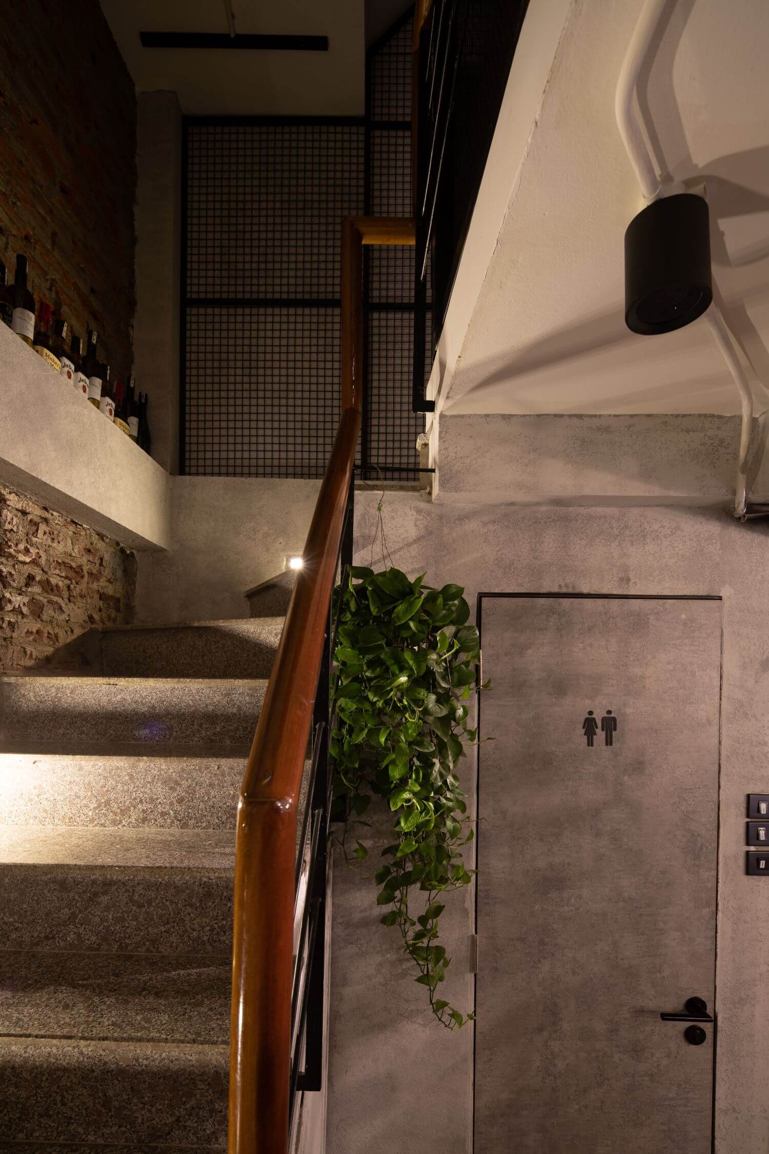
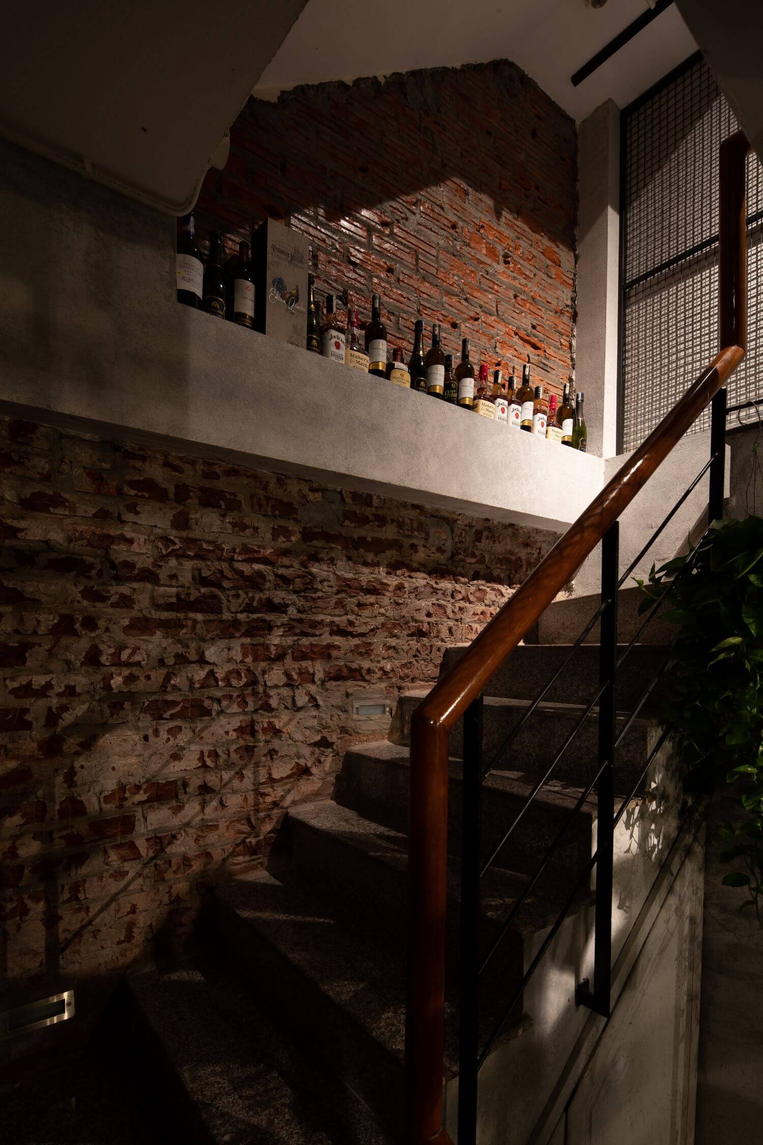
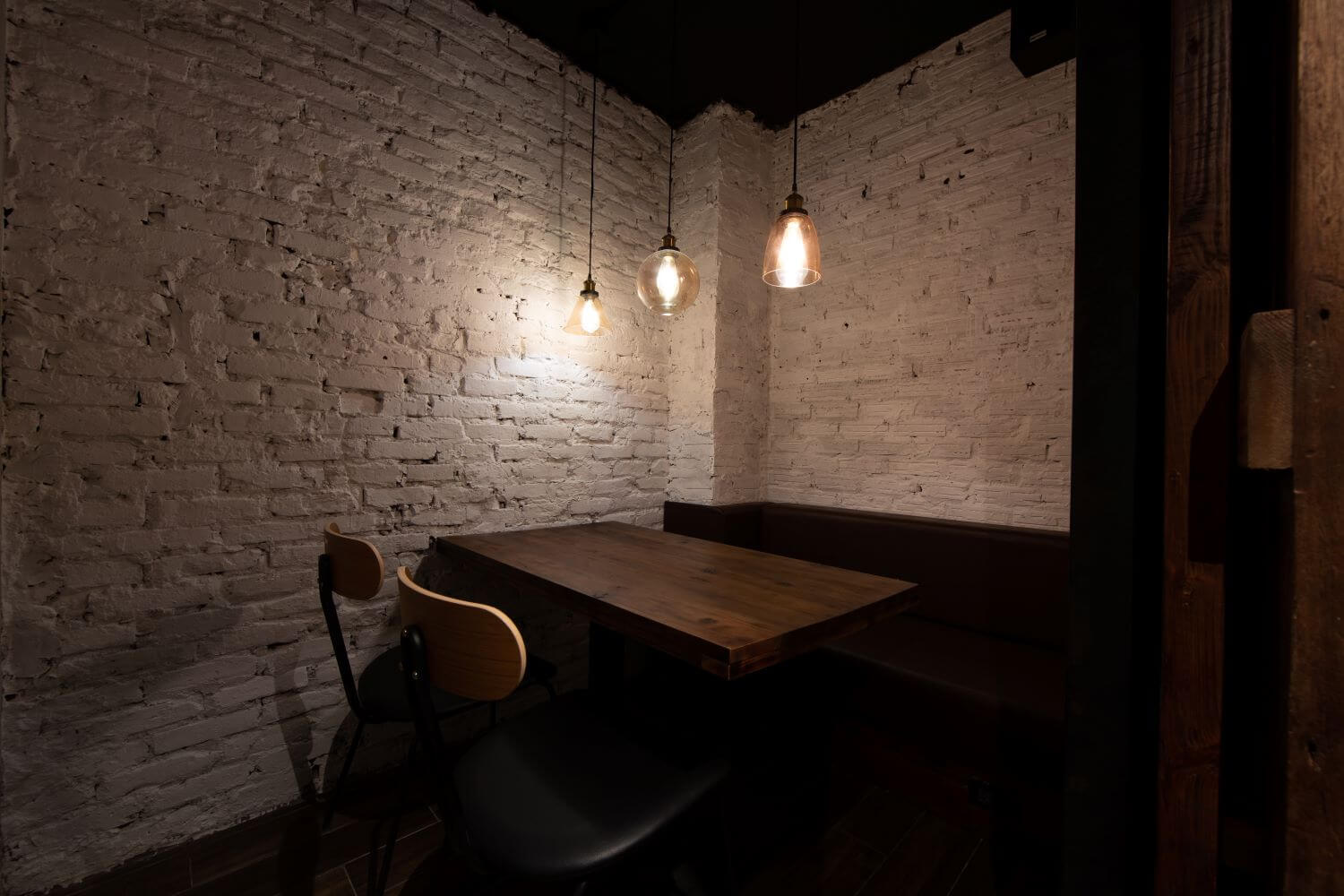
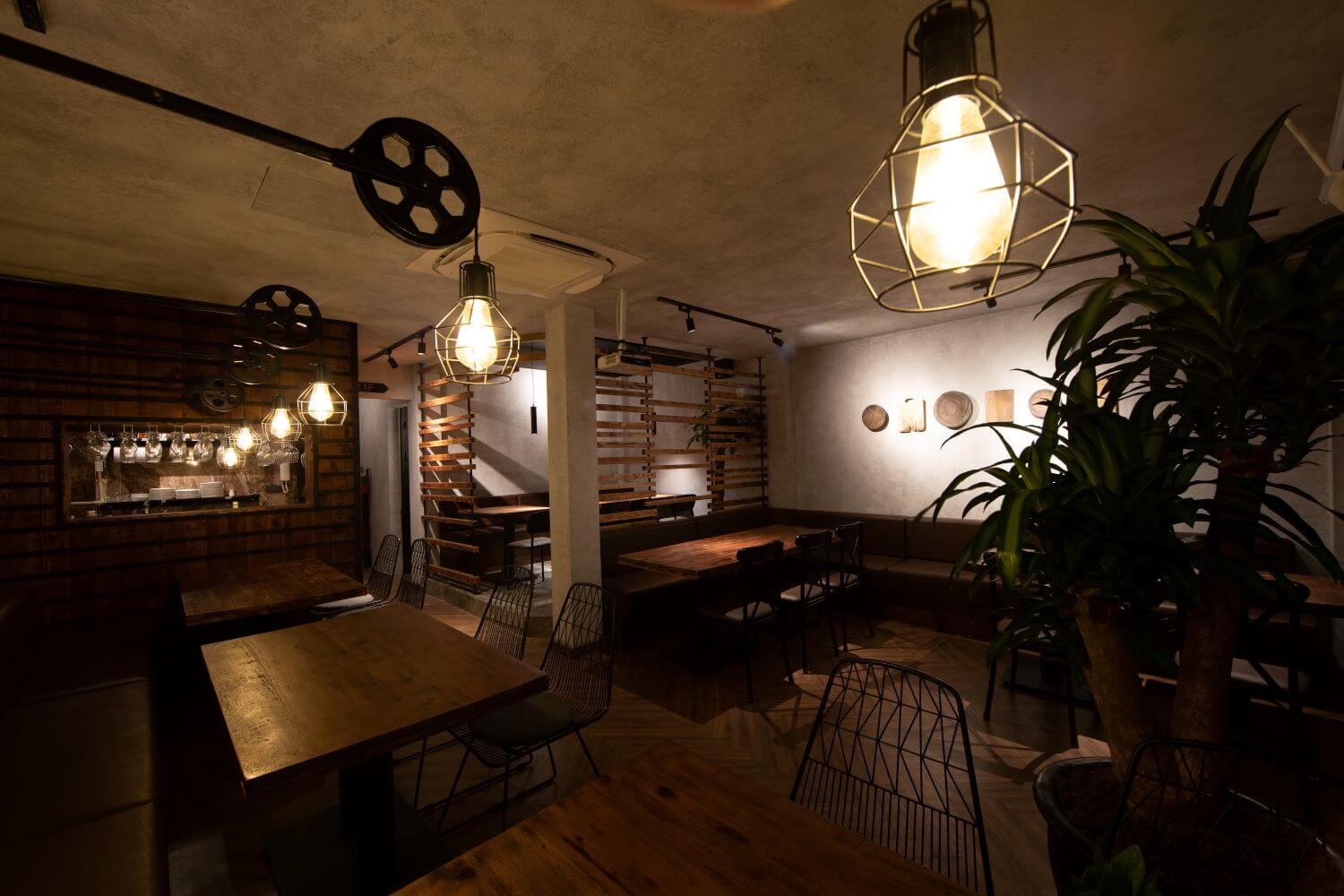
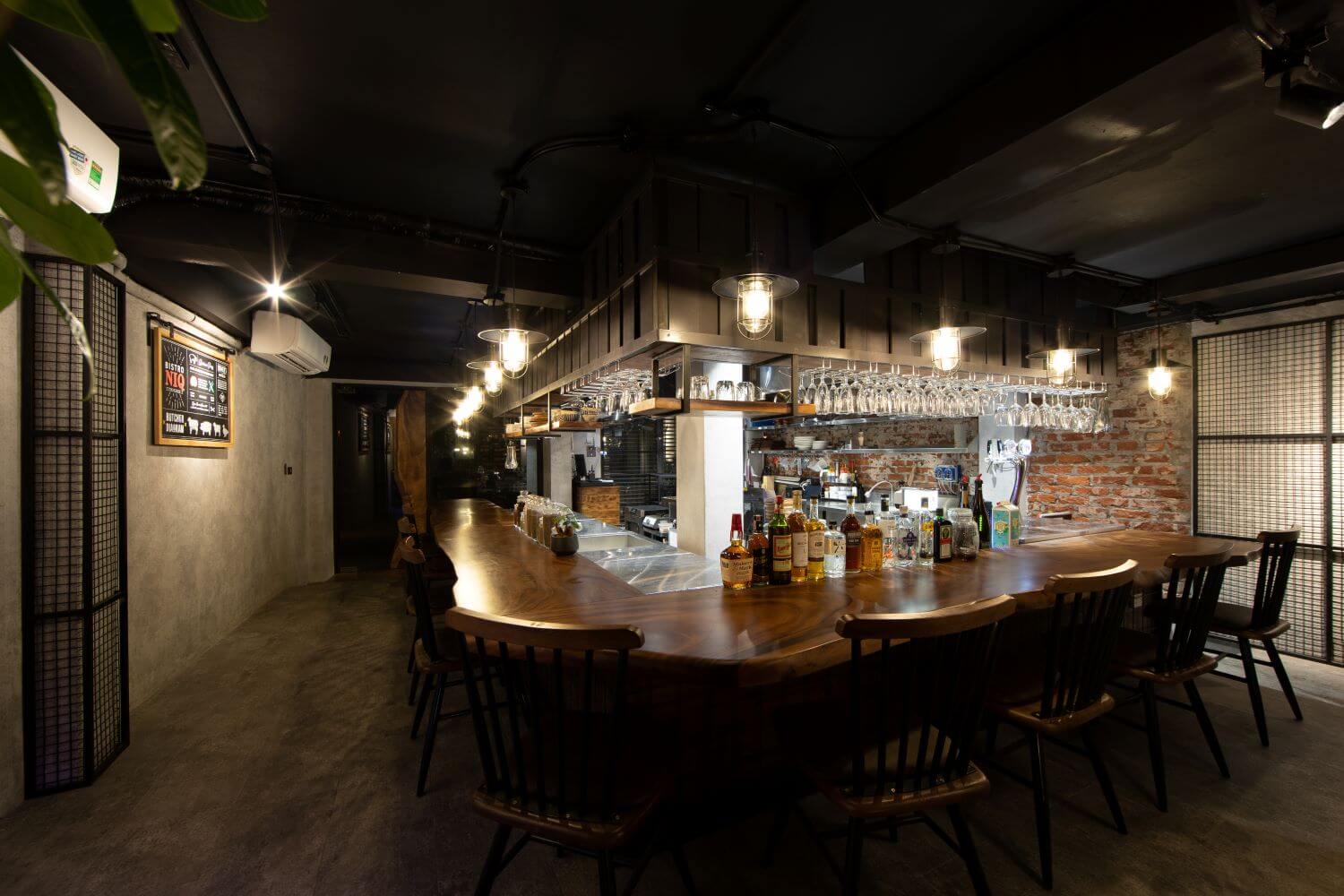
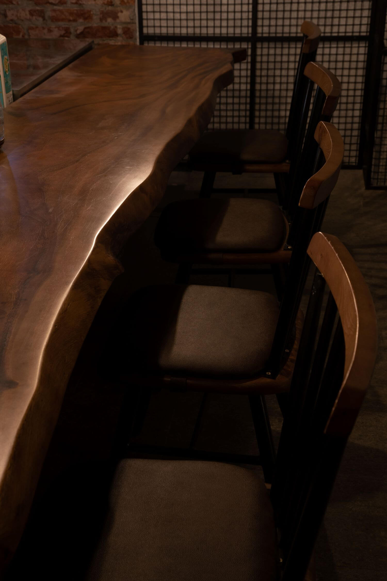
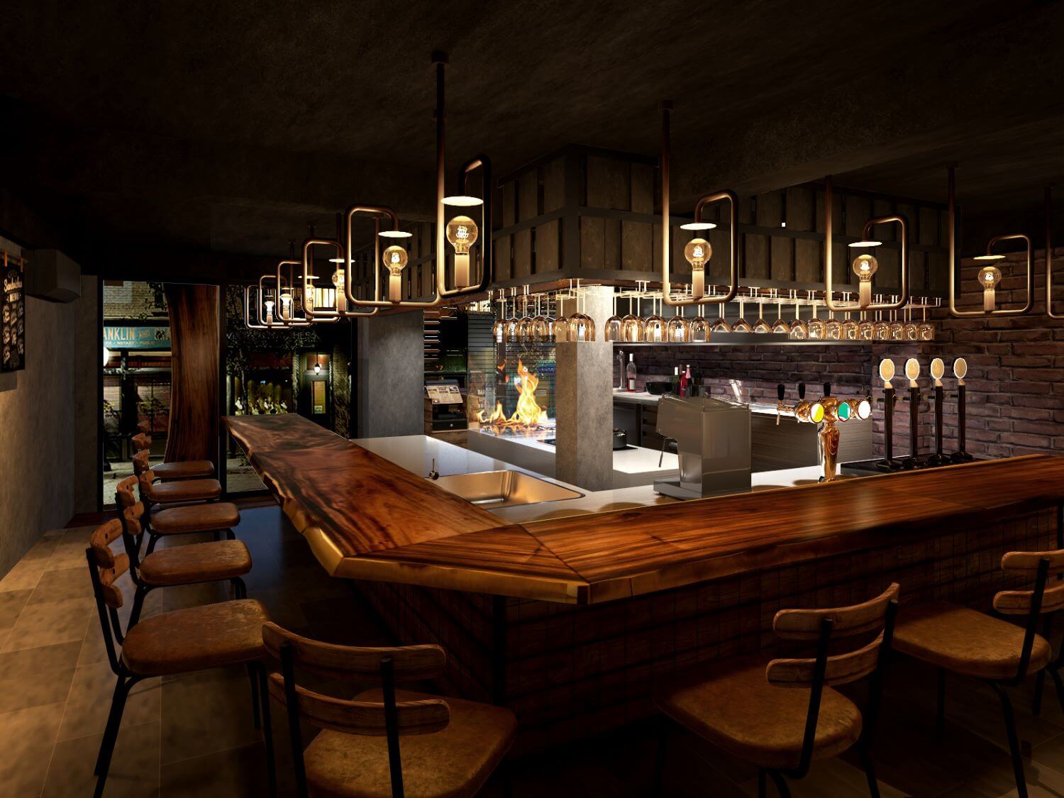
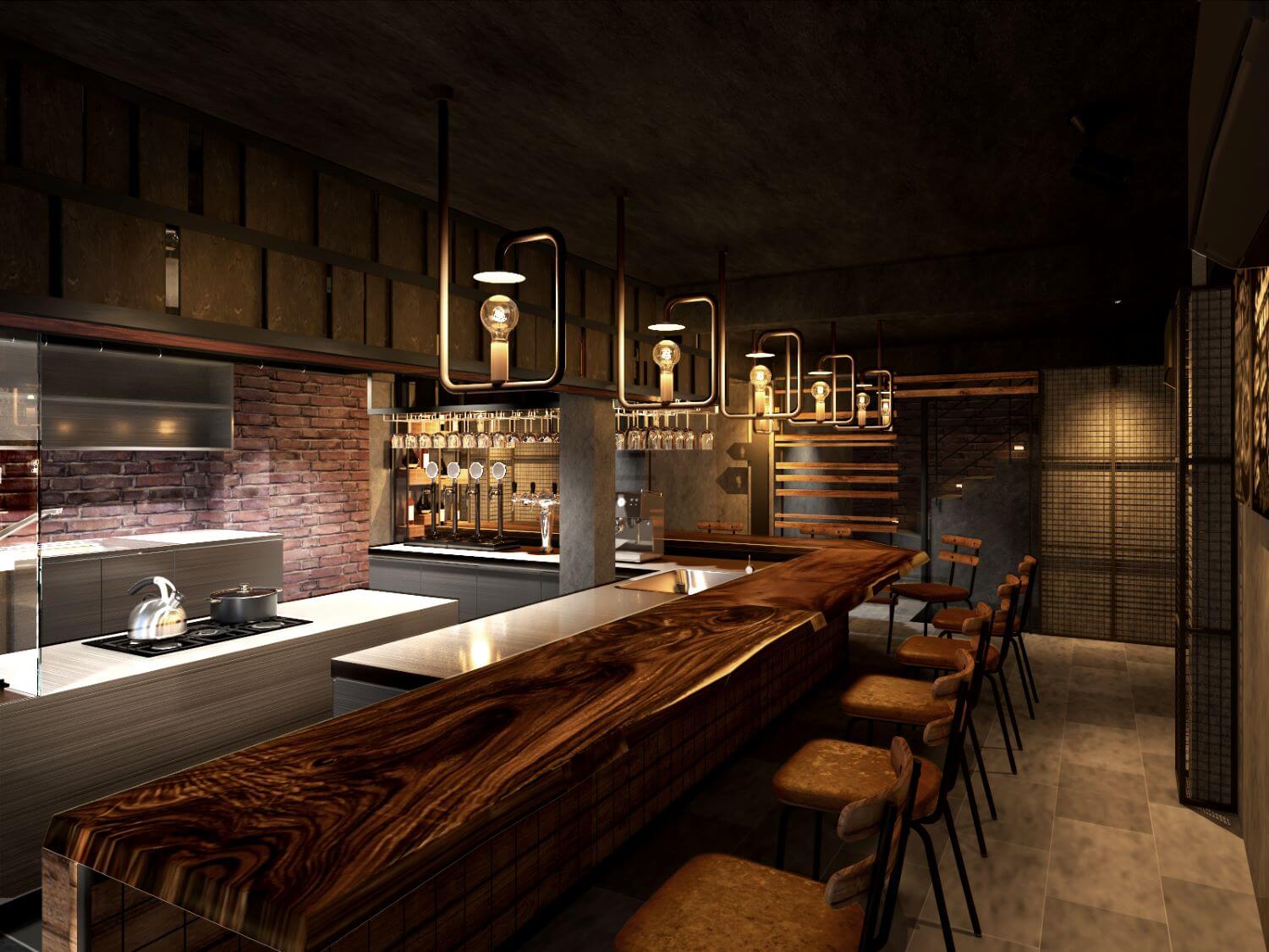
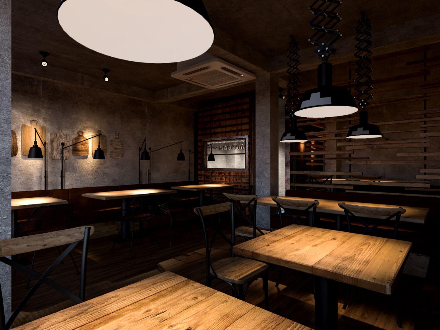
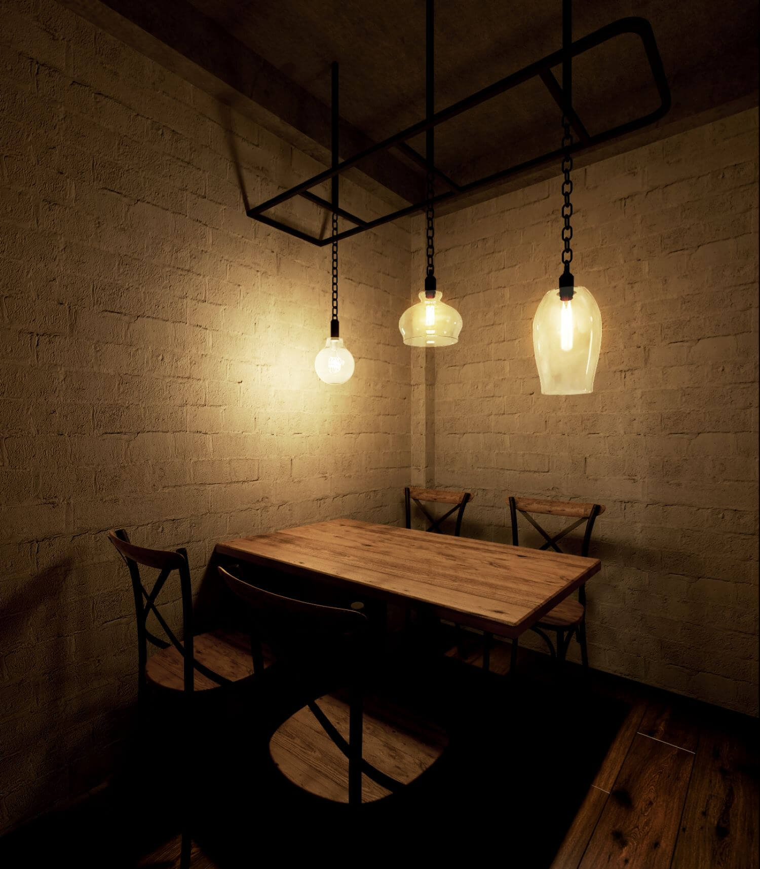
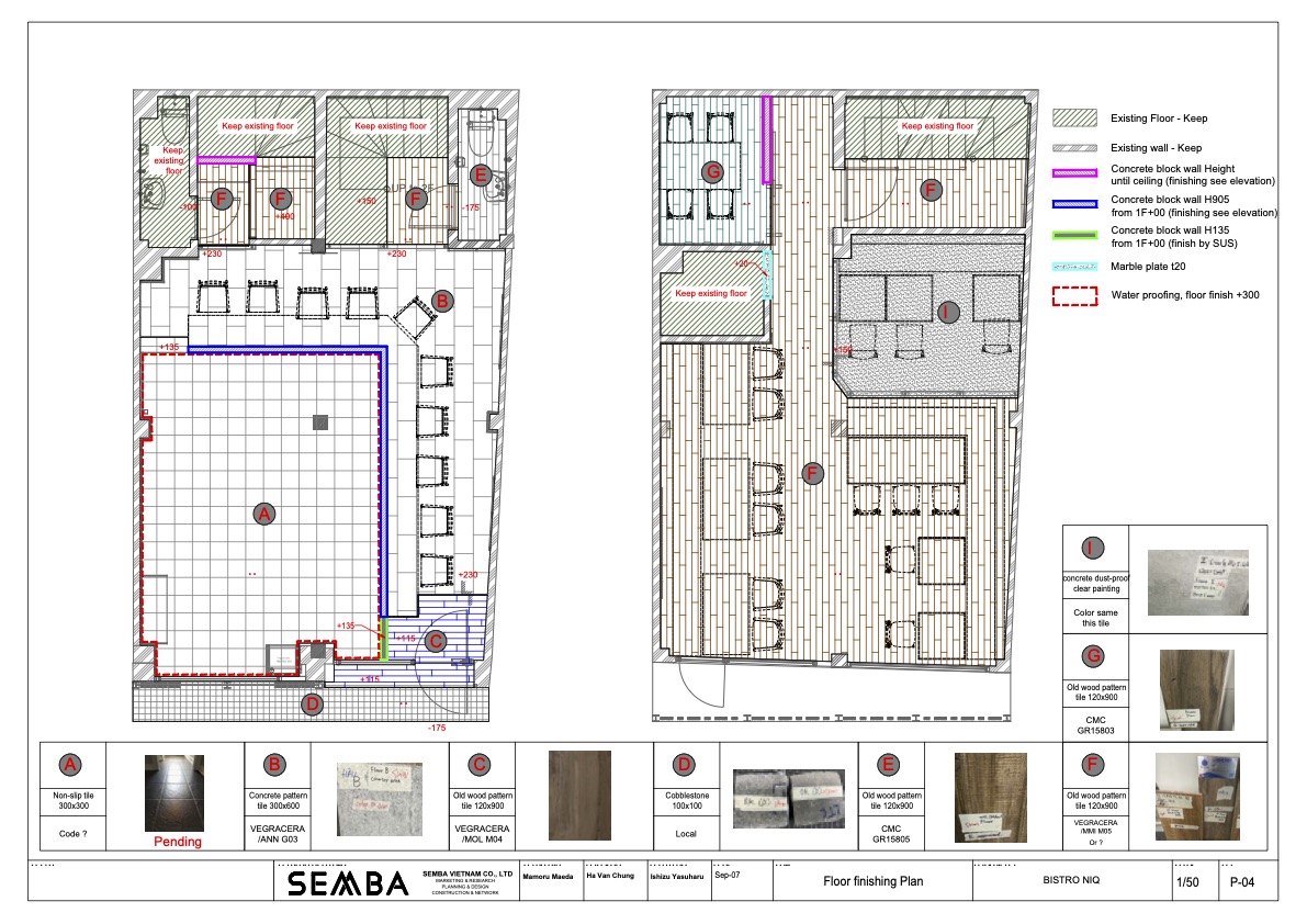
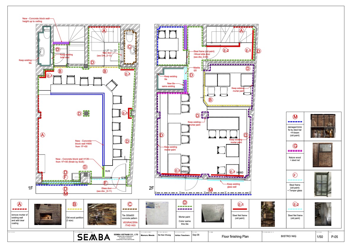
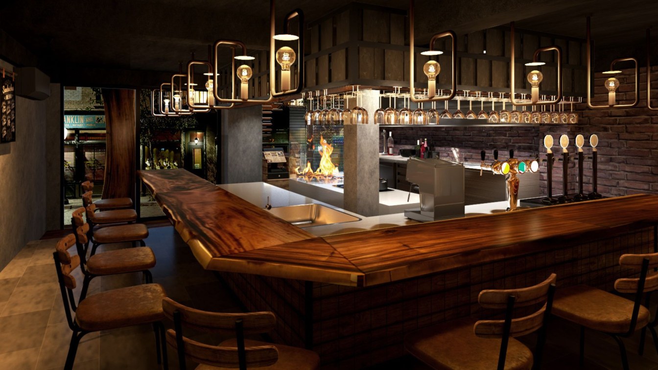
Therefore, rather than [building a new one], I thought of a method of [showing the broken state as it is!]. In other words, I incorporated a lot of the concept of subtraction. The configuration of "WILD & COOL" cut costs while retaining an industrial feel. We aimed to strengthen the image of a “steak restaurant” and produced a “sizzle feeling”.
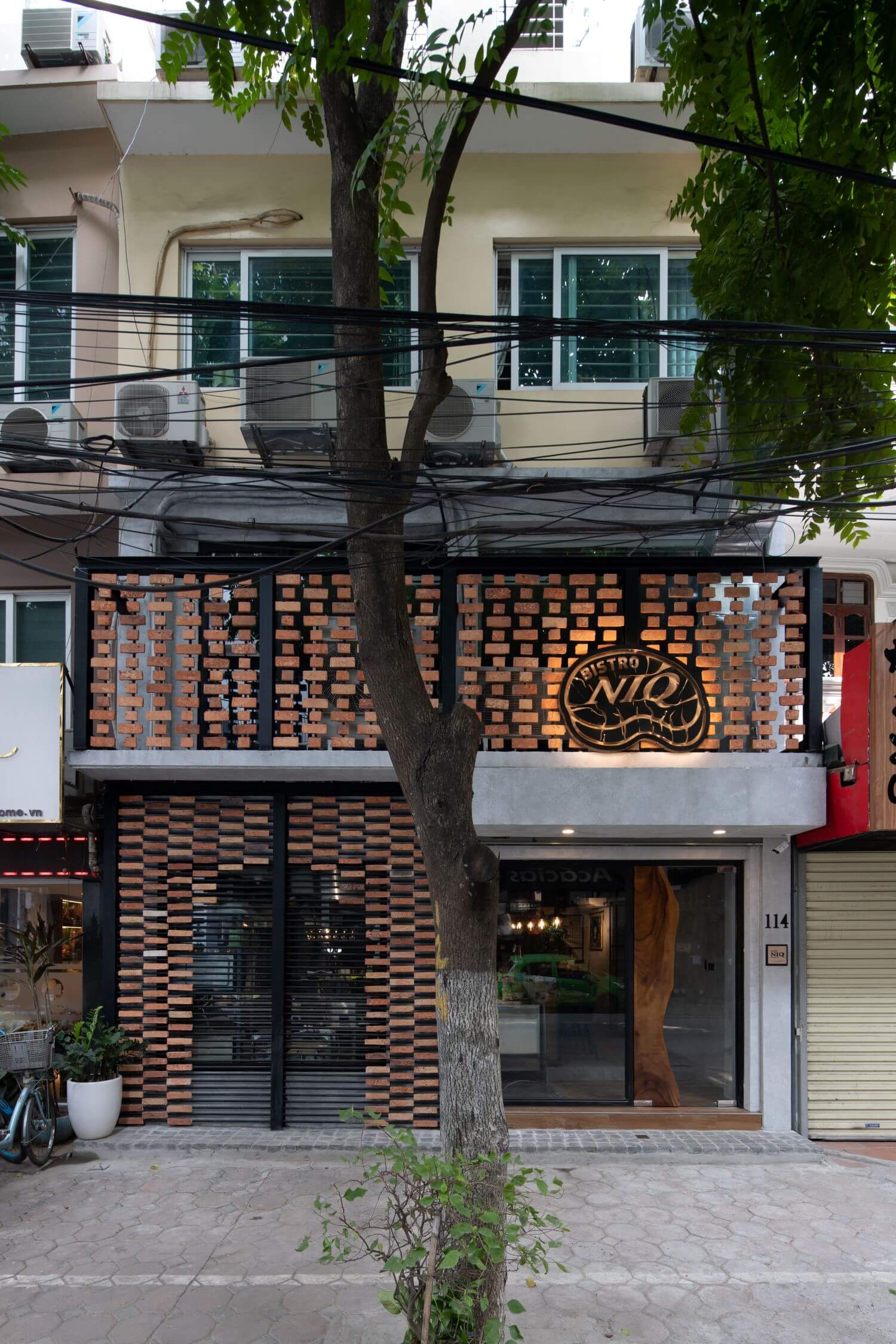
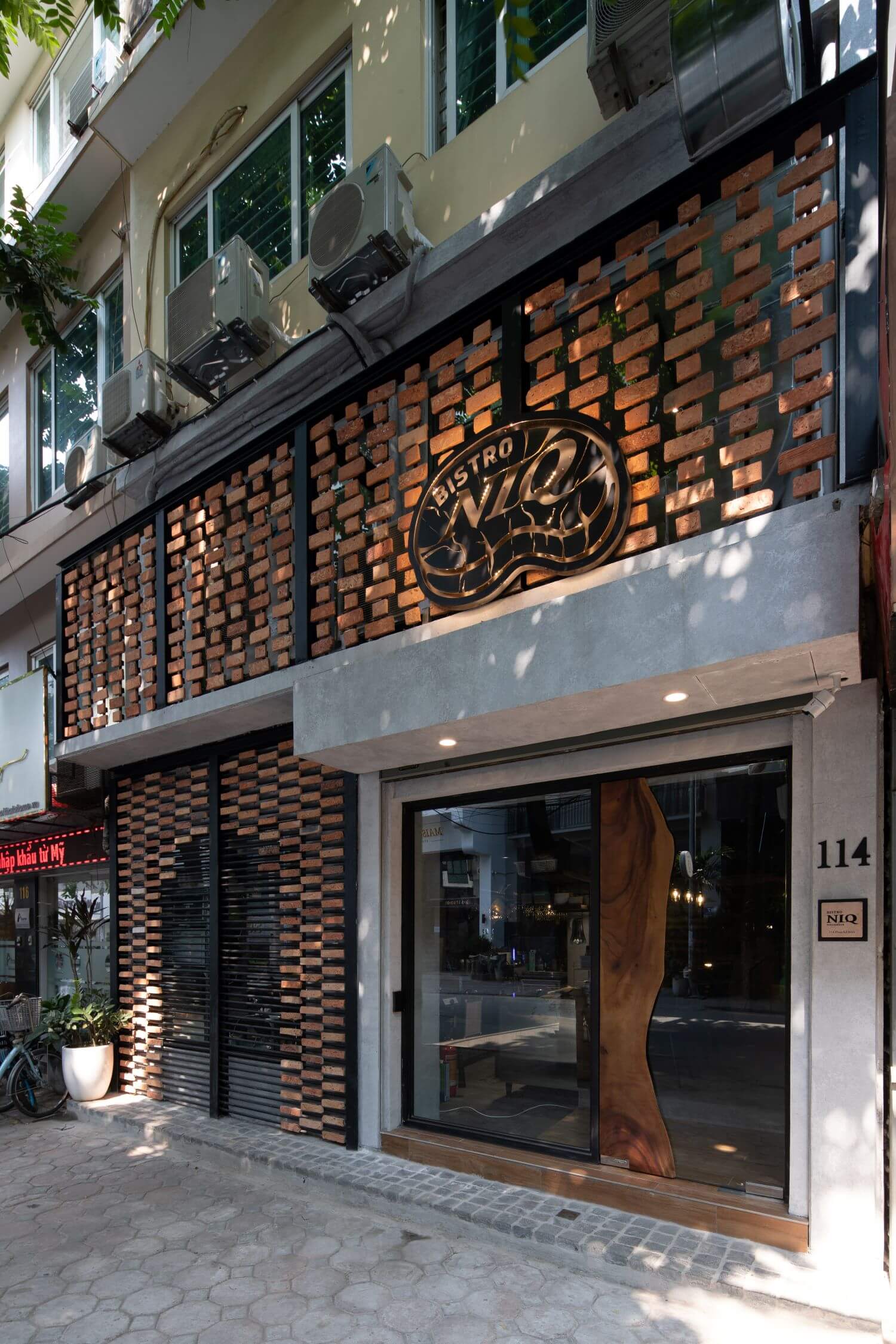
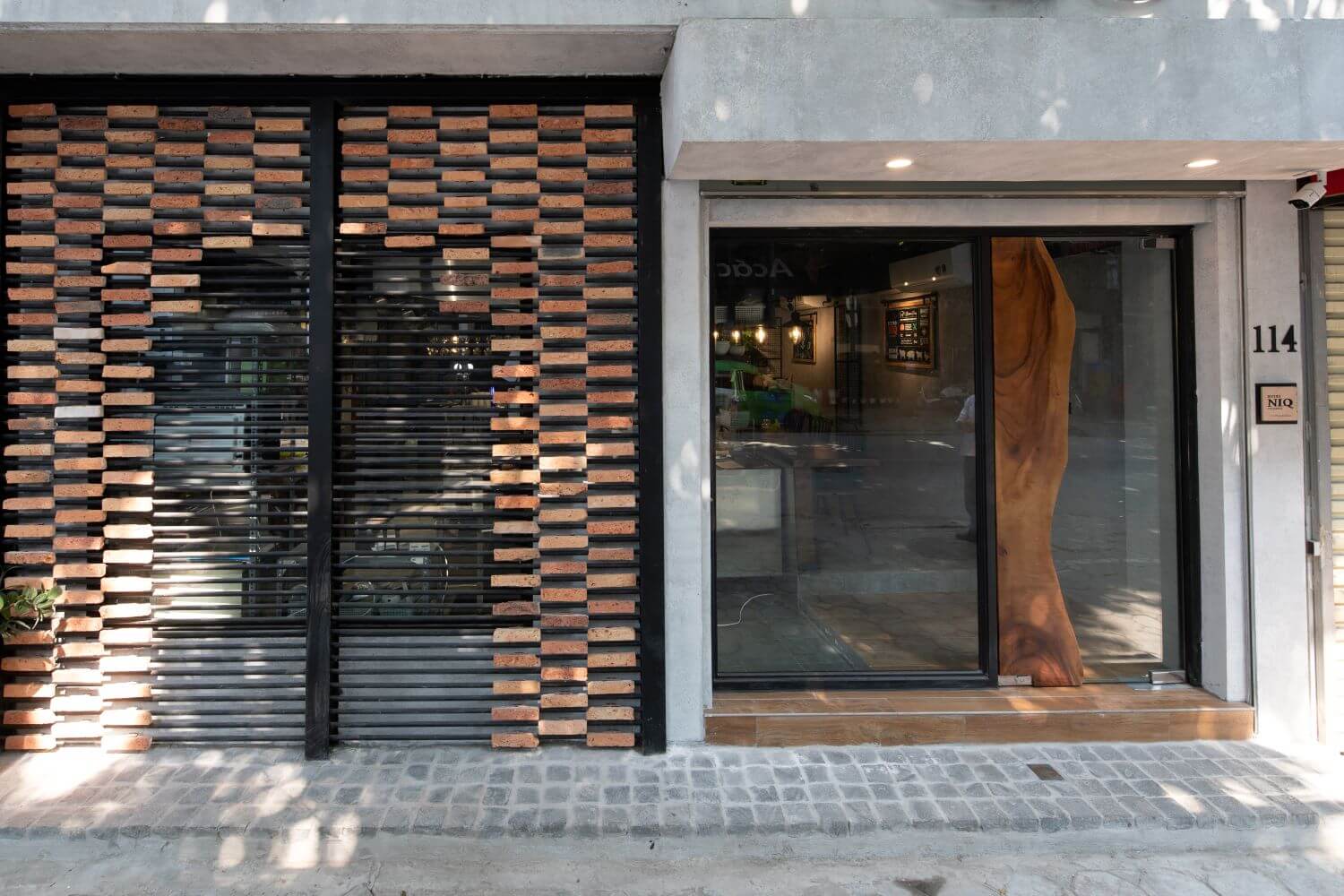
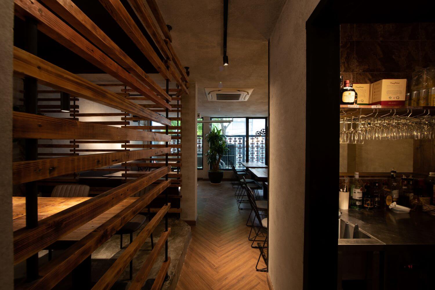
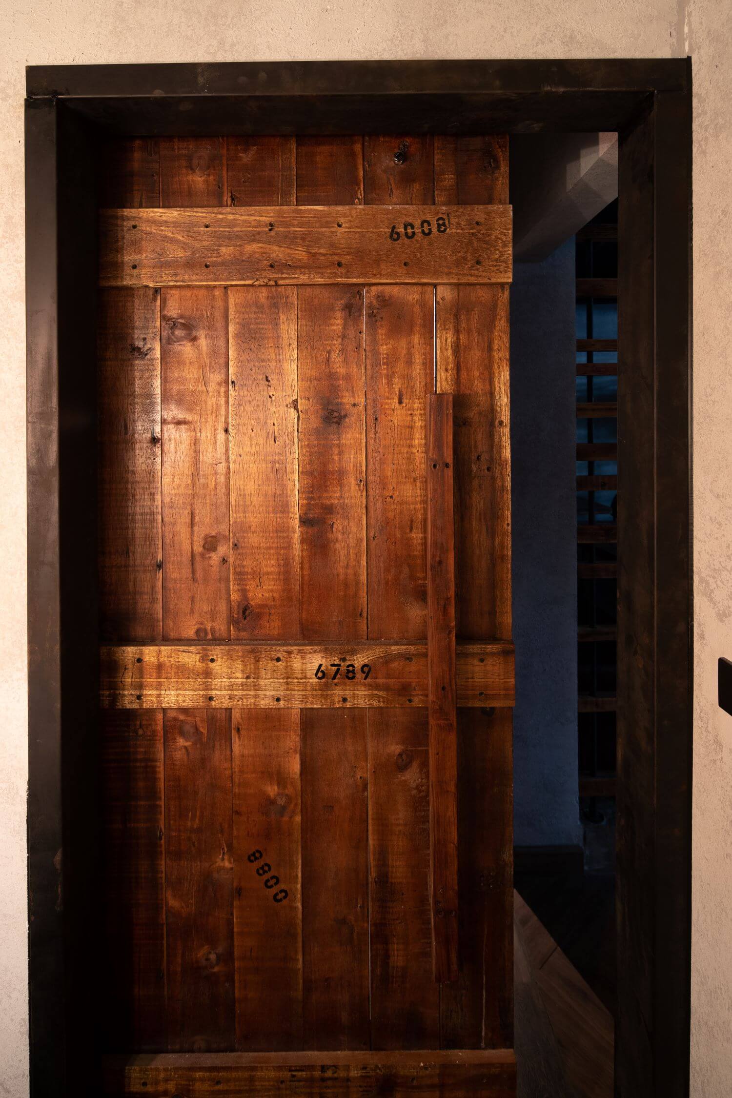
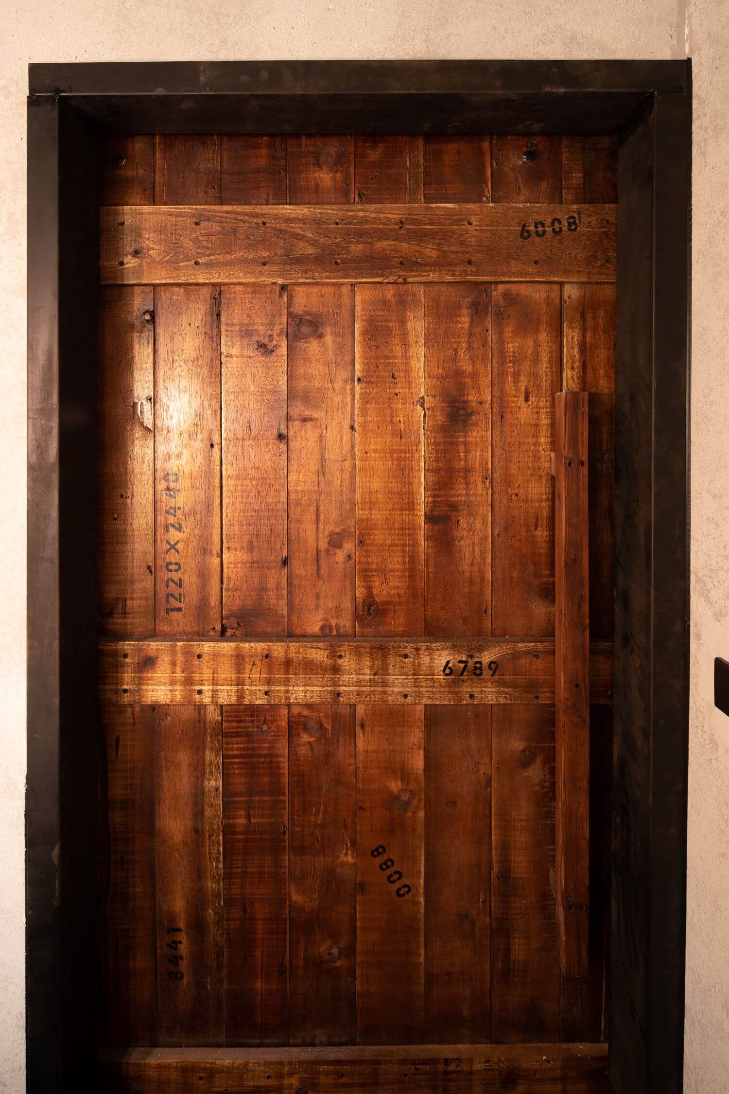
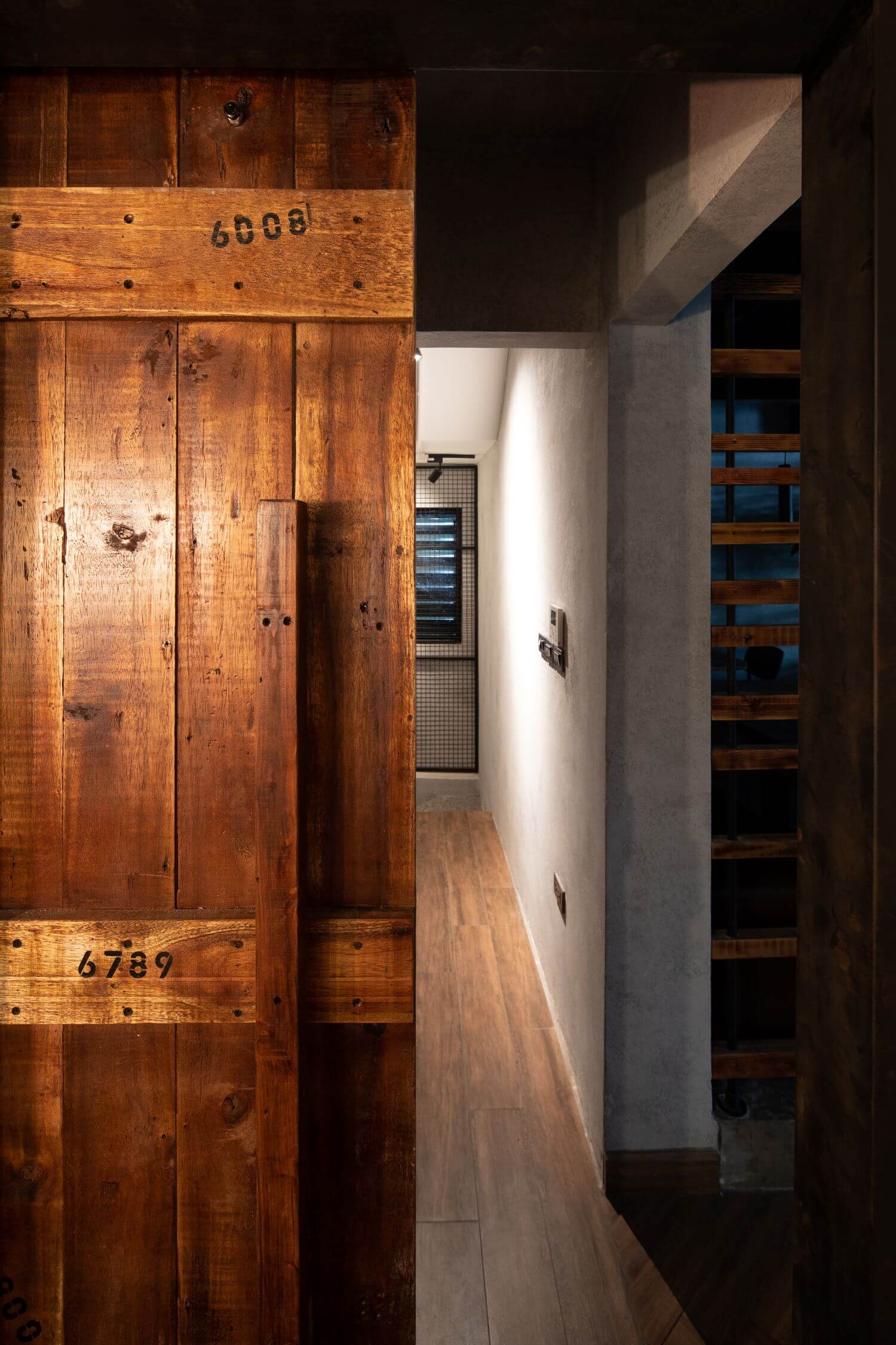
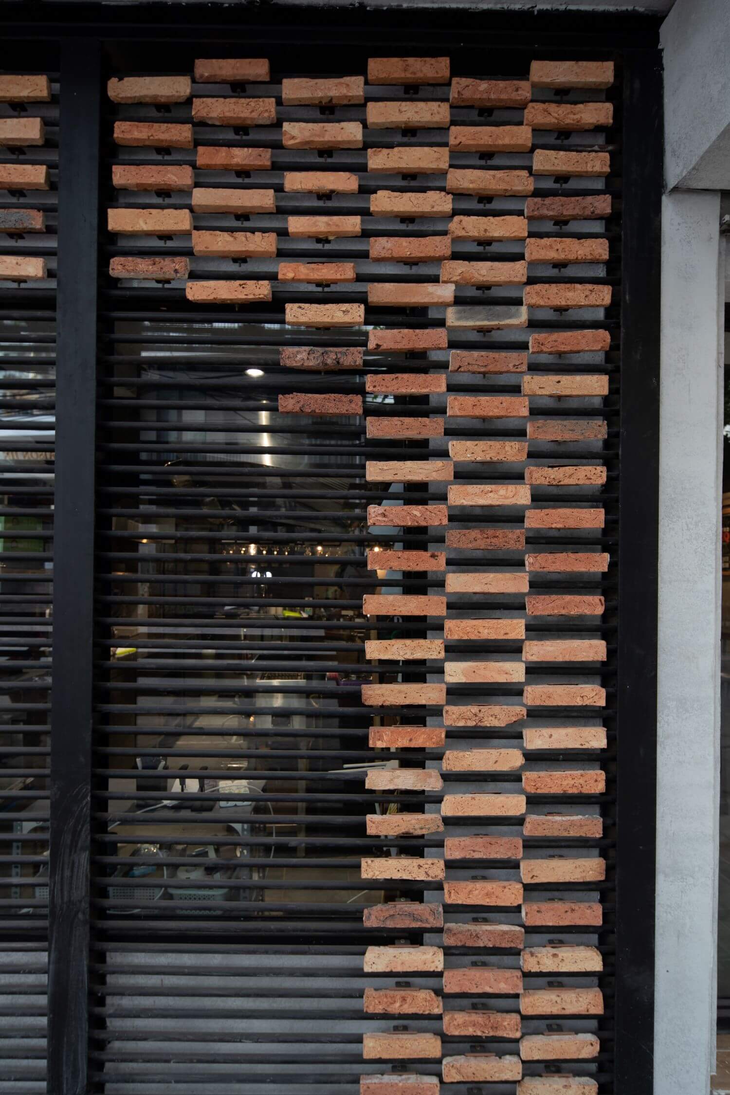
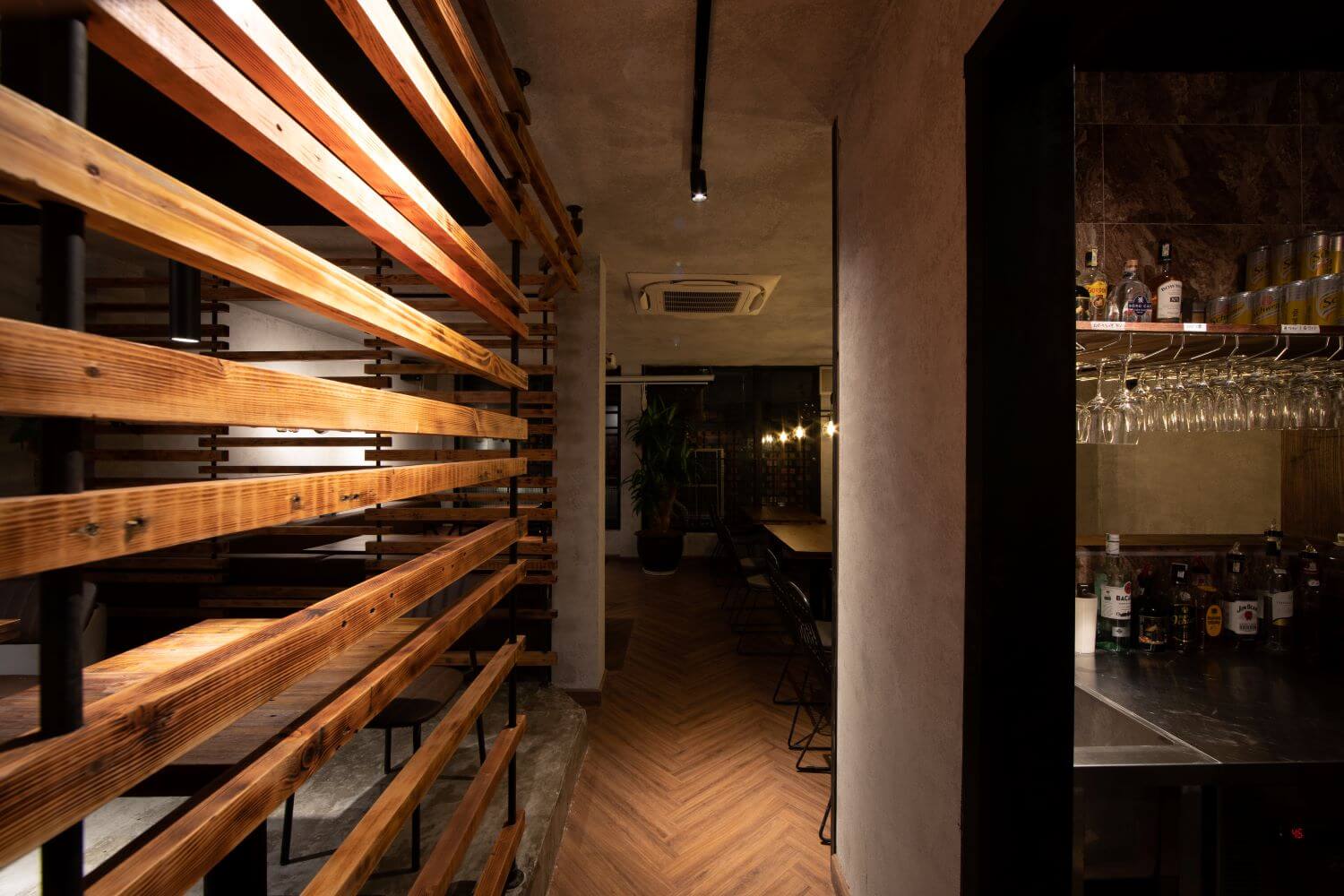
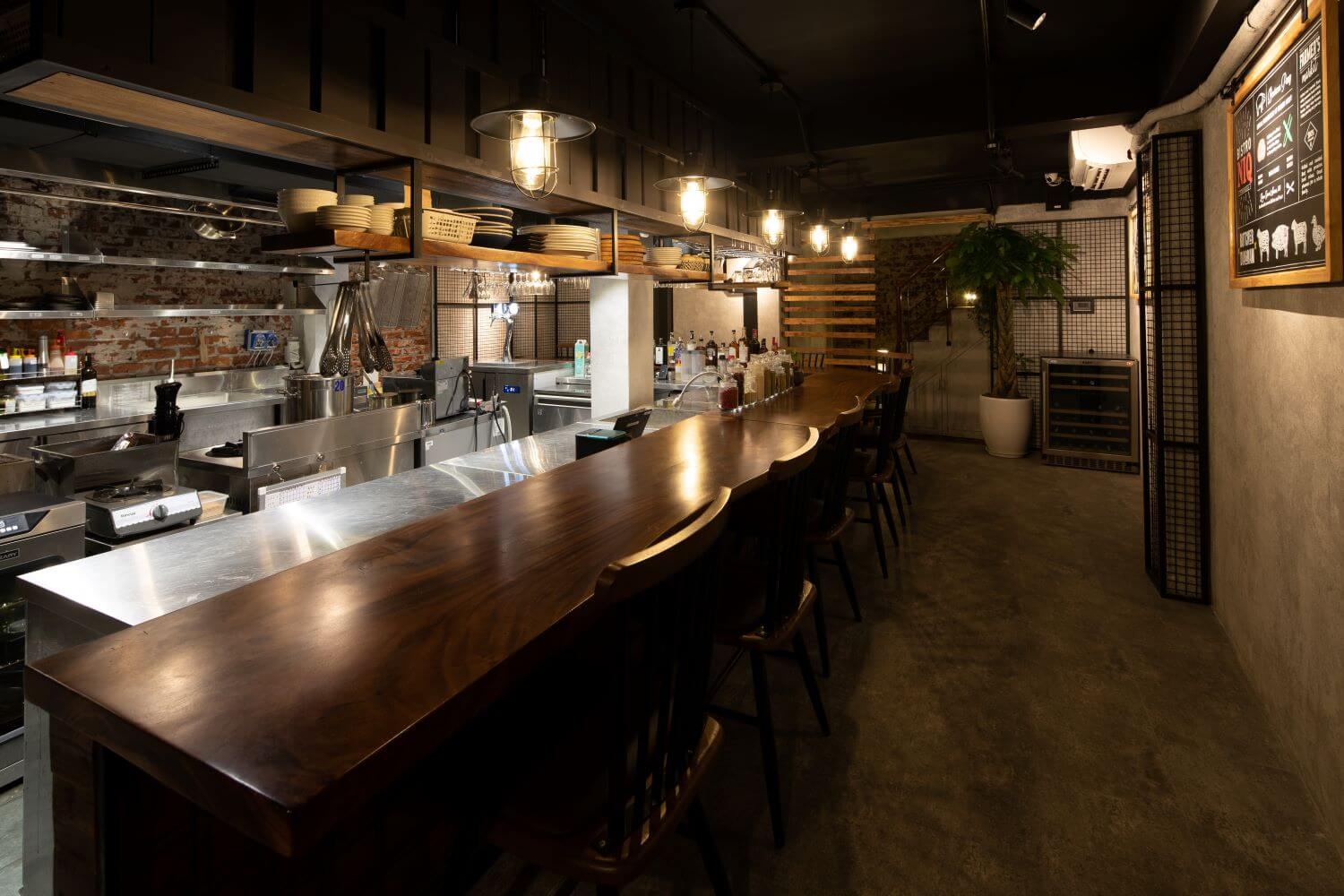
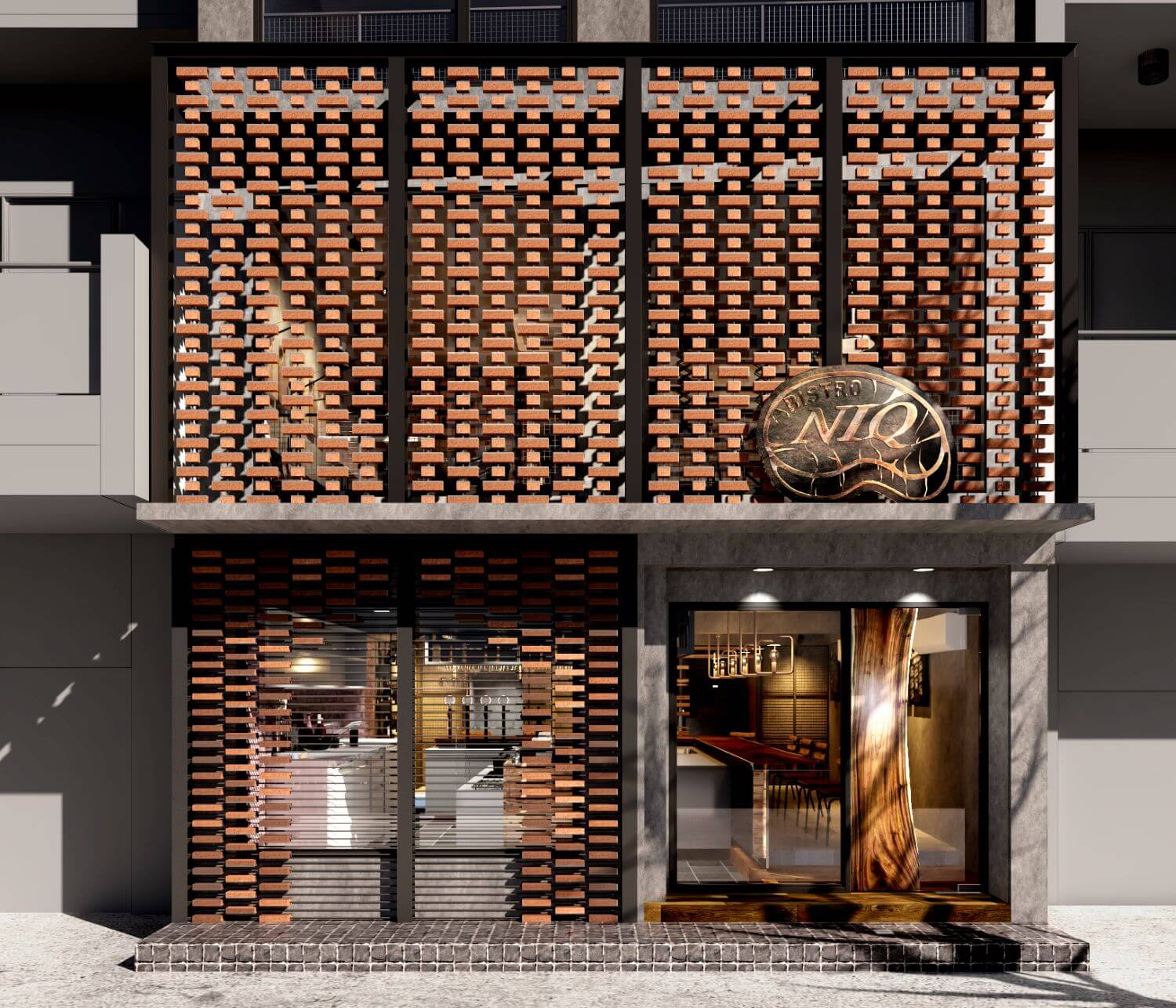
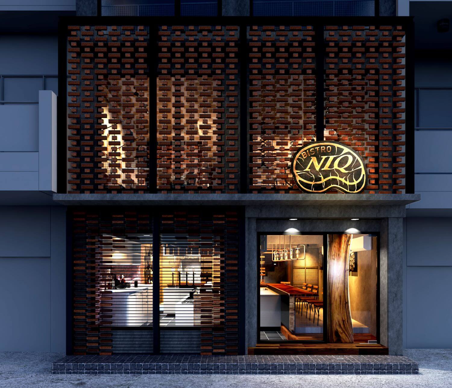
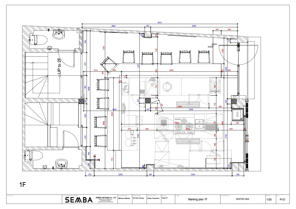
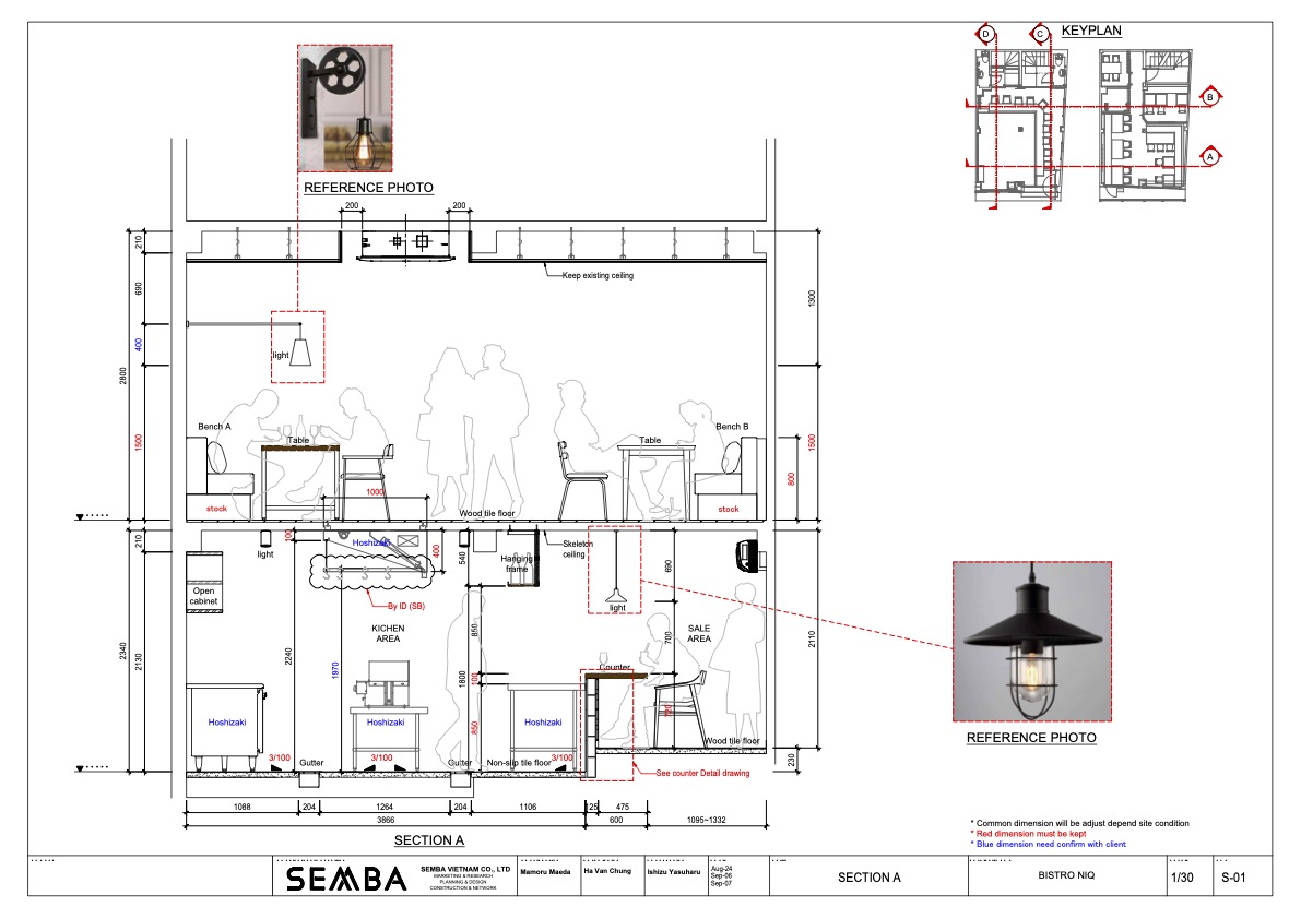
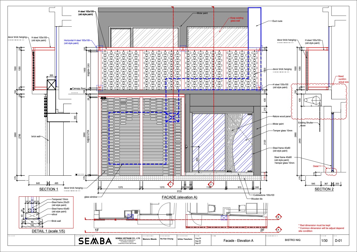
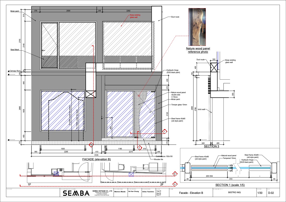
In addition, using recycled materials and waste materials, we also selected MATERIAL in the direction of "cutting costs while creating a cool finish!" The entrance uses a lot of glass to strengthen the attraction to the outside. To make the charcoal in the kitchen visible, the bricks were hollowed out in an arch shape, and flames were used to create a sizzle effect. I tried to convey the bustle of people inside to the outside so that the audience could not be seen as if it were the other way around.
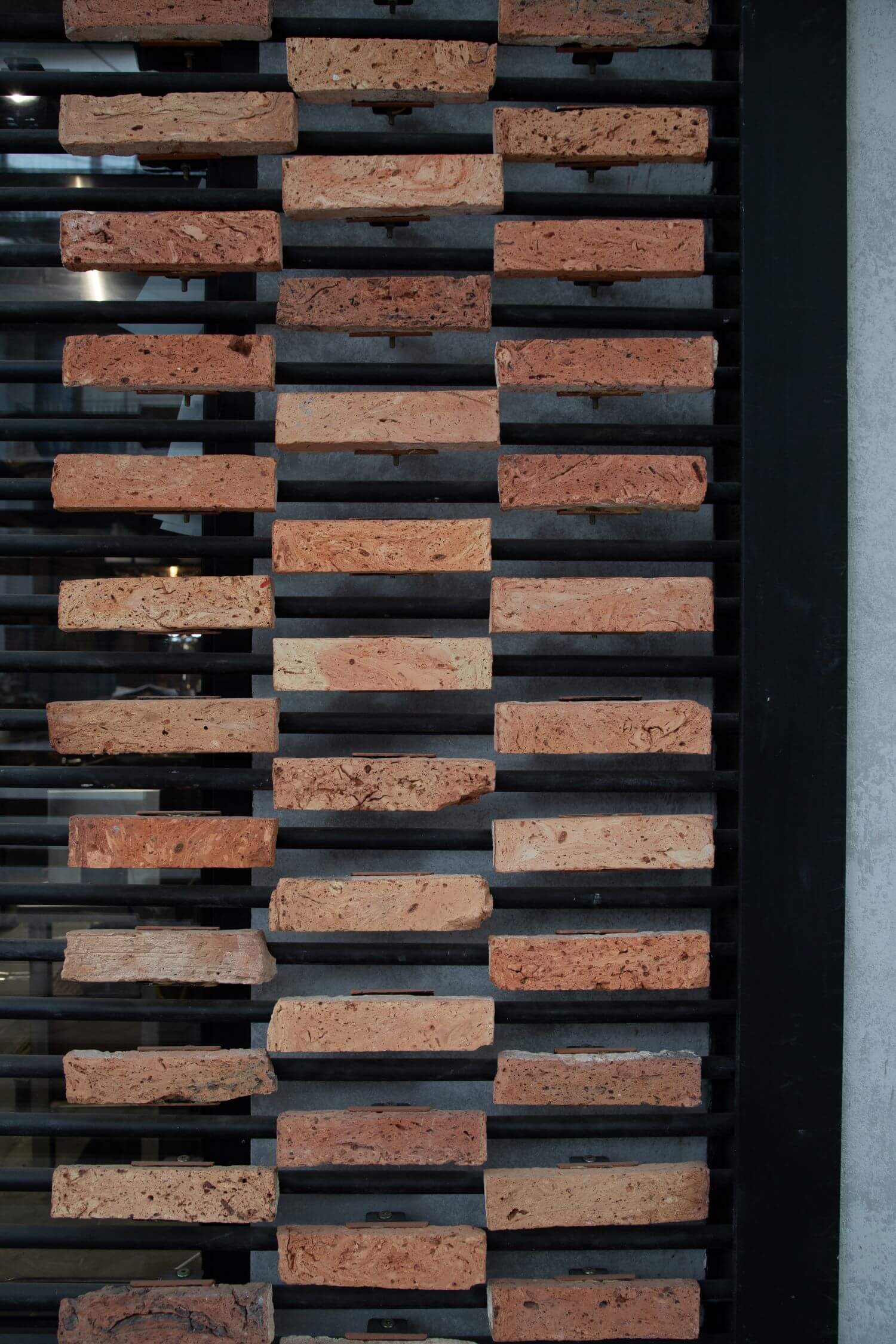
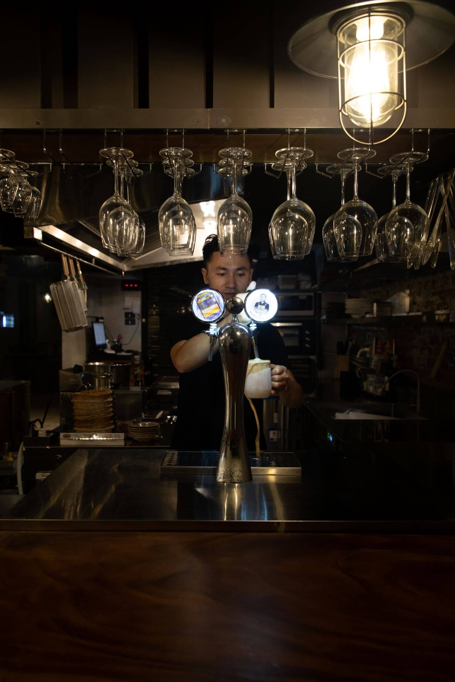
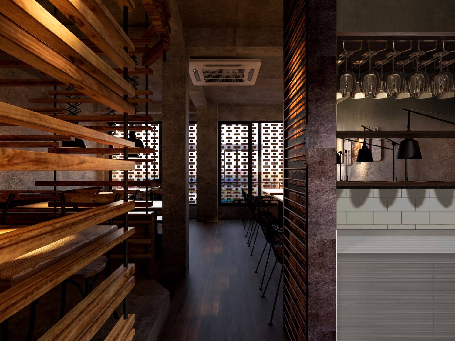
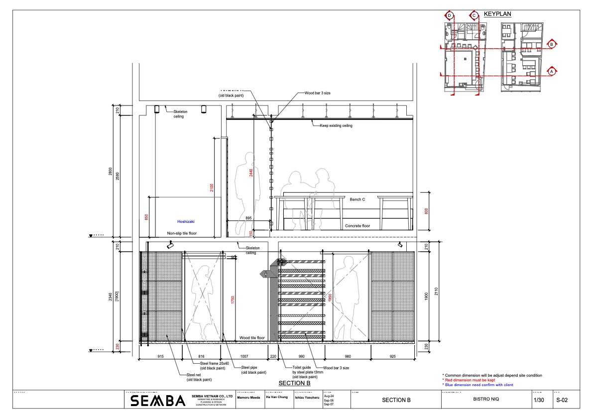
The bricks are suspended in the air with iron pipes, and the design composition is such that light leaks through the joints. By not completely obstructing the view, I wanted to create a subtle distance between the inside and the outside at the same time. In addition, only the inside of the kitchen is brightened, and the brightness and darkness with the audience seats further strengthen the liveliness of the kitchen.
