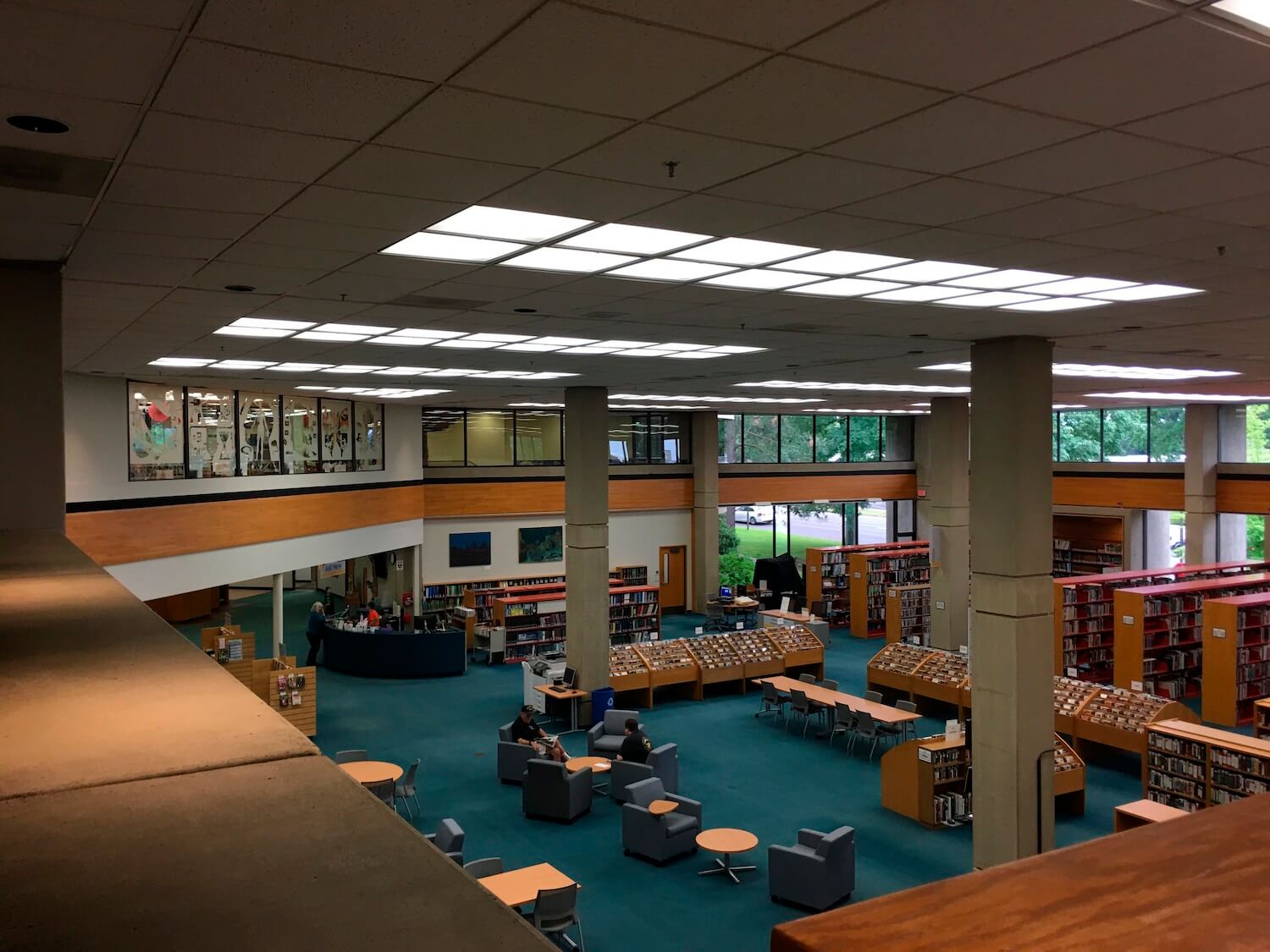
Hacker Architects: The Salem Public Library’s downtown location was due for a renovation to bring its structural resilience and building systems up to modern standards. The 96,000-square-foot concrete structure was built in 1970 and underwent an expansion in 1990. When funding came through for seismic renovation, accessibility improvements and life-safety updates, the city and library saw a rare chance to address some of the additional challenges encountered by staff and library patrons in their aging concrete building and outdated spaces.
Design for Integration and Resources
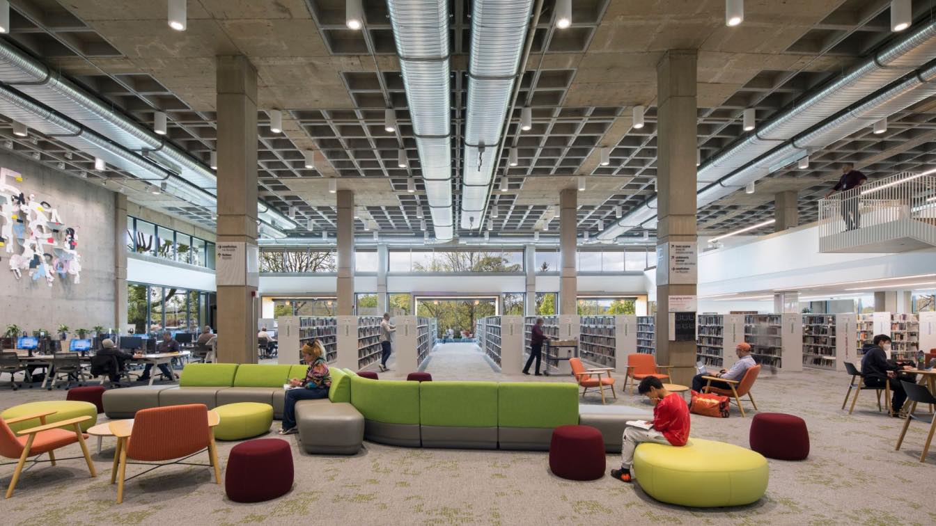
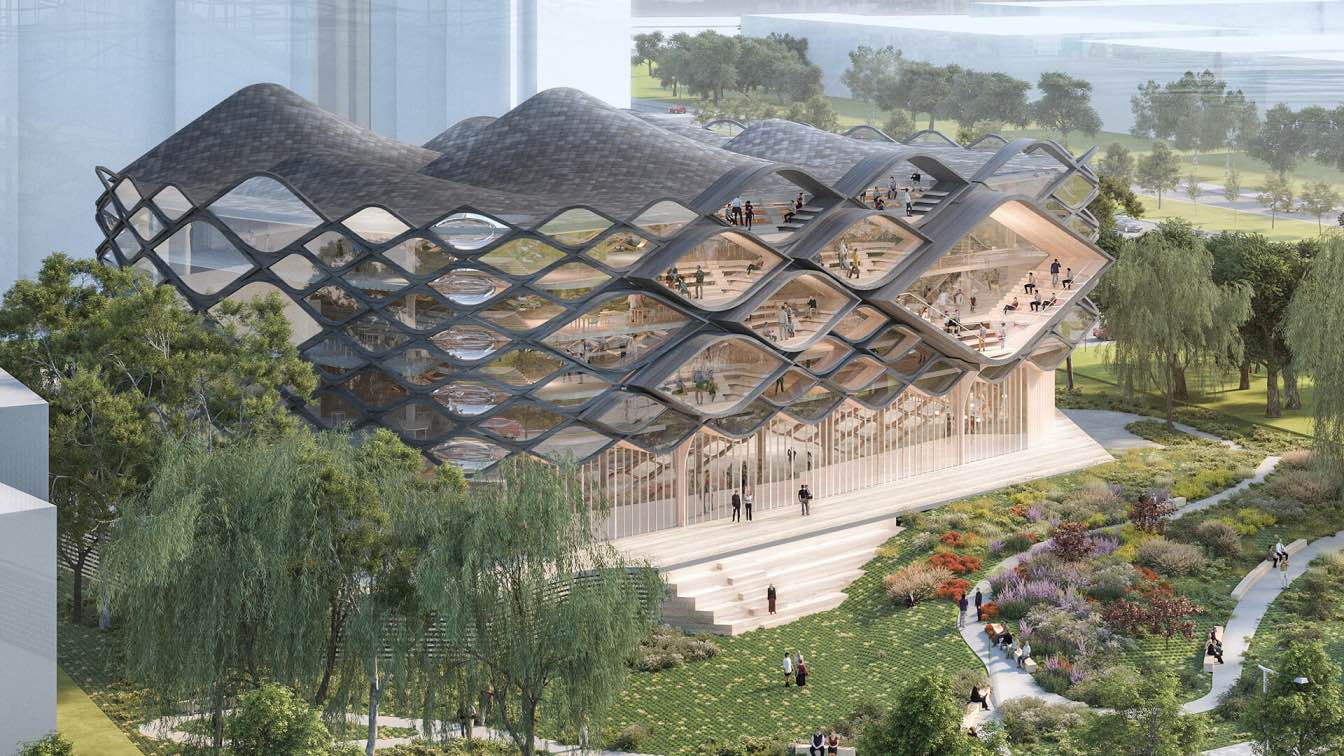
Through a deep partnership with the library team, a vision was established to create a space that is welcoming, safe, and flexible while enriching a connection between people and their community. The design brings daylight into the core of the large, fortress-like building, transforming an inward-facing brutalist-era building into a bright, voluminous space that invites the community in. New windows and redesigned entrances create connections between outside and in, and the voluminous central space creates vertical connections between floors. With almost no wiggle room in a utilitarian budget, the design team for the library needed to get creative finding ways to make every dollar spent do double-duty. Each aspect of the design is filtered through a practical lens of how each choice can contribute to improved seismic and life safety while also delivering on a vision that is community-oriented and centers the experience of patrons and staff.

Design for Change
To create a more pleasant, cohesive library experience for patrons, the design reimagines how different spaces with different functions relate to one another – staff spaces vs. public spaces, the needs of library sections serving different age groups, quiet zones, noisy zones, high-traffic areas. Library staff and back of house spaces are now consolidated on the lower floor for greater efficiency and functionality. Active public spaces are found primarily on the upper two levels. The youth services previously separated by several floors now relocated to the top level to allow for greater sharing of resources as well as improved operations and clarity of collections, which includes vibrant new spaces for the Teen Scene and Children’s areas, and the Discovery Room has been relocated to Children’s. The lower level plaza opens up to an active, bustling main entrance, adjacent to a maker space for hands-on learning, meeting and conference space, and a community room that can accommodate larger events after regular library hours.


