SAVE Arquitectos: Casa Quince is located on the outskirts of Pachuca, Hidalgo, connected to the entity's main entrances, in an area that has seen significant growth as a result of recent works that have favored its connectivity with the rest of the capital.
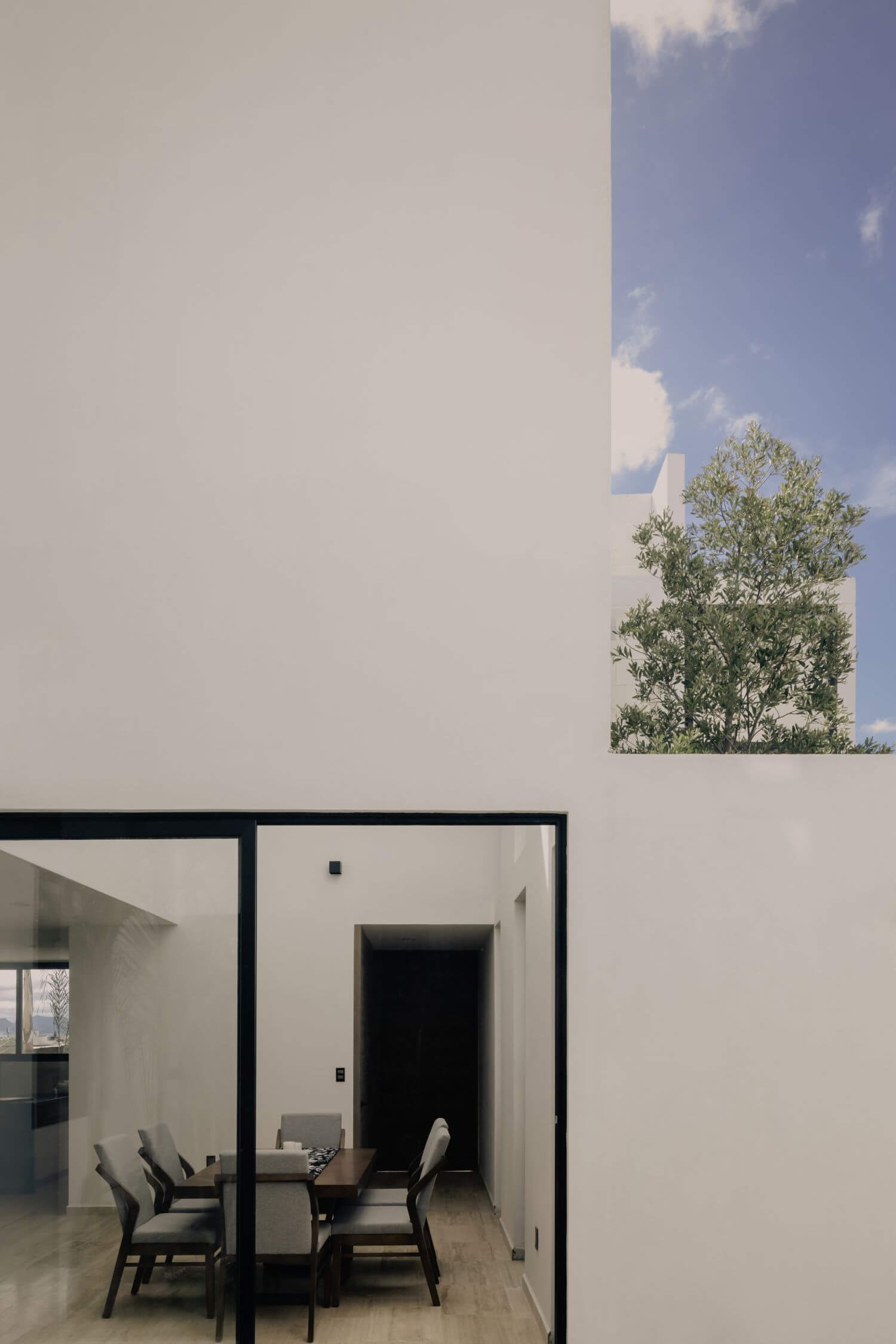
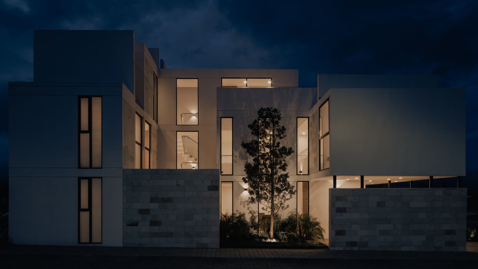
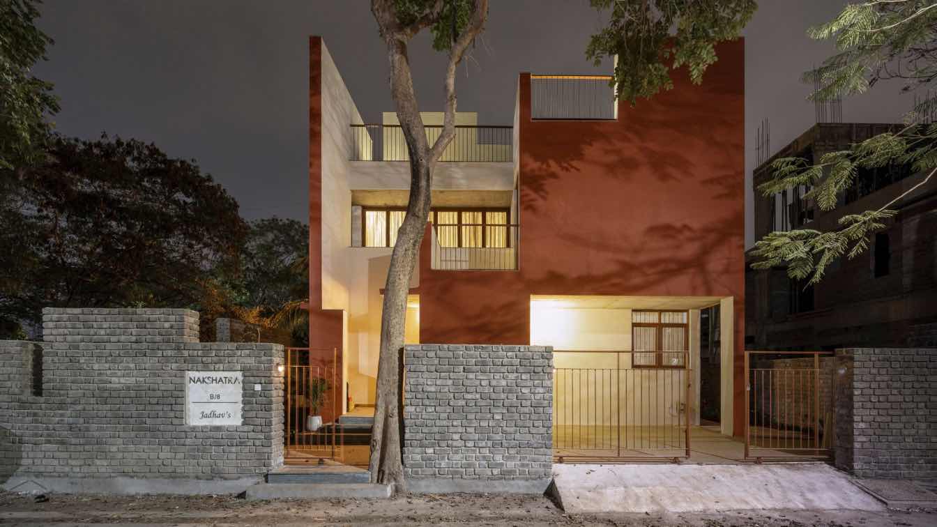
Our design intention was to create a facade composed of modulated volumes that seek to play with the depths and light-darks provided by the main facade's south orientation, in order to experience different environments complemented by textures, materials, vegetation, and lighting.
The rigidity of the volumetry is divided by patios, one private and one public, both with the intention of providing lighting and visual details of landscape to the user in all spaces and moments of their daily routine.

The main entrance, framed by a compact passage, frames the house's central and social space, which surprises with a double height of 5.6 meters and is illuminated by overhead light that enters through the space's roof, as well as the modulation of the plane on the east façade. The client's wish was, in this way, to create a direct invitation to their family and friends to the most popular space of the project.
Throughout the voyage of the project, the interior space configuration attempts to play with the user's scale through the relationship with the exterior spaces, the different heights, and the layout of the architectural program that intends to interact with the various social spaces of the residence.
The project is located in a corner, and because it is exposed to the outside, it was decided to protect the privacy of the spaces by designing a base of white stone screens. On the ground floor, it serves as a vestibule and provides privacy to the architectural program. The facades of the first and second floors were designed with a grid based on the alternation of windows and screens in white stone, with the orientation of the entire volume serving as the compositional axis.
The southeast-facing volume is suspended on four steel supports and stands on a white stone plinth, providing with natural lighting. The gardens in the south and east aim to contrast the pale tones of the facade finishes while also relieving the orthogonal traverse of the terrain.


