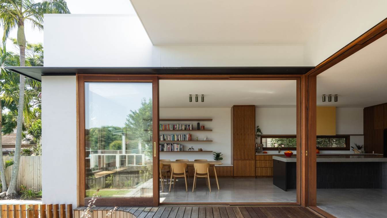
- buck&simple: "A brick bungalow transformed into a light-filled, sustainable home"Nestled next to a beautiful lagoon in the Northern Beaches, a single storey brick home was dark and cold in winter, prompting a major renovation. The extensive alterations and additions aimed to improve the family’s quality of life through three main strategies: creating a sustainable home, filling it with natural light, and providing much-needed amenity.
- The home now has a very well-insulated outer skin, responsive to the macro and micro environments, enhancing the user’s lifestyle and minimising power bills. Sustainable features include a robust concrete floor with large thermal mass and expansive north facing timber framed glazing with carefully detailed shading to keep the house warm in winter and cool in summer. The timber windows perform very well thermally and sequester carbon.
The design presents a formal façade to the street, retaining user privacy. As you progress through the house, it opens up in volume and natural light. At the heart of the home is a custom linear skylight running almost the length of the building, which utilises bold roof angles to flood the space with natural light.
The renovation provides increased amenity to suit the growing family’s needs while retaining some of the quality original features of the home. Colours and materials were chosen to pay homage to the original material palette, with contrasting tones, use of deep colour, and a variety of natural textures creating a vintage and permanent feel.


