Place Architecture:Design: Our clients approached us to help turn their 1980’s two-story contemporary into a home that reflects their vision by reimagining the kitchen, primary bathroom and front entry. As empty nesters, it was important to create an environment for aging in place and entertaining large family gatherings. The project goals focused on creative, efficient design while adding natural light and a modern aesthetic to the existing spaces.
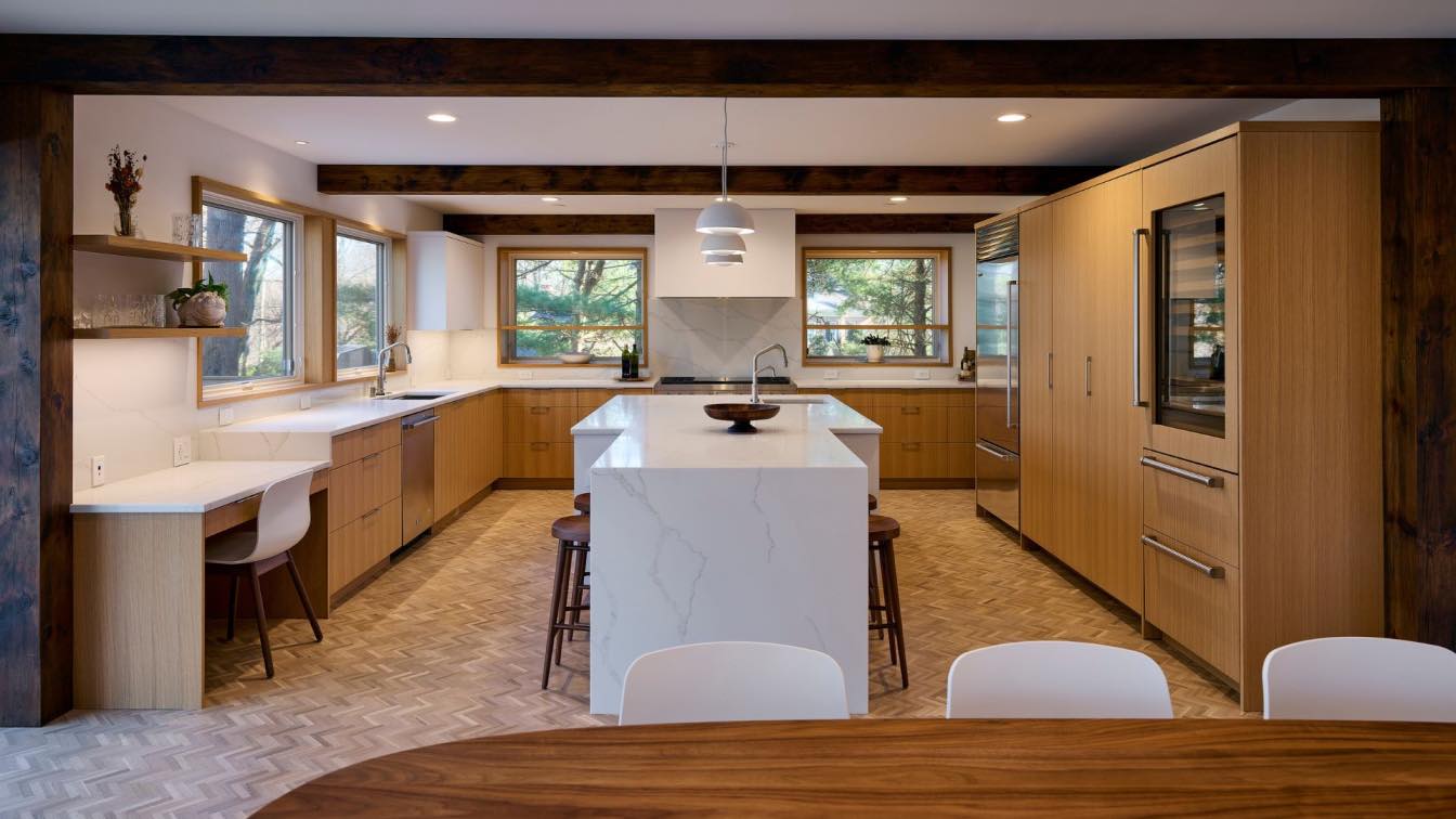
The original kitchen was a large seventeen foot square with an eight foot ceiling that needed a total renovation. The width dictated the need for two separate workspaces. The main sink area is the workhorse of the kitchen, mainly used for clean-up. The island, a second workspace, completes an efficient work triangle with the range, refrigerator and vegetable sink. The new layout includes a ‘L’ shaped counter with a series of tall, white oak cabinets at the perimeter concealing appliances and a hidden pantry. The island is not only designed as a prep area but also for seating as it narrows at one end to shelter the stools from the circulation path.

Other improvements include new windows on either side of the range, natural finishes and a reimagined ceiling.The new windows are trimmed with deep white oak jambs, framing views of the landscape. To delineate the breakfast area from the kitchen, two reclaimed rough hewn columns and three rough hewn beams were used to add dimension, warmth and texture to the ceiling. The existing herringbone hardwood floor extends to the entry, living and dining spaces, and is matched in the kitchen to replace the original floor tile, making it an aesthetically pleasing and sustainable choice.
The primary suite redesign encompasses a new spa-like bathroom, walk-in closet and dressing area. The existing closet area and bathroom had an unconventional configuration; the vanities were separated from the bath proper. A long narrow skylight hung above the original dressing area. In the renovation, the new shower is designed around the skylight, creating a powerful indoor-outdoor experience. Large format porcelain tiles on the walls and floor creates a clean monolithic appearance. The primary bath boasts many aging in place features including a flush transition from the shower floor to the bathroom floor, a comfort height wall hung toilet with dual flushing, and grab bars at strategic locations. Other creature comforts include a towel warmer, heated floor, recessed shampoo niche, built-in bench, wall mounted faucets and shower body sprays. Where the vanities were separated from the bath in the middle of the closet.


