Environment:
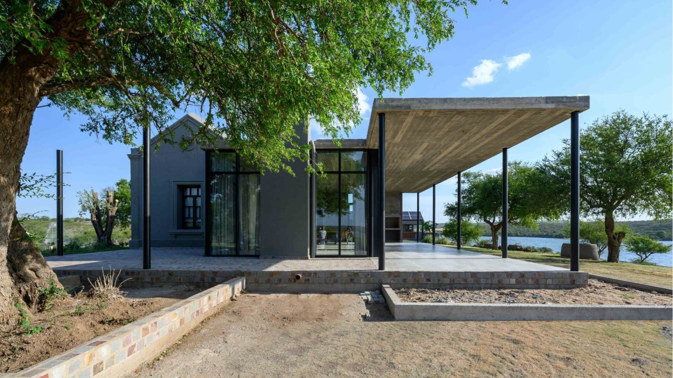
Karlen + Clemente: The expansion project works on a house that has existed since 1918, on practically wild land located in front of the Tercer Usina lake, in Córdoba.
The biggest challenge of this house lies in giving meaning to the original house again with the fewest possible interventions on it (only repairs and maintenance) and, since we understand that it is impossible to blend in with the old given the change in techniques, trades and materials , respecting that authenticity of the historical with an architecturally new and contemporary piece that does not overwhelm the context but rather generates a complementary opposite.
This new piece houses the social functions, capturing the views of the Lake by developing completely transparently and playing in opposition to the original block that remains as night and service areas.

Use:
Functionally, the project is essentially a temporary housing, so we aim to achieve the greatest accessibility and flexibility of the social environments with the outdoor space, guaranteeing full use throughout the summer season. It seeks to sustain the existing home to the maximum, so the expansion is based on 3 main objectives: 1. Incorporate the social area embracing the original block without affecting its structure. 2. Provide flexibility and visuals to the new architectural piece. 3. Adjust what is essential to be able to provide a new function to the original home.
The new entrance is made up of an "exterior hall" hierarchical by means of a transparent eave, through which we enter the compact volumetry, of thick walls and small openings that make up the existing house. It now has a night area with 3 bedrooms and a service area: the kitchen joins the new living-dining room through the old entrance door on one of the walls, in search of greater space and freedom of function.
The living-dining room expands to the outside by incorporating a gallery and metal pergola that surrounds it, allowing the exterior landscape to be linked with the interior of the social space.

Character:
Aesthetically we try to achieve pure and clear forms, working with transparent planes for the social and open areas, as opposed to the heavy box and small openings of the existing house.
As a result, the house appears heavy on its front façade, and gradually dematerializes on its rear face, completely opening up to the views, seeking to highlight its horizontal character through a thin concrete slab that makes up the outdoor social space.
The materials were chosen for their permeability and low maintenance, and for this we opted for exposed concrete framed in boards, glass carpentry in black aluminum and thin metal columns that give a sensation of lightness as opposed to the existing heavy box.


