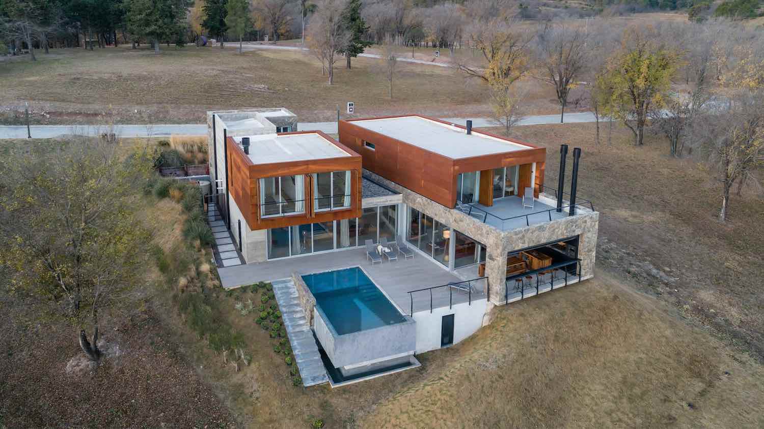
Juliya Andrievskaya Studio: A country house in the Moscow region (Pestovskoye reservoir), built according to an individual project.
What were the advantages and disadvantages?
The architecture of the house is made in Italian style. A house with large arched windows, which was the advantage. Inside the building there were no walls at all, there was no staircase connecting the floors, only the ceiling of the second floor and several load-bearing structures.
For whom was the interior created? What can we say about customers? What wishes did they express at the first meeting?
The clients are a young couple with two small children. Very positive and kind people. They came with the exact idea that the walls should be white, the sofa in the living room should be emerald-colored in velour fabric, the fireplace should be decorated with brickwork, the furniture should be in Provence style and the staircase with forged elements. But from their list we left only white walls. I moved the brick that they wanted to decorate the fireplace into the children’s room, replacing it with beautiful, natural, white marble.
I completed the project in a year and a half, of which I spent almost a year trying to persuade them to replace the Provence-style furniture with more contemporary ones. During the renovation, I managed to gain the complete trust of my clients and subsequently they agreed with my vision. Now they are completely delighted with their home and are grateful that I did not follow their lead and defended my ideas.

How would you formulate the main idea of the project?
Mediterranean style with modern furniture and vintage pieces. The main idea of the project: to create a space for living and relaxation, where after the noisy city you can plunge into the harmony of nature.
Color range
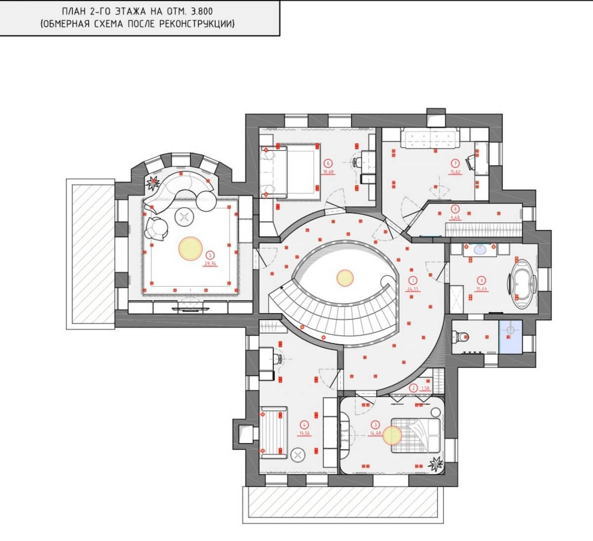
Natural shades with a dominance of white for a feeling of spaciousness and lightness. I wanted to swirl the space around the center of the house (like a shell in cross-section). To do this, I created a radius staircase and all the rooms turned out to be of a non-standard shape with a rounded wall. The interior was based on natural textures and light natural shades. All textures and colors in a monochrome interior should overlap and be combined. To add atmosphere to the living room and kitchen, the ceiling was decorated with wooden beams. It was important to combine several styles. With rough plaster and aged beams, I wanted to use modern furniture without patina or age. At the same time, hang a vintage chandelier from the 70s and use plaster stucco in a modern design. I have a huge interest in unconventional combinations of items.
Finishing materials
For finishing I used matte, rough plaster (decorative plaster “mazanka”). Mentally it takes us to the sea coast.
How did the color palette come together?
In furniture, I gave preference to bleached oak and light shades of white and gray, and only some items are made of red leather.
What criteria were used to select the furniture?
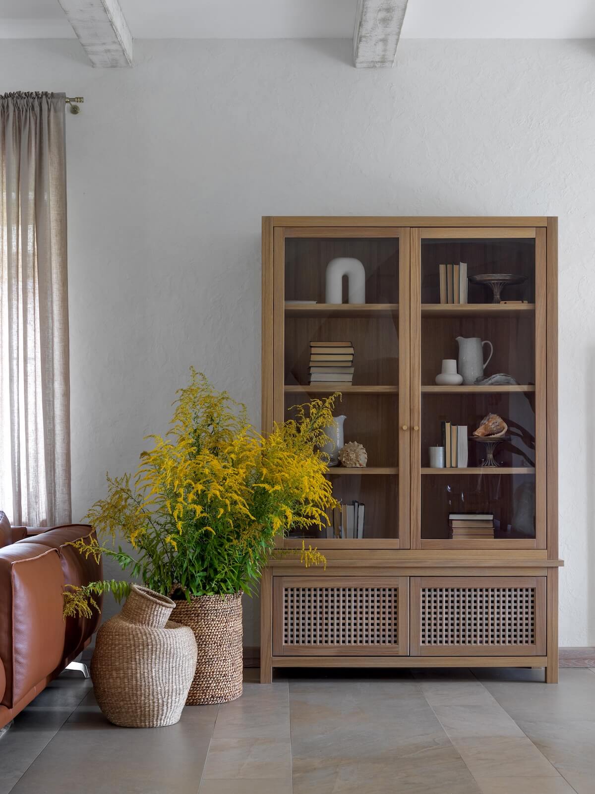
The house has a lot of decorative elements and furniture made by hand by local craftsmen. The large windows were decorated with light, translucent curtains made of natural linen. And, in general, only natural materials are used in the decor of the entire house.

Are there any interesting technological solutions in the project?
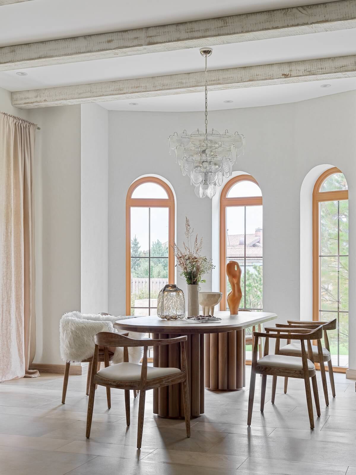
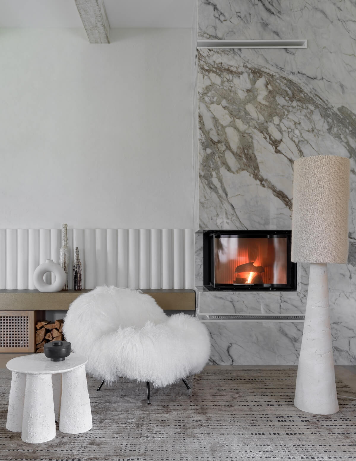
Dining area - table according to my sketches. The tubular bases and tabletop are made of solid oak. Clients brought chairs from Spain. Vintage chandelier from the 70s (Italy). The round panel on the wall was made by me from plaster and wool. Fireplace area - fireplace made of natural marble of Italian origin. Tubular plaster molding that echoes the table bases. A large tan leather sofa acts as an accent in a white space. Whitewashed beams visually break up a large area of the ceiling, give dynamics, creating the atmosphere of a country house. A silk carpet with an interesting pattern gives a feeling of softness.
Kitchen
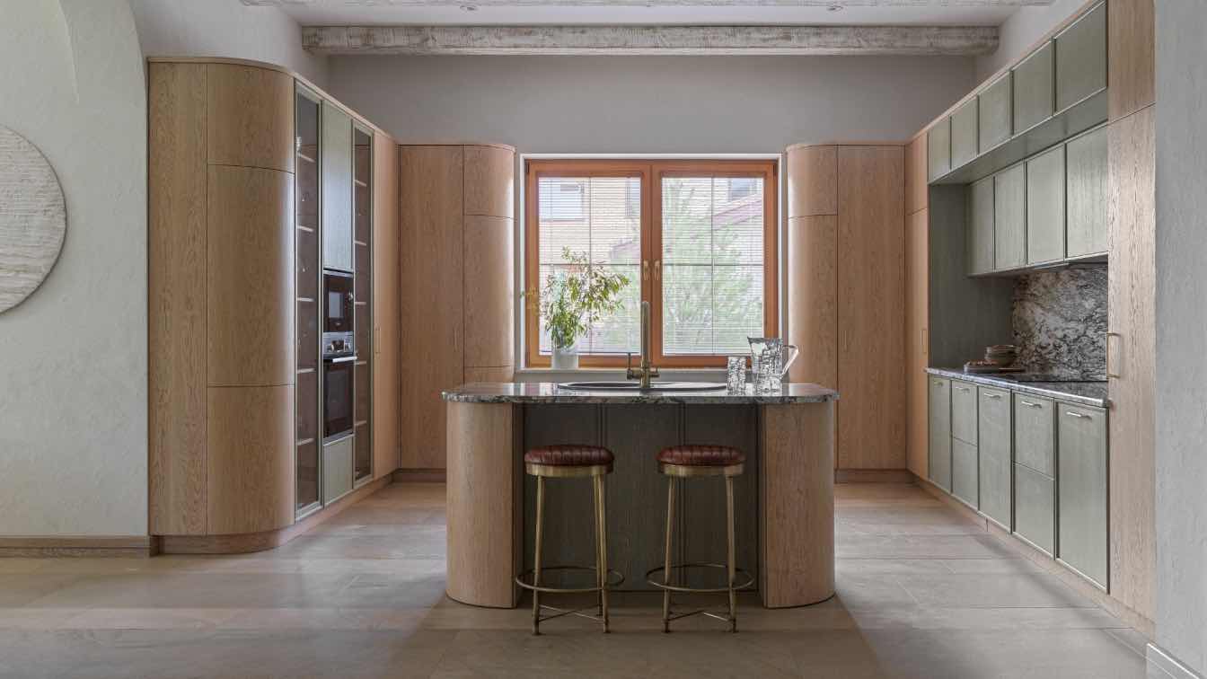
Continuing the living room, the ceiling is also decorated with beams. Everywhere I tried to soften the space and for this I used radius facades near the kitchen and island. The erected arches in the passages echo them well. The result is a large kitchen with modern facades made of natural oak veneer and soft olive with a thin frame. Beautiful natural granite Blue Flower (Italy) on the countertop and backsplash decorated and emphasized the color scheme of the kitchen.
Hall
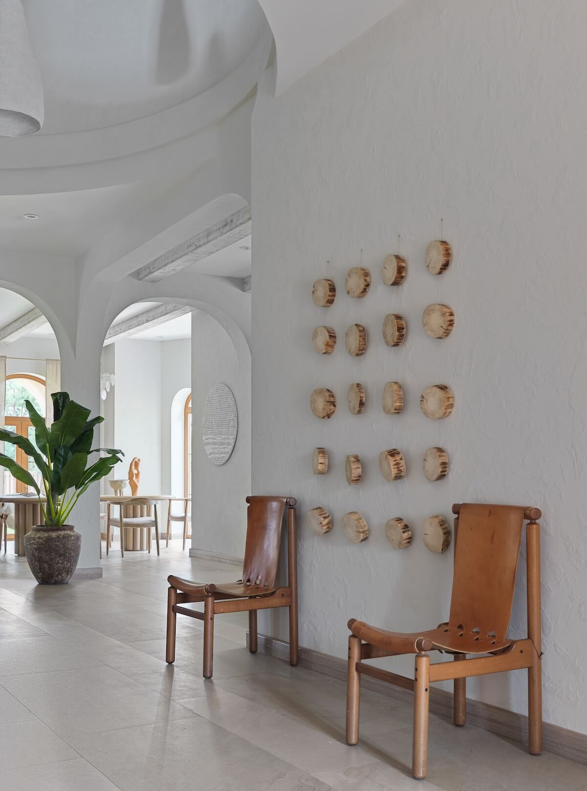
The white hall with a staircase trimmed with oak steps is decorated not only with handmade sconces, but also with large lampshades on long pendants of different heights. When I saw them, I thought that the guys who invented them created them specifically for this house. Above the vintage chairs, the wall was decorated with sawn hemp. Any items made from natural materials by hand, even collected in the forest near your home, fit perfectly into such interiors. A large wardrobe made of oak slats creates a maritime atmosphere.

Bathroom 1
The walls are decorated with fine mosaics made of natural marble. The plaster elements were created from drawings to match the circles on the floor tiles. Bathroom furniture according to designer sketches, handmade sconces.
Guest bedroom (red)
There is an arch trimmed with stone at the head of the bed. Stumps serve as bedside tables. A great addition to them is a jute carpet. The color of the bed and bedding looks bright against the background of a monochrome interior.
Bathroom 2
A bathroom with a window is always beautiful. It turned out to divide it into two zones. In the first there is a toilet and a shower, and in the second there is a large oval bathtub standing by the window. Furniture according to my sketches. Sconce interspersed with pieces of white and milky glass, also according to my sketches.
Master Bedroom
Architecturally, I really wanted to smooth out the space. She suggested rounding the corners. The result was an enveloping room. The doors to the dressing room were made according to my sketches. The veneer was laid out like a Christmas tree. A vintage pearl chandelier was brought from Spain. The “Serenity” bed was also made according to my sketches. Puffy headboard in a modern trend and Italian wool bouclé fabric. To complete the space and draw the eye away from the asymmetrically placed window, I made two pictures from the same fabric as the headboard.

Children's rooms
In one room, I suggested making a brick wall with Mickey Mouse graffiti. A brick wall is always a convenient and practical option. Yellow sofa according to my sketches. Oak furniture is in perfect harmony with the floor and brick. Children really liked the Alky chair from the 60s. The second children's room is in green tones. Fun circles are made of plaster and painted to match the color of the wall, they add atmosphere to the room. A combination of several shades of green is possible with the right selection of decor. The wall decor balanced out the circles and squares in the room's elements. The final accent was the carpet, which contains all the color spots.
Greatest success about this project?
Ladder. I coordinated it for a very long time, because the customer did not expect this. They liked the idea of a radius staircase, but they couldn’t imagine a concrete fence at all. They saw forging. After several months of my persuasion, they finally decided and even in the concrete construction version fell in love with it. And when they added the oak handrail and steps, the whole stage of my persuasion was completely completed. The staircase is decorated with handmade sconces based on my sketches, our joint collection with Alexey Drozhdin. Crystal elements with a vibrant texture on an aged brass base. From the same collection there is a ball chandelier in the living room, where glass on brass tubes pierces an oak ball.
Remember some funny episode while working on a project
During the time I was running this project, I forgot how to simply walk through the forest without a goal, going out of town. Everywhere and in everything I saw decorative elements that I wanted to use in this house. But in order to apply them, it was necessary to work with them quite a bit. This is how the bedside tables in one of the bedrooms and the decor on the wall in the hall were born.








About Julia Andrievskaya
Interior designer, artist. Born in Moscow. Having graduated with honors from the Art School named by M.A. Vrubel, received a higher engineering education at MISI-MGSU (Moscow State Civil Engineering University). Subsequently, she continued her education at the School of Architecture and Design.I have been modeling with clay for many years. The love of creativity and the desire for beauty smoothly led me to a passion for interior design. I've been doing interior design for over 10 years now. I have created more than a dozen different projects and brought them to implementation. I work in conjunction with construction teams. Apartments, houses, public spaces, regardless of size and style. I implement projects in different styles from modern classics to loft. Starting from design drawings and ending with textiles and decor

