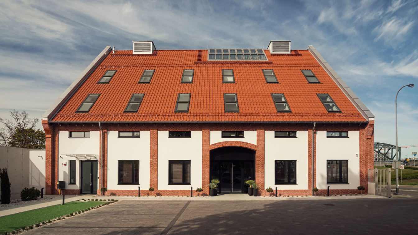
U-DENTAL is a chain dental clinic with a history of 15 years, targeting at middle and high-end consumer groups in Shenzhen. The brand set a new premise in One Shenzhen Bay, a vibrant mixed-use community, hoping it to balance contemporary art and a sense of technology to meet the demands for upgrading healthcare consumption.
To break the stereotype of conventional clinics that bring people anxiety and fear, DA INTEGRATING LIMITED adopted the concept of “contemporary art gallery” to explore the integration of medical space and contemporary art. With natural, geometric, and contemporary artistic elements intertwined in the white space, the design team created a distinctively peaceful, comfortable and warm dental experience.
Field: Starting from Emotions
The design fully considers users' experience. The overall space reveals a minimalist aesthetic. The combination of white surfaces, lines and play of light and shadows produces a peaceful, relaxing ambience, thus dispelling the depression and anxiety brought by conventional dental clinics.
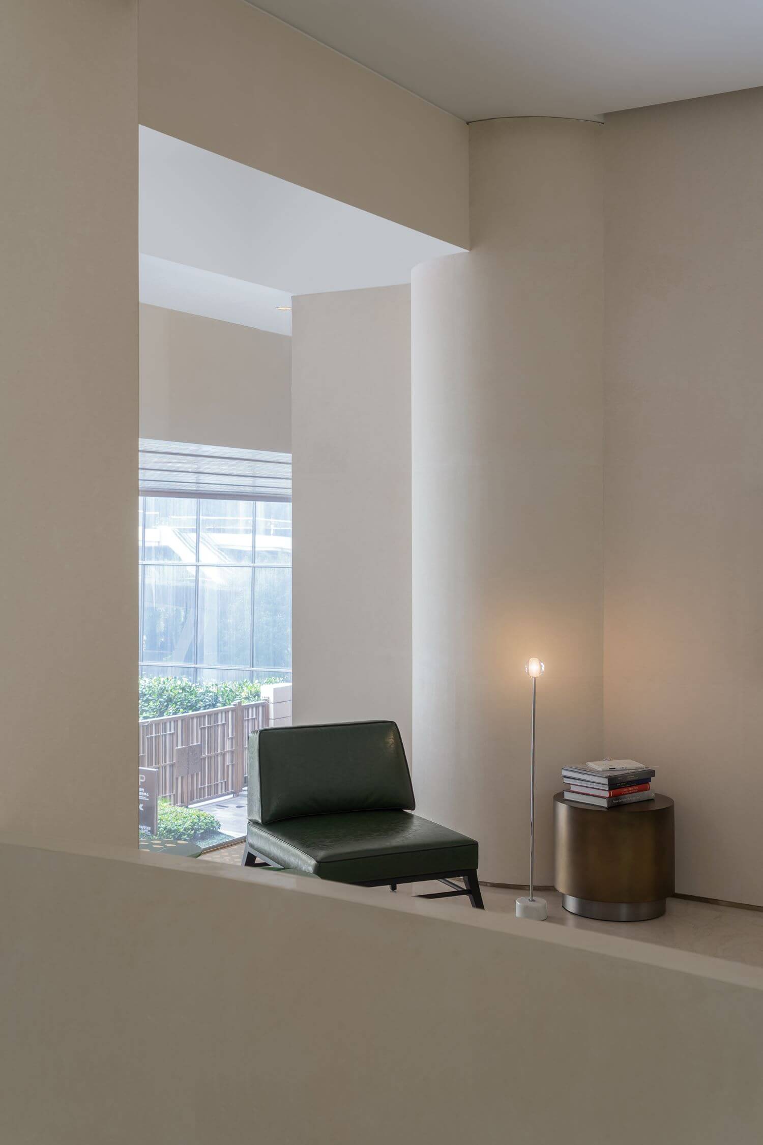
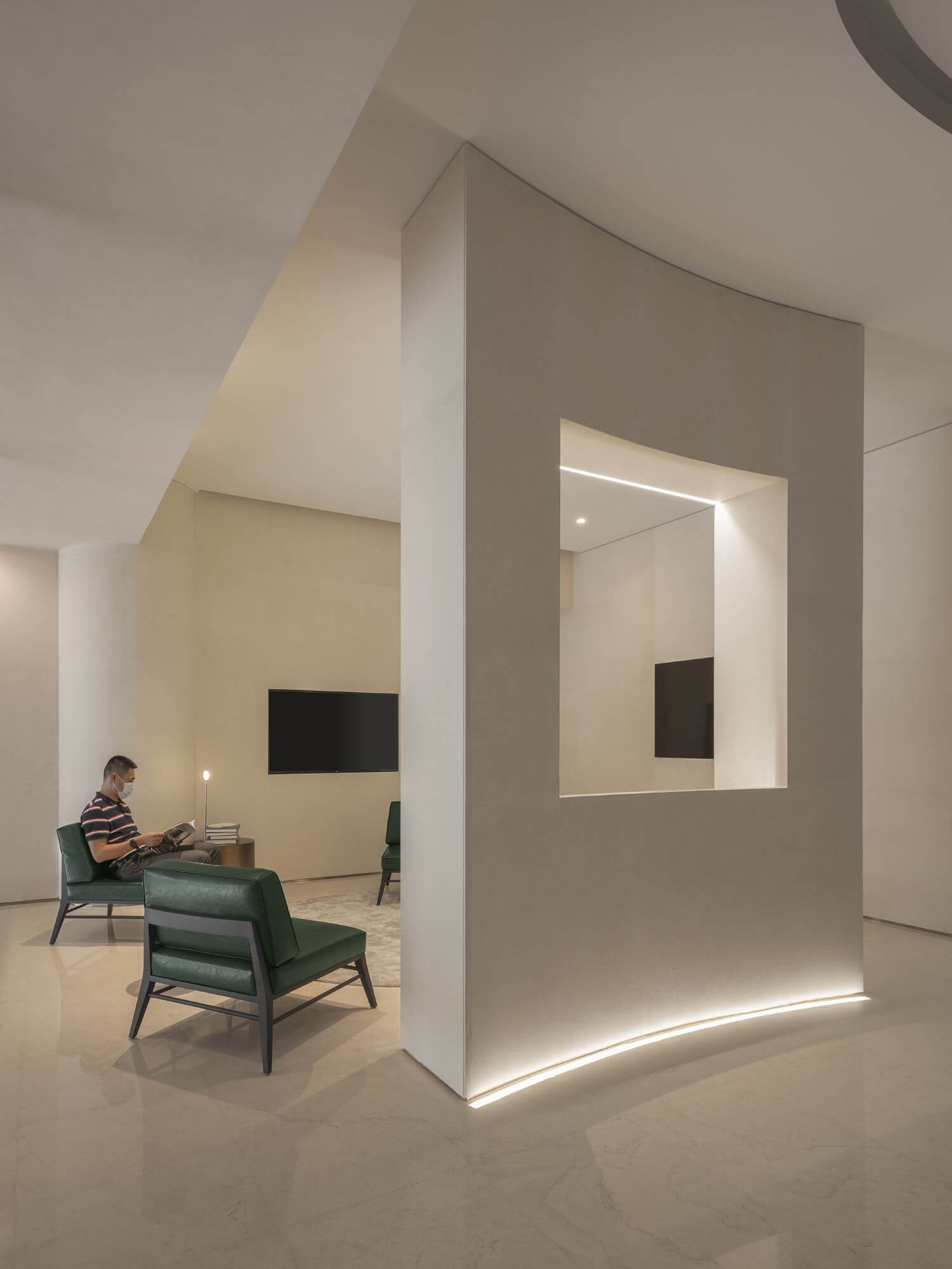
Geometric aesthetics are applied to the foyer and reception area, with the rigorous geometric order producing an emotional spatial field. The white marbles and beige stone materials set a simple, clean tone in the space. The carved-out opening at the center of the wall is like a cubist painting, and people naturally become the protagonist of the “enframed view”. Moreover, the warm lighting adds to a relaxing atmosphere.
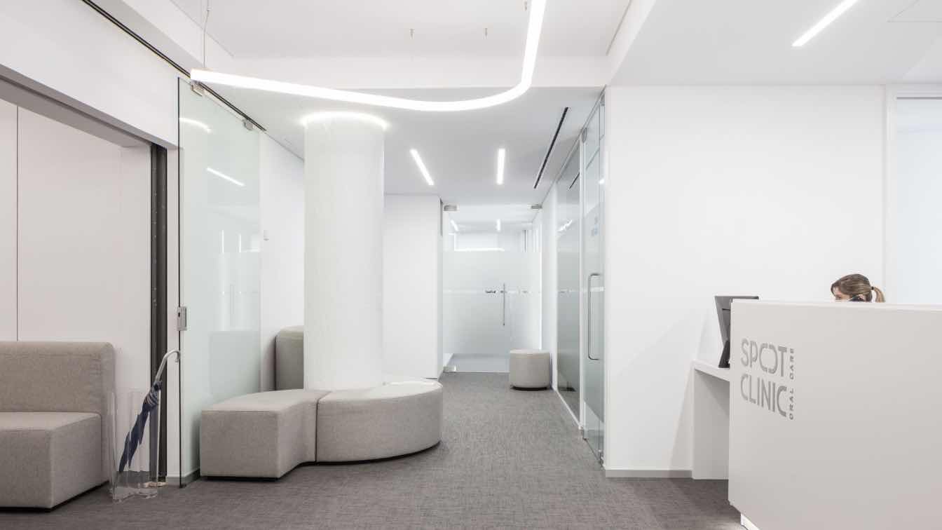
The slightly curved screen wall functions as a partition, delicately balancing openness and privacy. Besides, it echoes the arc-shaped ceiling, strengthening a sense of depth for the horizontal setting and meanwhile weakening the existing columns and fire-fighting pipes. Light strip is embedded in the area where the two columns connect with the ceiling, hence creating a contrast of solidness and lightness and showing aesthetics of contemporary sculptural art.

Space: From Complexity to Simplicity
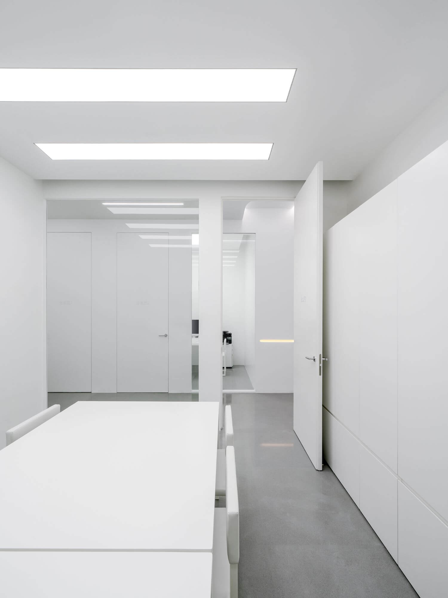
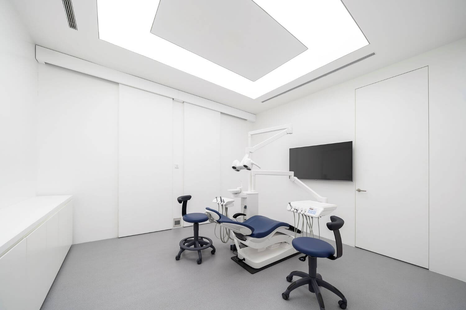
The design balances aesthetic simplicity with functional complexity. Starting from the medical attribute of this project, the main space is organized and cut in an orderly and precise manner, which efficiently accommodates professional and systematic medical functions. The design meets all the complicated specifications with a simplistic setting.
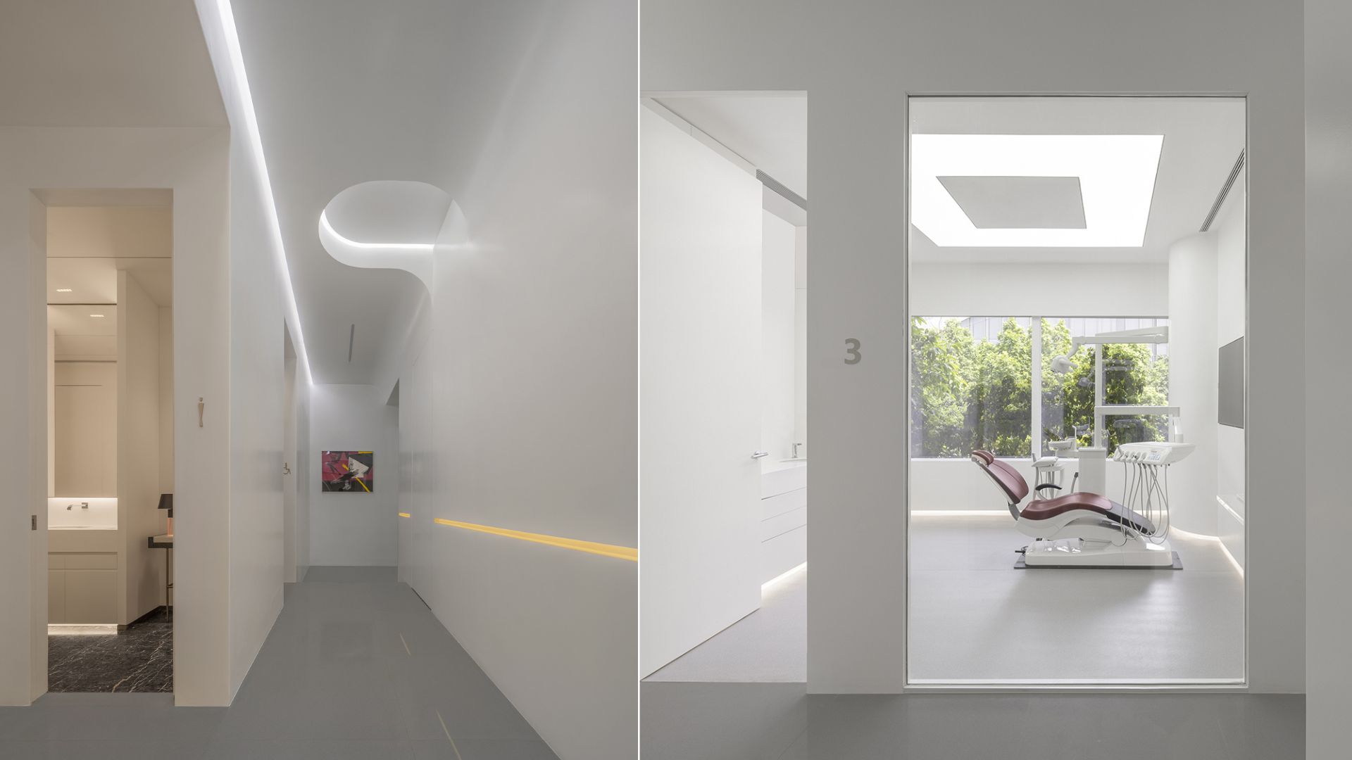
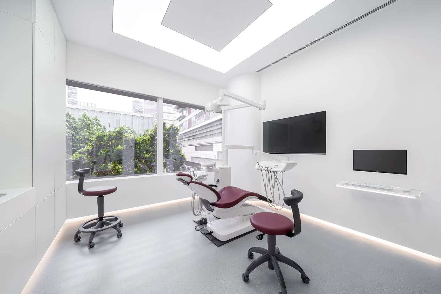
By absorbing the “pure white” expressions of contemporary art gallery, the consulting & operating rooms feature a rectangular plane, and adopt flat, seamlessly connected composition to ensure an integrated, smooth circulation. The glass curtain walls bring in adequate daylight and outdoor landscapes, so as to brighten the space and remove patients’ nervousness during treatment.
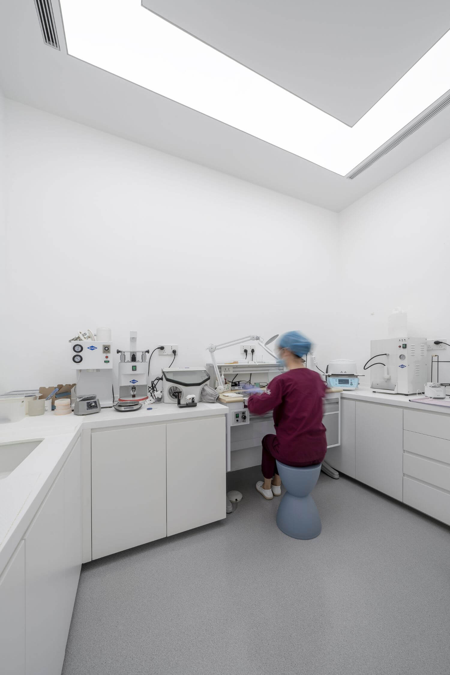
The professional functional area is set in an aseptic environment, with the pure “cleanness” of space complements the “complexity” of machinery and working state. Straight lines and squares from an integrated, simplistic spatial background, while dentists’ professional concentrated working status is like a piece of “artwork” in the space.
Details: Human Scale-friendly
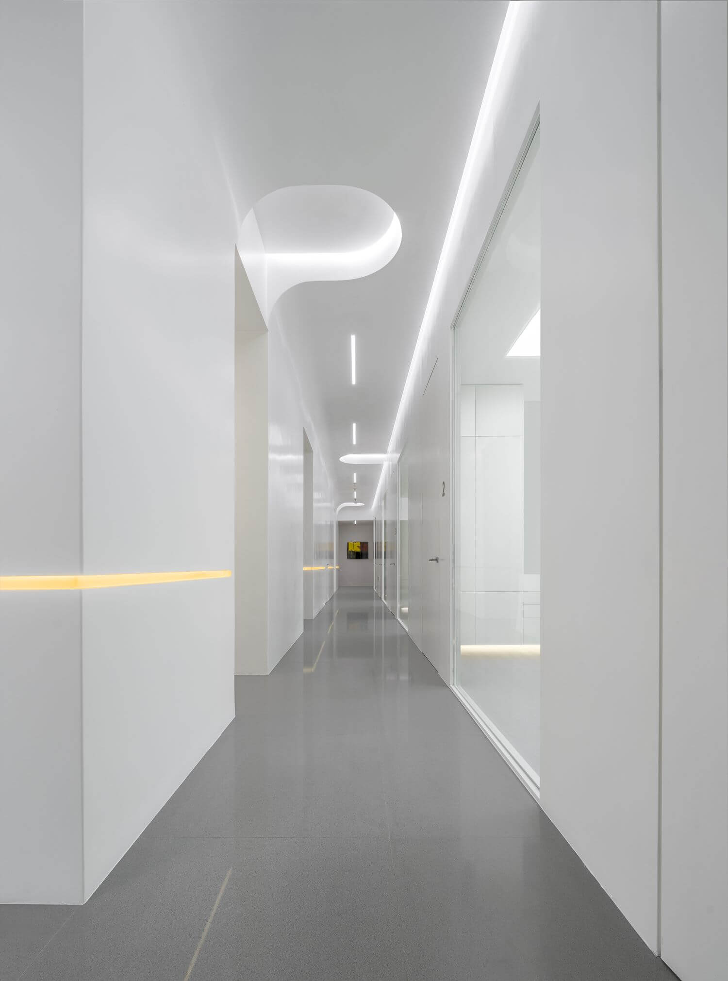
With a limited area of about 500m², the space perfectly balances practicality and the sense of design through innovative, simplistic contemporary aesthetics. Functional zones with different attributes are divided by the two automatic doors in the foyer, and connected by a contemporary art gallery-like passage loop, which improves the separate circulation routes of patients and dentists, and enhances the spatial order as well. Resin paint, commonly seen on yachts’ exteriors, is innovatively applied to the walls of passages, which meets the high requirements of environmental cleanliness and maintenance.
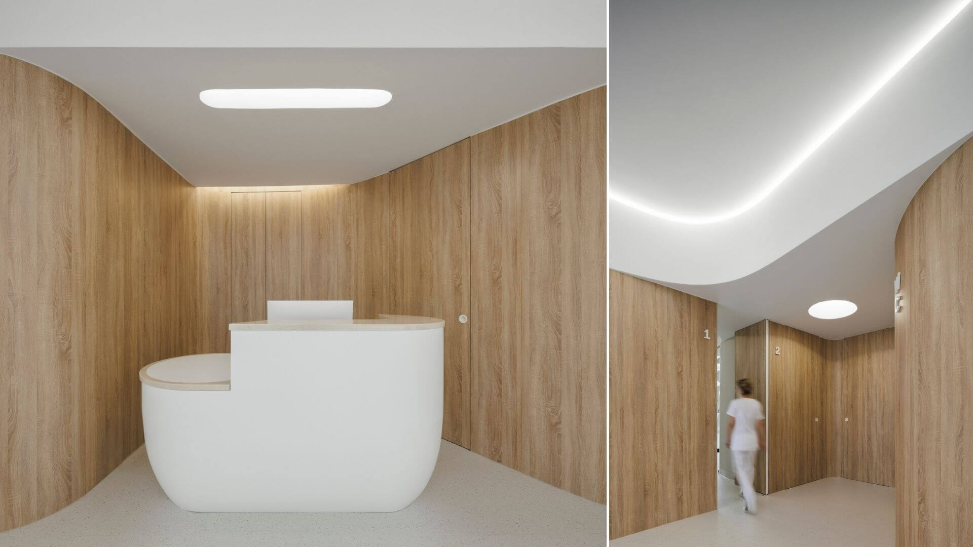
The clinic's U-shaped logo, which implies a smile, is extracted and translated into curved details in the space. This reveals functional aesthetics and helps weaken the sharpness of corners. At the passage area, the ceiling features curved structures and form chamfered corners with the wall, thus softening the square space.
The space incorporates not only artistic and human-friendly design languages, but also subtle lighting expressions. The professional and non-professional spaces are distinguished by white and warm lighting. Combined with materials and textures, the lighting reflection creates a differentiated visual effect. The warm yellow linear light floating on the wall shows a sense of technology, helps guide the circulation routes and provides a distinctive sensory experience. For this project, DA INTEGRATING LIMITED created a surreal, aesthetic and transparent spatial realm, which realizes harmonious fusion of the medial space and contemporary art.










About
DA INTEGRATING LIMITED is a creative solution provider for spaces of cross-border contemporary art. "D" represents design and pragmatism, while "A" means art. Chinman Ngai founded the design practice in London in 2013, with the aspiration for seamlessly integrating pragmatism and contemporary art into daily life. So far, we've created a great many contemporary art spaces, including but not limited to Shenzhen eMoCA, Sanya Museum of Contemporary Art, KENNAXU Gallery, Suiyue Art (Chengdu) and Tus Museum of Contemporary Art.
Based on the observations of contemporary humanistic lifestyles, DA INTEGRATING LIMITED mainly focuses on contemporary art and meanwhile works in wide spectrum of fields. We work on a wide range of projects such as contemporary art and cultural spaces, yachts & trailers, micro architecture, boutique stores, boutique hotels, residences, etc., and offer integrated, customized services which span upscale design, furnishings, decoration execution and more.

