1) Brand familiarization
ELMAU is a modern clinic of a new generation. Here a patient can receive a full cycle of dental services, relax while waiting for an appointment with a cup of coffee and take the children to the playroom. As the authors of the project, we set ourselves the task of integrating the Tatar identity into a stylish, comfortable and technological space.
Our team of architects started building the design concept with the clinic's name and location. We combined the historical and cultural component with cutting-edge technology.
2) How did you get to know your clients? How did the cooperation develop?
The project of the dental clinic was born in cooperation with the client. When the couple, owners of the ELMAU clinic, first approached AR ARCHITECTS, they did not have a clear idea of what they wanted to get as a result. But the joint work brought excellent results: already at the first meetings the designers of the bureau together with the customers approved the general concept. It was based on a departure from the classic concept of clinics in blue and white colors and an emphasis on ethnic identity.
3) The basic idea of the space.
ELMAU translates from Tatar as “smile”. The national language has become one of the design tools and is reflected in the names of the rooms. For example, the X-ray room is called КОЯШ - “sun”, and the children's room ЯРАТУ - “love”. In the clinic, each room has its own name in Tatar and an adapted translation into Russian. This helps to integrate historical roots into a modern context.

4) Interesting solutions in the interior.
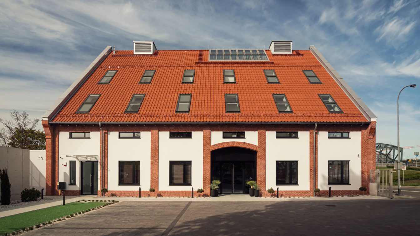
The three-storey building of the dental clinic is located near the historical center of Kazan - Lake Kaban. This place is famous for the most unusual legends and fairy tales and, of course, it influenced the ethno-filling of the design project.
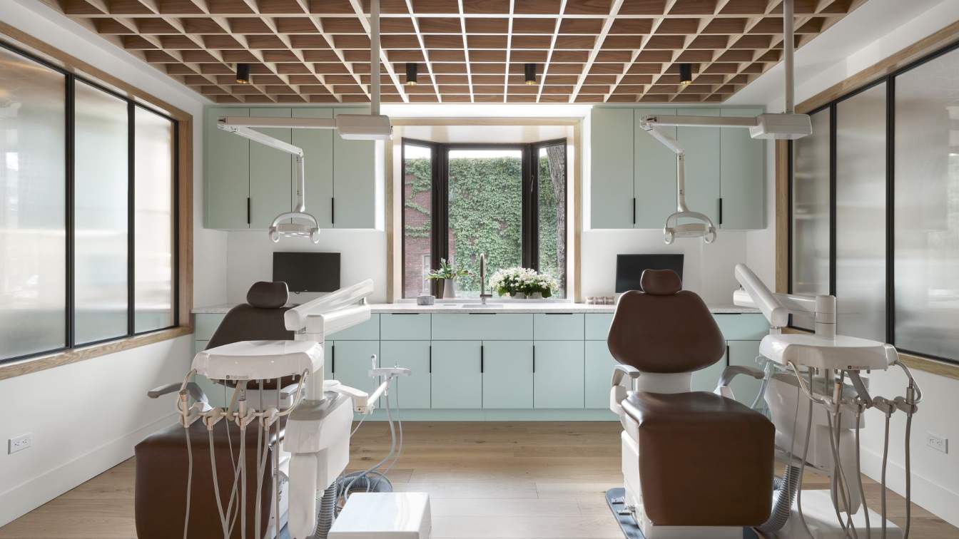
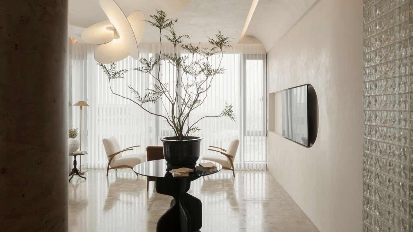
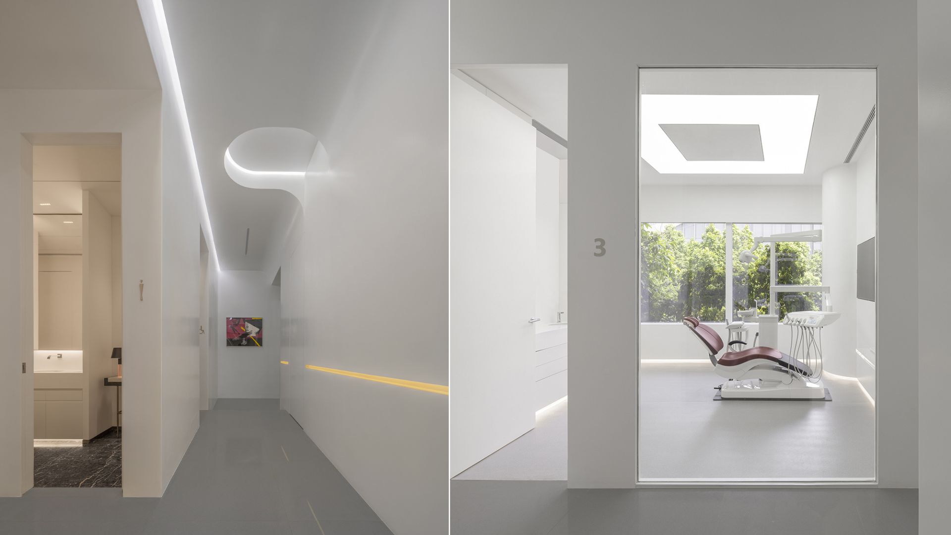
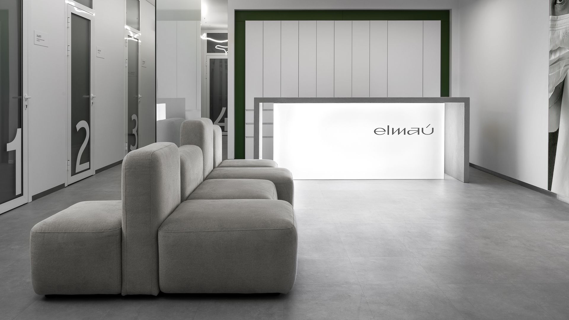
This is how the mythological dragon Zilant, the symbol of Tatarstan, appeared in the concept. Zilant is reflected in the project by a long LED strip. It continuously illuminates the patient's path on all floors of the clinic. The dragon's energy is also personified by the curved furniture that repeats its smooth movements.
All the furniture works in a unified ensemble to create a unique and authentic space. To add mobility to the design, we chose upholstered sofa transformers from furniture brand Mass Furniture. This is a modular sofa CHU'BAKKA in laconic gray color for the reception area and 20-meter sofa KOLBASA - a modern solution that obeys the main design concept thanks to smooth, movable forms and rich green color.
Green has become the central accent of the clinic. It is present in the color scheme, decorative elements and textures. Each component of the design is endowed with an independent meaning and at the same time works for the general perception of the interior. Transparent glass in the central zone is a reference to the water surface of Lake Kaban, plants - to the nature of the city, and gray shades - an allusion to the materials of the embankment and paving of the Old Tatar Sloboda.

5) What materials and furniture were used?
Brands used in the project:
FURNITURE:
Armchairs and sofas - https://massfurniture.ru/
TILE:
Tile - https://kerama-marazzi.com/
PLUMBING:
Custom sink - https://petrobeton.com Everything else is made to order
6) Final Word.
Our AR ARCHITECTS team created a unique dental clinic with a carefully thought out concept in just 2 months. We challenged the traditional design norms of medical facilities, prioritizing the comfort of doctors and visitors surrounded by modern-adapted motifs of Tatar identity.
Ruslan Aibushev, co-founder of AR ARCHITECTS, advises his colleagues not to be afraid of color in commercial projects, “because it can become a direct association with a brand and make it stand out from the competition.” This is how green, which is atypical for a dental clinic, helped ELMAU become more noticeable against the background of other clinics, both in Kazan and throughout Russia.