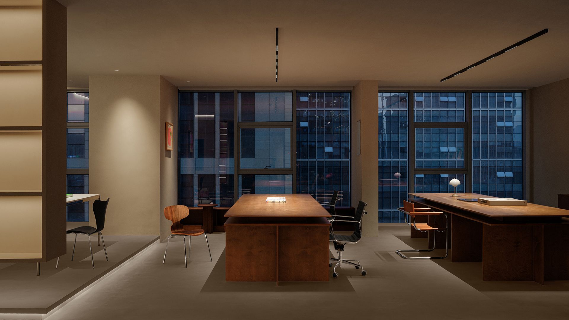
This real estate office, designed by Hiren Patel Architects transcends conventional workspace concepts, embodying the firm’s dedication to harmonizing human creativity with the tranquility of nature. Spanning over 12,500 sq ft, the office stands as a testament to HPA’s pioneering spirit. From the moment you approach, the architecture reveals elegance and innovation. Eschewing traditional cubicles and concrete barriers, the design fosters a connection with the environment, creating an invigorating and inspiring atmosphere. The curved roof and seamless indoor-outdoor transitions reflect Hiren Patel's approach to enhancing productivity and well-being through design.
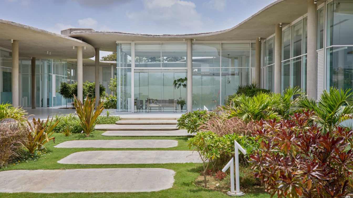
At the heart of the building’s design lies its most iconic feature—the roof, which curves like a wave. This is not just a bold expression but a symbolic one, representing the fluid and ever-evolving nature of both the client's business and the work that happens within. The roofline suggests movement and dynamism, challenging rigid office designs we’re accustomed to. It captures the essence of flexibility and freedom, setting the tone for what lies within.
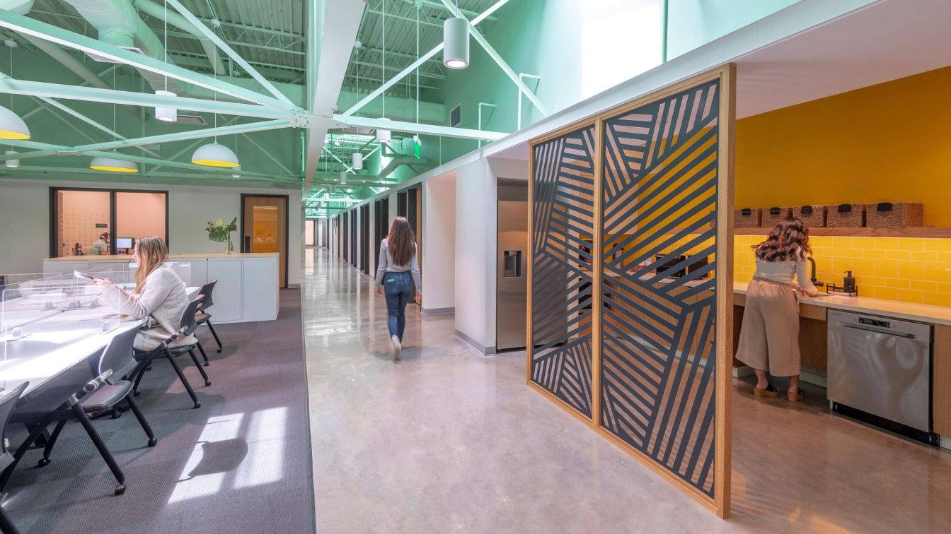
As you step into the office, you are welcomed by a space that is as open as it is inviting. The design eliminates barriers such as walls and cubicles, allowing for an uninterrupted flow of ideas and energy. This concept encourages collaboration and interaction, where creativity can flourish without the constraints of boundaries. Every corner of the office feels connected, not only to the people within but also to the world outside.
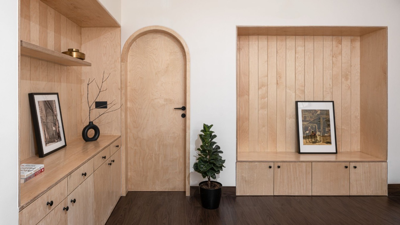
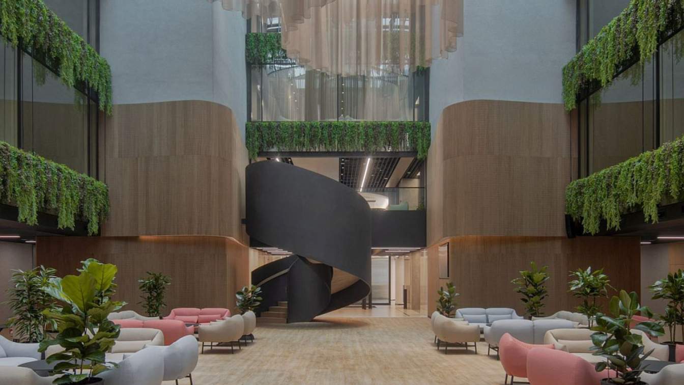
Floor-to-ceiling glass walls stretch across the building, dissolving the traditional separation between indoor and outdoor environments. From every workspace, there are clear views of the surrounding lawns and greenery, making nature an integral part of the experience. The use of materials such as warm-toned wood, coupled with natural light, creates a welcoming atmosphere that feels less like an office and more like a retreat. A living wall of plants enhances this connection to our surroundings, infusing the space with a vibrant, organic energy that promotes well-being.

At the core of the building lies a central courtyard designed as a zen garden. This serene space serves as the focal point, offering a quiet refuge for reflection and relaxation. Surrounded by planters and water features, the garden provides an experience that soothes the mind and invigorates the spirit. The sound of trickling water, the rustle of leaves, and the play of dappled sunlight create an atmosphere that is both meditative and inspiring.
The courtyard plays a vital role in the overall experience of the office. Positioned at the centre of the workspace, it offers employees an escape from the pressures of work, while also acting as a source of motivation. It encourages mindfulness and a deeper connection to the rhythms that surround us.
The design of this office goes beyond incorporating nature—it fully integrates and celebrates it. Water bodies flank the entrance, guiding visitors through a landscape that feels alive, breathing the vibrancy of plants and the serenity of flowing water.
While the design is focused on creating a peaceful, nature-inspired atmosphere, it doesn’t sacrifice functionality. The office layout is planned to ensure that every area serves its purpose. The reception area is open and welcoming, while the waiting area offers a comfortable space for visitors, surrounded by views of the surroundings. Private cabins are discreetly placed along the sides, offering quiet, focused spaces for work without disrupting the overall flow of openness. In the centre, the courtyard provides a calming focal point, while towards the back, a gym and sitting area cater to the physical and mental well-being of the employees. These features turn the office into more than a place to work; they make it a space for rejuvenation and creativity. The attention to detail extends to every aspect of the design, from the use of natural materials to the thoughtful placement of services, ensuring that the space is beautiful and highly functional.
In this office, work becomes more than a task. It is a place where employees are refreshed and inspired by their surroundings, where creativity flows and where boundaries between the built and nature are joyfully blurred. This office is not just a place to conduct business; it is a statement of how architecture can elevate the everyday experience, making work not only productive but also meaningful.


