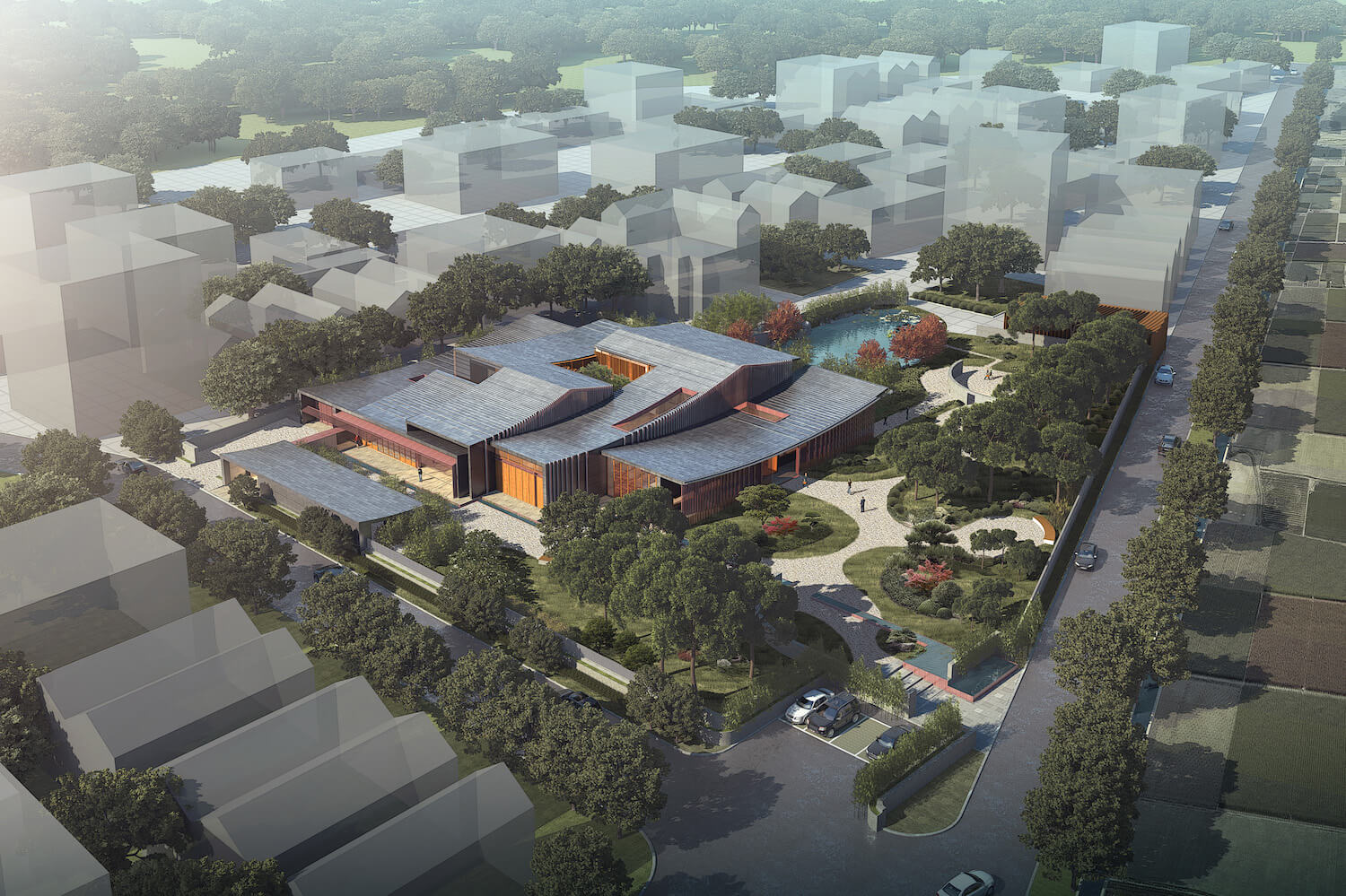
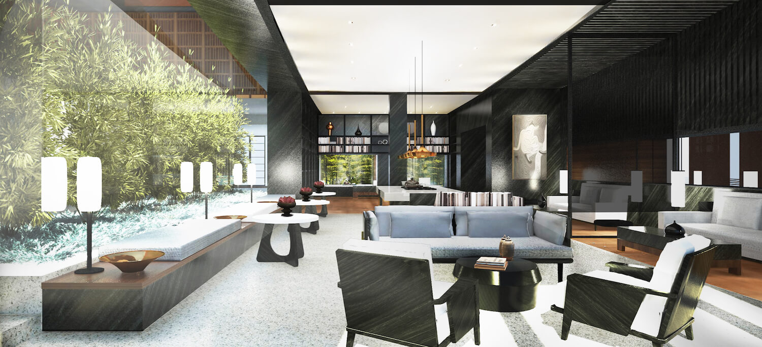
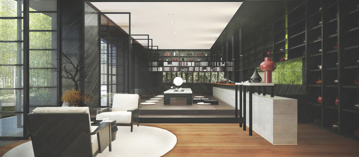
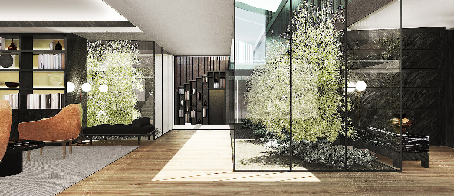
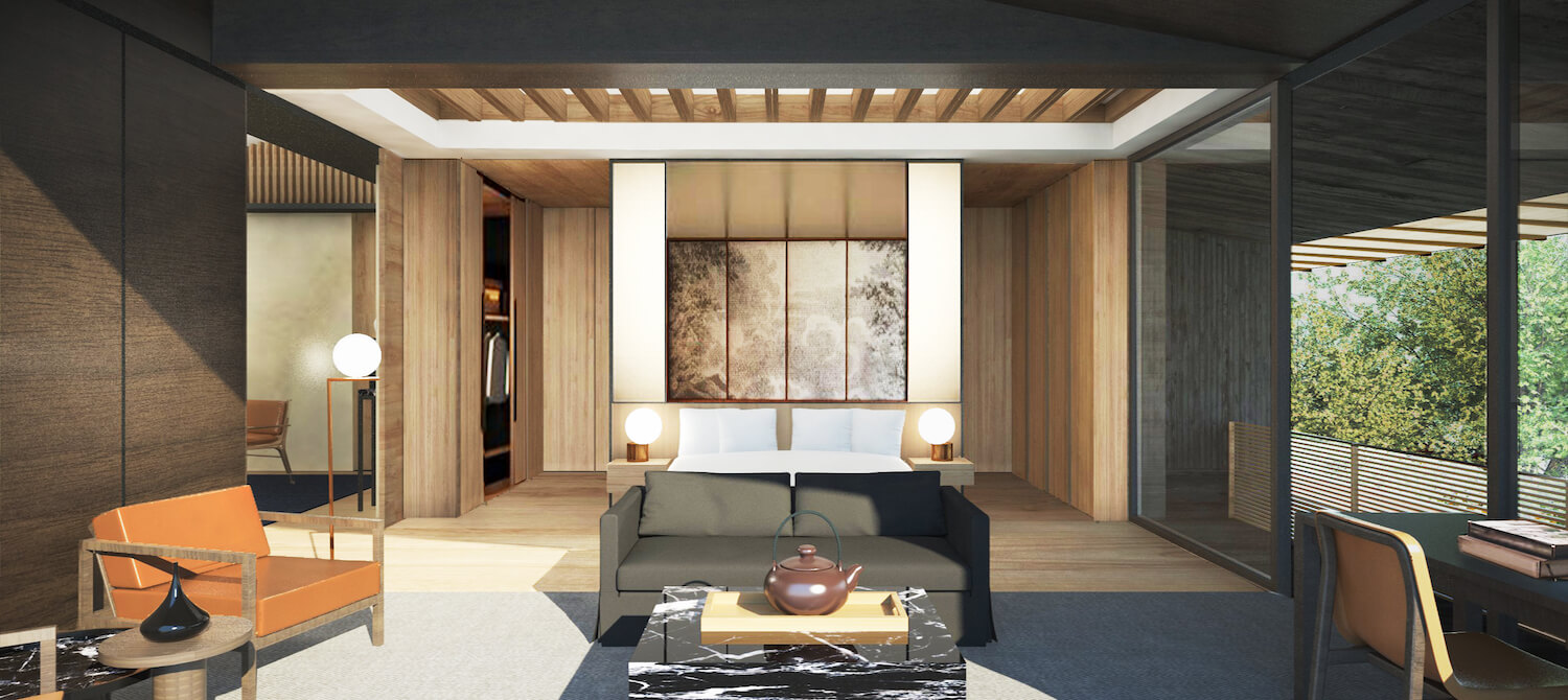
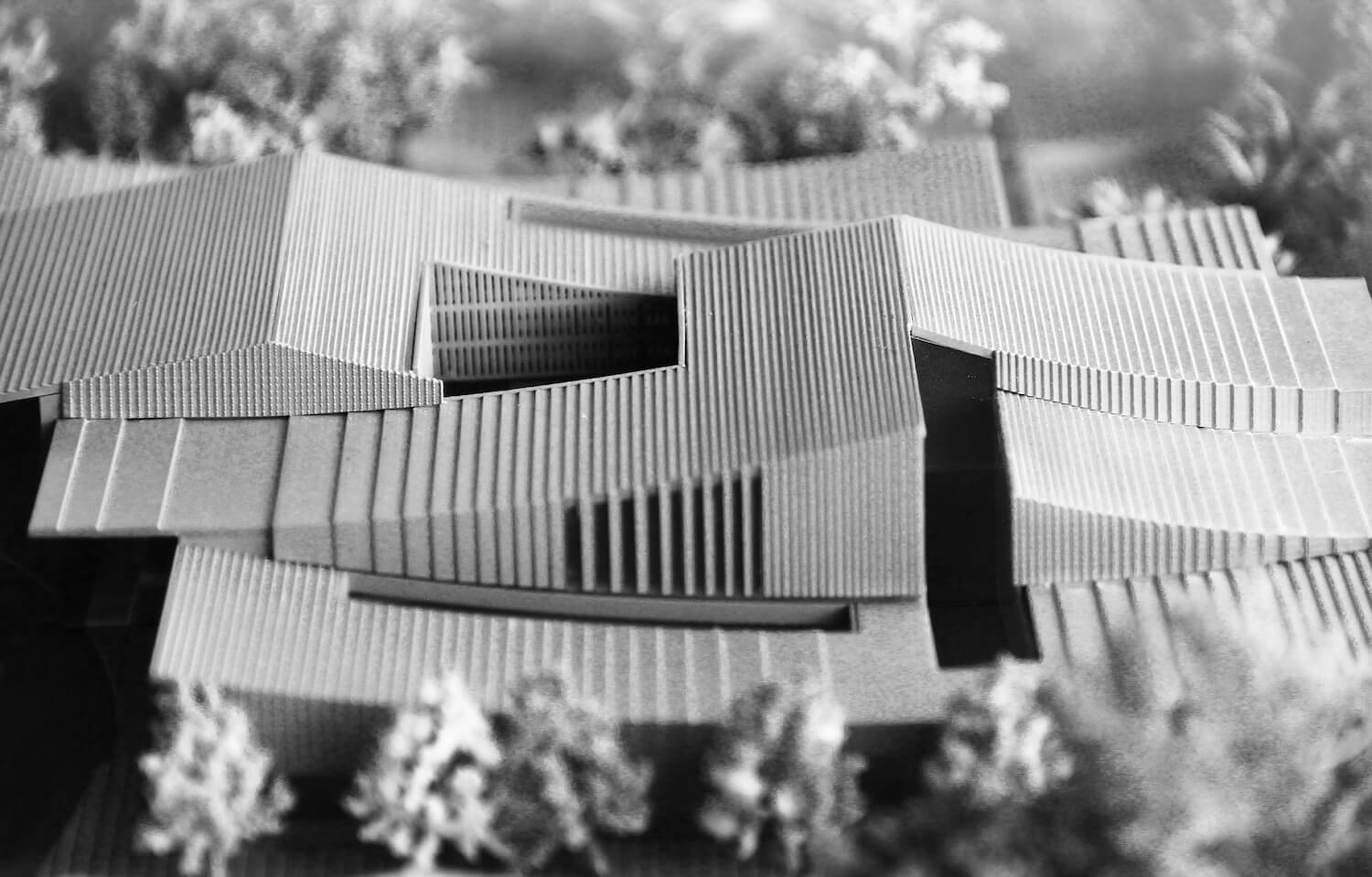
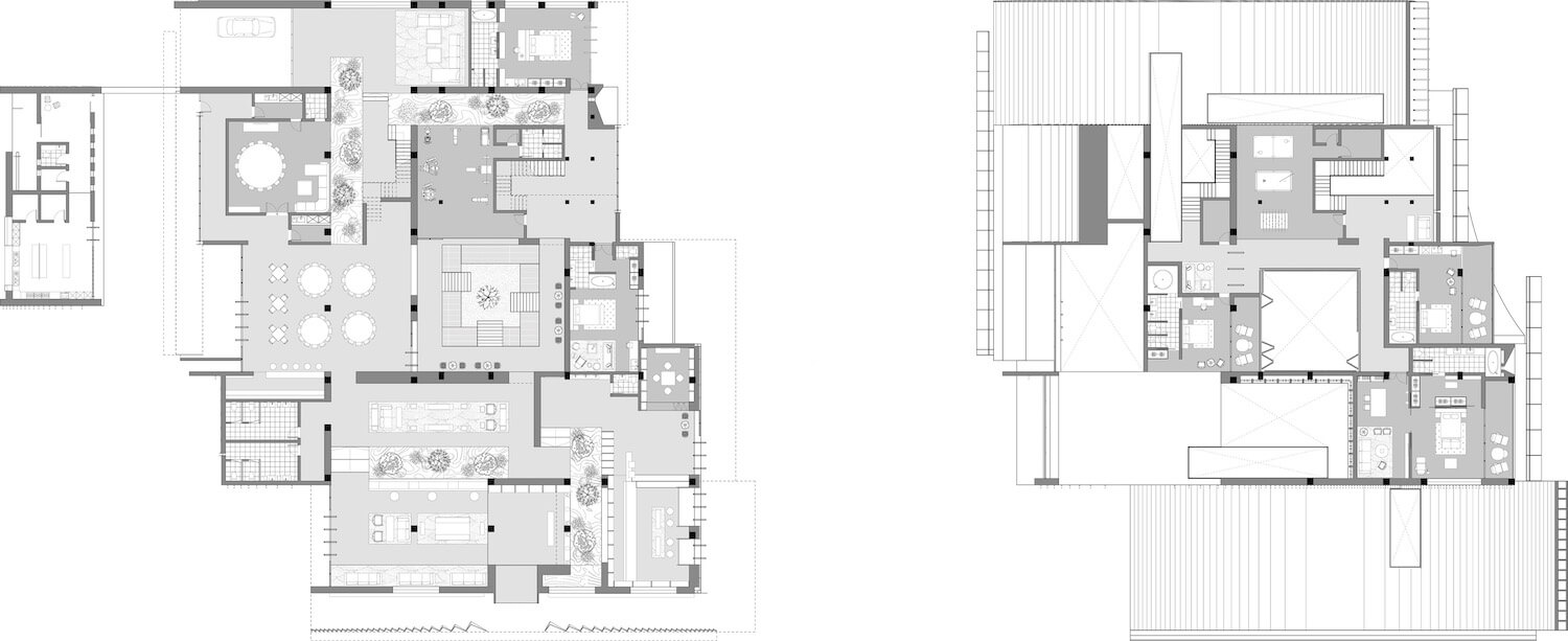
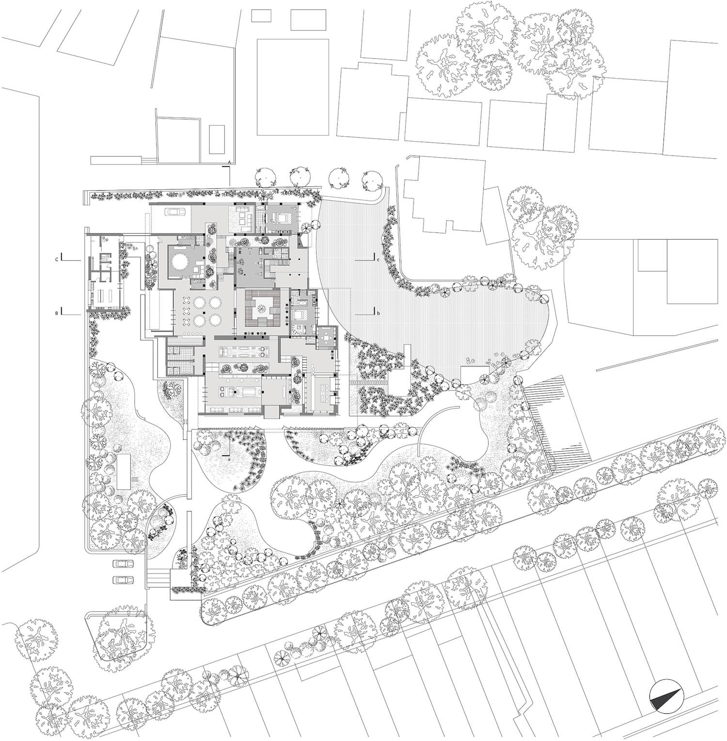
Located in an historical village site of Fujian, Studio ZHU is a renovation project that transforms original four-story “modern Chinese village building” into a boutique guesthouse. Within the original building framework, Design team proposed an interior courtyards strategy that resonates with the traditional housing typological layout of north Fujian area. The interior courtyards serve multiple spatial functions such as program division, introducing natural light to interior and blurring the boundary of inside and outside.
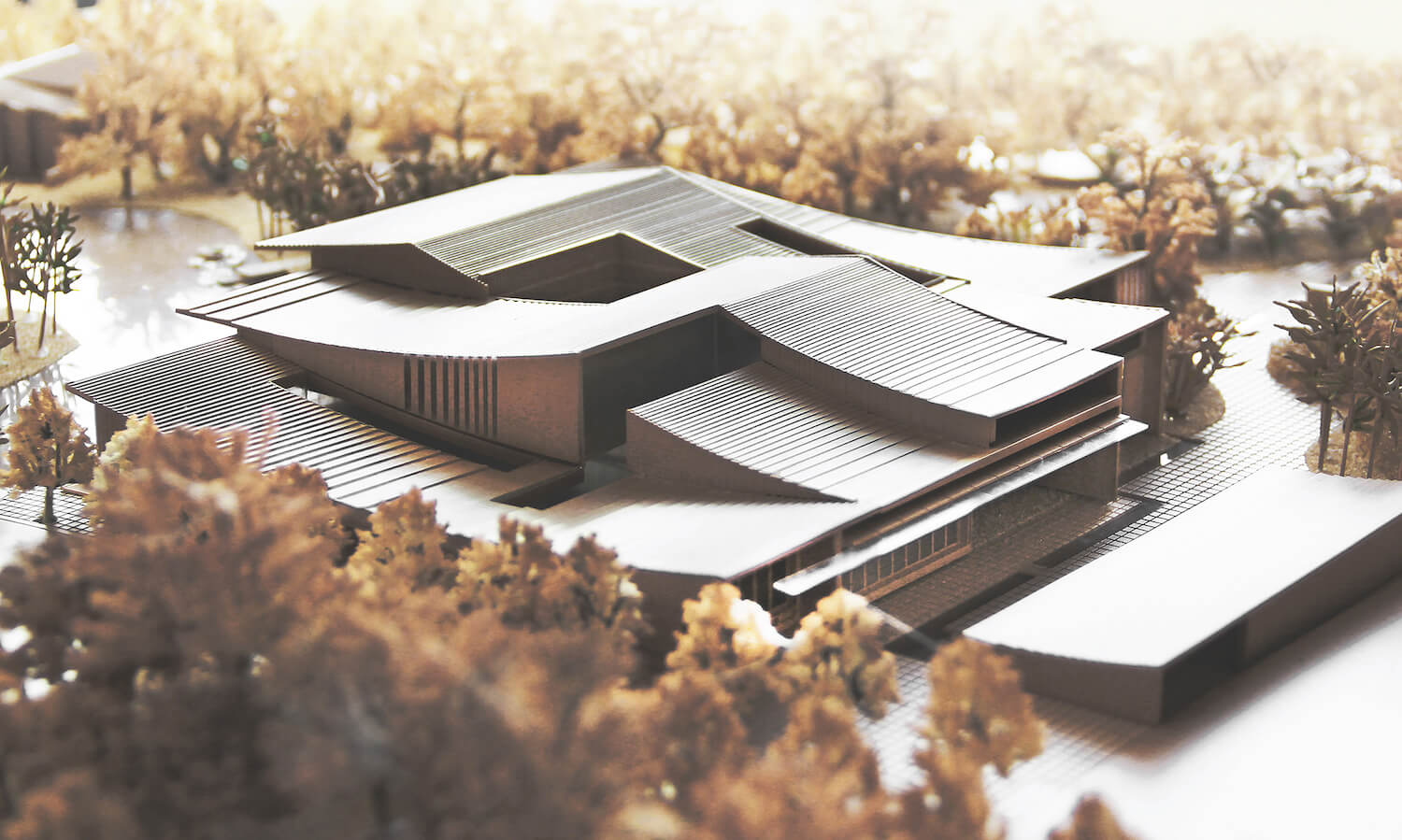
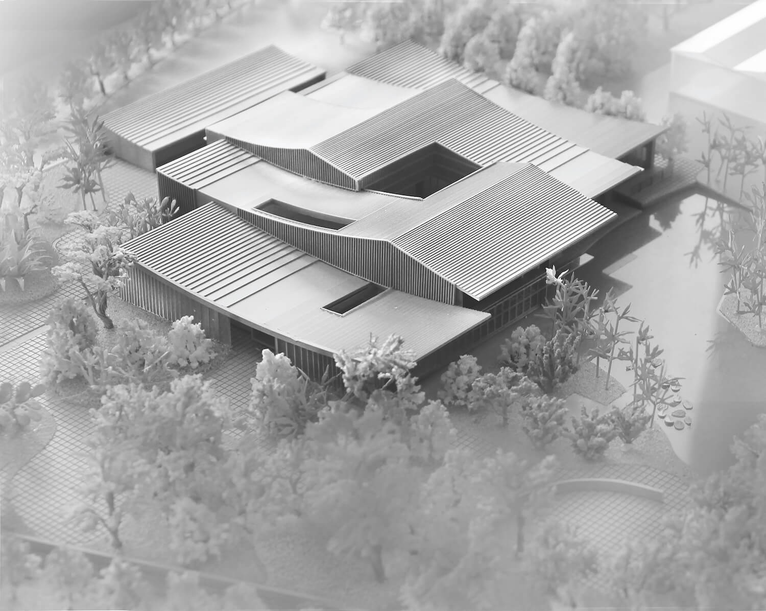
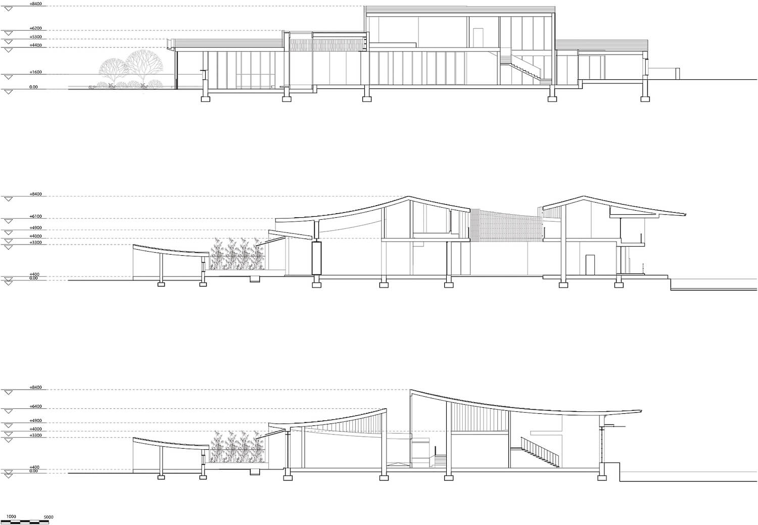
The form and tectonic aspect of the design also maintained a referential relationship to the archetype of traditional dwelling houses. The client has a preference on contemporary building language with a traditional vernacular touch. Based on the understanding and studies of traditional Fujian architecture and landscapes, the form of the building roof is the result of the combination of several carefully controlled cylinder segments, informed by the interior program requirements.
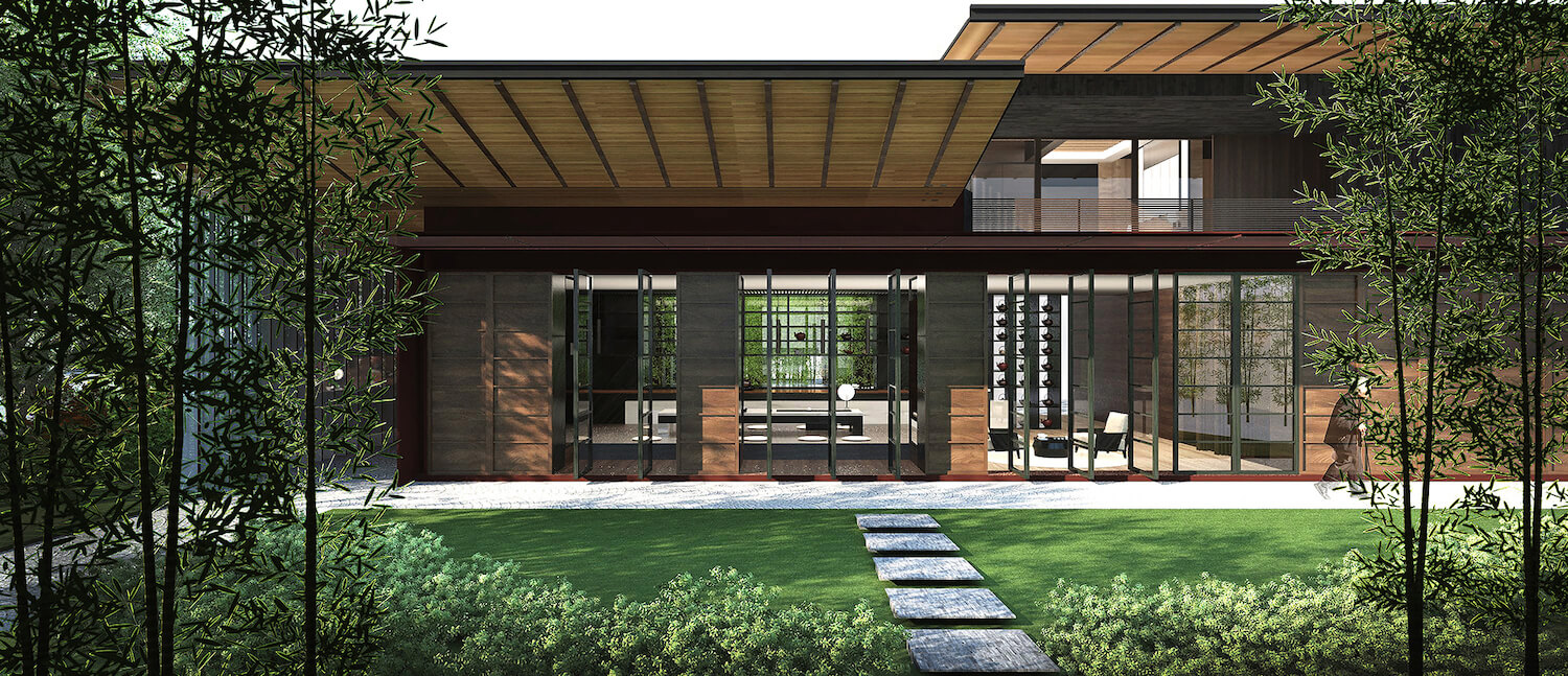
Although the overall geometry of the building is generated by a contemporary technique, driven by mathematical relationships. We aim to give the frontal expression of the building a more traditional touch. This means the interface of the building, where the users and the architecture interact, adopts a more traditional materiality and tectonics. Pieces of the roofs cantilevering out to create comfortable shading zones, which also resonate with the traditional local buildings.
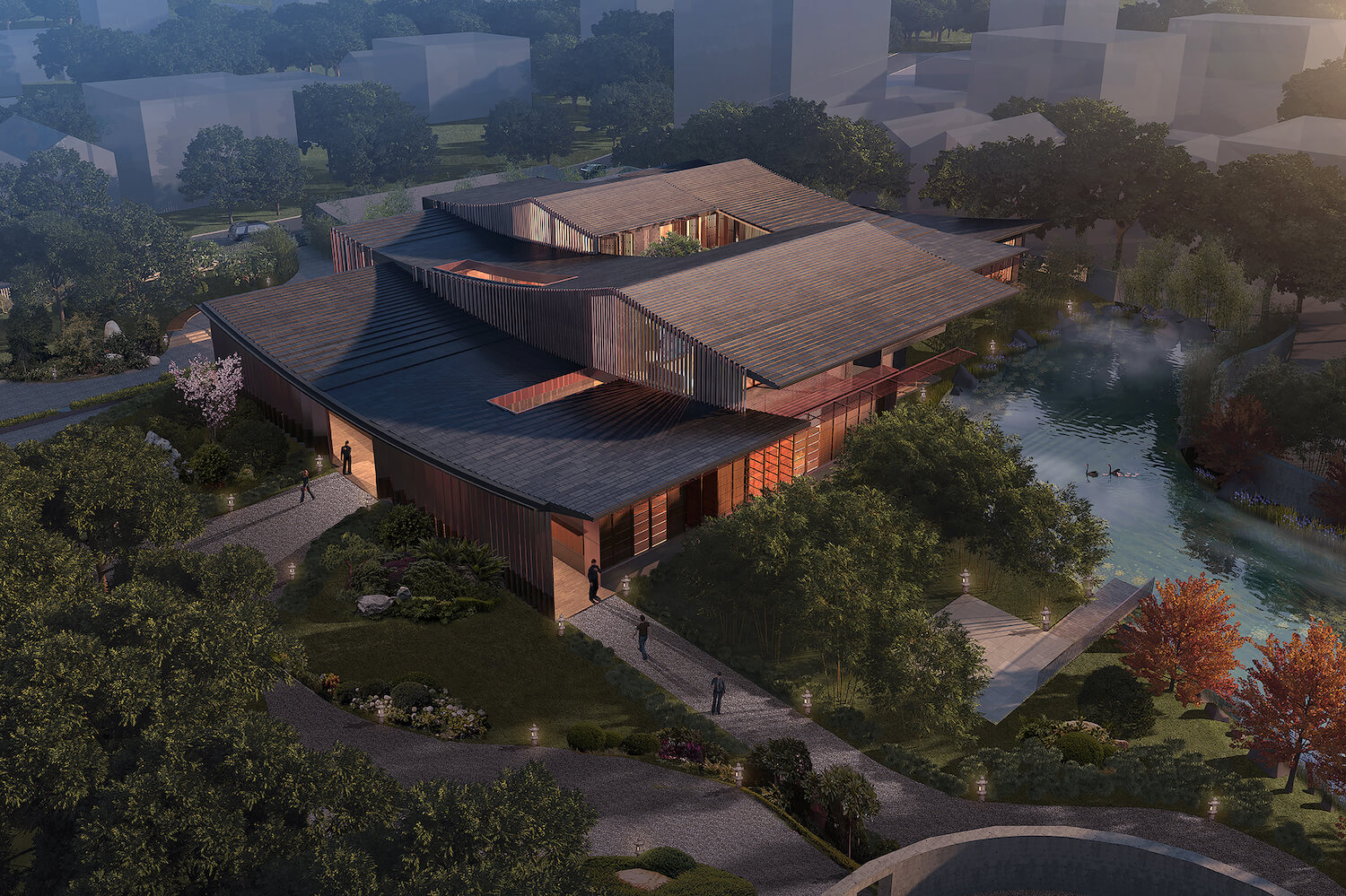
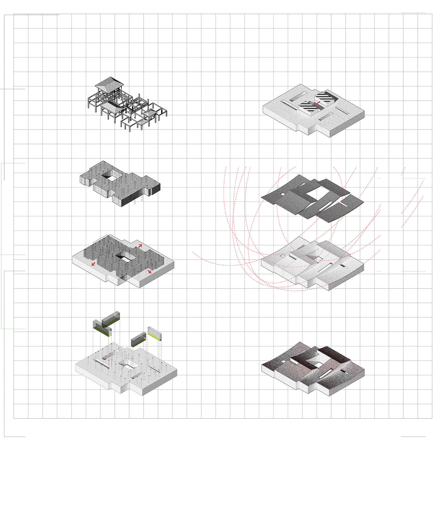
The original building’s footprint is too large without openings for sunlight. Some parts of the plan are too deep to get any natural light. The space is cramped. To reactivate the space without significant alteration on existing structures, micro courtyards are inserted into the original building volume for introducing nature and natural light to the interior. The boundary of inside and outside becomes ambiguous.
The design of the roof geometry of Studio Zhu is the most significant part of the architecture, as the client wants an iconic look for the building with a sense of tradition. To achieve this, the team decided to find a way to distill the imagery sensibility of the traditional architecture of Quanzhou. The traditional local architecture has a signature roof formulation.
The ridge of the roof has a gentle curvature that is projecting upwards on both sides. The tilings of the roof are then reciprocal to the shape of the ridge. To abstract this traditional image, we shape the roof by segments of circles as a translation of the ridge, and then make the tilings to be the height contourline of the geometry.
