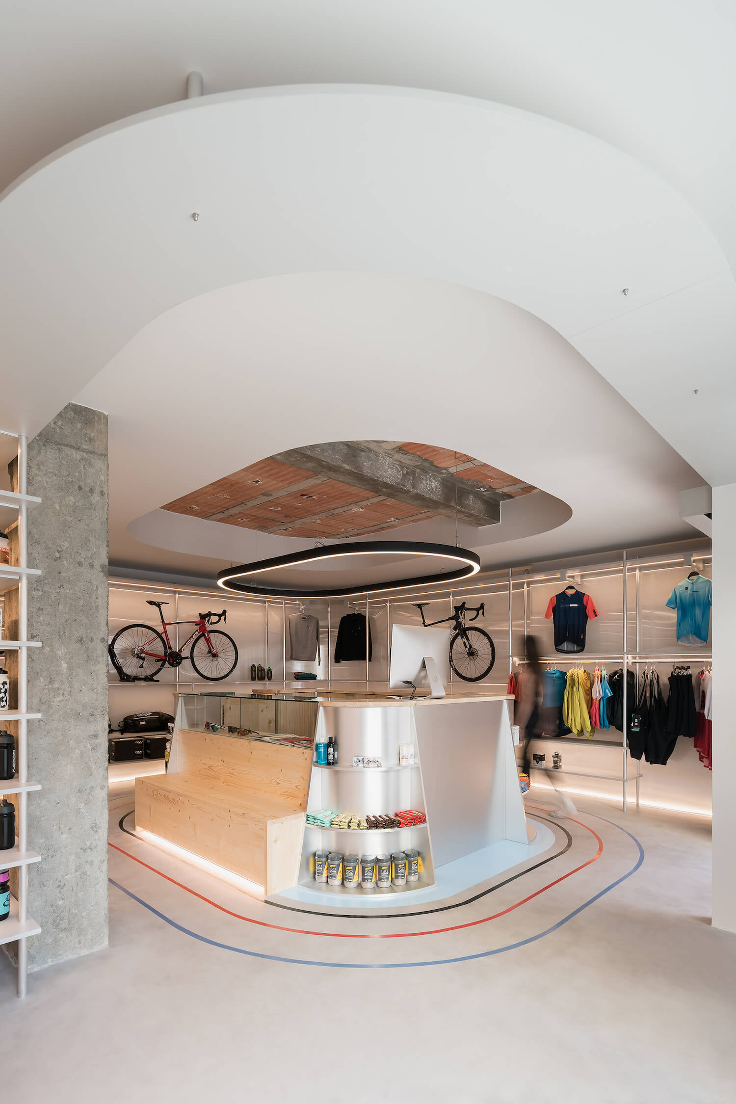
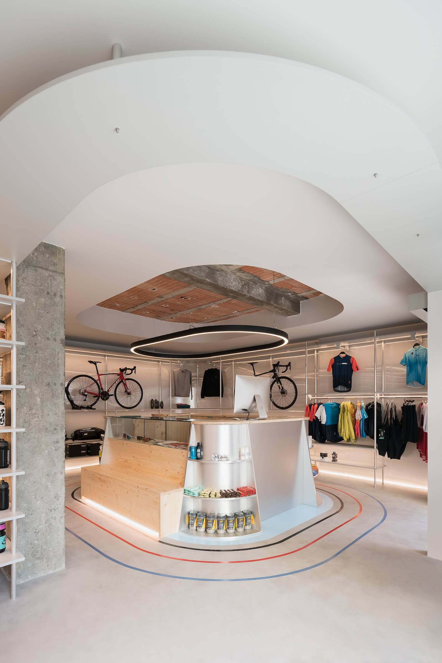
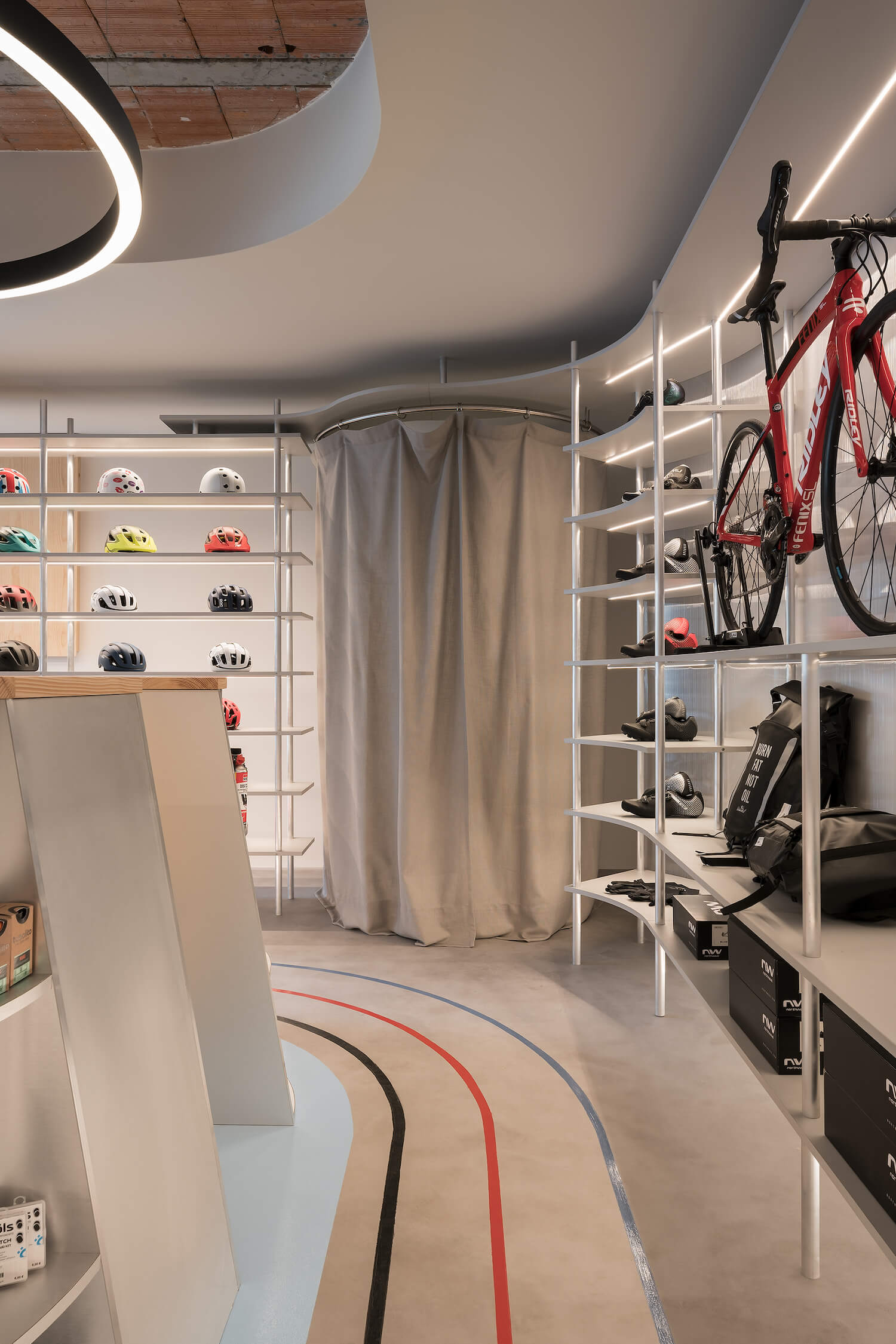
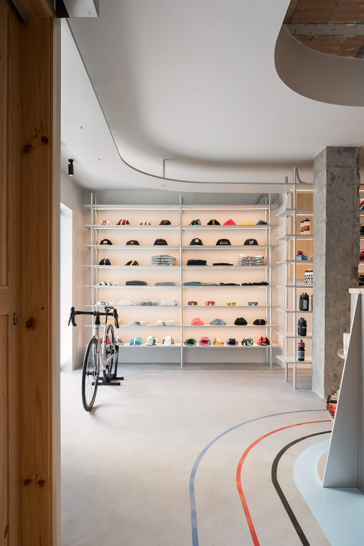
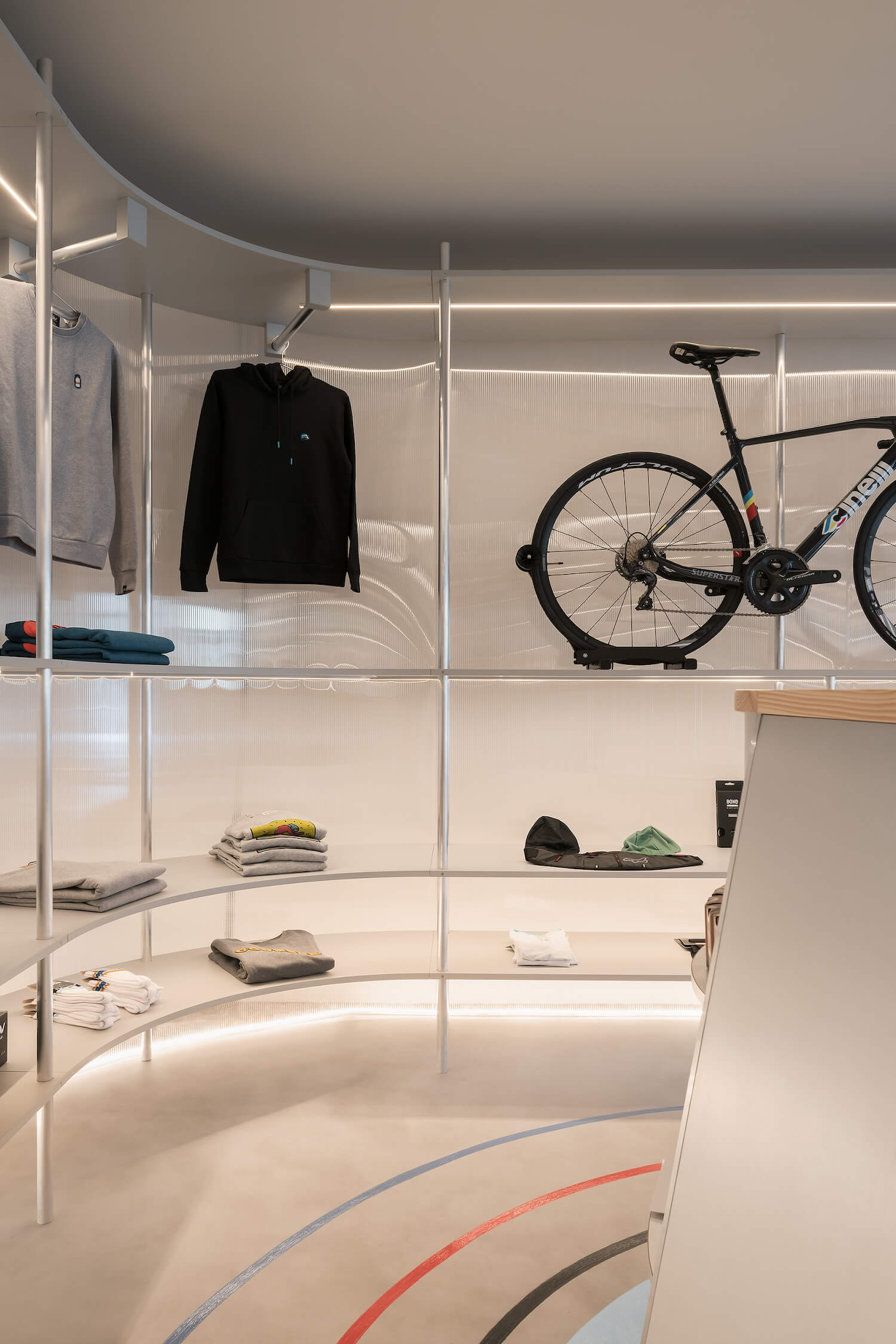
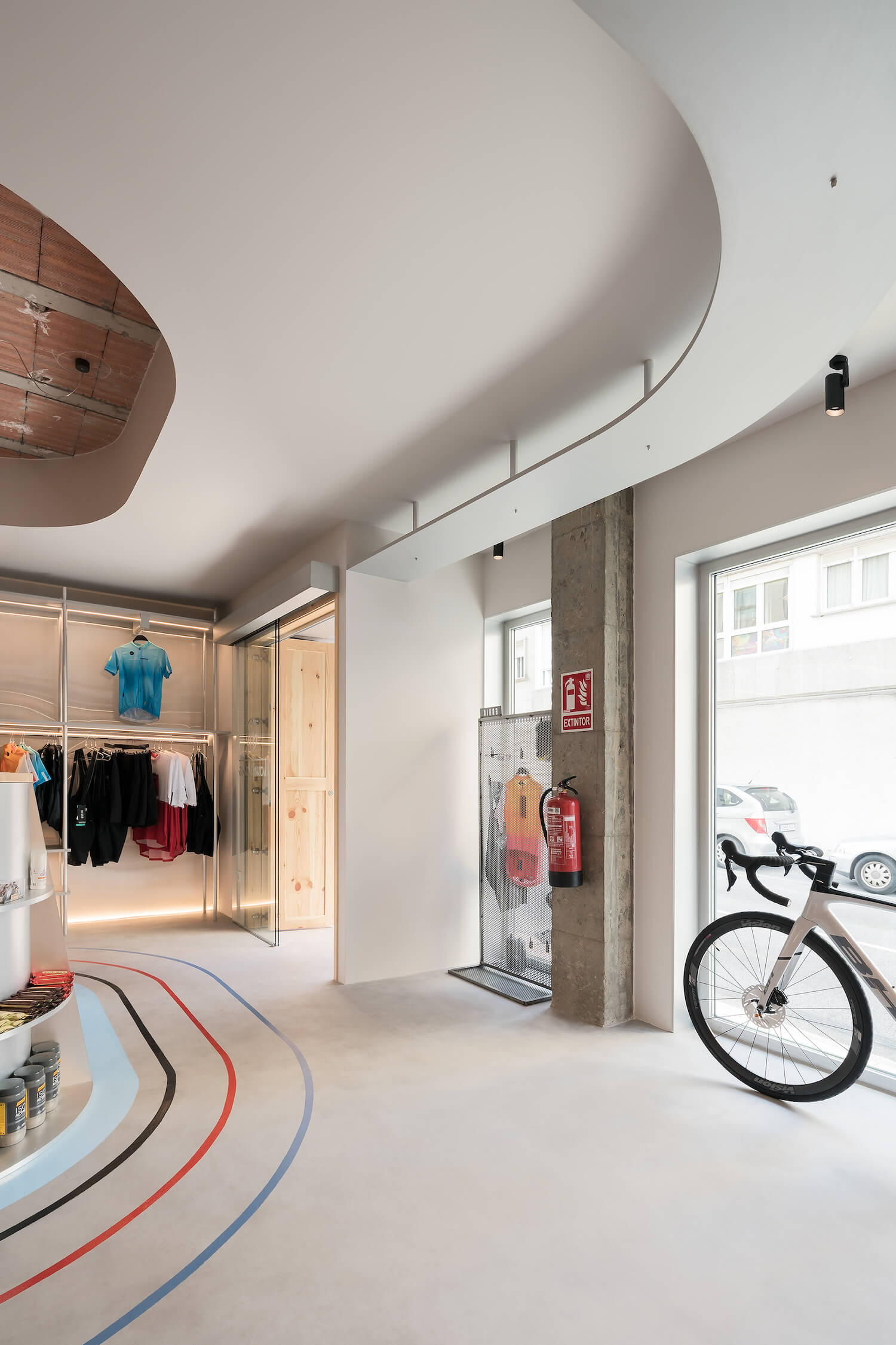
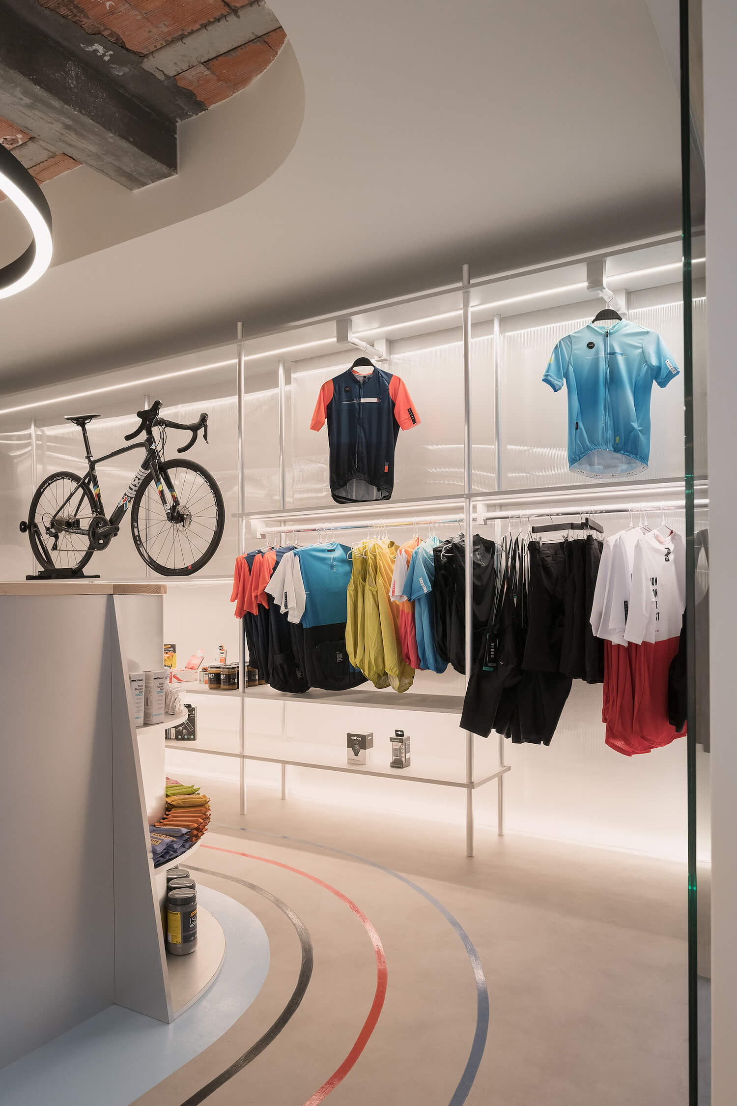
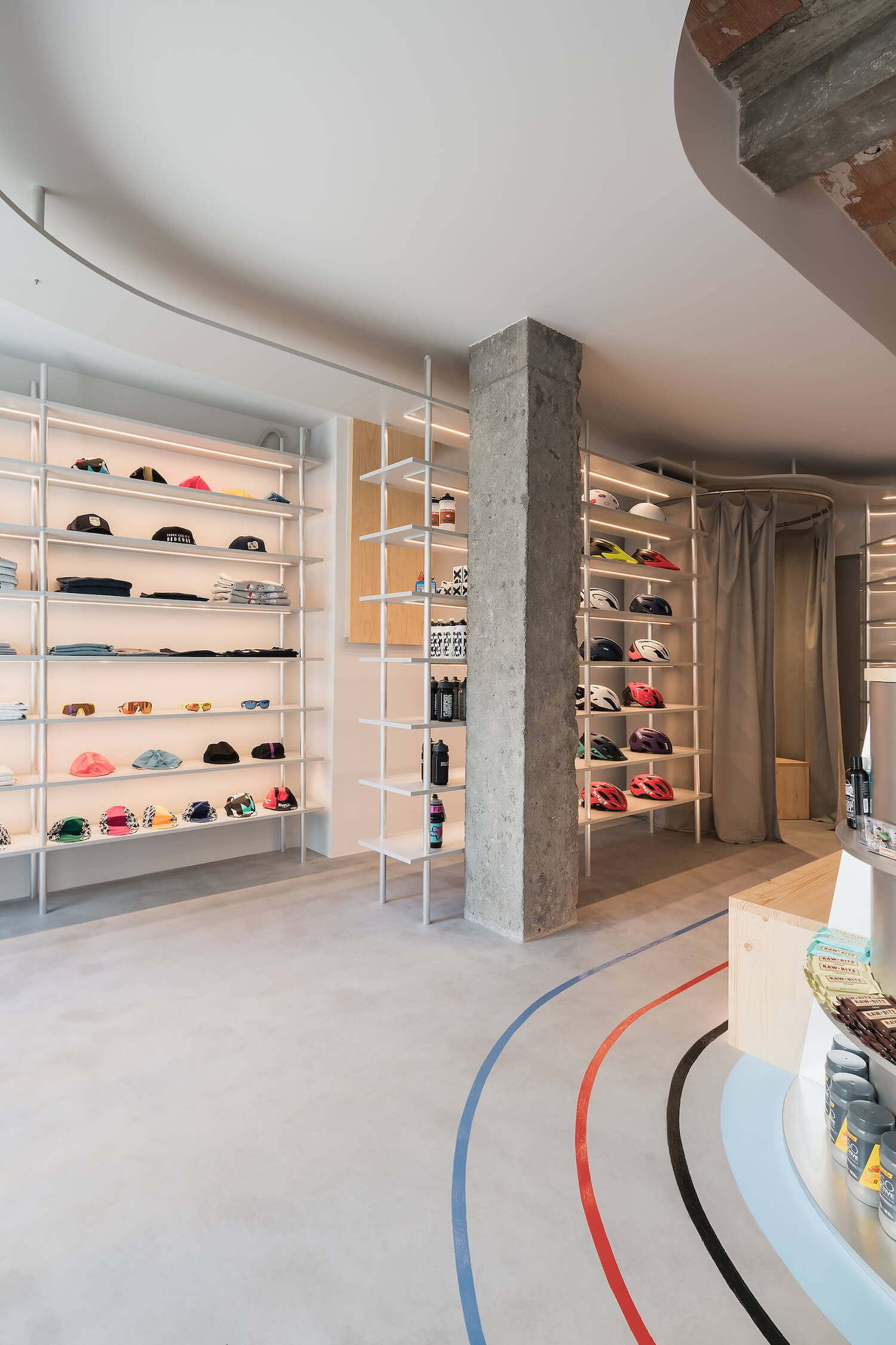
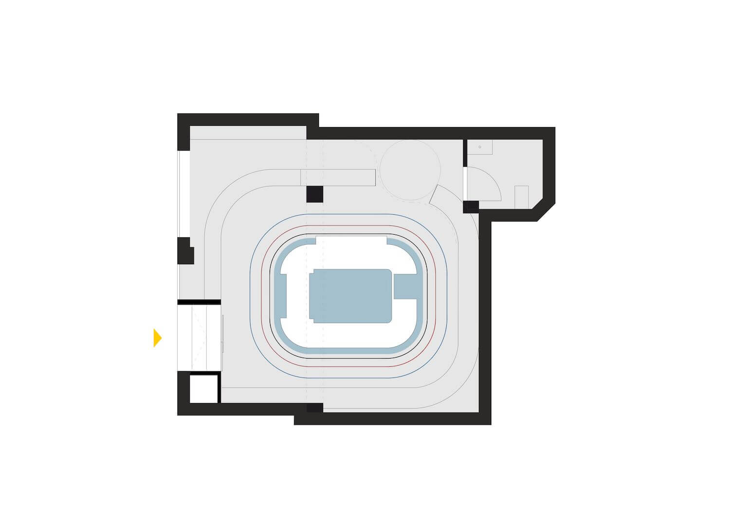
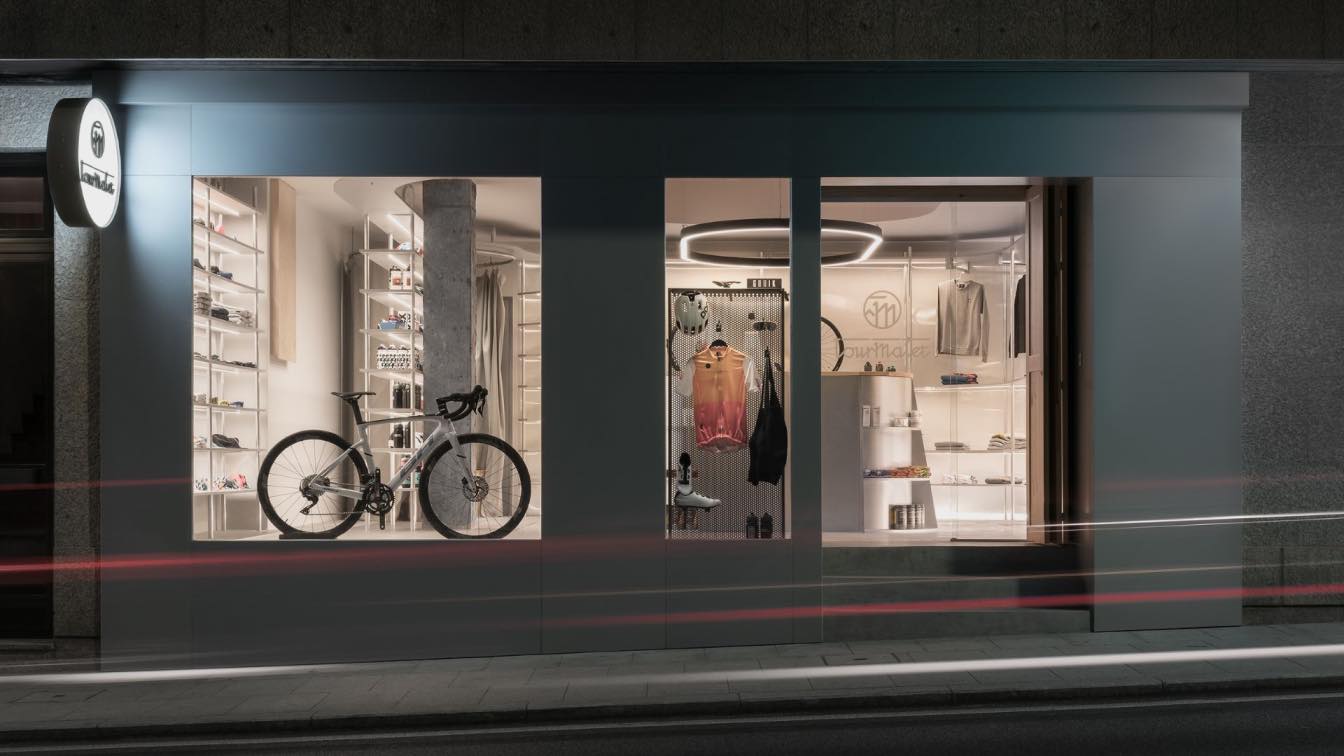
Nan Arquitectos: The purpose of the project is to create a space for the sale of bicycles and accessories. The main concept on which we base ourselves for the creation of the space is that of a velodrome that helps to mark the circulations, supports all the functions of the store and distributes the material to be exhibited.
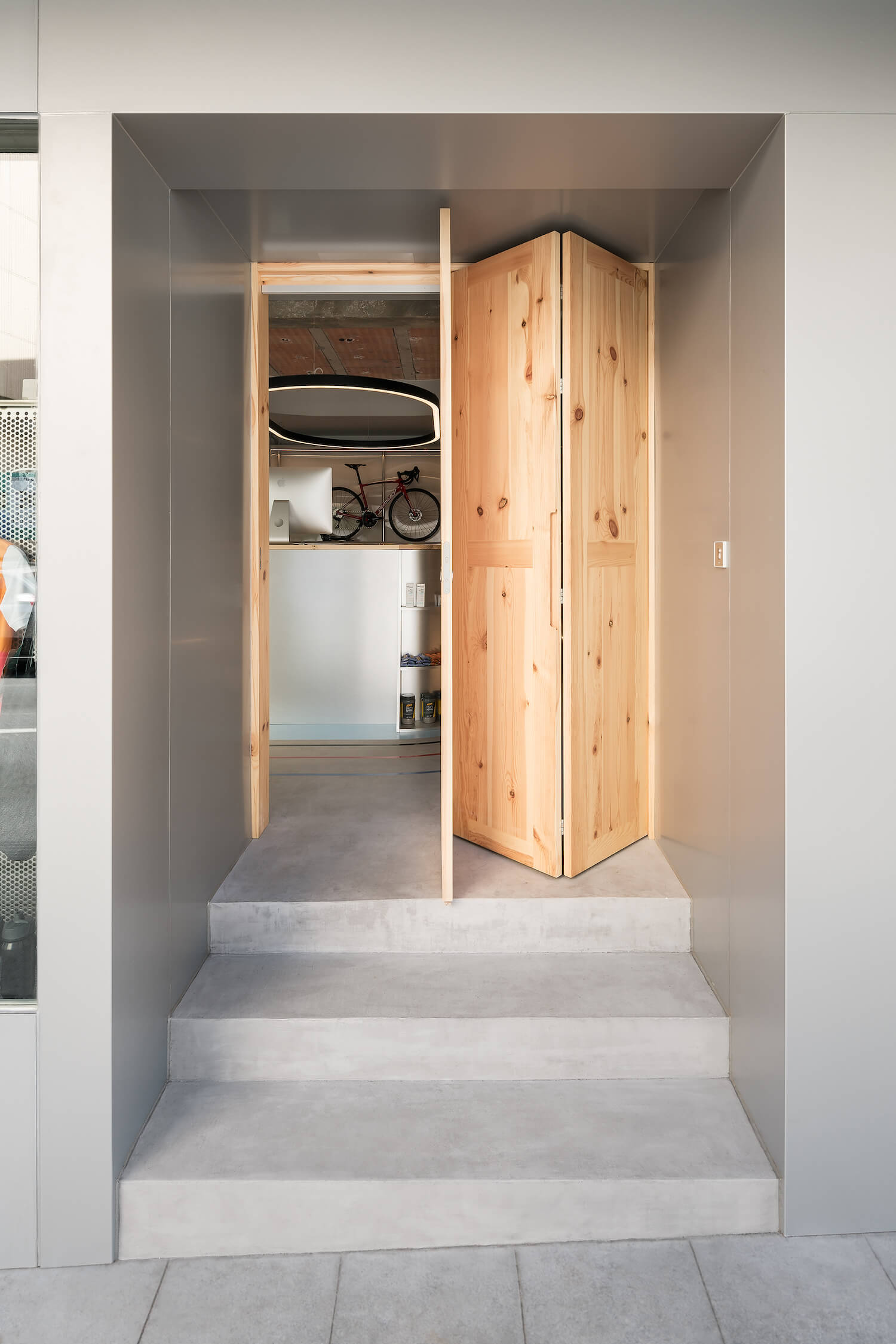
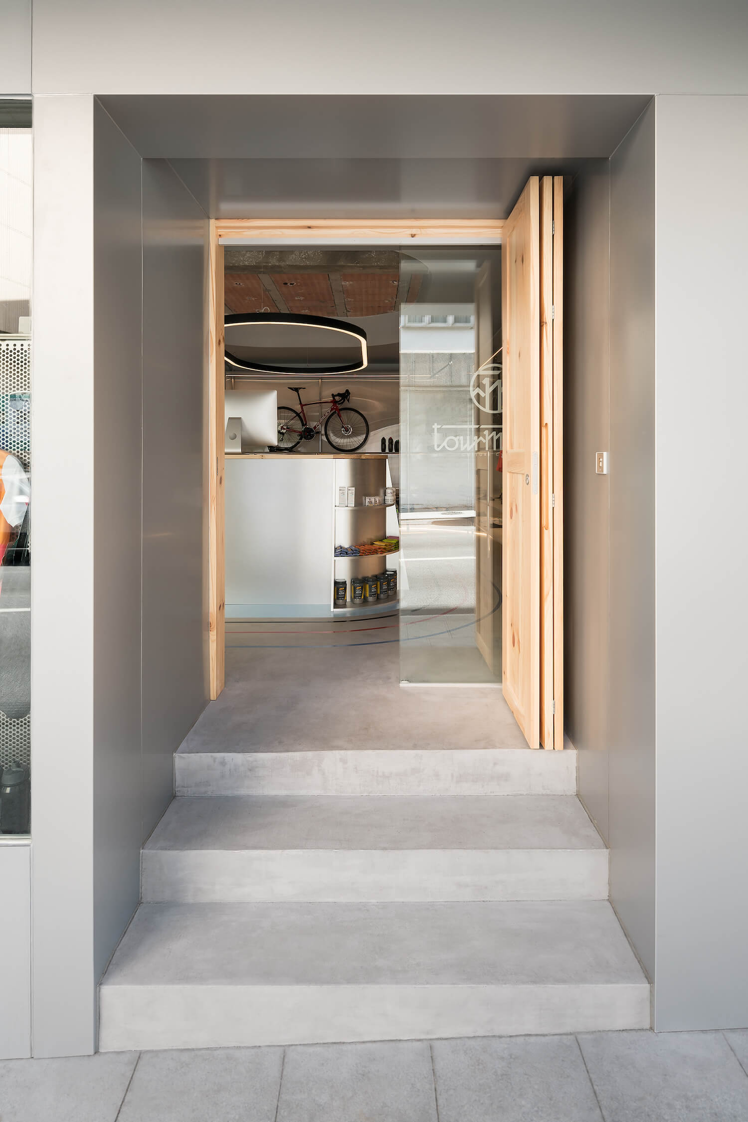
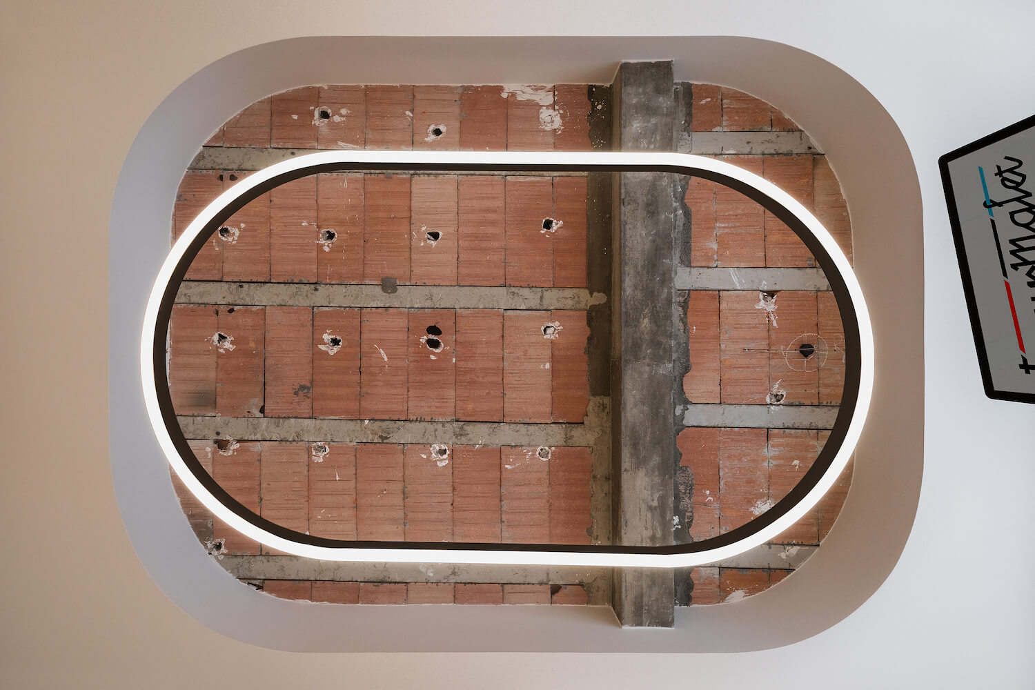
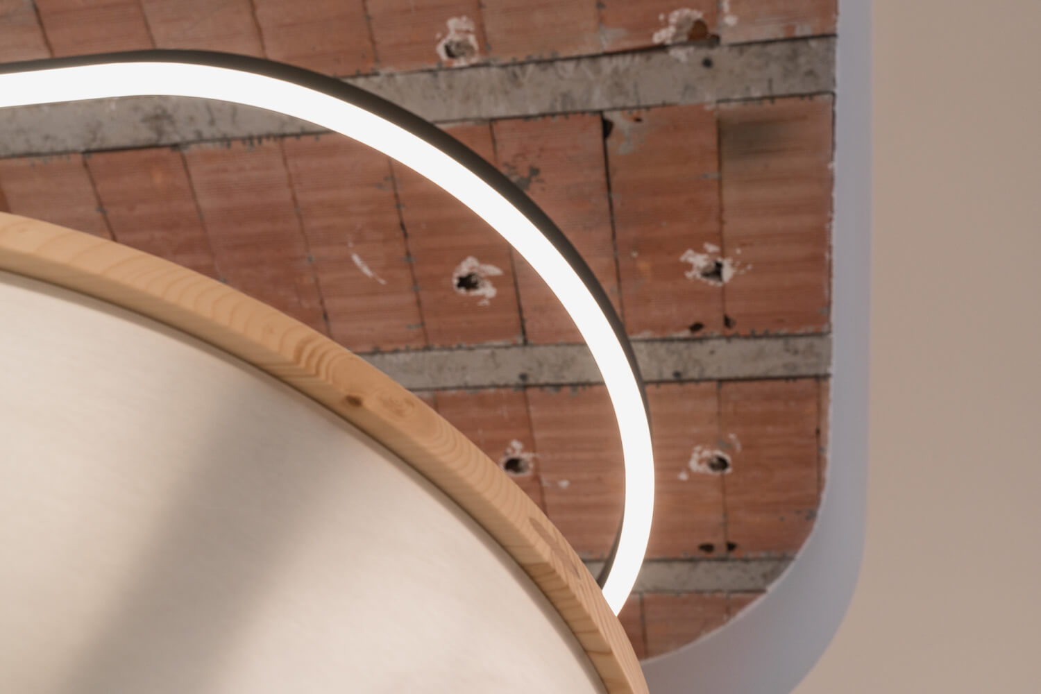
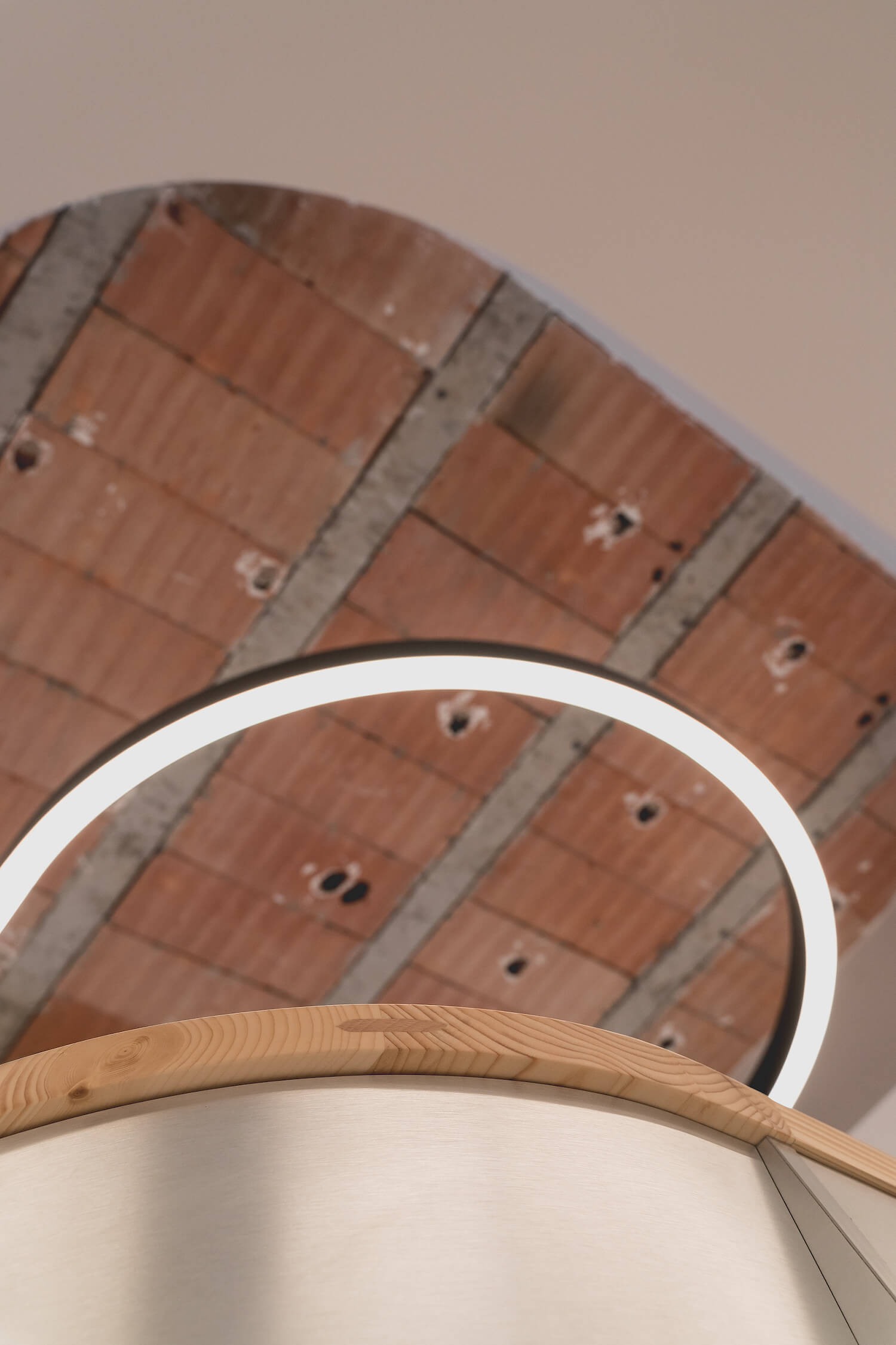
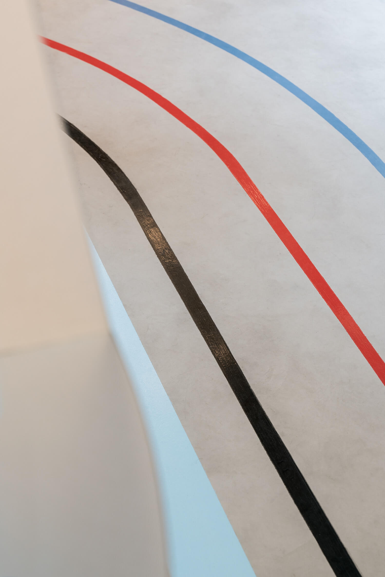
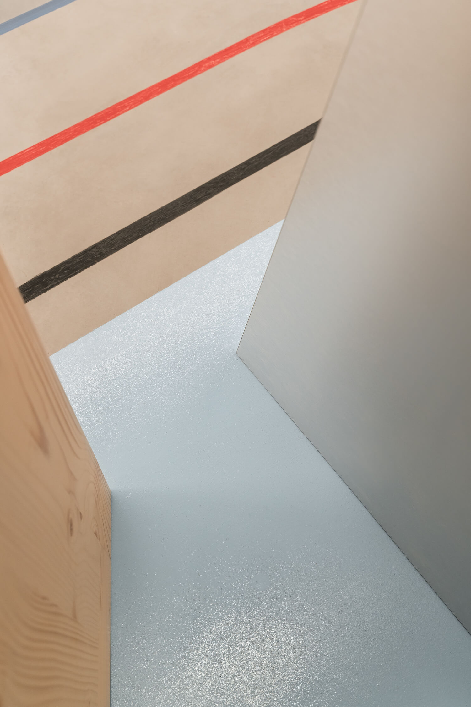
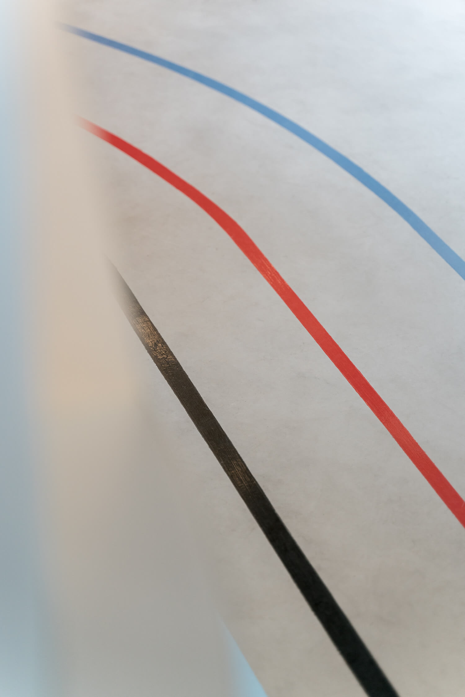
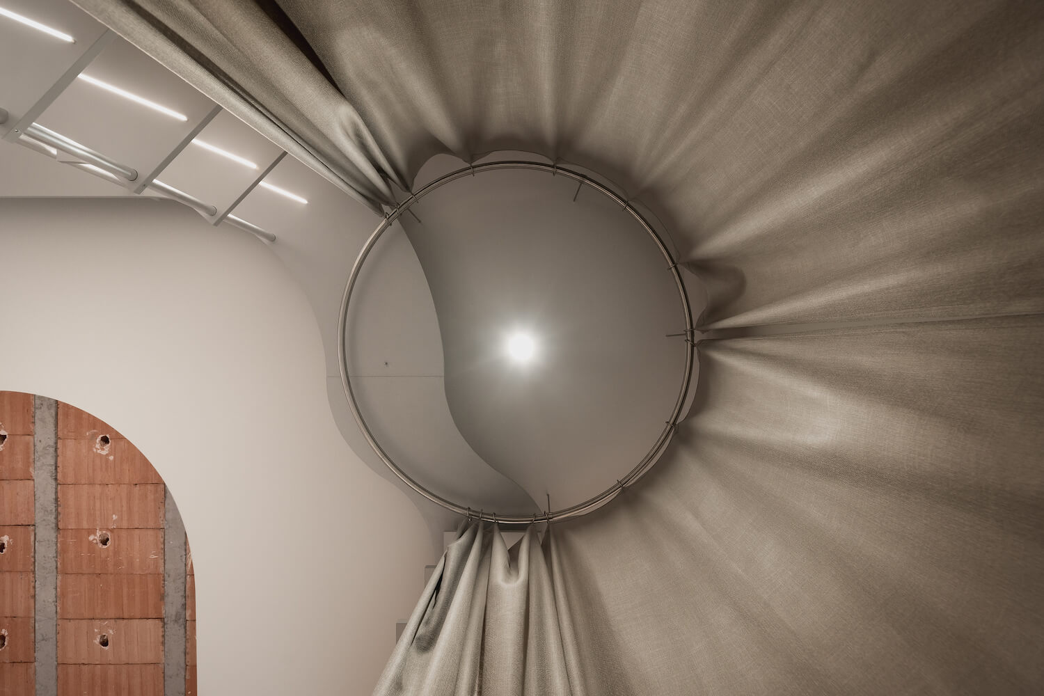
A large piece of furniture as a central element that included the counter and exhibition space is the main element of the project reinforced by a hole in the false ceiling in which the bare floor is shown making the negative of the counter. A suspended luminaire is also introduced that accompanies the furniture in its form and colored lines are drawn on the floor that simulate the streets where cyclists circulate.
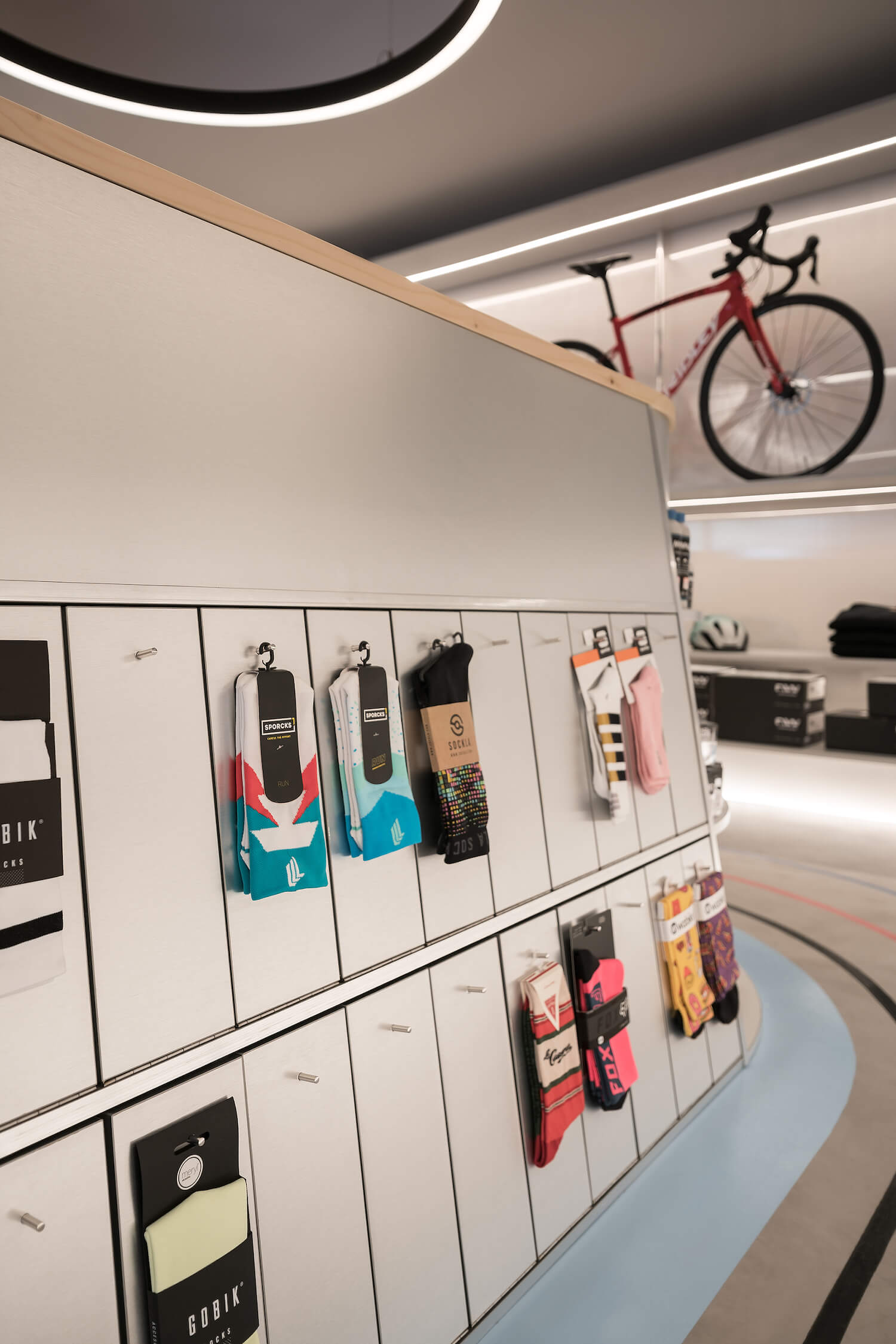
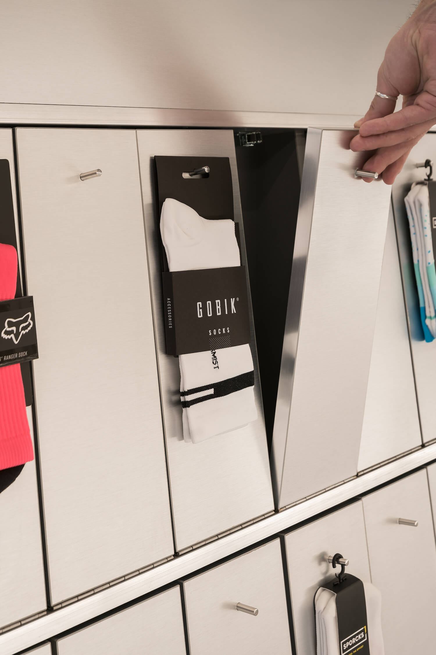
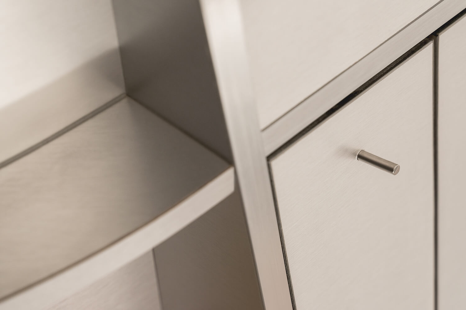
The counter organizes the entire space of the store, it functions as the backbone of all functions. Made of a metallic material, as a nod to the predominant material used in the manufacture of bicycles.
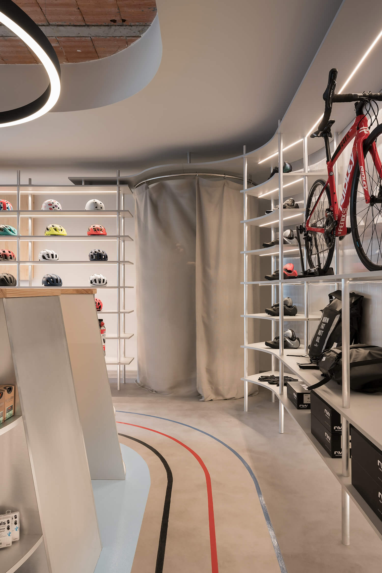
Being a small space, everything is measured with great precision to optimize the space in the best way, therefore, spaces have been designed to measure for bicycles, footwear, socks, accessories, ….
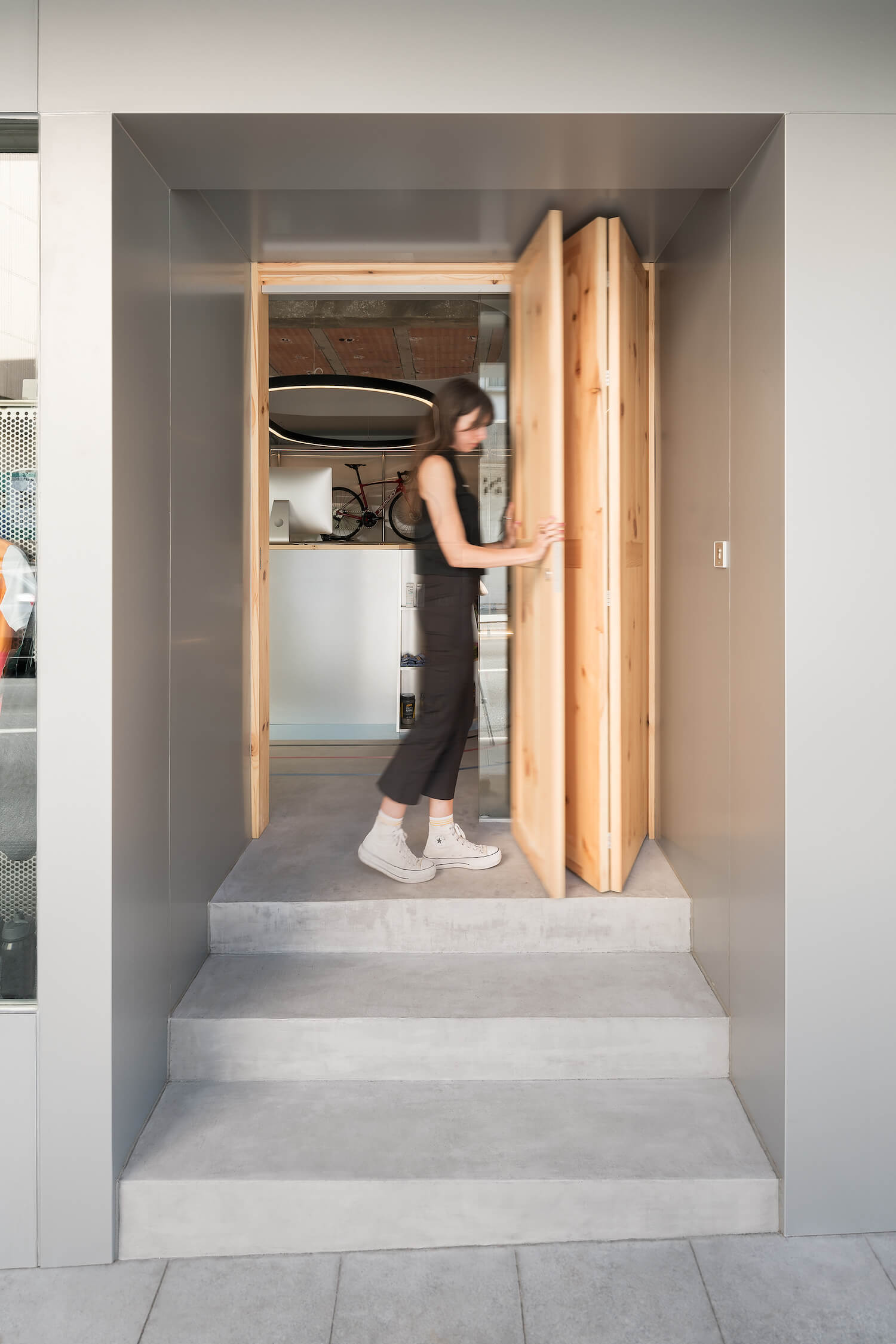
Homogeneity is sought within the entire space in such a way that the product to be exhibited gains prominence. To do this, accompanying the natural metallic shades, the remaining panels are painted grey. Like the floor, a continuous pavement with a gray concrete finish is sought.
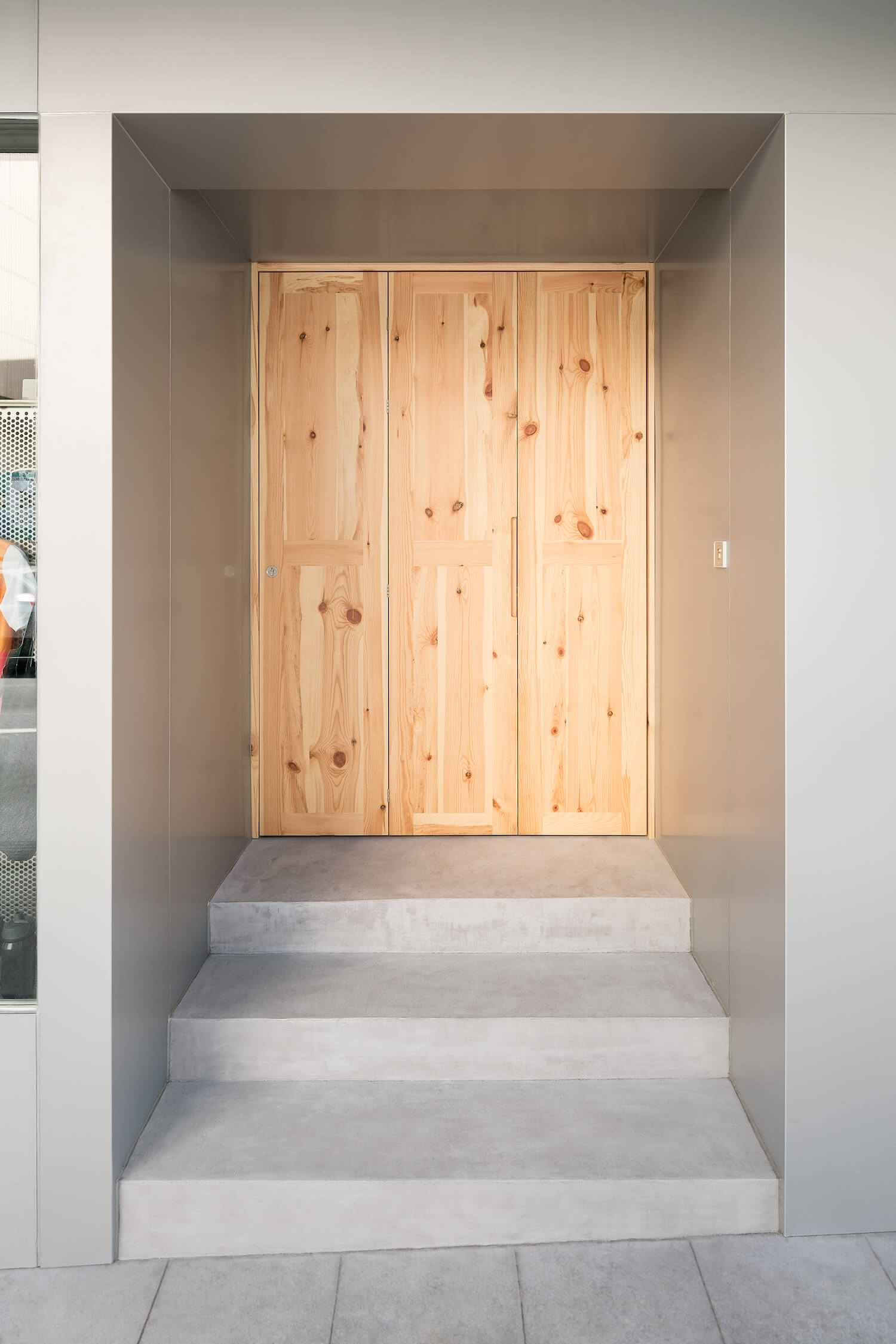
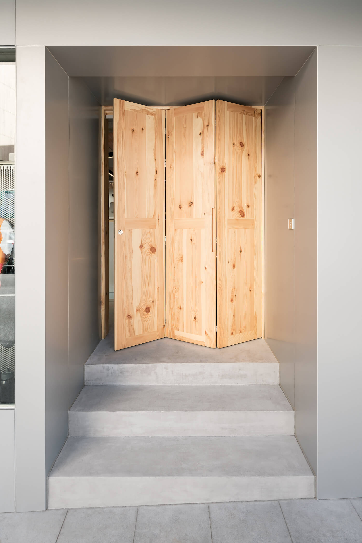
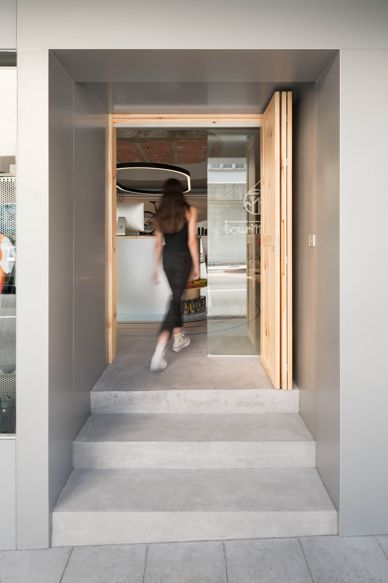
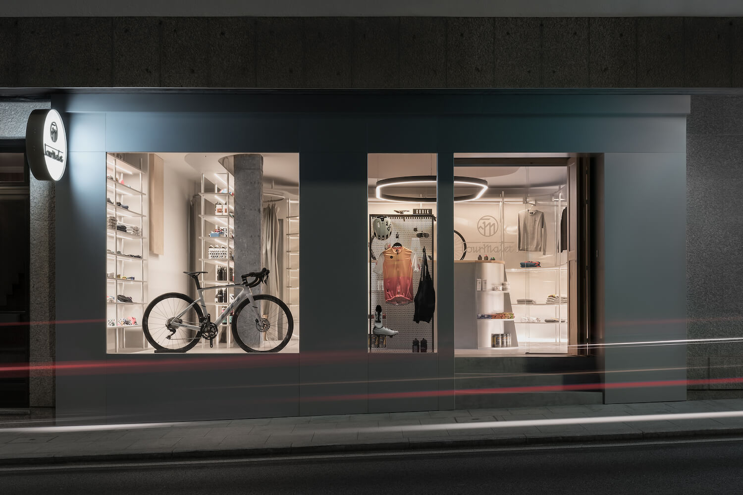
The facade, like the counter, is covered by a large metal plate, the predominant material throughout the store. The idea is to homogenize the entire front so that, through a very clean façade, the product displayed in the window is enhanced.
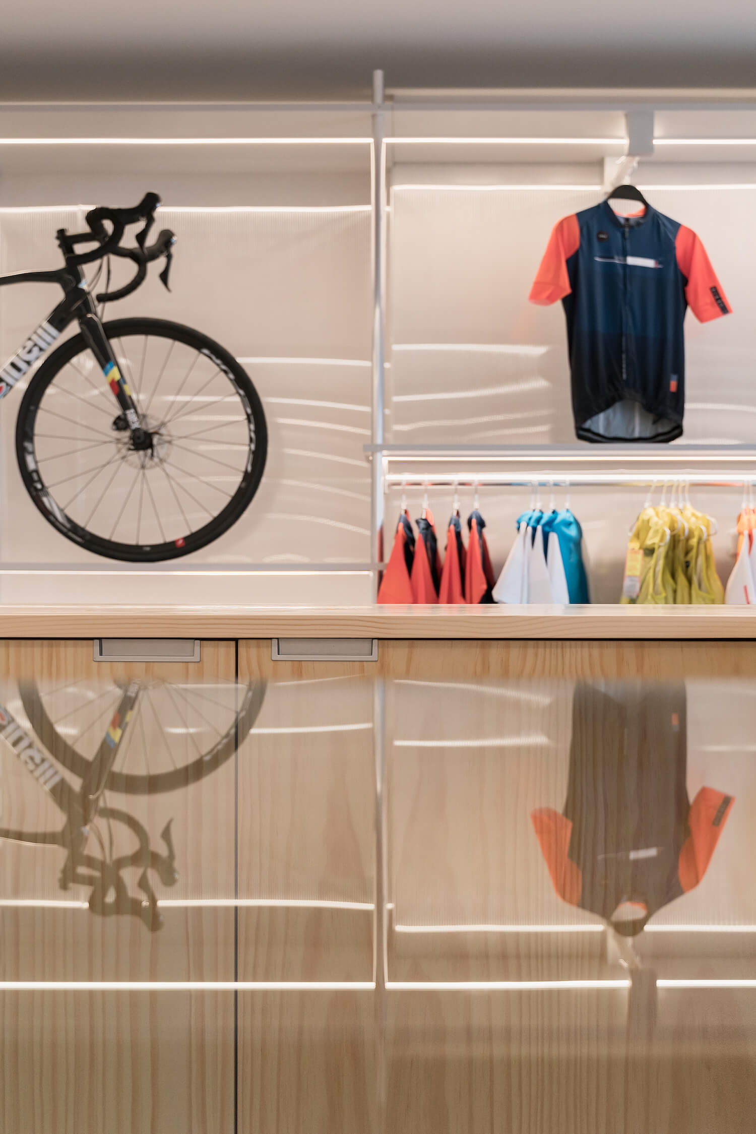
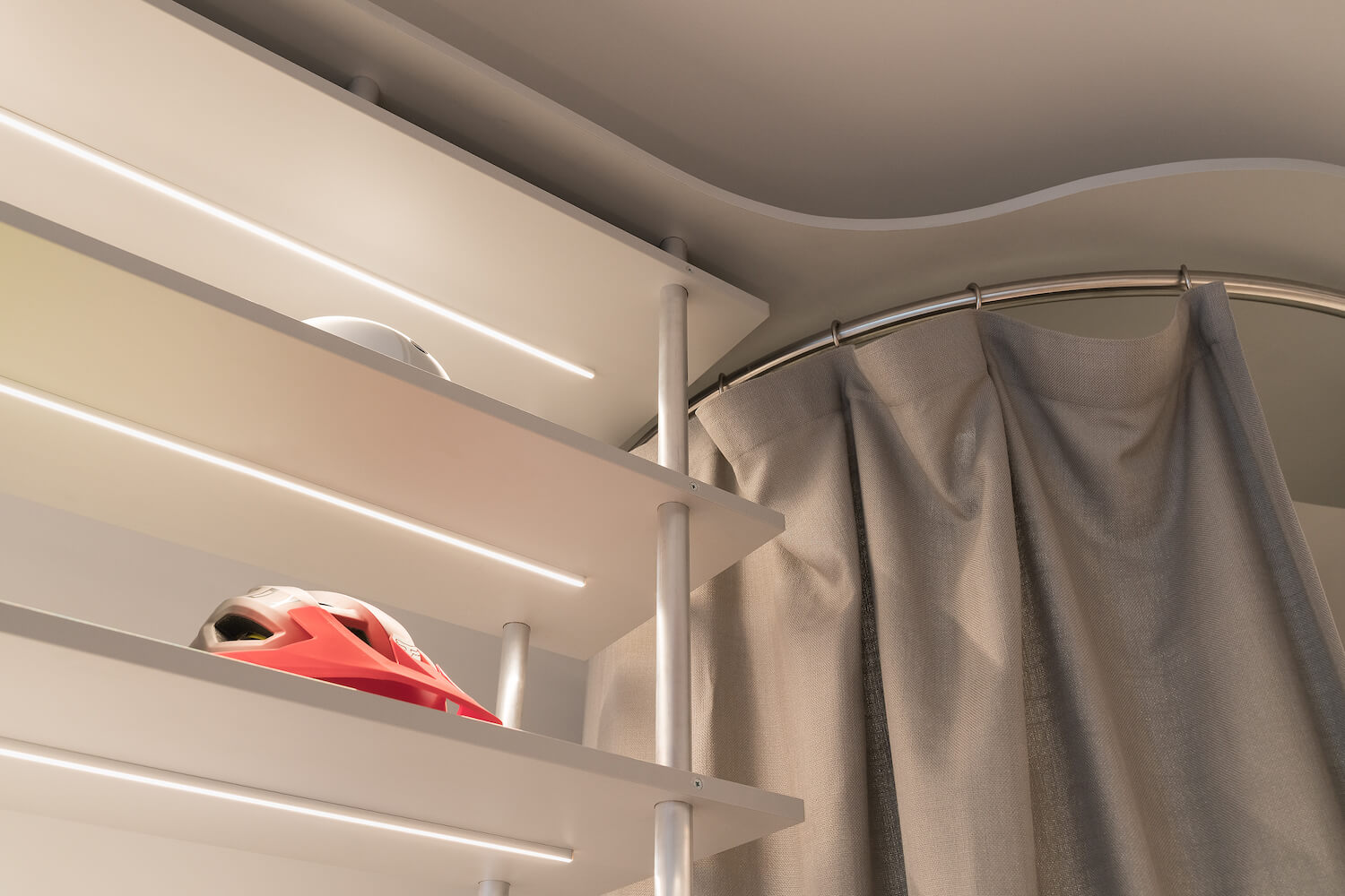
Lighting is an important chapter in each of our projects. In this case, the light intervention is focused on the product directly from the shelf. This generates an immediate attraction on the exhibition and is accompanied by the central decorative luminaire on the counter, reinforcing this central axis on which the other functions are developed.
Construction material.
