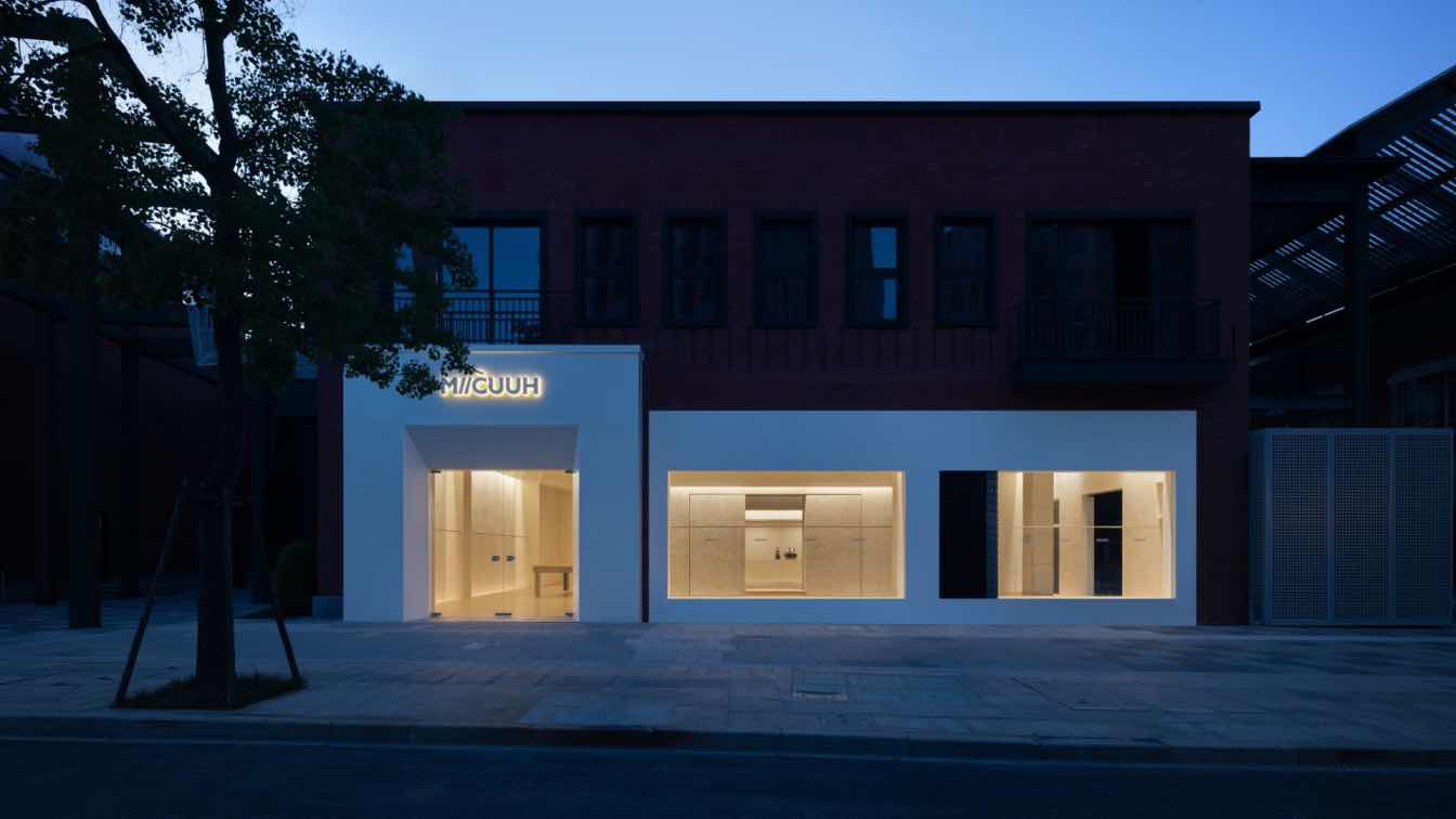
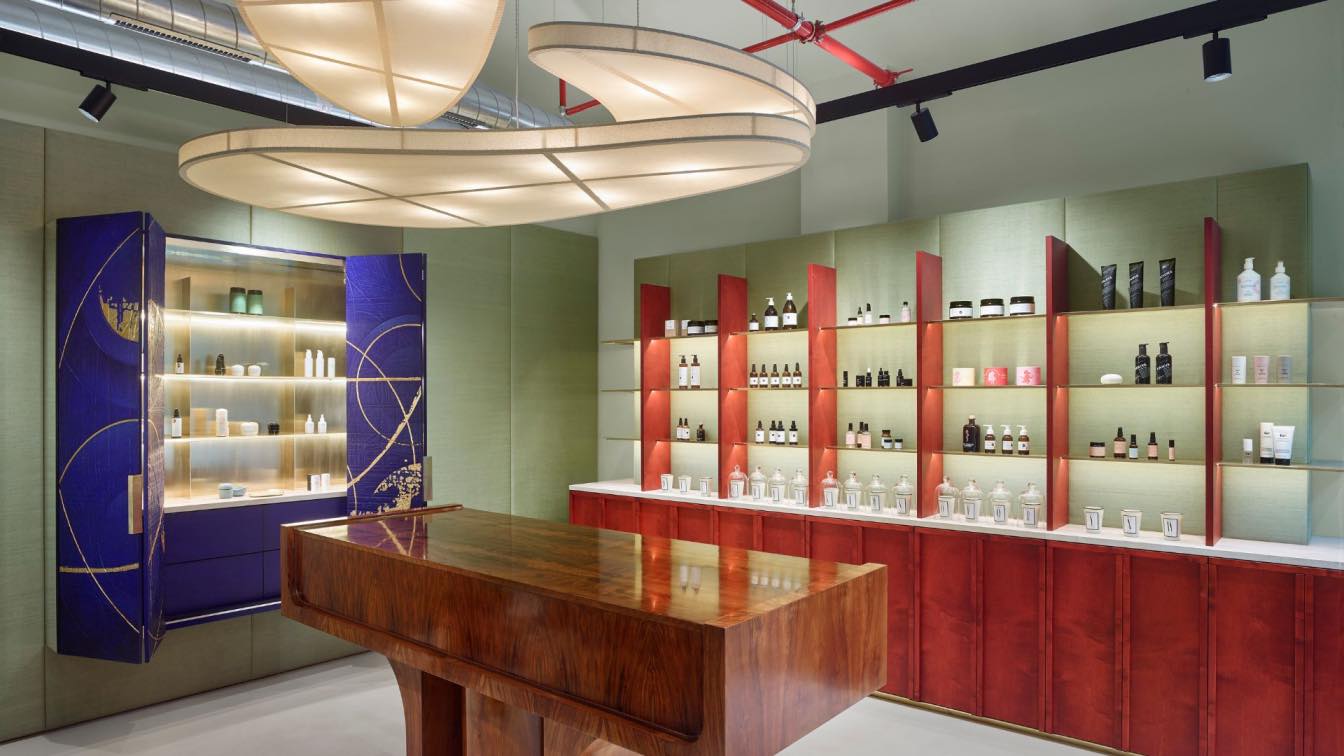
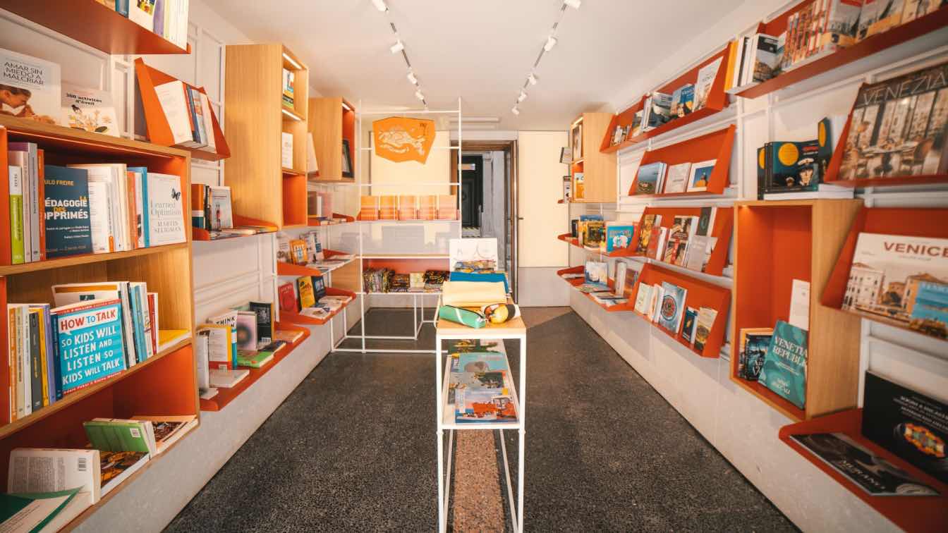
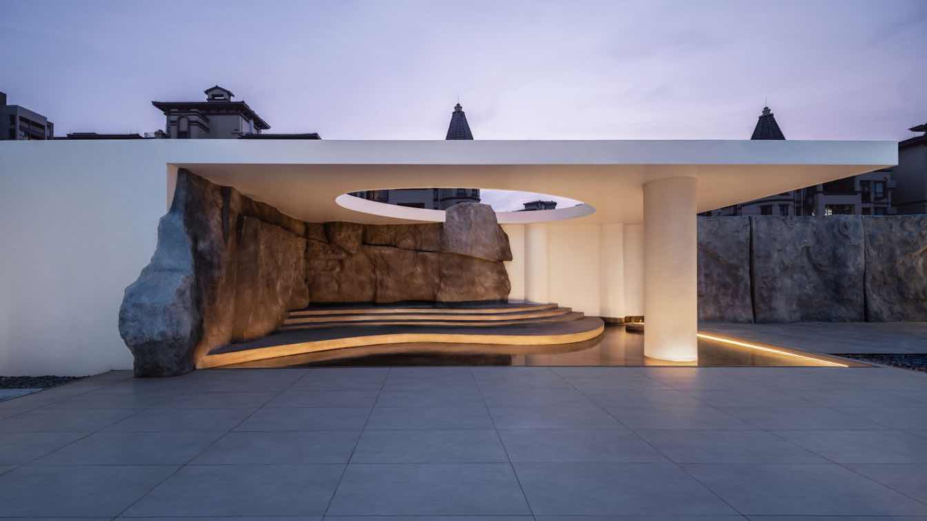
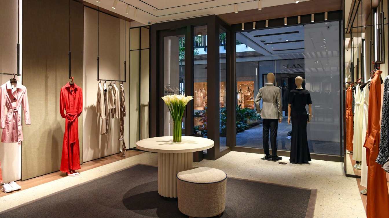
In the spring of 2024, Unknown Design was commissioned by MIICUUH to design the brand's first collection store in Linping, Hangzhou. Inspired by Le Corbusier's classic work, the Ronchamp chapel, the designers hope to create a sculptural and spiritual retail space with a soft and restrained form through the juxtaposition of different body scales and multiple material textures.
The project is located in Linping Yintai inPARK, Hangzhou, Zhejiang Province.
The store sits on the street with a minimalist white facade. The project site is square, with windows on three sides, covering an area of about 320 square meters. The spatial narrative unfolds with a rough-textured core cylinder as the main body, with a neat and sharp appearance, guiding people's eyes and emotions, while skillfully linking up the spatial layout. The interlacing of fine and rough wall blocks, openings of different scales, simple rectangular lines, and the sloping roofs on the southwest side of the building are intended to enhance the dramatic tension of the spatial form and shape the core spiritual space.
The two wall cabinets with the same rocky texture appearance are placed as an array of activities in the space, which can be displayed according to different exhibition needs, presenting a variety of spatial layout. The stainless-steel laminate is relatively weakened and discreetly integrated into the powerful volumes. The warm white art paint on the wall outlines a soft and quiet canvas background color. Wooden flooring and limestone tiles are mixed and matched to create a variety of shades and textures, and the floor guides and paving materials are in the same scale, appropriately embellishing the space.
Indoor windows maximize the presentation of the spatial structure to the outside, and a different market scene echo, supplemented by warm and rich lighting levels, to open up a space of sensory experience in the form of both strong and soft, without being overgrown.


