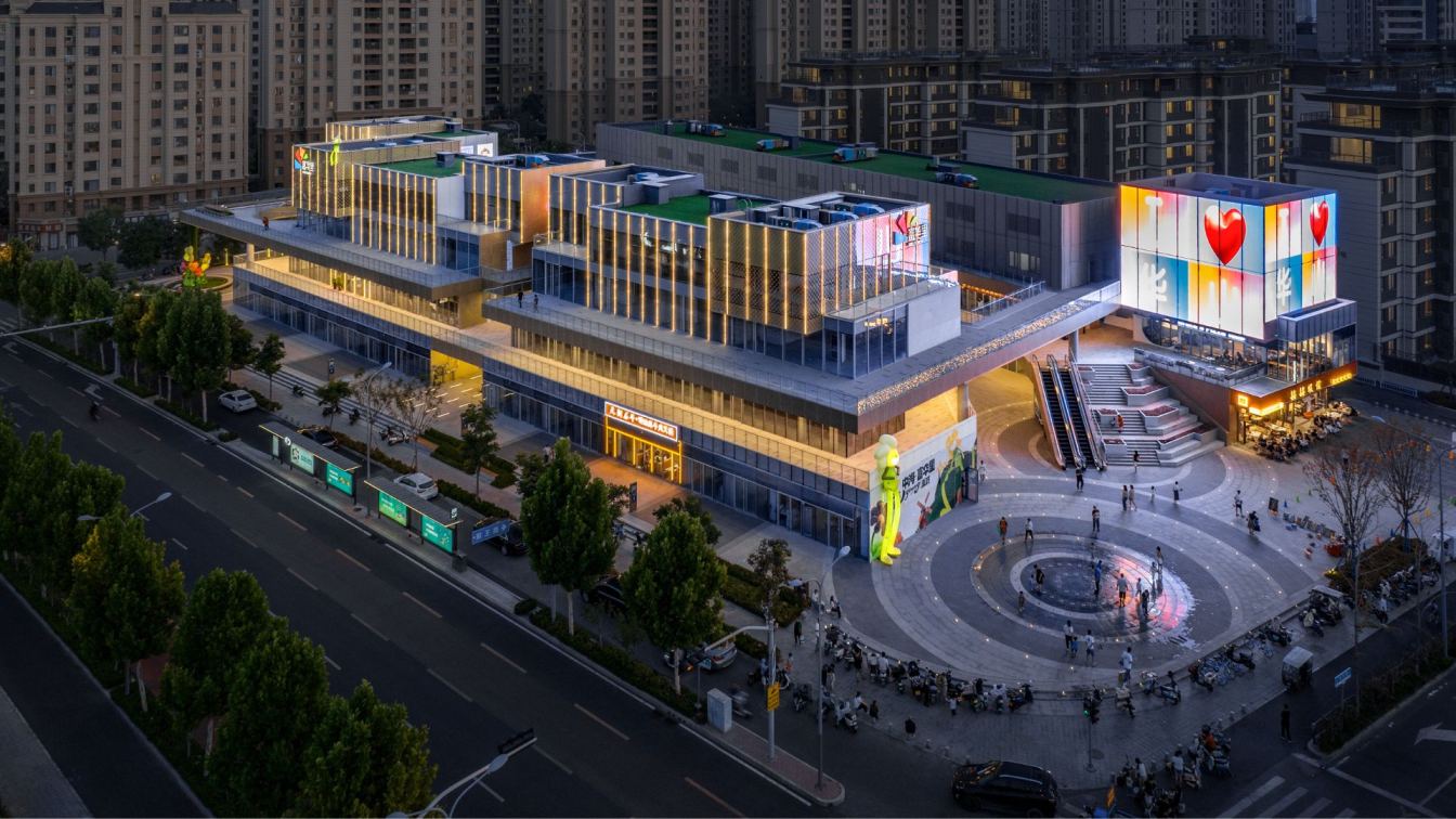
A Boutique Of Humility, Dreams, And Dresses
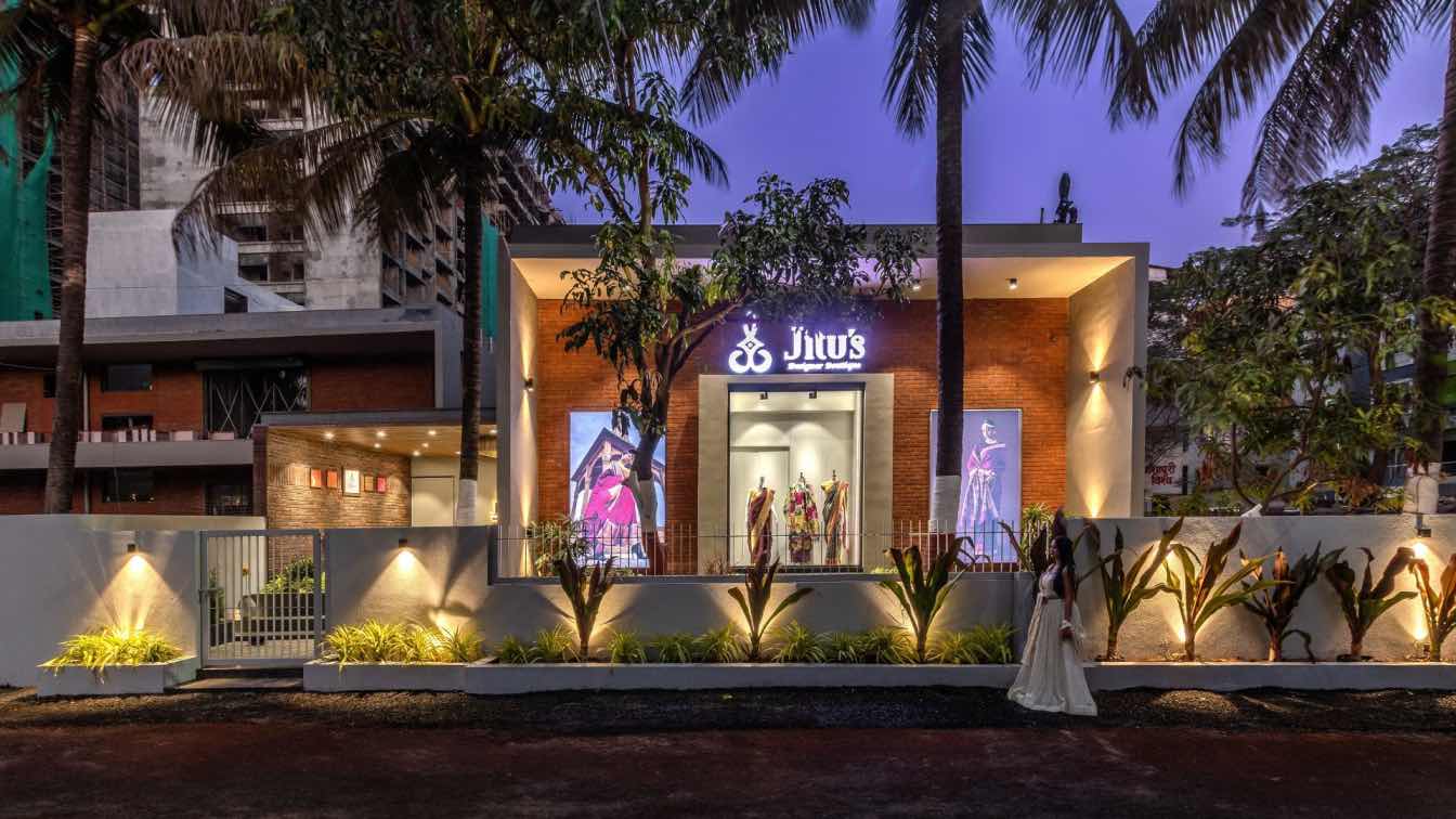
Interarch Associates: It was 11:30 a.m. on a laid-back Tuesday when I was entering Jitu’s Boutique, a charming bungalow-like structure with white and brick-clad walls nestled amid trees and farm plots. The clouds were adding drama to the earthy-contemporary facade of the boutique, which was showcasing a myriad of fabrics and dresses in its glass display cases. A mosaic of tiles was merging with natural stone, creating an open-air parlour where clients were preparing for what lay ahead: a spacious boutique featuring understated design and an array of beautifully curated fabrics. The grey, Kota-finished vitrified tiles were leading me inside through a passage adorned with antique decor, lush potted plants, and bronze-coloured moving racks. Inside, I was seeing a collection of dresses and fabrics arranged in a clean, organised manner.
The owner's cabin was directly in front of me, and a humble lady was stepping out to greet me warmly. She was introducing herself and escorting me to her cabin. The cabin, made of the same materials as the rest of the boutique, was featuring sleek black windows and a door overlooking the entire space and a small adjacent cash counter. A nostalgic 80s Bollywood song was playing softly in the background, accompanied by the fragrant dhoop that was wafting through the air, purifying every corner of the boutique.
"I have always had a dream of owning a boutique of all things curated, and this boutique is the reality of my dream," said Kusum, who, like every doting mother, had named the place after her daughter: Jitu. There was a sparkle in her eyes as she was describing the journey to me. "I was very clear about the aesthetic of the space: I wanted something rooted in my Maharashtrian tradition, nothing too modern or stark since I do not relate to the contemporary aesthetic very much myself. That being stated, the rest of the brief was very simple. I only asked for three more things: it had to function as an organised and neat showcase, it had to feel welcoming, and it had to be extremely comfortable for the client, irrespective of their background. Everyone is welcome here." I could say that the space was living up to her narration. It was making me feel comfortable and immediately catching my eye, even before I had properly looked at the fabrics.

The structure was spanning a whopping 5,000 square feet, and it showed. There was simplicity and class in the material palette, spatial planning, and curation of fabrics. Enveloped in a double-height volume, the space was comfortably air-conditioned and well-lit. While natural light did not play a key role, natural materials certainly did: lime plaster, burnt brick, teak veneer, solid wood, and glass, all finished with a neat white ceiling. The space was exploring the core theme of being a boutique in a simplified yet elegant way, featuring ergonomically designed display platforms, comfortable chairs with refined aesthetics, and tall, wood-cased display areas. All of this was tucked towards the periphery, leaving a relaxing square space in the centre, making the boutique a calming retail experience rather than a harrowing one.
What was catching my eye, though, was one corner with a small step up, tall mirrors on the walls, and an intricately traditional stool that was playing a salient character. This was the stage for patrons, where they could stand and imagine how their persona would change with their fabric selections. It was a trial room of sorts with a unique charm, surprising to see such an execution in a minimal setup. The interiors also were featuring sleek stairs dominated by glass, which were punctuating the space into two hemispheres and leading me up to the home decor section. To my surprise, I was feeling a new sense of space surrounding me. Technically, it was just a mezzanine occupying one-third of the total carpet area, offering a view that was overlooking the rest of the floor. It almost felt like a bird’s eye view. Here, the same design style was being followed, with ample space for manoeuvring. From where the stairs were beginning, I had noticed a solid wood door, which I later learned was leading to two changing rooms, a washroom, and a pantry. Oh! What a respectful way of entertaining patrons in a boutique; shopping here was truly an experience marked by hospitality and consideration.
As I was taking this tour, I was gathering my thoughts and reflecting on what was making this space so warm. It was certainly the colour palette—a soothing mix of earth tones—but also the uncluttered segregation of products that was relaxing me as a patron and giving ample space to the fabrics. The ambient lighting was robust and well-executed, serving its purpose admirably. Brass was appearing occasionally, sometimes as accent elements, decor objects, or in the mobile racks of shawls and silk sarees. However, more than anything, it was the simplicity, the urge to create something based in humility and harmony, and the translation of these virtues and visions into the design.
I took home a gorgeous saree that day, along with a few lessons in hospitality, humility, and customer retention!