Old houses offer an abundance of character, with their quirky corners, rambling layouts, and stone walls that echo stories from a bygone era. The thick limestone walls, vibrant cement tiles, and winding stone staircases carry a sense of history, promising a feeling of "home" even before one sets foot inside.
However, what makes a house charming at first glance can often pose challenges in everyday living. Our contemporary lifestyles don’t always align with quaint, unconventional spaces. Yet, completely modernizing a house can strip away the very warmth and authenticity that made it special. At studio NiCHE.:, we understand that reshaping a traditionally built home to suit today’s needs requires a delicate balance between old-world charm and modern functionality.
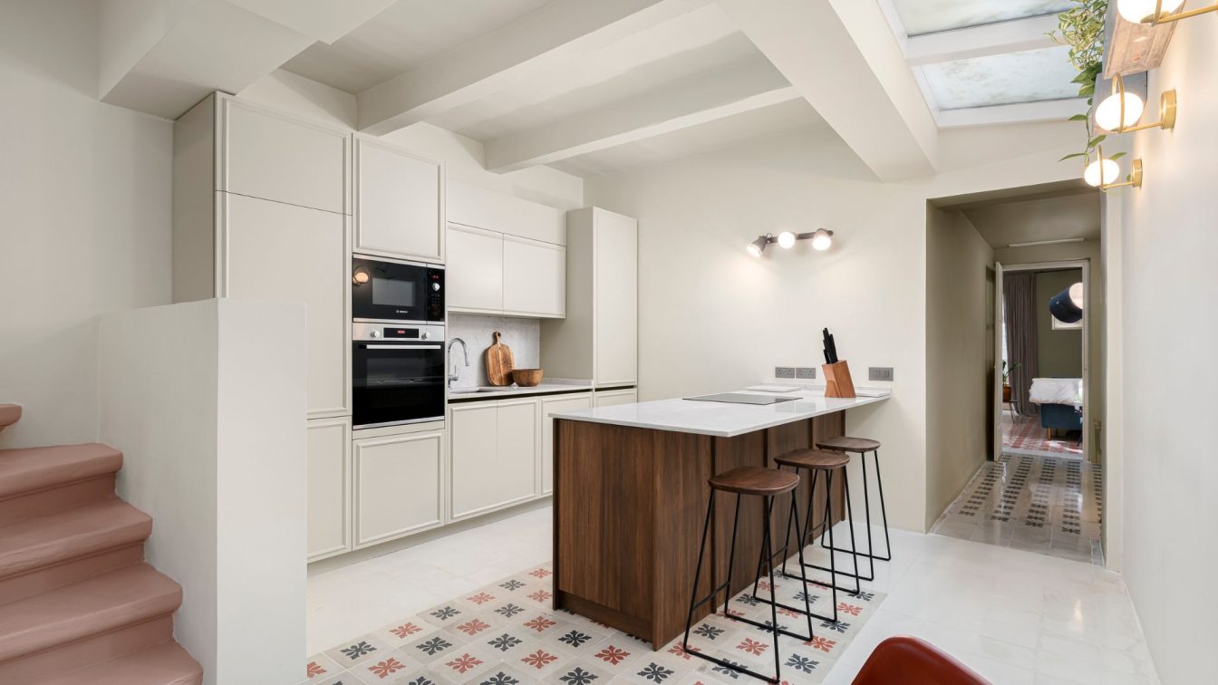
In a recent project, we were tasked with transforming the living and kitchen areas of a traditional townhouse. This space featured a beautiful mix of traditional elements, but its layout was less than ideal, tapering into a triangular shape that felt restrictive. Our challenge was to create a functional, open-plan space that embraced the uniqueness of the home’s architecture. Rather than hiding the angled wall, we made it the focal point. By removing other walls and reorganizing the internal layout, we transformed it into a striking backdrop for bespoke cabinetry and wooden wall paneling. The contrast between this feature and the bare vertical walls created a sense of visual harmony.
A central stone staircase was restored, with its black wrought iron railings brought back to life, creating a stunning contrast against the taupe walls. Natural light now flows through the home, reflecting off the custom wooden joinery, brightening the space. The footprint of the walls we removed was carefully filled with light grey concrete, which frames the original patterned cement tiles, seamlessly linking the past with the present. A sleek Carrara marble breakfast bar softly separates the dining area from the kitchen, allowing for social interaction while maintaining functionality. The custom joinery transitions from warm wood shelving to a blend of blue-grey lacquer cabinets, gradually giving way to off-white high units that disappear into the light pouring through the floor-to-ceiling windows.
To add a contemporary touch, we incorporated brushed gold fittings and selected furniture from an eclectic mix of international brands. The result is a space where the old and the new coexist in perfect harmony, combining practicality with timeless beauty. At Studio NiCHE, we believe that every home has a story to tell. Our approach ensures that while the space evolves to meet modern needs, the charm and character that first drew us to the home are never lost.


