studio NiCHE.: We were engaged by a young couple to transform a rental flat into a modern, inviting home. Their vision was clear: to remove the accumulation of old furniture, bring the kitchen out of its cramped, dark room at the back, and address the issue of guests walking directly into the living space from the front door. The flat, situated in a 1960s building, had gradually filled with furniture from various households over time. The new owners desired a fresh, youthful atmosphere—one that would serve as a welcoming space for family and friends while also providing a peaceful retreat at the end of a busy day.
Our design process began by carefully listening to what the couple wanted—and, just as importantly, what they didn’t. They wanted to connect the kitchen with the living space, allowing for easy entertaining and interaction. To achieve this, we reimagined the internal layout, integrating the kitchen into the social space and partitioning off part of the area near the front door. This redesign not only created a sense of privacy but also allowed for a glimpse of the living space through a newly designed archway.
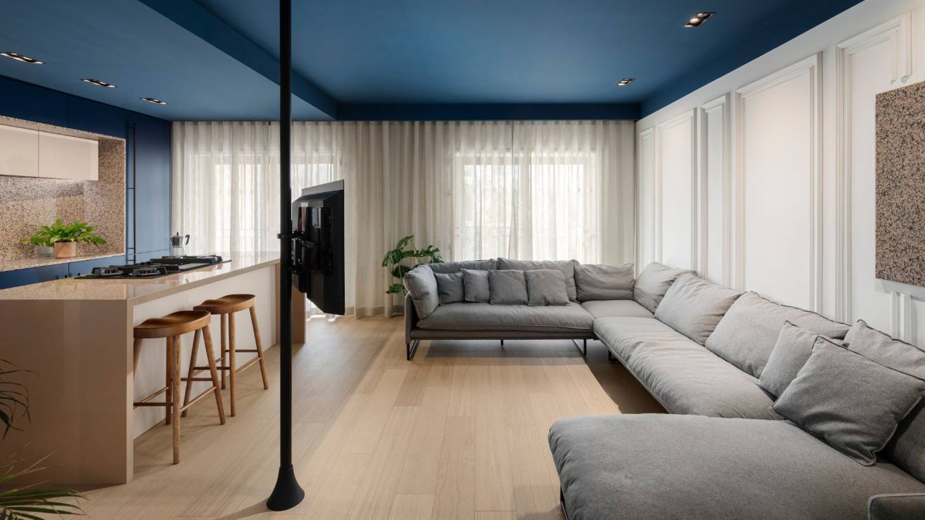
A key focus was establishing communication between the kitchen and living area. By reorienting the sofa to face inward, we created a more cohesive and interactive space. To avoid dedicating an entire wall to the TV, we employed a hotel-inspired solution: mounting the TV on a pole in the corner, which concealed the wiring and freed up wall space for aesthetic enhancements. This layout change made room for a kitchen island and added a touch of sophistication to the space.
Given the standard ceiling height of 2.6 meters and the boxy nature of the rooms, we introduced a sense of depth and height by painting the ceilings and main walls in a deep, dark blue. This rich tone creates an illusion of expanded space, with the walls and ceiling visually receding. We paired this with crisp white on the remaining walls and warm parquet flooring throughout, establishing a cohesive and inviting base palette.

The couple’s preference for neutral tones was complemented by the introduction of a striking salmon pink granite in the kitchen, which contrasts beautifully against the deep blue walls. This material was chosen for its durability and aesthetic appeal, perfectly aligning with the couple’s love of cooking and their desire for a high-quality kitchen surface. The kitchen design respects the proportions of the space, with the island serving as a functional and visually appealing centerpiece. The cabinets, finished in lacquer, were meticulously aligned to conceal the room’s awkward lines, resulting in a seamless and minimalistic appearance.
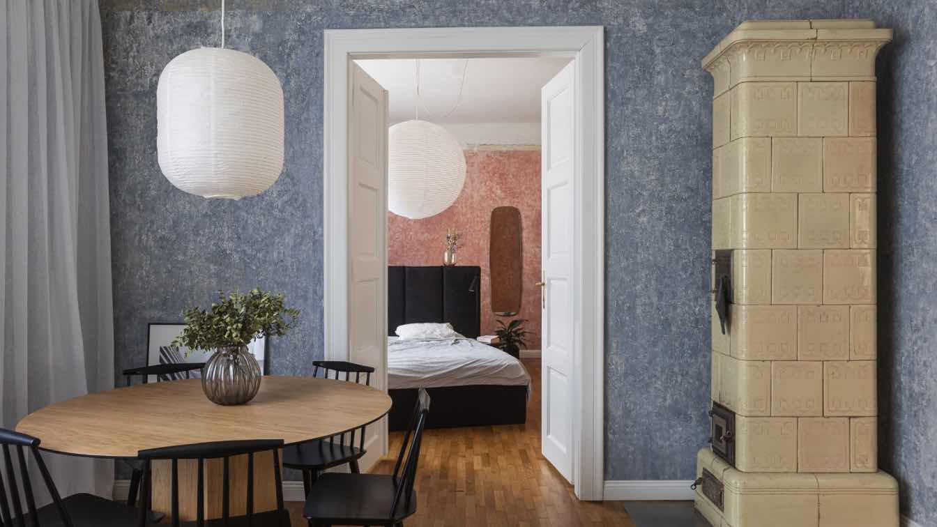
In addressing the flat’s original layout, we also made significant improvements to the archways. By opening up the arch between the dining room and kitchen, we created a walkway that improves circulation and brings in more natural light. We added a third arch near the front door, mirroring the building’s existing structure and creating a more balanced, welcoming entryway.
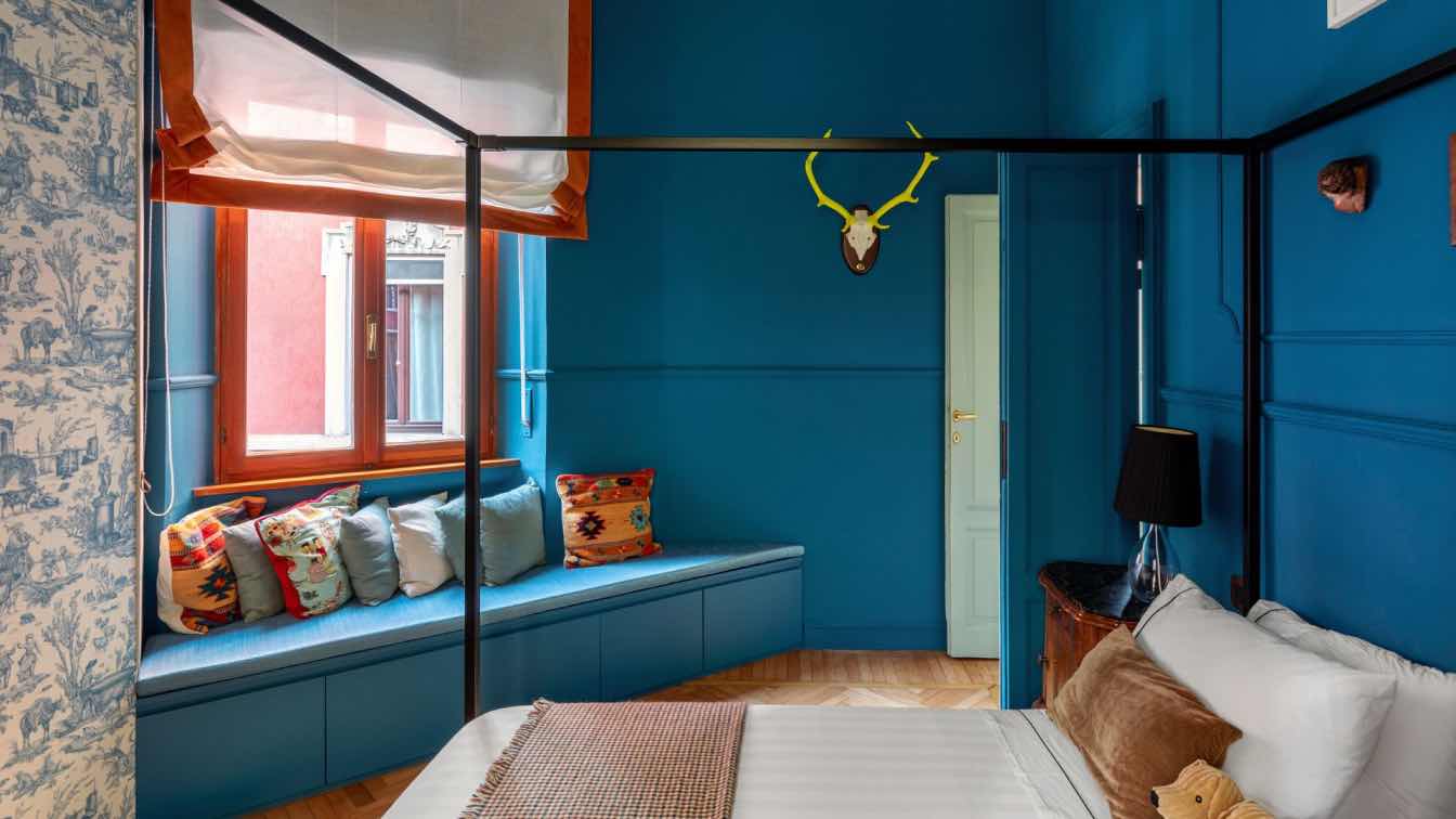
The result is a space that feels light, open, and socially balanced, yet retains a cozy and intimate atmosphere for dining and entertaining. The cohesive color scheme of deep blue, white, salmon pink, and beige flows seamlessly throughout the apartment, including into the bedrooms. Here, the warm parquet flooring continues, complemented by ornamental molding and geometric detailing that create a sense of continuity and refinement.
This project exemplifies our commitment to designing spaces that are both visually stunning and perfectly suited to our clients’ lifestyles. The final design is a harmonious blend of bold color choices and practical solutions, resulting in a home that is both restful and sociable, truly reflecting the spirit of its owners.


