On the surface, the private house in Ra'anana, Israel, is a perfect property, enjoying a fantastic location in one of the city's most sought-after neighborhoods and large, well-lit spaces. However, the angular outlines of the structure posed a challenging design problem. Interior designer Tzvia Kazayoff managed to turn this disadvantage into an advantage and designed a particularly pleasant and harmonious living environment for a young family of four. Here's how she did it:
Welcome to the home of a young couple with two small daughters, which recently underwent a complete transformation under the guidance of interior designer Tzvia Kazayoff. The connection between her and the couple began when they were looking for a property to live in and considered buying a house she had designed. Although they didn't end up buying that particular house, Kazayoff's work impressed them, so when they purchased their home in Ra'anana, they approached her and together they set out on this journey.
"The house is part of a particularly large building that served as a family home and was divided years ago in a straight line into two houses - thus turning the square layout into two houses in the shape of half-triangles, which actually create an abundance of angles and diagonals," explains Kazayoff. "In addition, the original bulky electrical cabinet was originally located in a strategic area, near the entrance and the staircase, and ran like a thread between the four levels." She continues, "When I first arrived at the property, apart from the angles that created quite a frenetic feeling, it was hard to ignore the abundance of artworks collected by the previous owners over the years, adorning each of the floors. It's an impressive collection of treasures that, as an art lover, filled me with inspiration. On the other hand, the atmosphere created on the floors was more reminiscent of an overcrowded museum that made it difficult for untrained eyes to understand the hidden potential.

Indeed, the first thing I said to the new owners was that despite the challenges, we can make a beautiful limoncello from this lemon because there are many advantages here: First, the house is divided into four levels: basement (outside of which the parking spaces are located), a spacious and well-lit entrance floor, a living floor, and a roof floor that wasn't used before the renovation. This layout allowed us to effectively plan a fantastic public wing and create two floors of comfortable and intimate rooms for the couple and their daughters. Another great advantage of this house is the presence of an elevator, which greatly facilitates movement and transition between floors."
"The task before us was to harness the existing structure to create a young, indulgent, and cohesive living space that doesn't fight against the challenging outlines but rather harnesses them to its advantage. In the design process, we chose to go with the angles and compliment them, while blurring them in certain places. One way to do this was to combine classic and eclectic features in a calm color scheme (based on cream, gray, and black) that softens the angles. Additionally, we worked extensively with materials such as wood, metal, and glass."
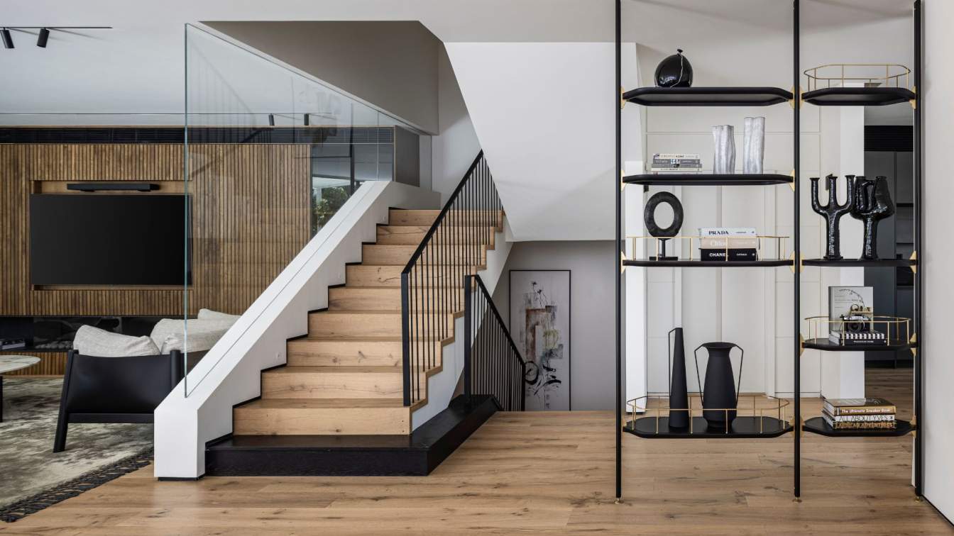
"The house is huge, and in order to give it a warmer and more enveloping feel, one of the first choices we made was to cover the floor with oak planks of varying lengths and widths, giving the envelope a young and refreshing look. We also used these planks to cover the stairs, with the first step being dark and integrated with hidden LED lighting, giving the monument an elegant and dramatic look in the evening. We replaced the existing railings with a classic and clean iron railing, and on the other side, we installed glass plates that contribute to the quiet look. We chose to keep the existing elevator, painting the original wood panel covering in a light shade, thus achieving a look that blends in with the overall design."

"The original electrical cabinet was removed, and in its place, we installed an iron bookcase that well defines the functions on the entertainment floor while leaving the space open and airy. In general, we incorporated many elements throughout the house that give a floating appearance. For example, instead of a regular panel, we chose to use STR profiles that create a disconnect between the walls and the floor, giving a precise and polished look."
"This is a family that loves and often hosts, so we designed a spacious living room for them with a significant feature wall of oak slats, between which metal slats were embedded. Behind this wall is hidden a vertical air conditioning system that air conditions the public space and eliminates the need to lower the ceiling height. On both sides of the wall, we designed illuminated glass niches for displaying fine items, and at the bottom, we incorporated a gas fireplace that heats the entire house. From this area, there is also access to the yard, which has been lovingly tended over the years, so we decided to preserve it in its original form. We covered the pool floor with new and fresh mosaic and incorporated an outdoor kitchen and dining area throughout the garden that faithfully serve the family members who often spend time in the yard."
"The festive dining area where the family hosts is located in a niche derived from the house's contours, which I see as ultimate for this specific function because the large windows surrounding it face directly to the yard and pool area, and it's also located on an axis that connects the living room to the kitchen. At its center stands a sculptural-museum table composed of a Corian surface in two shades and a dominant leather-covered leg."

"We chose to cover the facades of the parallel kitchen with practical and durable materials that mimic stone, as well as the surface - which gives the kitchen furniture the appearance of a homogeneous stone unit. In the large island, we planned seating for five, and this is where the four eat their family meals."
"The guest bathroom is located near the entrance, and the door leading to it is integrated as an integral part of the carpentry unit that covers the wall. It continues with a wardrobe closet and a dedicated area for the new electrical and communication cabinets. The space was designed in a minimalist line, and the mirror at its center is identical in size to the dimensions and proportions of the window. We created a parallel sink unit combining a 24 cm thick cast Corian surface, under which is a thin brass shelf. The tension between these two seemingly contrasting elements gives this space a precise and measured look."
"The staircase leads to the next floor, where the girls' realm was planned. Kazayoff created a beautiful and inviting family corner for them, full of toys: "This is actually the informal living room of the house, so we incorporated practical elements that match the family's lifestyle," she explains. "We incorporated a bench, lounging corners, and plenty of storage space for books and games. Also on this floor are the girls' bedrooms, who share a common bathroom; a guest room; a well-equipped service room; and a kitchenette with a drinking water sink and a small refrigerator."

"The girls' bathroom was designed to be especially indulgent, with a large vanity covered in oak veneer above which is a trough sink that allows both of them to get ready simultaneously for a day at kindergarten and school. We covered the walls with terracotta-colored tiles with a glaze that give the space a nonchalant and effortless look."
"The parents' master suite is located on the attic floor, which stood abandoned before the renovation: "We cleaned it up and planned a pleasant and indulgent space for them, with the original sloped ceiling above, which was covered and painted white. The wallpaper adorning the bedroom walls was chosen in full coordination with the fabric upholstery of the bed's headboard, creating a soothing effect that softens the angles in this floor."
"Opposite stands a carpentry unit that reflects the happy nature of the couple, on which books and collections are placed. Further into the room stands an extra-clear frosted glass wall that leads to the spacious bathroom, at the center of which is a vanity that defines and divides between the shower area and the oval free-standing Corian bathtub area and a sophisticated anti-bacterial Toto toilet that also serves as a bidet. The walls were covered with large tiles in a color that continues the shade of the wallpaper in the bedroom, giving this space a warm, enveloping, and impressive look."