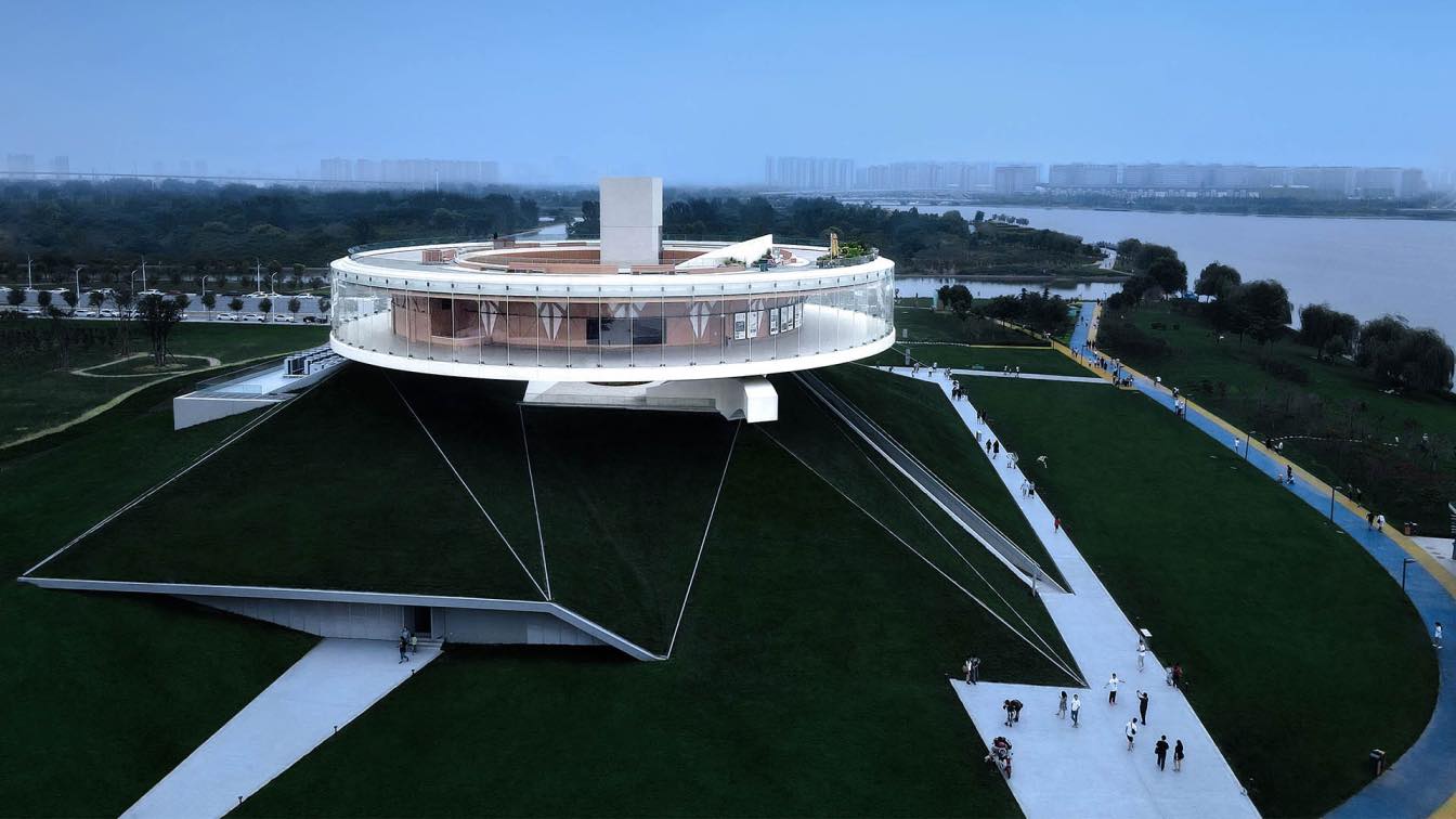
Supporting an unconventional office ecosystem inspired by nature, the Nest Art Center in Shenzhen, China is designed by M Moser Associates, and developed by Q-Plex.
For art centers, their design aspirations – rooted as it is within its locale - is of equal importance to its attention to practical considerations. It is not only a reflection of contemporary movements in culture and art, but also a benchmark in the city’s progress on an international stage. Q-Plex’s developers hope that it will become an iconic symbol of the city, known for its refined qualities, both internal and external – and thereby create a fruitful tension between its spatial accomplishment and future potentials.
At the moment, we have come to recognize beauty as a productive force, as we believe that a lively spirit of competitiveness is an essential element of beauty. In Shenzhen, an ambitious city with major international aspirations, the spatial and aesthetic qualities of the Nest Art Center present a unique image which encapsulates the spirit of the times, and provides a template for the city’s development in times to come.
- Why was M Moser Associates Chosen to Design the Building?
From the earliest stage of its design, the Nest Art Center was conceived as a continuation of major art spaces established in cities around the Greater Bay Area (consisting of Hong Kong, Macao, and nine cities in Guangdong). Its architectural, interior, and functional space design concepts have been designed to an international standard, and it aspires to serve not simply as a place within which to view art, but as a significant emblem of the times itself.
“The placement of an organic element within a rectiliner structure creates a symbiotic relationship between the building and the surrounding natural environment.”-- Ramesh Subramaniam, Design Director @ M Moser Associates
Following this, the American firm M Moser Associates (Shanghai branch) was selected for both the architectural and interior design. They have previously completed many prestigious projects including the headquarter buildings of Google in Malaysia, several offices of PayPal across Asia, and Tencent’s headquarters in Guangzhou. For this project, a thoroughly innovative approach was incorporated in the interior design blending indoor space with the context of the greater urban ecology in which the building stands. The spirit of current movements in technology, the future and fashion runs throughout the building, indoors and out, and even beyond into the realm of the city’s concept of culture and the built environment.

- The "Egg" Emerging from the Cocoon
The innovation of architecture is not only about the new form, but also bringing forth new ideas in internal logic and activities. This approach enables the creation of new aesthetic concepts and meanings, so that every building project may truly fulfill and exemplify their own unique cultural values.
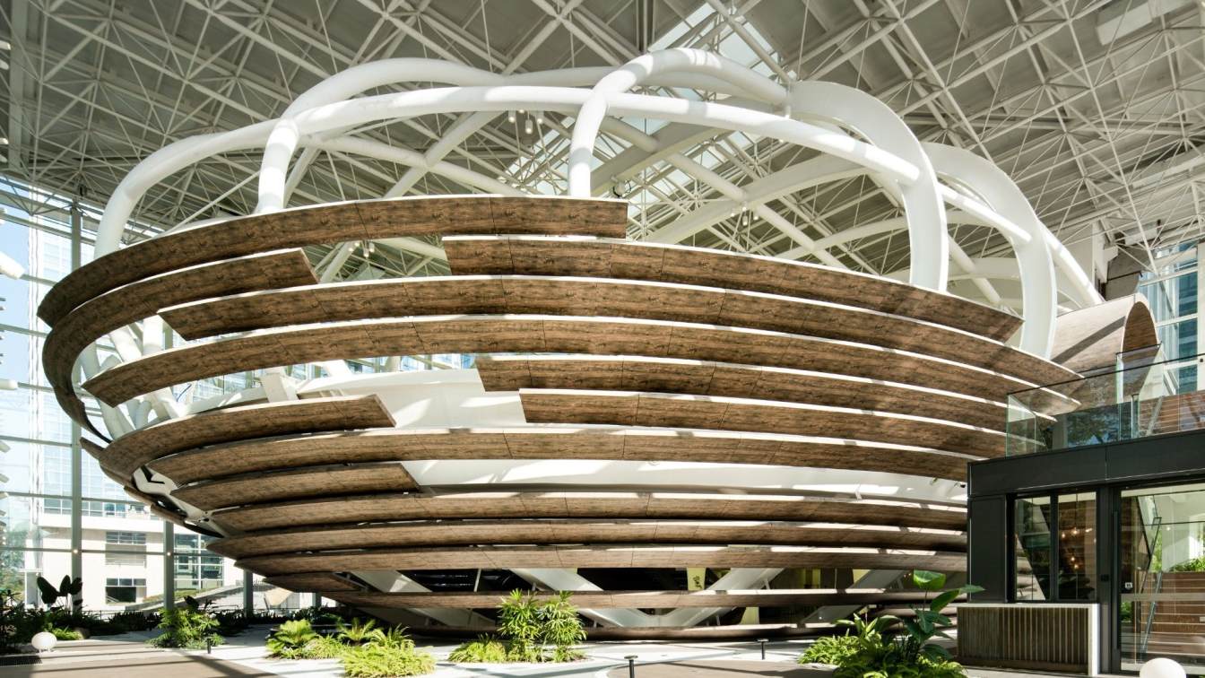
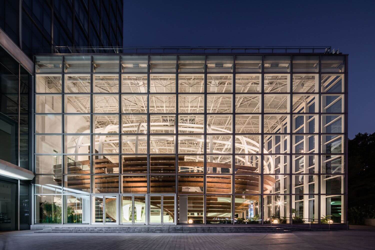
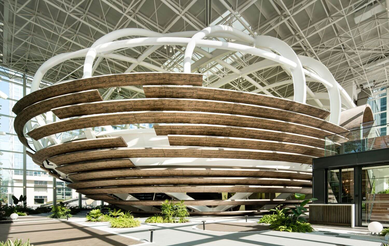
The architecture is easily recognized with its elliptical structure housed within a glazed frame facing the street, referred as "an egg emerging from a cocoon", which forms an independent yet connected relationship with the surrounding area. It seeks to embody the ideals of innovation, freedom, and distinction, creating a unique, thoughtfully considered space. At the same time, the shape of the "egg" easily lends itself to the required function of the space. As a diversified building integrating corporate conferences, roadshows, cocktail parties, etc., the Center aims to be a true incubator for companies, and to provide an outstanding platform from which to announce themselves.
"Nest" implies a new life, hope, and vitality. In its combining of art, architecture and ecology, the project aims to echo the unique temperament of the new, vibrant city where it resides. The abundance of hi-tech and scientific research companies here has created a dynamic atmosphere, which provides a backdrop that contributes to Q-Plex’s attraction as an international-level space – an oasis of alternative arts and culture in Shenzhen.

In addition, the white grid-like structure inside the building extends throughout the project, which gives a continuous and cohesive order to the architecture as one moves through the various spaces. This provides a visually striking effect, while simultaneously giving expressions to a rational and scientific spirit.
Within the building, the interior design has also incorporated white flowing lines to lead the eye throughout the space. Such creates an elegant contrast of rational straight edges and gentle contours, which illustrates the main characteristics of the Nest Art Center - a city icon with long-term vitality, and possessed of both inner and outer refinements.
If architecture is to reach the level of art, then light must have an intrinsic role in the defining of space. It runs through the shape of the building and changes its rhythm. Here, the circular glass curtain wall and pure white steel frame structure increase the sense of transparency within the space as light passes through it. As the architecture is sculpted by illumination, its nature-inspired flowing forms are accentuated, creating the defining aesthetic qualities of the Nest Art Center, now a well-known and outstanding landmark in Shenzhen.

- Functional Architectural Design: A Measurement of Beauty
A space’s structure to a large extent determines how the building will function in the future. The developer hopes that the Center will become a comprehensive business incubator.
The exterior design of this landmark building establishes a strong visual presence, while the interior, in contrast, presents a simple and flexible spatial character. We have set it up in such way as neutral, in order to better serve the art exhibitions, private cocktail parties, and other events as intended to host. The space is flexible, changeable, and precise, in order to seamlessly coordinate multiple types of activities, create multiple atmospheres, and connect multiple companies with each other, allowing for unlimited possibilities in the future.
As an international event venue, the Nest Art Center has thus far held multiple exhibitions and events, including but not limited to immersive art exhibitions by Ron English, who is known as the “Godfather of Street Art”, ROLLS-ROYCE NEW GHOST NATIONAL LAUNCH, Forums by TEDXShenzhen, COLOR WHEEL.
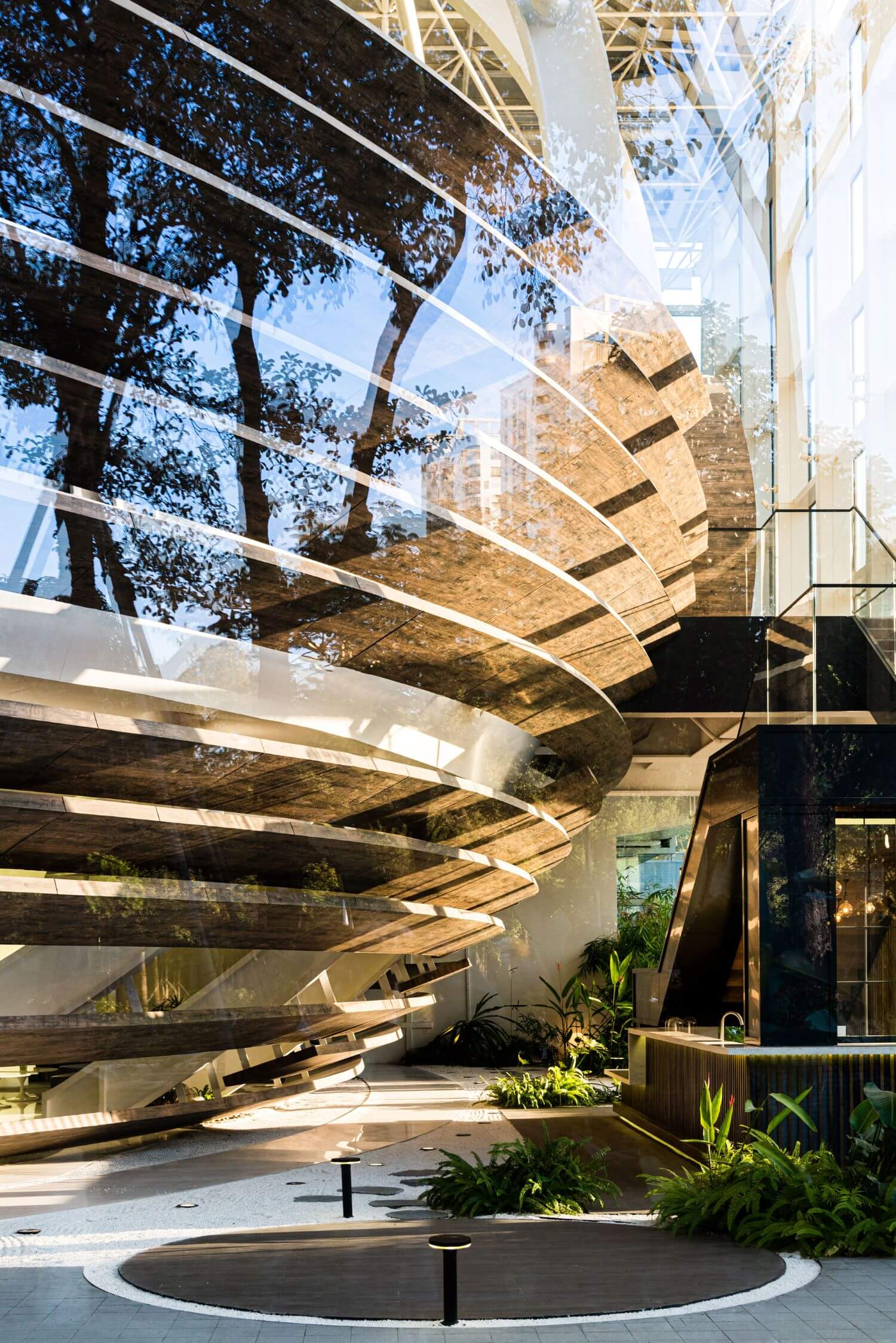
Looking from the floodlit stage, out and beyond the glazed curtain wall to the city beyond, one may observe the beautiful skyline of Shenzhen. The space overhead seems to meld with the blue sky above, as the clarity of sunlight brings out more relaxation and refreshment. This is the moment for the interpretive relationship among people, architecture, and the environment at its peak.
The main venue is located on the upper floor, while the lower level is reserved for business conversations or leisure activities. The path to the bar is winding and relaxed, slowly leading to the upper level, gradually becoming wider and quieter the further away it gets from the bar. The pathway is aesthetically unified through the motifs of old Spanish boat timber and moss, which envokes a quiet garden environment in the city. Meanwhile, the main elliptical shape visible from the street presents the beauty of geometry, and the integration of the reception desk, cafe, and event space incorporates a dynamic pragmatism into the architectural design.
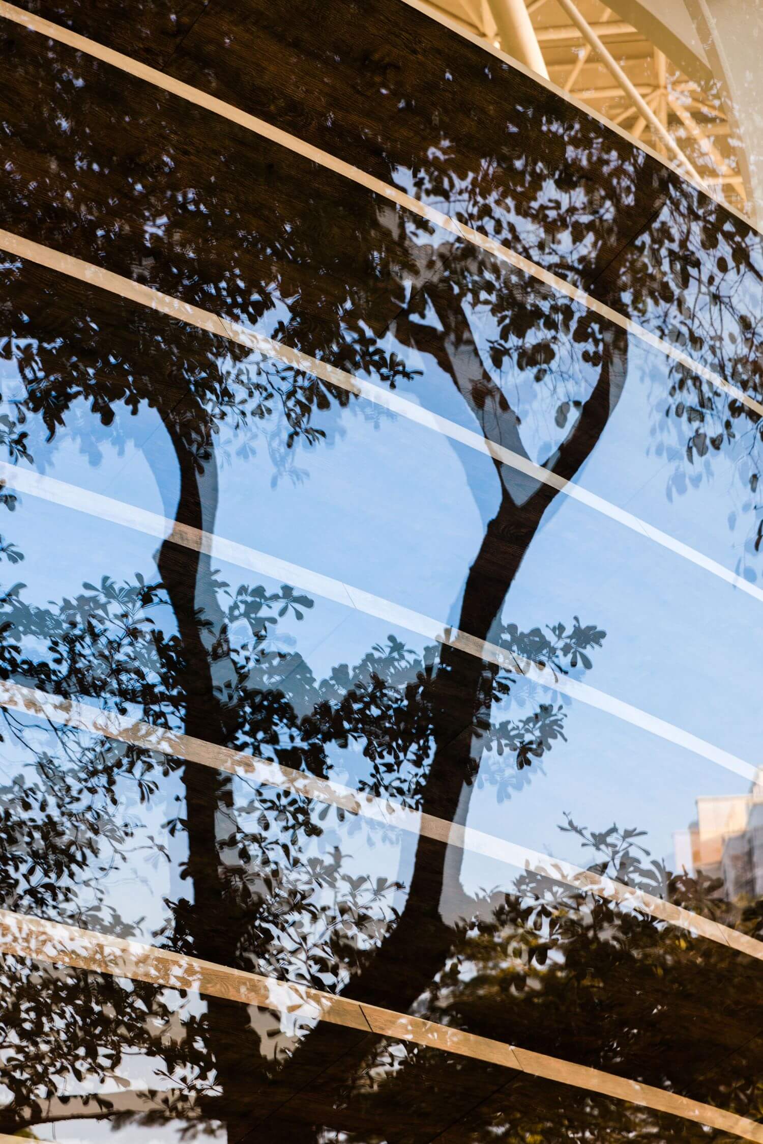
The materials used in the ellipse’s lower portion consist of metal plates clad in wood veneer created with 3D printing technology. The unique nature of the wood-like surface draws people into the space, while the contrast with the metal also calls attention to a sense of layering and texture. From afar, it appears like an outsized art installation, and lends the building an atmosphere of aesthetic ambition and refinement.

- A Flowing Feast
Other than the wooden and ceramic floors used in traditional art spaces and laying artificial turf to introduce nature into the interior, the concept of urban green parks is echoed here, and raises the aesthetic quality: the fusion of natural landscape and artistic elements is a compelling match and sets a new standard for this type of space.
The indoor greenery is a prominent symbol of a larger landscape beyond, with layers of daylight filtered through the white frame, flowing onto and through the building – the total effect recalls the phrase, "Although made by humans, it seems to have come from the sky above". This “inner garden” creates a dignified air of culture, with its green plants casting shadows on the Zen-like white sand, eloquently bearing witness to the gentle passing of time.
The famed Spanish architect Antoni Gaudí once said, "The straight line belongs to man, the curve to God.” The beauty of non-linear contours lies in their similarity to the ones found in nature, fascinating in their uniqueness and unexpectedness.

The various interiors of the building are connected through a series of curves, with each one performing the task of creating a degree of spatial tension. The reception desk is the center of the main lower area, focusing on visitors’ sights with a cylindrical shape which narrows at the location of the desk.
A system of pillars arranged around it are utilized by the designer as light-emitting membrane lamps. The ceiling is embedded with a ribbon-shaped fluorescent lamp slot which playfully winds its way between the pillars, leading the eye through the space.
Wooden shutters form a connection with the external courtyard, introducing warm natural light. Moving to the second level, the glazed stairwell has a flooring of wooden steps that echo the wood oval at the entrance area, which boasts a main venue with a platform of 1200 sqm free of beams and columns, with accommodation of up to 500 people.

- Words from the Developer
Shenzhen is the youngest first-tier city in China, and has become an international metropolis through its willingness to explore and innovate. The same is true for the Nest Art Center. It has a forward-looking perspective and its architectural design speaks of vigor and vitality. It seeks to symbolize these fast-paced times, which are embodied by the continual breaking through of established standards. At this moment, when the cost of real estate in the city is at a premium, the project aims to connect people, nature, and architecture, and aspires to be more than simply an art center or building, but rather a living, self-contained urban landscape.
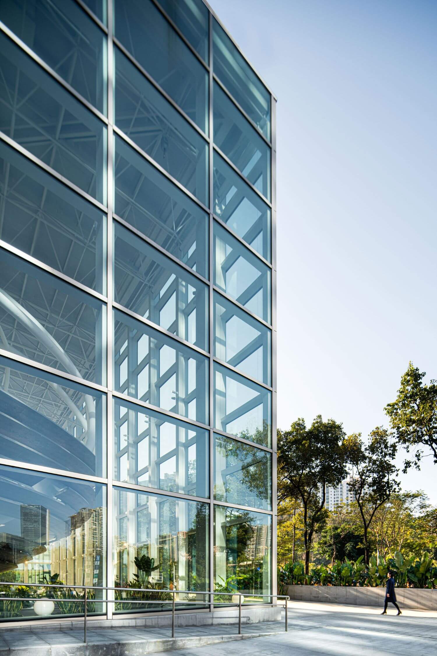
Seen from any angle, the Nest Art Center retains a bright, transparent appearance, visually integrated with its external surroundings. In our view, beauty is a productive force. This concept applies not only to the form and materials of a building, but also to the comfort, spirit, and feelings it engenders. Without this larger, holistic architectural approach, which focuses on meaning and a complete, systematic process of thought, all efforts to create a vibrant design would only lead to style without substance.
Good design necessitates a thorough and systematic process. From a commercial point of view, design must achieve reasonable economic value; from an artistic point of view, design must achieve a recognizable humanistic value; and from a human perspective, design must realize a subjective personal value. It is only through the collaborative process of builders and designers working closely together that long-lasting works of universal excellence can be created.



About
Q-plex is an innovative corporate complex located in Shenzhen’s Overseas Chinese Town with features reminiscent of the San Francisco Bay Area. Crafted by a top international design team, the project delivers a pleasant workplace that stimulates productivity.
With a deep understanding of the integration between architecture, nature, and the human spirit, the project aims to present China with an eco-friendly, collaborative, integral, and fraternal office space. Q-Plex offers ten low-density office clusters suitable as headquarters in the new ecological creative park of the city.
The property includes a large-scale art exhibition space with over 2,000 sqm known as the Nest Art Center and a commercial street with vertical greenery in the artistic style of the Singapore Gardens. Additionally, Artisse Place, a development of first-class serviced apartments and facilities are available as well, such as a fitness center, heated swimming pool, indoor golf, cinema, spa, art galleries, bars, fine dining venues and etc.

