Stukel Architecture: Aligned between a row of assorted businesses on one of Greenacre’s busiest roads, Manyolia, a boutique jeweller desired to stand out from amongst its commercial neighbours. Selling internationally sourced, high-quality gold and diamond jewellery pieces, the client desired to rebrand its retail space, as the outdated interiors were attracting the wrong clientele. Inadequately equipped for storage and merchandising displays to host their collections, the clients were limited in their ability to market their exclusive products. Creating a new retail branding experience for Manyolia was the key focus for the new design.
With minimal changes that could be made to the store’s exterior, a perforated screen in anodised gold was inserted and framed to the store’s front, featuring a contemporary and circular geometric pattern. The screen has enabled the jeweller to be set apart from amongst its neighbours, as it has established a lux presence on the main road, and created a veil of intrigue for passers-by. It has also served to provide the jewellers’ clients to shop in privacy whilst handling expensive pieces. The interior layout was maximised to ensure that the store could accommodate for the owner’s active family and social network, where gatherings could be held without compromising on its exclusivity. Display cabinets were maximised in all wall surfaces and located at a comfortable eye level.
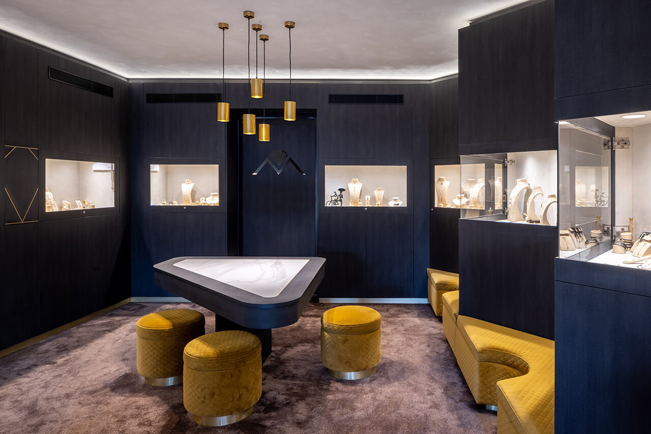
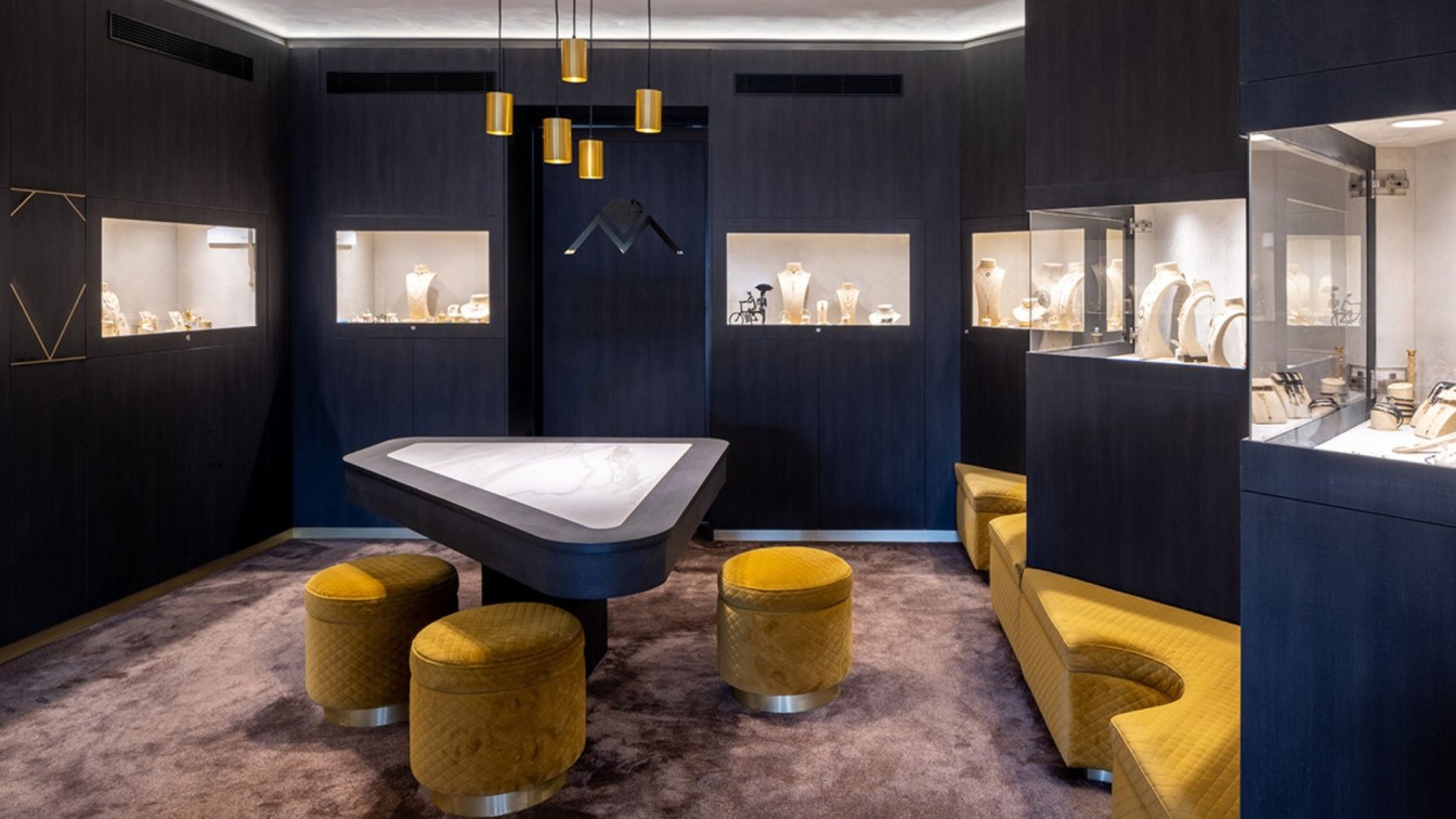
Double sided display cases were incorporated into the front facade to catch the eye of the pedestrians. A zig zag display case offered a zone for seating and casual observation of pieces with a mirror. The custom circular pouffe was designed to be detached from the seating zone and casually arranged around the low curved conversation table for those frequent spontaneous social gatherings. The interior finishes were modelled on creating a jewellery box experience that was in likeness of the cabinetry display. A suede-effect finish was applied to the ceiling, and reflected with a plush silk-like carpet to recreate the lavish atmosphere of being inside of a jewellery box. Dark timber veneer finishes were applied to the joinery, paired with black tiling and stone, referencing the exterior casing of a jewellery box. Whilst, touches of brass inlay within the joinery were added as a note to the precious items held within the store, as a large-scale jewellery box within itself.


