Mahya Salehi Studio: The story of this restaurant is heavily inspired by the beautiful region of Oaxaca; Oaxaca is Mexico's mezcal heartland and mole mecca, its capital of textiles and an epicenter of ceramics production. The sensory stimulation one experiences in Oaxaca is unlike any other destination in Mexico, making it a perfect source of inspiration for our design.
Housed within a commercial building, our project is a tenant improvement of an unfinished build-out. With a modest design budget- a challenging feat given the area's soaring costs- we transformed the space through the inexpensive medium of paint, transporting guests from Sonoma to the vibrant, terra cotta towns of Mexico.
Drawing inspiration from the artisanal crafts of Oaxaca, we incorporated intricate patterns, wood furnishings, clay pottery and strategic casework throughout the space, immersing visitors in a sensory experience that transcends borders.
Full text:
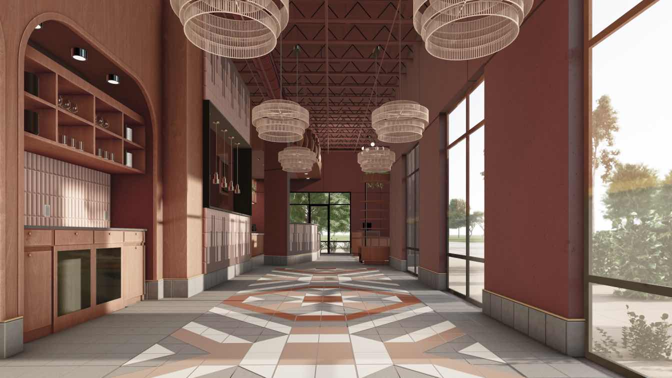
Curated lighting fixtures cast warm glows, highlighting the richness of the interior design elements. The main pendants over the dining tables pay homage to handwoven baskets, crafted by women artisans in Oaxaca. Over the built-in booths, onyx sconces add detail and intricacy to a simple, painted wall. This again was a strategic use of the limited budget; by utilizing ornate fixtures, we were able to create a rich atmosphere with a coat of paint as the main finish on the perimeter walls.
We meticulously crafted the intimate dining area, fostering an ambiance that invites guests to savor each bite while creating lasting memories.
Our design seamlessly melds the traditional with the contemporary, paying homage to Oaxaca's cultural heritage while infusing a modern sensibility. By blending textures, colors, and architectural elements, we have created a distinctive environment that celebrates the spirit of Mexico in the heart of Sonoma.

Floor Tile Design: Blending Craftsmanship and Cultural Inspiration
Our dining area's floor tile design is a testament to the meticulous craftsmanship and cultural inspiration found in Mexican interiors. With a labor of love, we intricately laid out 4456 individual triangle and square tiles, creating a mesmerizing pattern that draws its roots from Mexican textiles.
Inspired by the rich hues of Oaxacan landscape, the tile colors—blush, rose, stone, and oyster—complement the overall theme of deep, earthy tones. The design's innate intricacy stands in contrast to the exposed ceiling structure and ductwork, evoking a sense of organized chaos reminiscent of Mexican food markets. This "perfect imperfection" creates a dynamic atmosphere within the space.
Practicality was also a key consideration. The same tiles used for the floor were extended as baseboards, wrapping the perimeter walls for easy cleaning. This blending of functionality with design, showcases our commitment to durability, cleanliness, and maintenance without compromising the sophistication and transportative qualities we sought to achieve.
Brand Identity and Imagery: Unifying Design Language
Throughout the interior design process, we recognized the importance of a cohesive brand identity for Carmen, extending beyond the physical space. As a result, we presented Carmen with branding ideas that seamlessly integrated with the interior design, encompassing their logo, menus, and even cutlery.
The logo design journey was a collaborative exploration, resulting in a final design that resonated with the essence of Carmen's La Hacienda. Inspired by the significance of corn in Mexican cuisine, we crafted a lotus flower silhouette using an arrangement of five corn husks. This symbolism not only pays homage to the main source of nutrients in Mexico, but also serves as a fitting representation of the brand's identity.
By incorporating the branding with the interior design, we achieved a strong design language that unifies all elements. The logo, menus, and table settings are integral components that contribute to a well-defined brand image, reinforcing the unique character of Carmen's Resturant. Each detail was carefully considered to ensure a cohesive narrative that resonates with guests and captures the essence of the dining experience.
In line with this vision, we meticulously curated the plate ware, glassware, and cutlery, carefully selecting items that align with the design story. Each piece harmonizes with the overall aesthetic, further reinforcing the brand's identity and elevating the dining experience. From the moment guests enter the space to the moment they engage with the menu and utensils, the cohesive design language immerses them in the distinct world of Carmen's.
With a holistic approach to design, we establish a strong and unified brand language that extends beyond the traditional boundaries of interior design. This comprehensive approach enables us to create a memorable and well-defined brand image that seamlessly connects with guests at every touchpoint, ensuring a cohesive and captivating dining experience.

How is the project unique?
The floor tile design is a testament to the meticulous craftsmanship and cultural inspiration found in Mexican interiors. With a labor of love, we intricately laid out 4456 individual triangle and square tiles, creating a mesmerizing pattern that draws its roots from Mexican textiles.
Inspired by the rich hues of Oaxaca's landscape, the tile colors complement the overall theme of deep, earthy tones.
The design's innate intricacy stands in contrast to the exposed ceiling structure and ductwork, evoking a sense of organized chaos reminiscent of Mexican markets. This "perfect imperfection" creates a dynamic and memorable atmosphere.
What were the key challenges?
Housed within a commercial building, our project is a tenant improvement of an unfinished build-out, which gave us the framework for the architecture and a carte blanch for the interior design.
With a modest budget of $150,000, a challenging feat given the area's soaring costs, we transformed the space through inexpensive medium of paint, transporting guests from Sonoma to the terra cotta towns of Mexico. Infusing a saturated palette throughout, we aimed to capture the essence of Oaxaca's vibrant spirit.
One of our bold design decisions was to leave the industrial ceiling exposed. This was both a cost-saving decision and an intentional design gesture of tribute to the raw and authentic nature of Mexican architecture. To achieve visual harmony, we unified all elements by painting them in the same captivating color, resulting in a cohesive and immersive environment.