Hoogwegt is the largest independent supplier of dairy products and ingredients in the world, operating in over 130 countries. Operating under the motto ‘We add vision & value’, it provides high quality products, real-time market information, intelligent logistics services and tailored risk management solutions. This mission is also reflected in the company's Warsaw office located in the LIXA building. BIT CREATIVE architects are responsible for its design, drawing on the brand's values and vision to create a space that visually reflects its mission.
Hoogwegt's modern office in Warsaw is a 767 sq m space designed in an extremely consistent and coherent manner. The main objective was to create a functional interior, whose design would refer to the character and branding of the company. Hence the recurring motif is the use of the navy blue colour, graphic patterns and the letter ‘H’ taken from the Investor's brandbook. And although the office space contains various types of rooms, both for work and for meetings, they form a visually unified whole.
- An office programme which meets the needs of the Investor was, as always, our priority when creating a new layout and design. In this case, we wanted to design a conceptually coherent space, so we limited the range of colours and materials used. The rooms blend into each other, which is reflected, for example, in the design of the ceilings, which are based on a square and finished with materials in the same grey colour - explains arch. Barnaba Grzelecki, owner of BIT CREATIVE.

As the architect himself points out, it is the design of the ceilings that deserves special attention here. In the entrance area and in one of the conference rooms, you will find a bespoke acoustic ceiling made by Nyquist. The cuboidal elements made of PET material form an interesting composition of alternating boxes with cut-outs in various shapes - the letter ‘H’ referring to the company's logo, squares, circles with space for a luminaire and semicircles. In the offices, open-plan spaces and other meeting rooms, in turn, the ceiling was also designed according to an individual project, this time by Morrow Woods. These are ceiling islands of expanded metal painted blue and islands of a second type made of PET panels. Both versions of the islands are finished with laminated perimeter trim in a woodgrain colour - the same as on the walls or parts of the built-in furniture. To emphasise these unusual elements and to quiet the background, the ceiling and installations have been painted white. Between the islands, black linear luminaires in the size of the individual island groups were suspended.
- Another interesting element is the foiling that appears on the glass walls, where, due to the limited budget, the fluted glass has been replaced by a pattern of small strips glued parallel and perpendicular to the floor - adds arch. Zuzanna Wojda.
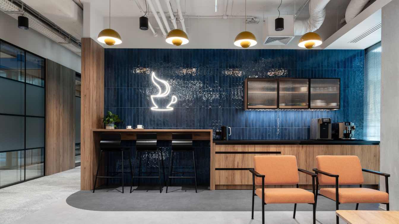
Also mportant was the functional division of the space itself, which was intended to meet the specific needs of the Investor. In the case of the Hoogwegt project, the entrance area consists of a reception, a waiting area and an open coffee point. A lot of wood and various materials in shades of grey were used in this part of the office. This colour appears on the floor, the ceiling or the front of the reception counter. A counterbalance to the muted colour scheme is provided by tiles, furniture and decorative fixtures in navy blue and orange.

The staff area, on the other hand, which consists of open space and offices, is primarily a bright interior, warmed up by wood, with colourful accents in the form of lacquered expanded metal on the ceiling or coloured locker fronts. The spaces have been differentiated by selecting different wallpaper patterns for the offices and open spaces. The entire décor is complemented by a large amount of living greenery in free-standing and standing pots on the lockers.
There are a total of four meeting rooms in the office space, three of which can be combined into one, creating a larger space for 20 people. These rooms also feature the colour blue and the colour combination of wood and grey. The ceiling echoes elements from the staff spaces, but due to the smaller size of the rooms, limited to islands of PET panels. In one of the smaller rooms, on the wall we find symbols cut out of dibond from the Investor's graphic card, which refer to the company's area of activity, the dairy industry.
The main meeting room, designed for 10 people, stands out somewhat from the others due to the use of orange in a rather bright shade. As this is the main meeting room for guests, the ceiling from the entrance area is repeated here, i.e. a grid of cuboidal boxes with different-shaped internal cut-outs.
Also noteworthy is the social room with kitchenette. Its colour scheme and the room's finishing materials also refer to the climate of the overall arrangement. - In the kitchen, we kept the floor simple and the ceiling open, where only the ceiling is painted white. In the kitchen, attention is drawn to the dark blue tiles of various colours and the fluted glass fronts. On the two opposite walls, decorative wall lamps placed in the axes of the wood panelling are a distinctive feature. In this way, the space becomes a less formal, but still stylistically identical, meeting point for employees - concludes arch. Jakub Bubel concludes.


About
BIT CREATIVE design studio specializes in space planning and interior design for corporate clients. It offers a wide range of services related to relocation, as well as rearrangement of corporate headquarters. It is a team of professional architects and designers who have many years of experience in arranging commercial spaces. The studio was founded by Barnaba Grzelecki in 2017.

