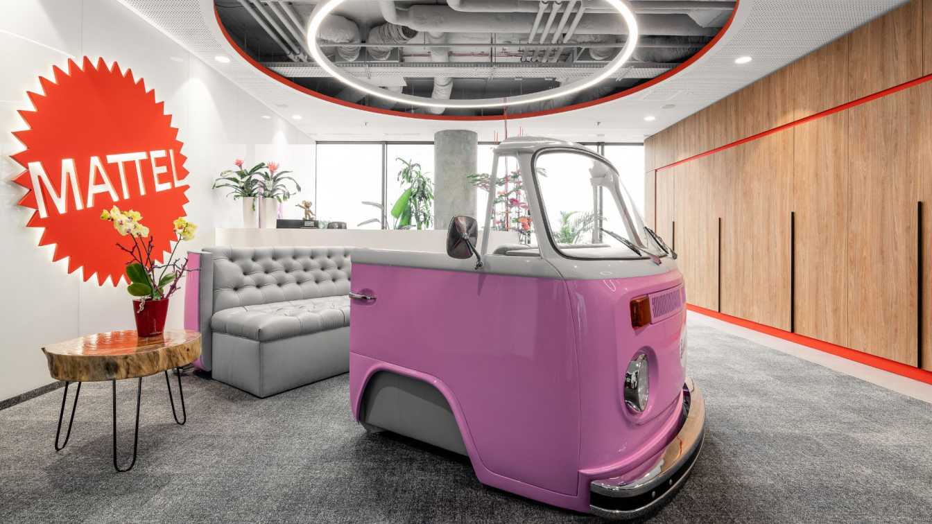
The story of the world's most popular doll has attracted millions of viewers to movie theaters, confirming Mattel's success. See the interior of Mattel's Warsaw office, which was designed by BIT CREATIVE.
Located in the heart of the Warsaw Business District, on the 34th floor of Skyliner, Mattel's Polish headquarters is 650 sqm which takes everyone to the magical world of the manufacturer of the most popular toys for children. Barbie, Fisher Price, Hot Wheels or Matchbox are already iconic products, which have also become an important, though not dominant, element of the interior design.
- The main idea accompanying us in developing the concept for the Mattel office in Warsaw was to create a multicolored interior reflecting the spirit of the products created by the brand that we all know well – says architect Barnaba Grzelecki. - At the same time, we were focused on creating an interior that would not, in the end, overwhelm the employees with the number of colors and intensity of contrasts. Among other reasons, we decided to visually differentiate the space depending on the function performed – he adds.
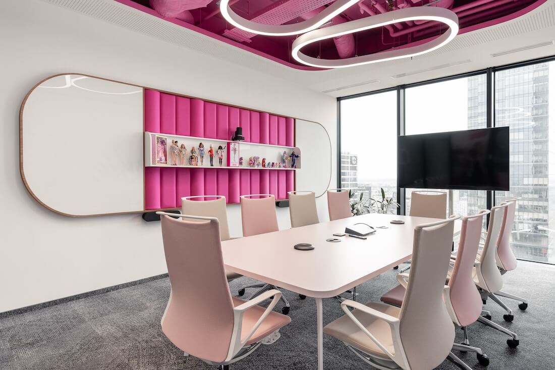
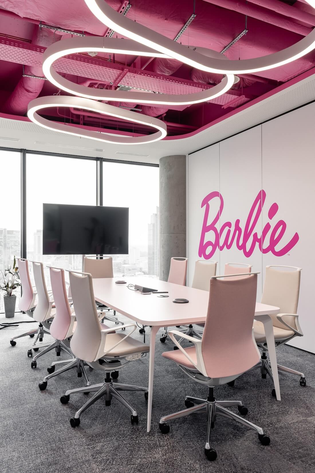
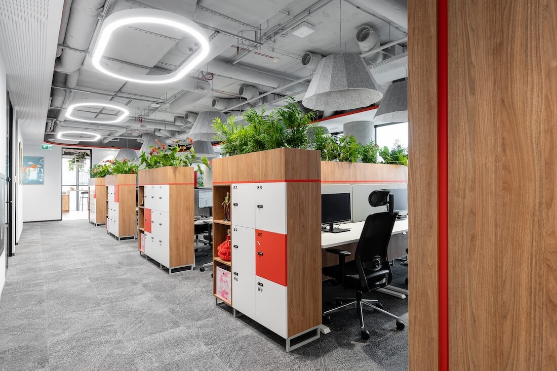
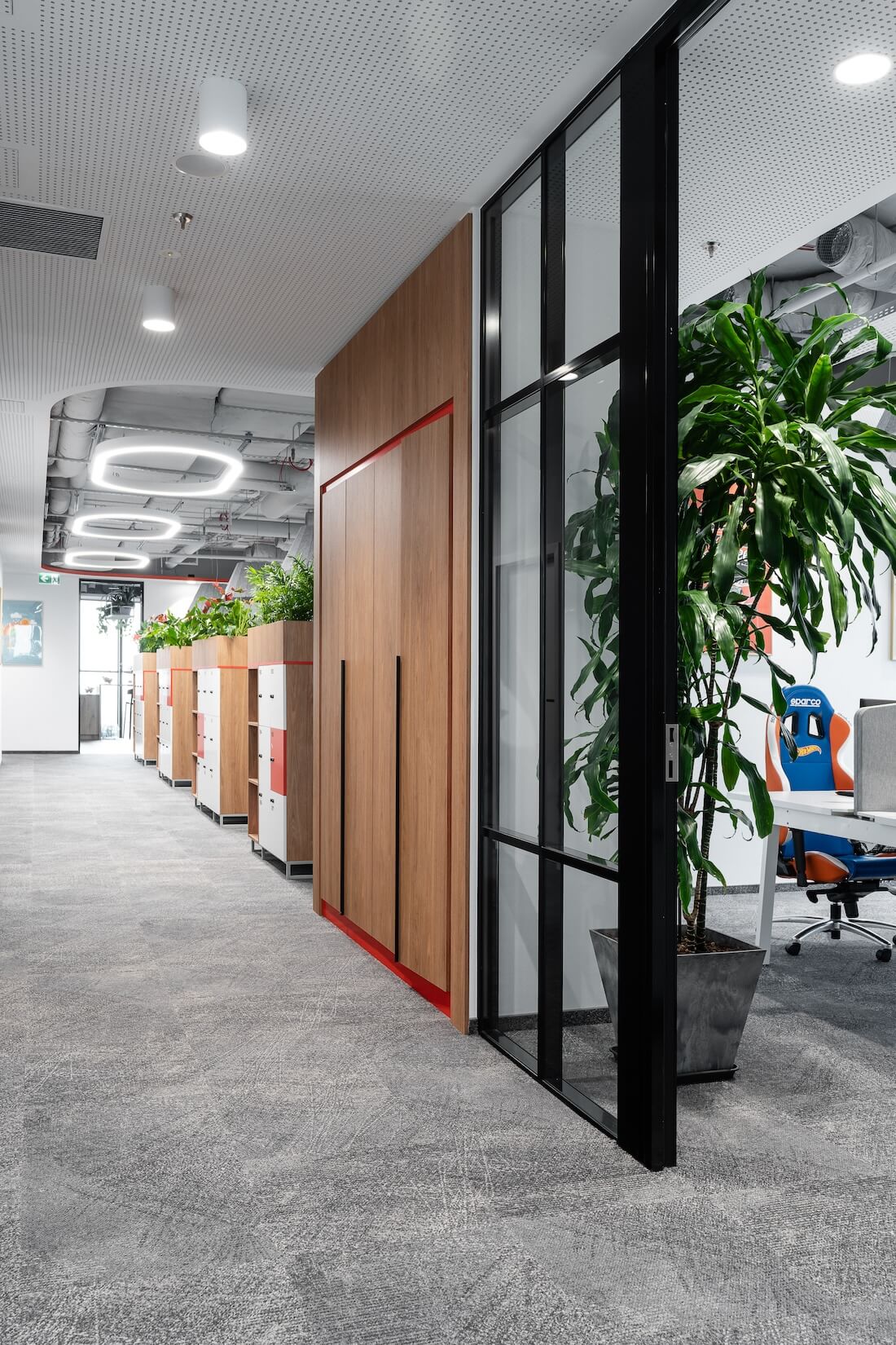
Thus, the meeting rooms were infused with colors and brand motifs from the Investor's portfolio, while the open common spaces and strictly work spaces were calmed down through the use of a limited color palette (gray and white) and the use of only delicate accents in the main red color from the company's brandbook.

- From the perspective of the passageways or open space, the interior of Mattel's office may seem rather calm and subdued. However, grouped by their size, the meeting rooms inside are teeming with color – emphasizes architect Jakub Bubel.
The office features meeting rooms of widely varying sizes, collaboration rooms, a large functional kitchen, as well as open space and separate office areas. The reception area, together with the waiting room, is an element that is part of the overall character of the interior. Perforated ceilings, a painted ceiling, warm wood or colors such as white, gray and red can also be found in the rest of the office. A point that, in turn, announces a twist in the interior design is a sofa in the form of a Barbie bus.
The two main and largest meeting rooms represent the most recognizable brands, Barbie and Fisher Price. Since the rooms can be connected to each other, they relate to one another visually, while being a mirror image of each other. Smaller four-person rooms are those under the Hot Wheels and Matchbox brands - in this case, as well, they are visually similar to each other. On the walls there are graphics prepared by the Investor and lacobel for writing. In both rooms, an unconventional solution are tables based on fragments of a car engine, and modified conference chairs created from original car seats.

The third group consists of small rooms intended mainly for intimate meetings. A common feature of these rooms is the manner and location of a particular finish. However, each of them also has a distinctive element characteristic of the brand, such as a scrabble game board in the form of a table, or a wall of Megabloks blocks. In each of these rooms, the ceiling and walls feature unusually vivid colors from the color scheme of each product, emphasizing the character of the brand it represents.
On the other hand, the employee spaces in the open space area are kept in a white-gray color scheme with elements in red. The ceiling in these parts is a common element for the entire arrangement, but large-diameter felt lamps hang above the desks. The walls are decorated with decorative panels upholstered with fabric in two colors. On the other hand, the social areas and the collaboration zone combined with the chillout area are much more boldly decorated.
- In the social room, we wanted to add some finishing touches to give the kitchen a retro feel. Hence, you'll find fluted fronts or a bright terrazzo countertop in the kitchen cabinets, and neon on the wall. Under the ceiling, we designed steel flowerbeds with expanded metal, where live plants grow in pots – tells architect Zuzanna Wojda.

Another unquestionable advantage of this room is its location on the floor plan from corner 34, which provides a panoramic view of Warsaw and the surrounding area during a coffee break. For this reason, the kitchen has been planned with varied seating areas - from armchairs, chairs and a sofa, to hockers at the bar countertop directly at the elevation.
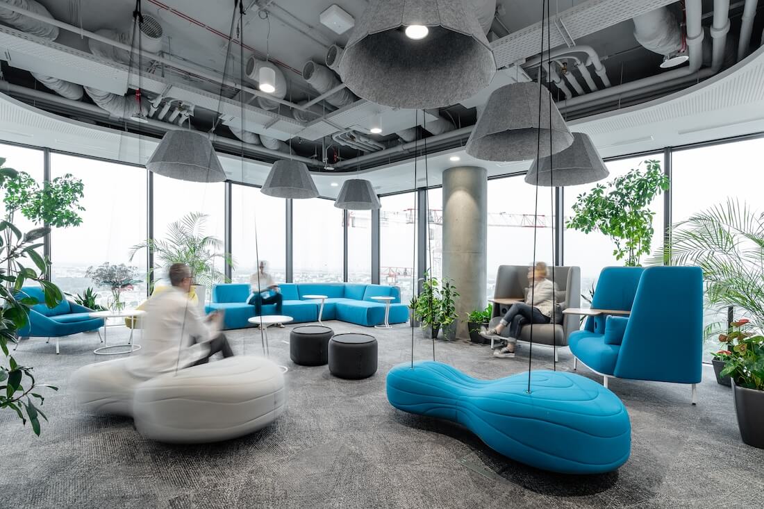
The collaboration zone connected to the chillout zone, on the other hand, is a part of the office with diverse functions. It serves not only as a space for collaborations, but also for relaxing the organization of larger internal meetings. Comfortable furniture, such as a modular sofa, armchairs or swings attached to the ceiling, as well as high chairs with a small, comfortable tabletop for working on a laptop, have been placed in this room.
And although placing such a large number of functions in a relatively small area was quite a challenge while preparing the spatial layout design, as you can see, the architects of BIT CREATIVE met it one hundred percent.






About
BIT CREATIVE design studio specializes in space planning and interior design for corporate clients. It offers a wide range of services related to relocation, as well as rearrangement of corporate headquarters. It is a team of professional architects and designers who have many years of experience in arranging commercial spaces. The studio was founded by Barnaba Grzelecki in 2017.

