Overview of the Office Space
The Ernst Pharmacia office space by Design Three Sixty is a modern office space, located in the Industrial Area Phase 1 of Panchkula city in Haryana and spanning 5500 square feet space. The design theme revolves around bold opulence, incorporating dark neutrals and contemporary elements.
Inspiration
The primary inspiration behind the interior design stems from the vision of a young professional leading the company. Seeking to create a bold and opulent modern space, we focused on incorporating dark neutrals, wood elements, and strategic lighting in the design of the space. The interior design speaks to the everyday employee, with an open workspace plan emphasizing the collaborative ethos of the company.
Overview of Each Space
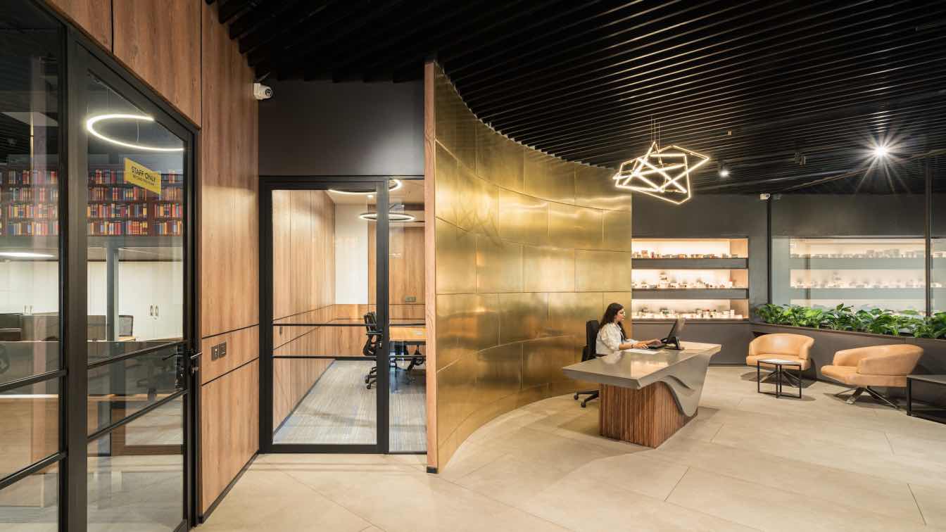
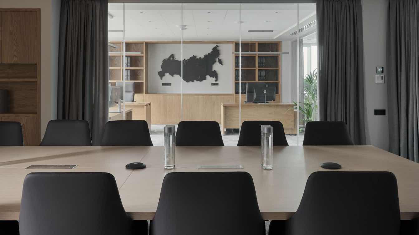
Entrance: The highlight of the entrance space is the curved, gold metal paneled wall which is the centerpiece of the reception area, giving the space a sense of depth and dynamism. While gold and wood evoke a sense of classic luxury, the curved facade and the black ceiling introduce modern and contemporary elements. This blend of styles makes the space appealing and reflects a sense of timeless design, which reflects the ethos of the young and growing company.Conference Room: A spacious room with a capacity for 20 people, adorned with visually appealing light fixtures, creates an engaging environment for meetings. The conference room embraces the elegance of minimalism while harnessing the power of natural light. Minimalism is the overarching design philosophy here, where less is indeed more. Clean lines, unadorned surfaces, and a predominantly monochromatic palette dominate the room. Expansive windows stretch from floor to ceiling, allowing an abundance of daylight to pour in.
Working Space: Taking advantage of the ample height and natural light, the open workspaces create a collaborative and productive work environment. The design of this space is characterized by a captivating minimalist aesthetic that seamlessly incorporates an intriguing interplay of neutral tones. The mezzanine floor showcases a clever design choice of faux bookshelves adorned with colorful cover art. Yet, it's the staircase that unquestionably steals the spotlight. Its steps are a canvas of vibrant colors, beginning with a deep forest green at the base and gradually transitioning to a radiant, eye-catching yellow. This spectrum of colors not only captivates the eye but also serves as a profound metaphor for the voyage of innovation and creativity.

Director Room:
In crafting the Director's Room as a cozy and elaborative space, the emphasis on elegant aesthetics is evident through the use of rich materials and thoughtful design elements. The use of rich materials, such as Grey veneer employed to create a warm and inviting ambiance. The inclusion of stone accents adds a layer of sophistication, bringing a earthy feel to the room. The pop panels, contribute to the room's cohesive and polished look. The choice of a modern fixture complements the overall design aesthetic, creating a harmonious blend of functionality and style.
The juxtaposition of sleek, leather chairs against the warm tones of the grey veneer and stone creates a balanced and inviting atmosphere.
Color Scheme and Materials
The dark color scheme, complemented by warm wood elements, creates a sense of sophistication and opulence. Lighting plays a pivotal role, strategically placed to enhance the overall atmosphere. The mezzanine space introduces primary colors, breaking the monotone color scheme and infusing vibrancy into the workspace.
Sustainable Design Features
The placement of ample windows strategically minimizes the need for artificial lighting, contributing to the well-being of employees. The office incorporates sustainable features such as workstation planning for optimal natural light flow, under-deck heat insulation, and eco-friendly HVAC systems, ensuring a comfortable and environmentally conscious workspace.
In conclusion, Ernst Pharmacia's office space is an innovative design, reflecting the company's vision, culture, and commitment to providing a dynamic and collaborative workspace for its employees.


