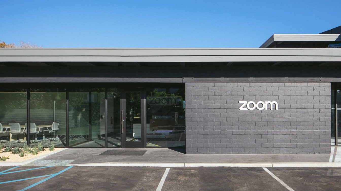
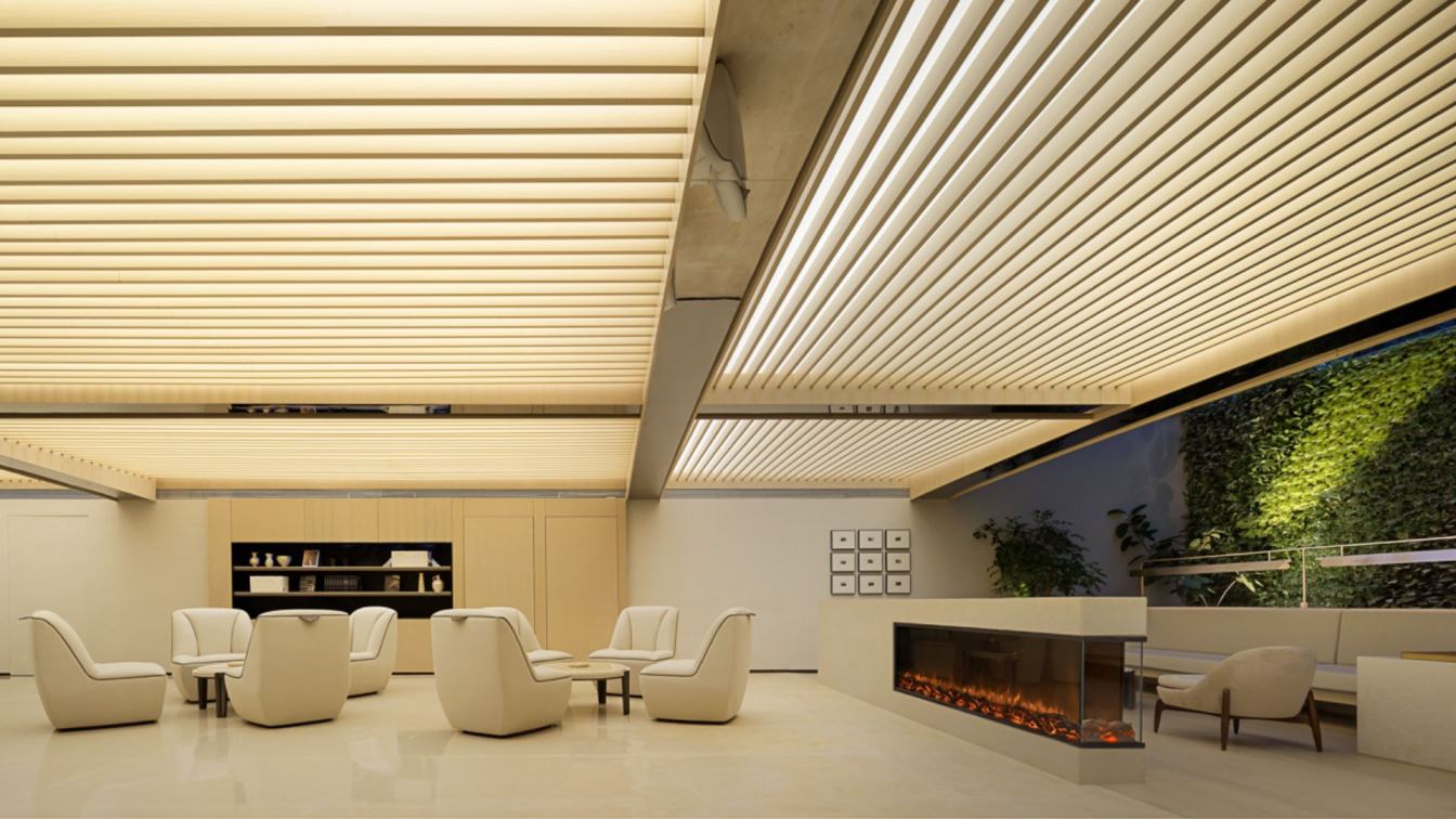
ANACAPA Architecture: This objective of this project was to transform a tired 1970s-era building into a vibrant and creative office for international video conferencing experts, Zoom. Located near downtown Santa Barbara, the split-level building had been haphazardly remodeled over the intervening years prior to Zoom’s acquisition; the original open-plan design had been divided into a rabbit warren of spaces.
The first step was to strip away the layers of prior renovations and open up the space to create an intuitive flow between the building’s 6,500 square feet of space which is spread over four levels to fulfill the company’s program and employee needs effectively. A new ground-level entry welcomes clients through product showrooms and displays to demonstrate and ultimately sell their communications technology. The large, central glass-topped, two-story atrium at the center of the building was preserved to provide interior circulation and bring daylight into the center of the building. New stair seating functions as the multi-tool of the building. It serves as an important gathering space for all-hands meetings and presentations, as well as a touchdown space for casual meetings and as an alternative workspace, and of course for circulation between floors. A communal kitchen and snack area are built into the atrium. Open-plan office space for sales staff surround the atrium. Other spaces include conference rooms, break-out rooms, and a mother’s room.
The building’s basement was designed exclusively for staff and includes open-plan office space, small teleconferencing meeting spaces, and a show kitchen with a dual display system for team gatherings and presentations. This level also features a patio area for dining, games, and relaxation. Both interior and exterior of the building is exposed masonry. A new exterior elevator tower was added to supplement vertical circulation. Outside, a GreenScreen grow wall was added to supplement the otherwise limited opportunities for natural landscape. Other updates included replacing all exterior railings, new exterior paint, as well as reworked landscaping and updated parking and the addition of bike storage.


